Lab 4: Introduction to CrimeStat

In this lab we explored the space and time correlations in residential and commercial break and enters and vehicle thefts that occurred in Ottawa, Ontario between January 2005 and March 2006. We applied nearest neighbour statistics to identify clustering and compared them to spatial autocorrelation statistics such as Moran’s index. The knox index was then applied to look at spatio-temporal patterns in car thefts. Maps of the various clustering results and kernel densities were produced to visually examine the crime patterns and findings were discussed.

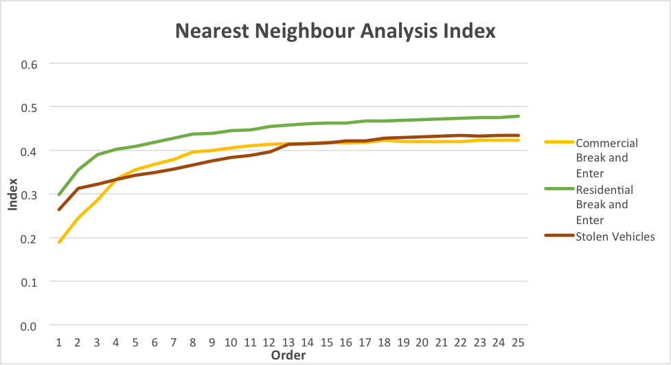
The 1st order break and entries and car thefts are more spatially aggregated than expected. This can be seen by looking at the nearest neighbor spatial aggregation indices on the graph. The index is a ratio of observed distance over mean random distance, so an index smaller than 1.0 indicates clustering (Levine, 2015).

The correlogram shows that spatial autocorrelation decreases exponentially with increasing class distance. A value of 0 represents complete randomness and no spatial autocorrelation. Residential break and enters are correlated the most (MI = 0.032449), followed by vehicle thefts and then commercial break and enters.

The fuzzy mode clusters can be seen in Map 1 as categories of coloured and sized points. The biggest and most red points indicate the highest frequency of residential break and enters committed within 1km and the smallest yellow points then indicate the smallest frequency. Clusters of red point then show where spatially there is the highest frequency of spatially correlated crimes. In Map 1 it can clearly be seen that most crimes happen in the core downtown residential area.

The nearest neighbour hierarchical spatial clustering is seen in Map 1 as purple ellipses. The ellipses delineate hotspots where at least 10 crimes have occurred within a 1km distance of each other.

Map 1. Fuzzy Mode Analysis Results


The nearest neighbour risk non-adjusted clusters depicted as purple ellipses in Map 2 do not consider population density. The nearest neighbour hierarchical spatial clustering analysis was then risk adjusted by normalizing crime frequency by population 15+. The analysis yielded 3 orders of clustering results. The first order or ellipses are the risk-adjusted hotspots where 10 or more crimes occurred within 1km of each other. The second order ellipses are clusters of the first order ellipses and the third order ellipses are clusters of the second order ellipses. In Map 2 we can see that the first order risk adjusted ellipses have the same general pattern, but are yet different from the risk non-adjusted clusters.

Map 2. Nearest Neighbour Risk Non-Adjusted and Adjusted Clustering Results

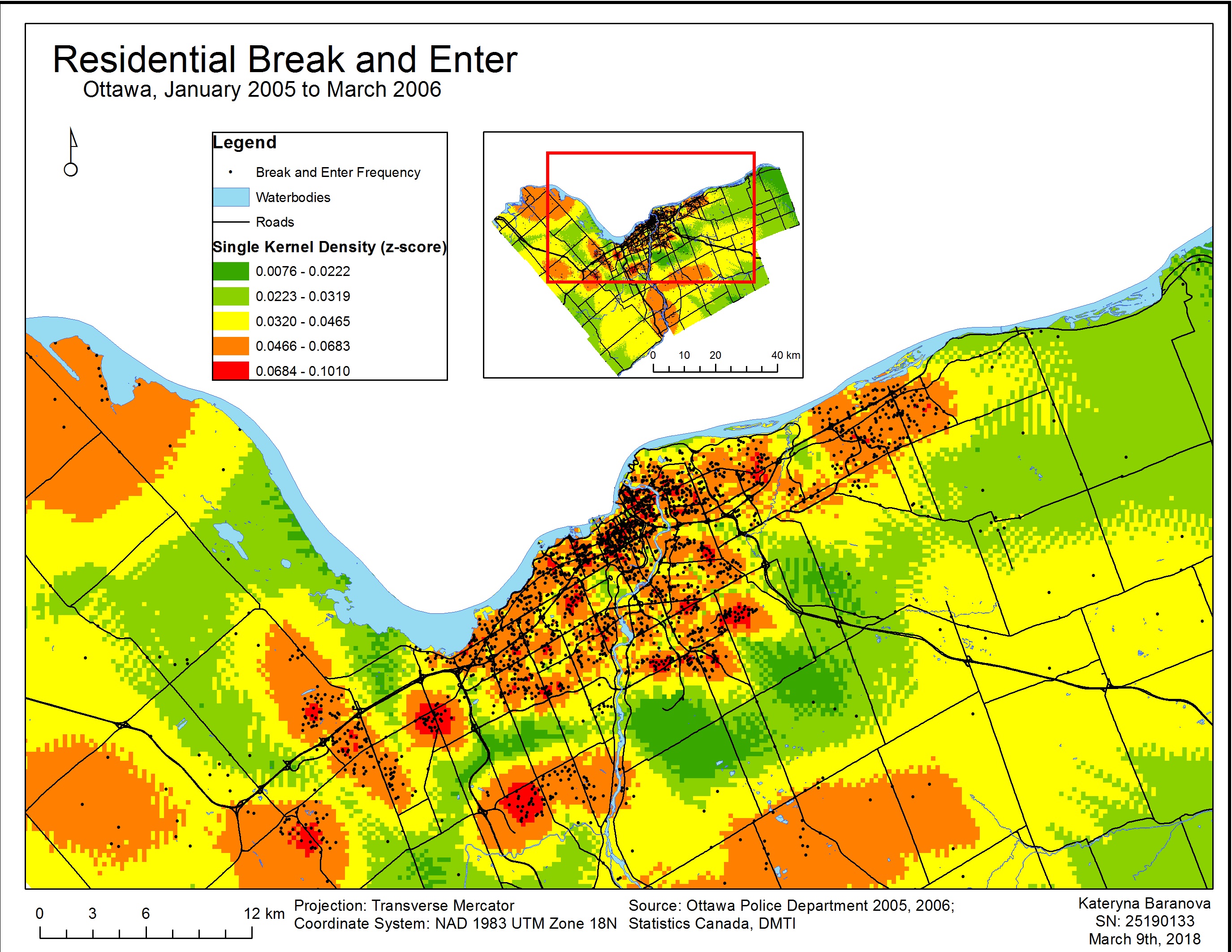
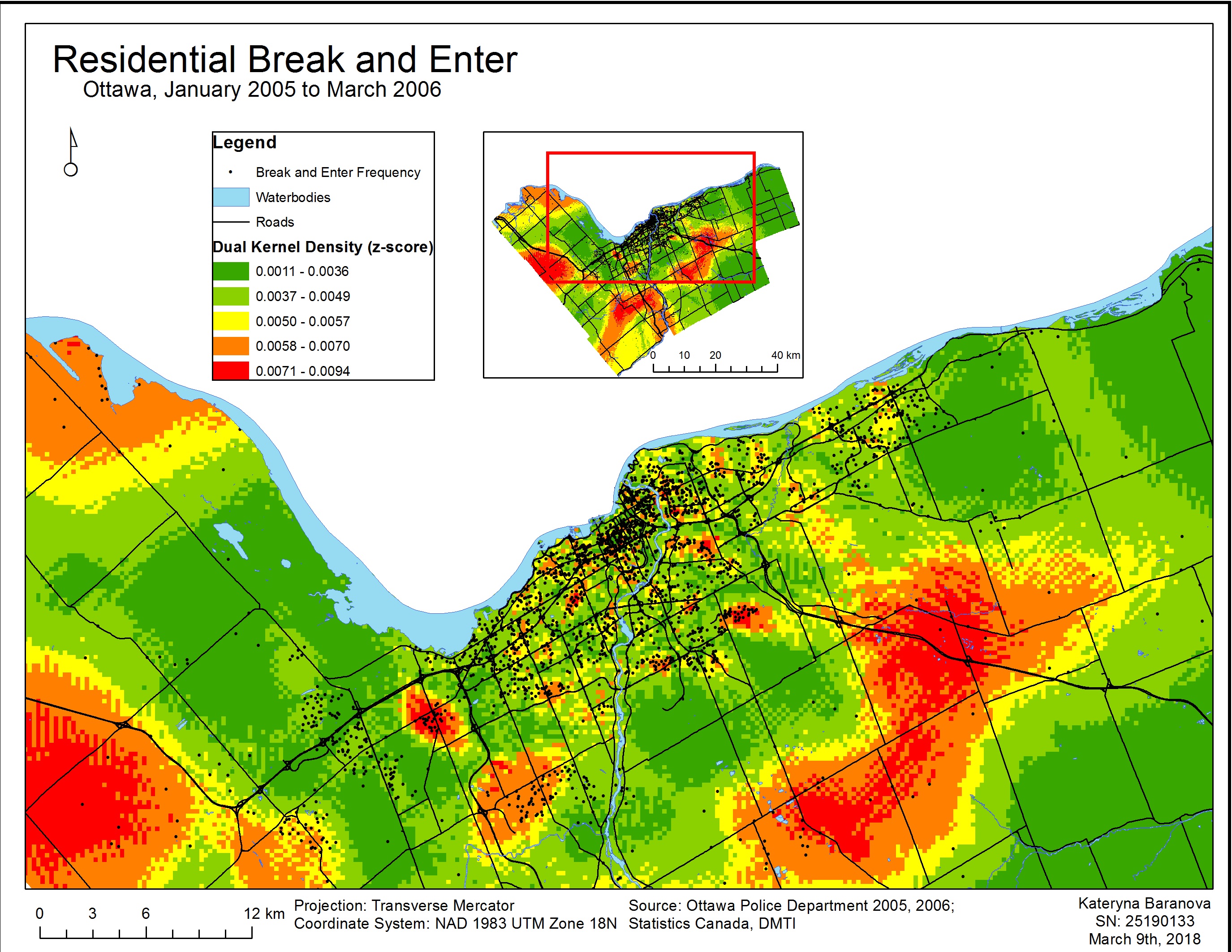
In Map 3 we can see the results of a single kernel density estimation and in Map 4 the results of a dual kernel density estimation. The single kernel density surface estimation does not account for population density whereas in the dual kernel density estimation the population 15+ is taken into account to produce a relative-risk surface. The black points represent the frequency of individual residential break and enter crimes and are overlain on the kernel density maps. Crimes are highest where the surface is red and lowest where it is green.

Map 3 of single kernel density estimation corresponds relatively closely to the risk non-adjusted near neighbour analysis clusters. Map 4 of dual kernel density estimation corresponds more closely to the first order risk-adjusted near neighbour analysis clustering results and gives a more precise estimation of relative residential break and enter risk to an individual. 

Map 3. Single Kernel Density Analysis

Map 4. Dual Kernel Density Analysis

REFERENCES

Ned Levine (2015). CrimeStat: A Spatial Statistics Program for the Analysis of Crime Incident Locations (v 4.02). Ned Levine & Associates, Houston, Texas, and the National Institute of Justice, Washington, D.C. August.

Lab 3: Introduction to Geographically Weighted Regressions

In this lab we worked with the geographically-weighted regression – a spatial analysis tool that looks at non-stationary spatial variables in order to model the interrelationships between these variables using multiple regressions. Non-stationary variables are those that vary or “drift” spatially, such as demographic factors and many others (Leung, 2000). The GWR multi-regression model produces a raster surface by running a regression for every variable and assigning a coefficient value for each independent variable for every cell. The cells closest to a data point are assigned a higher value than those further away. The cells with corresponding coefficient values then produce a tessellation that depicts the spatial variations between the dependent and independent variables (Columbia University, n.d.).

The coefficient of determination R2 that is produced by running GWR is simply put a “goodness of fit” that determines the amount of variance in the dependent variable that is correspondent to the independent variable. The values range from 0 to 1 with 1 indicating the best model fit. This variable is very important to look at when determining the success of the model in explaining spatial autocorrelation (Legg et al., 2009).

After running the Ordinary Least Squares (OLS) and Geographically Weighted Regression tool a few maps were produced to show the difference in the produced results. The data used for this analysis was from UBC’s Early Development Instrument. The regression analysis began with the identification of the most important variables affecting a child’s social score. Through performing Explanatory Regression Analysis in ArcGIS and then comparing the adjusted R-squares to find the highest value and Akaike’s information criterion for the lowest values, 4 most important variables were identified: gender, ESL, lone parent and income. After identifying these variables the tool was run again this time with only the most important factors and adding language score. This produced 3 variables of interest: language score, gender and income. Then the OLS tool was run for the above to determine the associated statistics.

The results of the OSL and GWR analysis were mapped over the neighborhood groups to compare the two and determine which model is better suited for the data. We can see (Map 1) that the results produced by the OSL tool with the strongest fit are scattered all over the map, therefore not producing a meaningful model. With the GWR results (Map 2) we can see that the strongest R-squared values (i.e. best fit) are in clusters, therefore providing us with the most accurate results for east Vancouver, part of the Kitsilano area, Downtown and Northern Marine Drive area. The following maps (Map 3, 4, 5) represent the spatial distribution of language scores, gender and income respectively. The strongest spatial correlation is between social scores and language scores (Map 3) followed by income (Map 5) and quite ambiguous results for gender (Map 4).

Map 1. Ordinary Least Squares Results for Children’s Social Scores in Vancouver, BC

Map 2. Geographically-Weighted Regression Results for Children’s Social Scores in Vancouver, BC

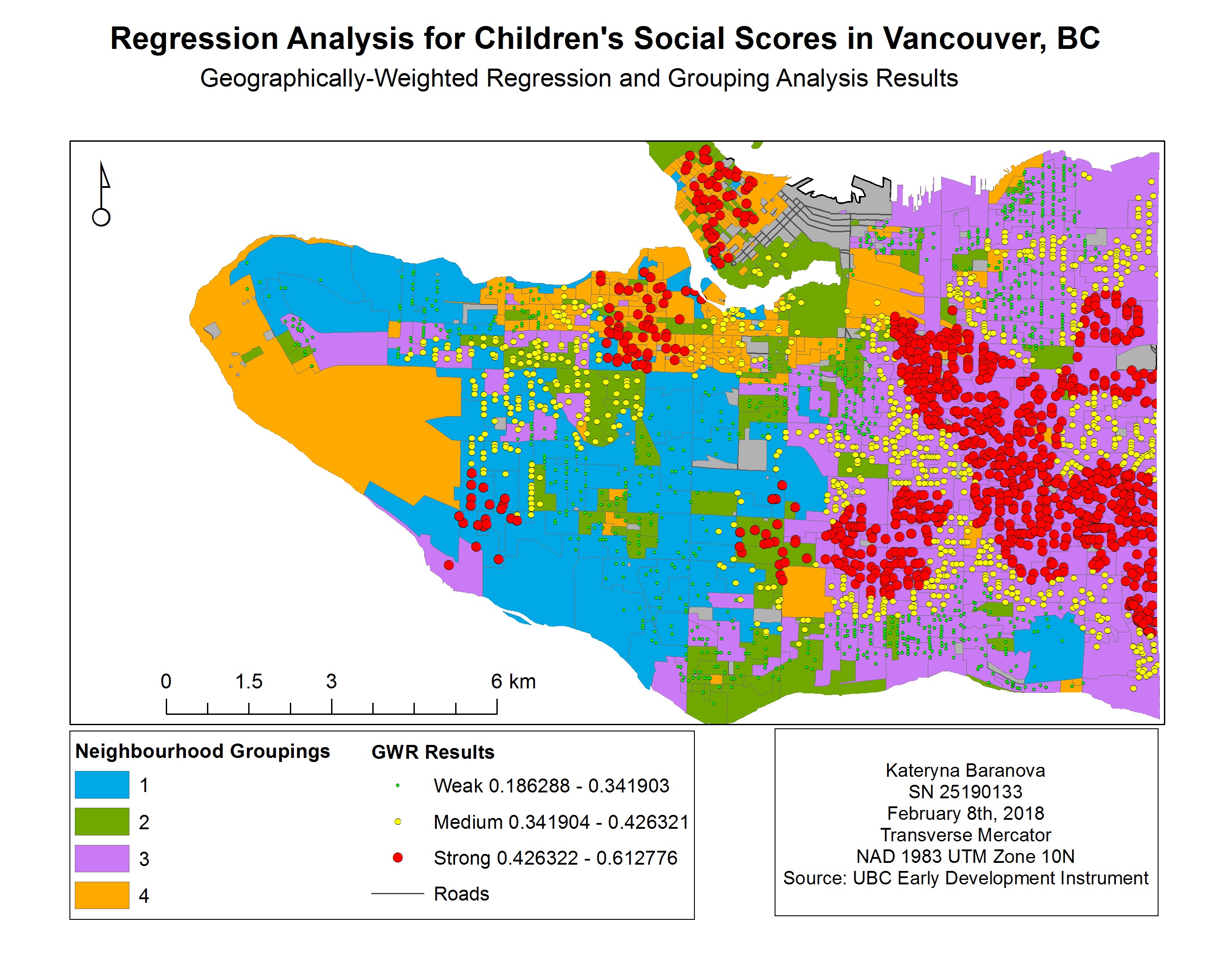
Map 3. GWR and language scores for children in Vancouver, BC

Map 4. GWR and gender for children in Vancouver, BC

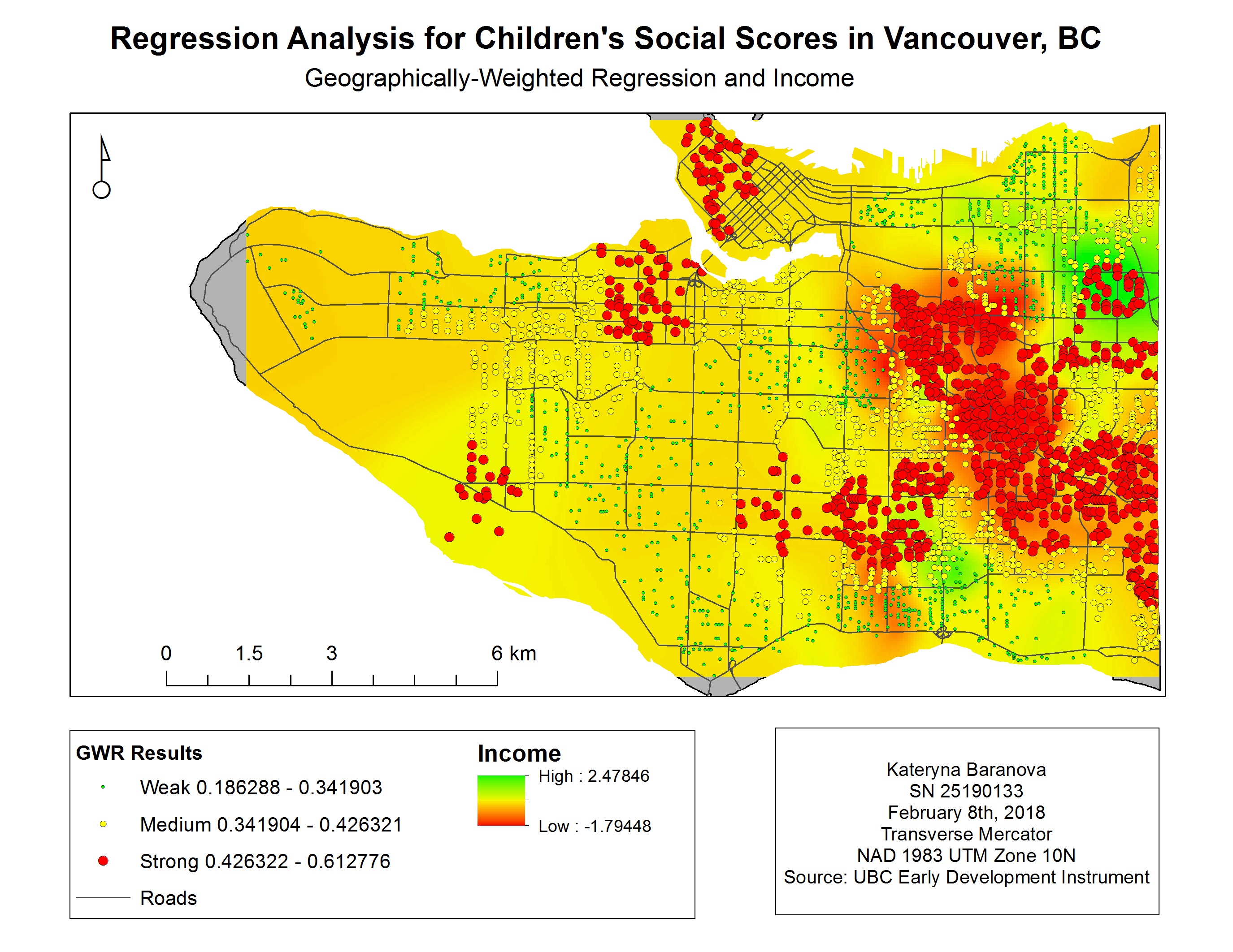
Map 5. GWR and income for children in Vancouver, BC

References

Columbia University. (n.d.). Geographically Weighted Regression. Retrieved from https://www.mailman.columbia.edu/research/population-health-methods/geographically-weighted-regression

Legg, R., Bowe, T. (2009). Applying Geographically Weighted Regression to a Real Estate Problem. ArcUser. Retrieved from http://www.esri.com/news/arcuser/0309/files/re_gwr.pdf

Leung, Y. (2000). Statistical tests for spatial nonstationarity based on the geographically weighted regression model. Environment and Planning, 3, 9-32. Retrieved from http://journals.sagepub.com.ezproxy.library.ubc.ca/doi/pdf/10.1068/a3162

Lab 2: Exploring Fragstats

In this lab we conducted an assessment of land use change around Edmonton, Alberta between 1966 and 1976. I focused my study on urban land use change to measure urban expansion over 10 years.

The amount of urban built-up areas in Alberta increased almost tri-fold over these ten years from 19,596 hectares in 1966 to 54995 hectares in 1976. However, the growth was seen not only in the expansion of the city core but also in an increase in number and size of disjunct areas. The urban areas were built on what was previously cropland, pastures and productive woodland. Further rapid urban growth is expected and an effective land use management plan is necessary to manage urban expansion with minimal costs to the surrounding environment.

The data used for analysis in this report was retrieved from the Open Government Portal. The analysis uses CLUMP (Canada Land Use Monitoring Program) data for Edmonton, Alberta in the years of 1966 and 1976. It includes 14 land use classes that were sorted based on air photo interpretation, field surveys and census information. ArcGIS was used to produce two maps depicting various land use classes in 1966 and 1976 (Map 1) and then looked closer at urbanization of the urban core (Map 2) and the peripheral land (Map 3). It can instantly be seen (Map 1) that both the core and peripheral areas experienced rapid urban growth over 10 years. The built-up areas increased in number and size taking over other land uses. If we look at the core urban area of Edmonton (Map 2) we can see that it grew significantly, taking over what was cropland and pasture in 1966 and replacing. As mentioned above, the amount of disjunct areas around the core also increased with urbanization moving further away from the center. If we look at the change in one of such areas (Map 3) we can see that urbanization replaced pastures, cropland and marshes.

Through using FragStat for analysis, the total area of the built-up areas class increased by 35399 hectares with the total core area increasing by 22560 hectares. Built-up areas almost triple and came to occupy 8.5407% of the study area in 1976 compared to only 3.0413% in 1966. The number of disjunct urban areas also increased from 88 to 384 within ten years indicating a shift away from the core urban area (Table 1). Although the number of patches increased greatly for urban areas from 133 to 417 the number of patches for the whole landscape decreased by 209 therefore indicating a loss in landscape diversity most likely caused by urbanization (Table 2).

To analyze where the increase in the built-up areas came from in 1976 we created a transition matrix (Table 3). We can see that built-up areas from 1966 contributed only 35.63% of the total 1976 area. Most of the 1976 built-up areas came from cropland 38.88% followed by unimproved pastures and range land 13.51% and productive woodland 5.00%. Figure 2 you can see the complete breakdown of what land use classes in 1966 have been converted to built up areas in 1976. Can conversion of productive land to urban areas can be problematic in the long term therefore it is important to understand where urban growth comes from.

In figure 1 we can see the land use total areas by classes between 1966 and 1976. We can see that most land use classes decrease in area that they occupy and the two most significant increases can be attributed to built up areas and productive woodland. The latter can be explained by the maturation of unproductive forest land from 1966 to 1976.

Table 1: Changes in class level metrics for land use in Edmonton, Alberta between 1966 and 1976.

Table 2: Changes in landscape level metrics for land use in Edmonton, Alberta between 1966 and 1976.

Table 3: Transition matrix depicting where the change in land use in 1976 came from.

Table 4: Description of class and landscape metrics used.

Figure 1: Total areas of land use classes in 1966 and 1976.

Figure 2: Land use class change to urban built up in 1976.

Map 1: Land use change between 1966 and 1976 in Edmonton, AB.

Map 2: Land use change in the core urban center of Edmonton, AB between 1966 and 1976.

Map 3: Land use change in the peripheral urban area in Edmonton, AB between 1966 and 1976.

References

Open Government Portal. n.d. Edmonton CLUMP 1966, 1976. Retrieved from

http://open.canada.ca/data/en/dataset?organization=nrcan-rncan

Kevin McGarigal. 2015. Fragstats Help. Retrieved from

http://www.umass.edu/landeco/research/fragstats/documents/fragstats.help.4.2.p

Lab 1: Spatial Statistics Using Modelbuilder Tutorial

The below map gives a hot spot distribution of heart disease rates by county in the southern United States. The data for this map was taken from CDC Wonder for the year 2016. The total deaths from heart disease were divided by the total population of the county to find the heart disease rate and normalize the data. Also a spatial weights matrix was created using the 8 nearest neighbors to run the hot spot analysis. Since this is a big dataset, and before zeroing in on 2016 I looked at years 1999 to 2016, models were created in Modelbuilder to process all of the data. The first model was designed to separate the data into 18 yearly classes and process it year by year. The second model used a hot spot analysis tool to define statistically significant hot and cold spots with confidence levels of 90%, 95% and 99%.

By looking at the results of the hot spot distribution we can immediately identify that Oklahoma has the highest concentration of heart disease cases out of all the other southern United States. The east coast and Texas have some of the lower concentrations. Further data and analysis is needed in order to determine the causes of such spatial variations of heart disease rates. Perhaps the concentration of hot spots in Oklahoma could be due to older population, poverty, unhealthy diets, poor air quality, higher caffeine consumption, or even genetically predisposed population. It could also be due to infrastructural distributions and by this I mean a higher concentration of nursing homes and heart disease centers. Any or all of these factors could play a role in determining the patterns, however that information was not available to us for the purposes of this assignment. Overall Oklahoma seems like a problematic state in terms of heart disease fatalities and I would suggest moving to Maryland which seems to be the less troubled according to this map.

Spam prevention powered by Akismet