Original Ad
Meme’s are ideas that are shared among people. They generally have a target audience and are used to control or influence the viewers thought. Meme’s have a major role to play in consumerism. Consumerism often makes people think they want things they don’t need by linking a product or brand to an individual’s desire.
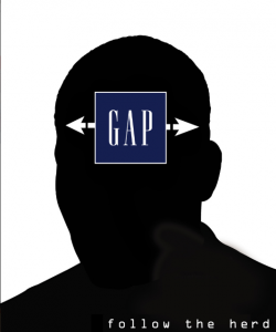 I believe that this specific advertisement does not target a specific audience even though the GAP Company logo is used. A specific audience could be fashion and clothing consumers, but everyone wears clothes thus this ad could apply to everyone. The product advertised in this ad is clothing and fashion. The advertisement consists of a black and white silhouette of a head. The use of the black and white colour scheme is very plain and simple, this could signify the simplistic and impressionable nature of fashion consumer’s. As well, the black and white element makes the other aspects of the ad stand out even more. The GAP Company logo is used in the centre of the head silhouette, this could signify the empty and impressionable space in the mind of the consumer. This “gap” is filled by ideas and products that trick the consumer into thinking they need or want them. Another aspect of this advertisement is the quote at the bottom which says “follow the herd”. This ties together the overall meaning of the ad which could be that fashion and clothing are a product that the consumer needs to fit in or be classified as “cool”.
I think the ad is very simply and to the point. It was very easy to identify what exactly the ad was try to point out and what stereotypes it was attempting to mock. Consumer’s of fashion are often so influenced to look a certain way in order to fit in or be liked. However, I think there are a few areas of this ad that could be improved. This ad would be better if it was more obviously geared towards a target audience.