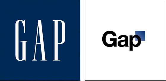
Gap’s New Logo
 I personally like the old logo of Gap. It is the symbol that I can link to the original image of Gap.
That is also how many consumers think about Gap and its image. The old one that people are familiarly with,
represents this brand’s value of vintage, easy-to-wear and casual. However, the new logo looks more like a hi-tech
software company and it cannot link to Gap any more. Gap Company is taking a risk to use its new logo which also costs lots of cash to renew its image such as the store and the bag. Actually, consumers assume that new logo may bring the different style of Gap’s design. Some loyal consumers may not accept the new logo and their loyalty finally result the lost of these consumers.
 Comments(0)