Reflection on the Course

Geography 270 was a course taught me how to utilize GIS to perform geographical analysis. I was able to learn about the functions and applications of ArcGIS and use them to conduct assessments and analyses on certain areas of interest. I was also able to work individually and in a team for various projects in this course. The highlight of this course was successfully being able to say that I can use ArcGIS and it’s functions to create maps that can then provide information on an area. This course helped me to understand the story behind maps and how useful and powerful they really can be.


Land Assessment for the Development of the Pineapple Place Resort and Spa on the Island of Hawai’i

Final-Project

The proposal for our final project was to perform a land assessment for the island of Hawai’i in order to find an ideal location to being the development of the Pineapple Palace Resort and Spa, a relaxing getaway that tourists or locals could treat themselves to. Our goal was to find a couple of locations that would be ideal based on the land use on the island, while taking into consideration things such as the proximity of highways, other hotels and environmental hazards like tsunami and volcano danger zones.

For this project, I worked in a team with three other classmates. Our team worked well together as we were all dedicated and put in equal amounts of time and effort into our work and research. Two of us were in charge of creating maps and the flow chart and gathering information onto ArcGIS while the other two were in charge of gathering information and editing the report. I believe that our team worked well as a unit, as we were very efficient with our time and project management. However, it was difficult to agree on a topic to begin with because our horizons were so broad. We all came to a consensus that we did not want to analyze the Vancouver area because we had studied it so much in class, but we did not know exactly what we wanted to do. It took us much longer to decide than it should have and it was a bit alarming at first. Though we had our difficulties, once we were able to settle on a project proposal, our efficiency increased profusely.

Through working on this final project, I was able to learn a lot more about ArcGIS and all the aspects that are necessary when performing a land assessment. When we first started our project and found one main source for the island of Hawai’i that had all the datasets we required and were all projected and formatted the same, we thought that the project would be simple. However, we learned that a lot had to be done with the layers, rather than just download and add to the map as a layer. As well, when all the layers came together to produce our final map, above, it became more clear that planning for building development in an area with so many intricate parts to it is much harder than it seems.

You can view the final report with six maps attached to it at: Geob 270 Final Project


Housing Affordability

dataclass-page-001

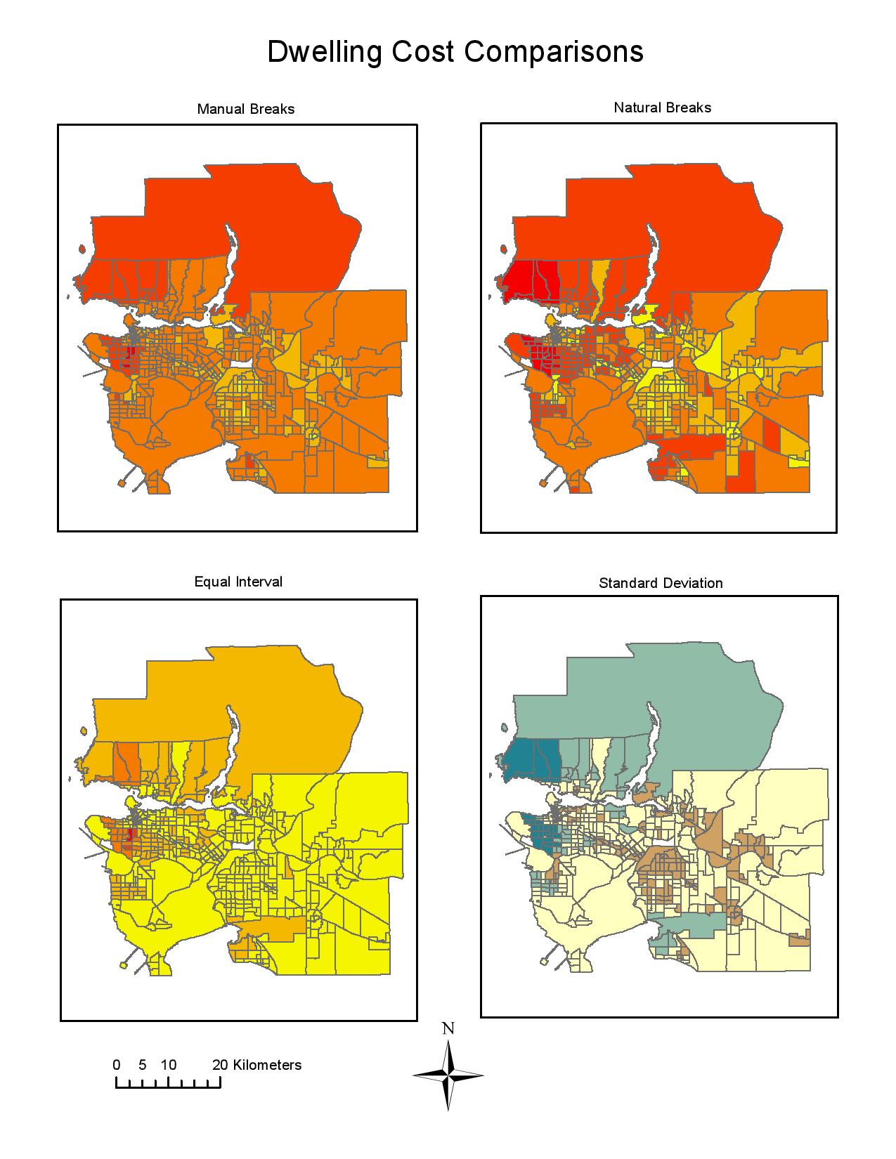
The four classification methods above: manual breaks, natural breaks, equal interval, and standard deviation, are data classification methods that influence the interpretation of data in maps. Depending on the situation, certain data classification methods can be favoured over others and at times they can be unethical.

As a journalist, I would choose the natural breaks classification method because it shows exactly where there are natural breaks in the local area. To the audience, the prices are being portrayed accurately and it shows a range of prices over the Vancouver area, especially the places where the housing costs are the highest.

Where, as a real estate agent, I would choose the equal interval classification method because the house costs appear to be more evenly spread out and lower in cost. There are ethical implications for the choice of classification method because most real estate agents would probably want to sell as much as they could, therefore they would present a map as affordable to spark interest in the buyer in a certain area, when in fact, the area is probably more expensive than what they expect.

affordabilityVO-page-001

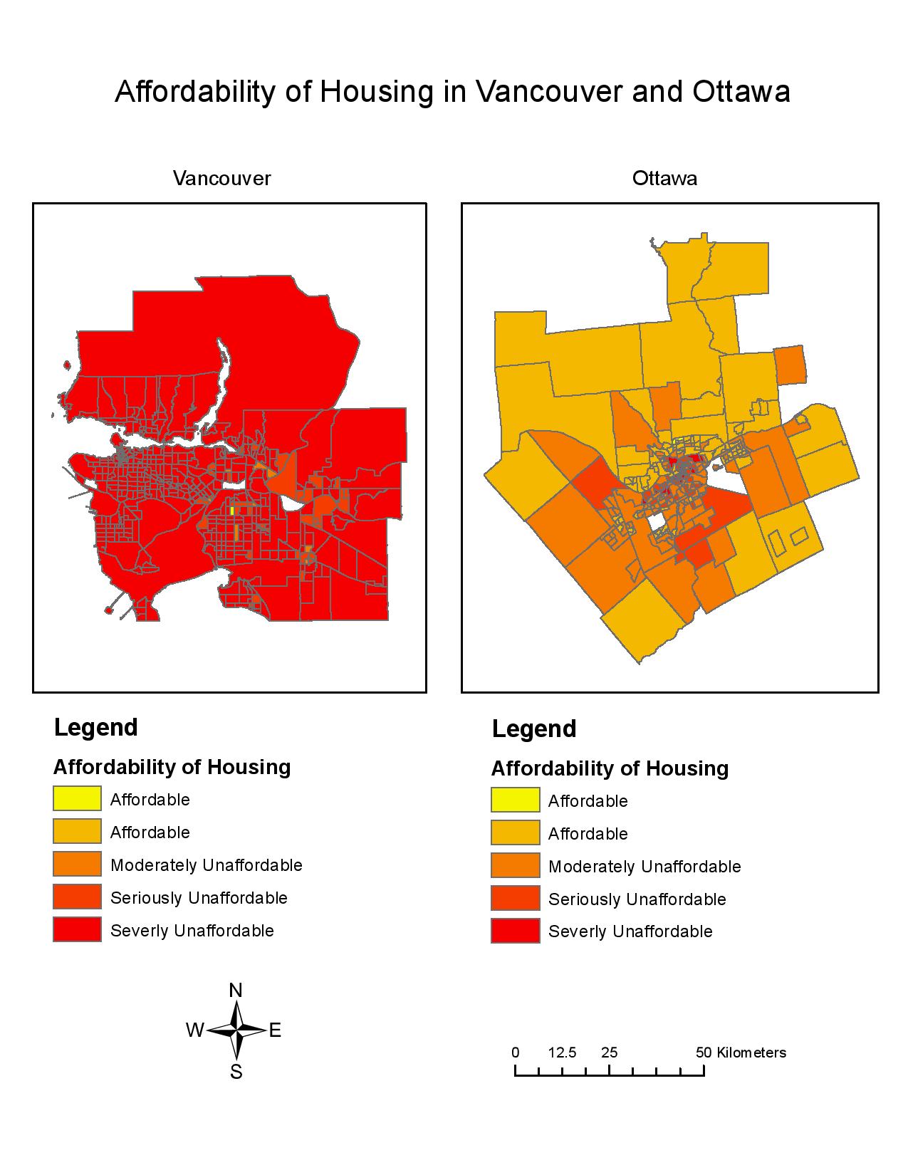
Affordability is measuring the ratio of the cost of housing to the median household income. This is a better indicator of housing affordability than the housing cost alone because each city has a different median income. Larger cities tend to have a higher median household income than smaller cities, therefore, comparing this to the housing cost is a more rational way of measuring housing affordability. The housing affordability rating categories as determined by the 12th Annual Demographia International Housing Affordability Survey of 2016 are Affordable (3.0 and under), Moderately Unaffordable (3.1 to 4.0), Seriously Unaffordable (4.1 to 5.0), and Severely Unaffordable (5.1 and over). Since the data was collected by professional urban planners and is recommended by the World Bank and United Nations, it is to be trusted. It is important to note that affordability cannot be said to be a good indicator of a city’s livability. The affordability of a city does not account for socioeconomic factors and many factors that people would consider crucial to live, i.e. education and access to health care.

ACCOMPLISHMENT STATEMENT

Worked with census data to classify, normalize and visualize the affordability of housing in two cities in order to compare and analyze the differences between Vancouver and Ottawa.

Planning for a Tsunami

mylab3-2

In the event of a tsunami, the percentage of the City of Vancouver’s total area that is in danger is approximately 15.5%. To find this value I found the total area of all areas in danger in the City of Vancouver, 20314805.889169 sqaure meters which was found under the Vancouver_Danger layer, and I divided it by the total area of the City of Vancouver, 131033339.950334 square meters which was found under the Vancouvermask layer. I multiplied the value by 100 to get the percentage.

Healthcare Facilities in Danger  Educational Facilities in Danger 
False Creek Residence St. Anthony of Padua
Broadway Pentecostal Lodge Ecole Rose Des Vents
Coast West Community Home Heritage 3R’s School
Yaletown House Society Vancouver Montessori School
Villa Cathay Care Home False Creek Elementary
Emily Carr Institute of Art & Design (ECIAD)
Henry Hudson Elementary
St. John’s International
St. Francis Xavier
Institute of Indigenous Government (IIG)

I found these danger zones by clipping the Vancouver_Danger layer with the Vancouver_healthcare layer and opening the attribute table to see which health care facilities were in the danger zone. I then did the same thing with the Vancouver_Danger layer and the Vancouver_education layer.

ACCOMPLISHMENT STATEMENTS:

  1. Acquired basic knowledge of the ArcGIS software by understanding it’s functions in order to analyze maps made by the software and perform geographical analysis.
  2. Utilized knowledge of misaligned and improperly referenced spatial data to distinguish distortions and specific biases that are visible on maps.
  3. Used spatial analysis, tabular datasets and ArcGIS applications to create a map highlighting the zones of the city of Vancouver that are in danger if a tsunami is to occur.


Misaligned and Improperly Referenced Spatial Data

In order to fix misaligned and improperly referenced spatial data, you must take into account properties such as areas, angles, distance and direction. When data is projected into a different coordinate system, these four properties can be compromised and a map is said to be distorted. For instance, a Mercator projection of the world distorts the area of countries and maintains the angles. Take for example Alaska and Brazil, they appear to be the same size when in reality, Brazil is significantly larger. On the other hand, a Peters’ projection of the world distorts the angles and shapes of countries but, maintains their true area. The “projecting-on-the-fly” method allows you to combine separate layers with different projected coordinate systems in order to align them onto one map projection. As well, you can use the ArcToolbox Project and Transformation commands which will allow you to combine separate layers with the same projected coordinate systems by changing the coordinates of the layers to align with each other. These commands help align different layers onto one map projection, however one changes the coordinates (ArcToolbox Project and Transformation) and one changes the coordinate system (“projecting-on-the-fly”).

In order to prevent misaligned and improperly referenced spatial data, we can use the remote sensing technique called Landsat to provide us with more accurate data for geographic analysis. Advantages to using Landsat are that the images from Landsat have been collected since 1972 and contain a lot of data within the set. This can tell us about land use, water, agriculture and a multitude of other aspects and how they have changed over the years.