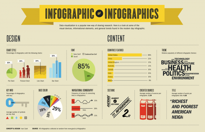
Data representation has been fairly direct and simple over the last decade, but a new form of data representation is on the rise. Infographics can turn those boring data spreadsheets and statistics into creative and appealing displays that catch the attention of the reader and make it more memorable and unique. The cost of the most basic uses of websites to make Infographics are currently free and can provide you with graphics to display data in a never before seen way. Popular free websites such as Visual.ly have provided users an insight into this fascinating advancement in information display. This can be strongly related to the class discussing MIS and BTM. It shows a strong shift in IT and signifies that companies may soon need to start following this trend before their outdated representations of data result in other companies being able to take over because they’re more responsive and adaptive. If the companies are able to experiment with this new technology before it matures, it may provide them with a competitive advantage of uniqueness in the rapidly changing world of technology. All in all, this new innovation opens up a more artistic approach in data representation.
More Info Here!
