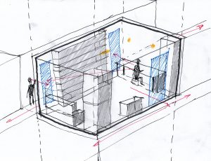
In-class exercise: An analytical sketch of my room. I learned from this exercise that adding a person before adding anything else in the room makes it easier to get the relative proportions of things more accurate.

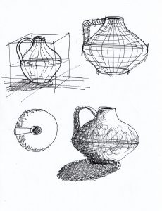
Experimenting with what the skeleton of this vase would look like, and where light hits objects.


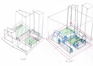
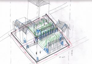
A field trip to Cathedral Place. I’d passed this place before but had never been inside, so it was fun discovering the courtyard. I walked around the block and inside the buildings while taking photos. I drew it partly from memory and partly from referring to my photos to see where the parts connect. It was hard to get the big picture without walking far away from the site and looking back at it. I struggled with representing this in 3D so I started by focusing more on the plan/footprints first.

The site in 30s, 1 min, 2 min, 5 min, 15, and 30+ min. The first four show the whole block while the last two focus in on the half the block that I found most interesting. In the last drawing, I got a bit lost in the details of trying to represent the grade changes and consequently lost clarity and some of the scale was off. Quick drawings with fewer lines seem to be more successful for conveying information with clarity and to force you to prioritize what information to include without overthinking it. What stood out to me about this site was the complex grading and repetition of sitelines that overlook archways and triangles.


