The world is getting more and more mobile with the prevalence of mobile devices such as smartphones and tablets. As more and more people are engaging with the on-the-go type of life, mobile web design also becomes crucial for marketers in order to catch up with this trend.
The mobile web refers to access to the world wide web, i.e. the use of browser-based Internet services, from a handheld mobile device, such as a smartphone or a feature phone, connected to a mobile network or other wireless network. Unlike the traditional website which displayed on laptops, mobile web brings better mobility but also more limitations.
- Small screen size – This makes it difficult or impossible to see text and graphics dependent on the standard size of a desktop computer screen.
- Lack of windows – Only one page could be displayed at a time, and pages could only be viewed in the sequence they were originally accessed.
- Navigation – Navigation can be challenging since it will be largely depend on scroll with figure or keyboard with less flexibility.
- Speed – On most mobile devices, the speed of service is slow.
Here I am comparing the mobile website layout for two of the clothing brands, Forever 21 and Aritzia:

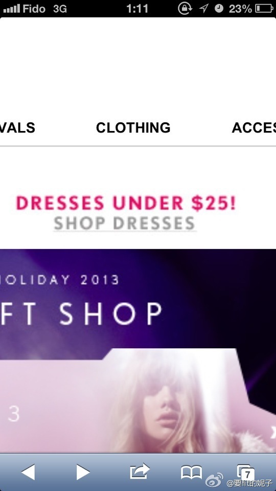
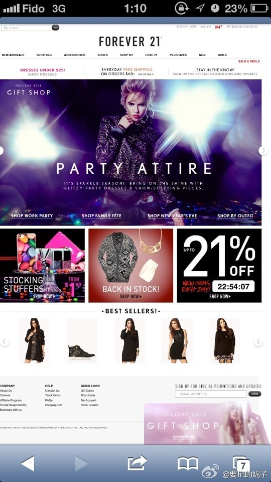
The mobile web page of Forever 21 looks no difference with its website when opening on a laptop. This is good in a way that it seems to create a seamless browsing experience across all platform and creating the sense of familiarity for consumers. However, due to the limitation of most mobile devices’ small screen, the entire website page looks very crowded and the fonts are too small to see with out zoom in.(picture 1) Yet, when I did zoomed in, the fonts became big but unclear and it’s not so convenient to move the page around to get to the place I want to click at. Also, when I zoomed in the page, the pop up adds also stays on the page and enlarged as I zoomed in the whole page, which making the navigation even more difficult.
Now let’s look at Aritzia’s mobile page:
 picture 3
 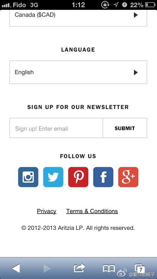 picture 4
 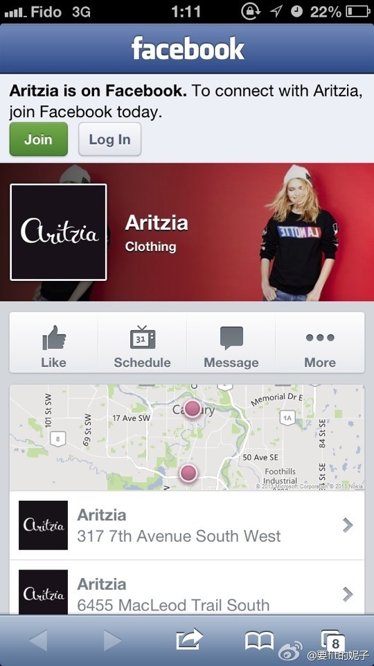 picture 5
The mobile web page is very different from the normal website page. The mobile page is very concise and neat. It fully considered the fact that with most mobile devices such as smartphones, users are most likely be convenient only with figures to scowl down and up not from left to right. Therefore, with this page, users just need to scowl vertically to browse the info they are looking for. (picture 3) Also, all tap can be clearly seen without zooming. When you scowl down to the very bottom, Aritzia has all the social media tap attach. I try the Facebook one and it leads me directly to the brand Facebook page. I think it’s a very smart way to do so since when consumers are direct into Facebook interface, they are more familiar with Facebook under this context. Also, consumers will be able to get more detailed information about the brand such as events, pictures through Facebook. (picture 5)
Sources:
http://en.wikipedia.org/wiki/Mobile_Web
http://www.socialnomics.net/2013/08/06/mobile-marketing-trends-ig/
http://canada.forever21.com/Product/Main.aspx?BR=F21
http://aritzia.com/on/demandware.store/Sites-Aritzia_CA-Site/default/Home-Show?gclid=CKH52Lml87oCFVFgfgodzVMAsA