Data was primarily acquired from the City of Vancouver Open Data Catalog. Population density data was acquired from UBC’s geography G drive. Additional location data, like City Hall, Police Stations, Hospitals, High Profile Areas, Supermarkets, and private schools were manually geocoded, either through excel or the editor tool in ArcMap. Private schools were manually added into the Schools dataset. For High Profile Areas, information was obtained from Tourism Vancouver to identify the areas experiencing the most human traffic. Translink was used to identify the top ten bus routes with the most ridership. We were then able to limit our original bus stop layer. We kept both East and West bound routes because there would be more people around these areas, either at the bus stops or going by. All of the data that needed to be clipped was clipped by Vancouver Mask, also found in the G drive.
After acquiring all of the data, each dataset was sorted into a category by the level of danger. A dataset was deemed dangerous, if it had high levels of human congregation and interaction or population density. The “Most Dangerous” category included the City Hall, Police Stations, Hospitals, Schools, Canada Line Stations, and Skytrain Stations data. We will call this our Tier 1 layers. The “Very Dangerous” category included Supermarkets, Bus Stops, Community Centres, and Homeless Shelter data. This will be our Tier 2 layers. Population density would not take into account the movement of people and therefore would be less dangerous than Tier 1 and Tier 2. Population density was categorized as “Moderately Dangerous”. The “Most Dangerous” category of locations were merged to create layer Tier_1 (figure 1)and the “dangerous” category of locations were merged to create layer Tier_2 (figure 2). We then collected the events in Tier_1 and Tier_2 to get our Tier_1_CollectEvents (figure 3) and Tier_2_CollectEvents (figure 4). The graduated symbology is showing overlapping points, larger circles meaning more events.
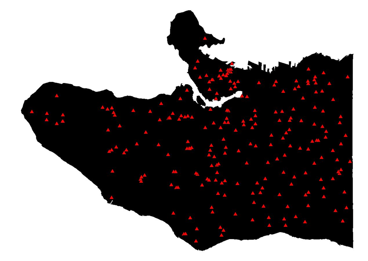
Figure 1
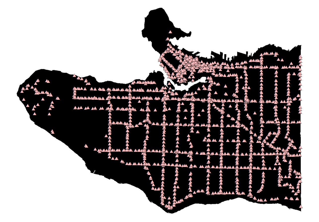
Figure 2
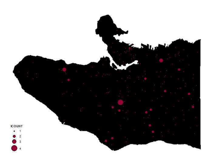
Figure 3
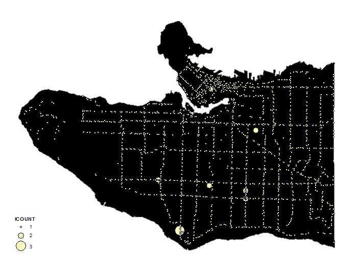
Figure 4
We then used the Kernel Density tool on Tier_1_CollectEvents and Tier_2_CollectEvents, which was able to create a surface with the highest value where points occur. The surface will then spread from the high, center value and reach zero when the search radius is reached. We use the default search radius which was calculated depending on how many points were considered and the configuration of the input data (Arcgis for Desktop). This resulted in our KernelD_Tier1 and KernelD_Tier2 layers. We then reclassified the data. Data outside our area of interest (The City of Vancouver) would have no significance to us. So we excluded these zero values using data exclusion, and classified this layer with 5 classes by natural break because we thought that is what fit our data the best. We also added our friction values into the attribute table. These friction values we determined proportionally We then added friction values into the respective layers. The friction values were calculated proportionally (class max/absolute max)*100, with a normalization value of 100 (figure 5).
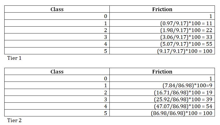
Figure 5
The friction values indicate the ease of human travel, with lower friction values corresponding with ease of travel and vice versa. Next we used Extract by Mask to get rid of the values extending into the water, since these values are not relevant. Then we had to do another reclassify for both tier 1 and 2 layers due to a problem with the raster calculator not using our inputted friction values to do the weighting calculation. The resulting layers are Tier1_Final (figure 6) and Tier2_Final (figure 7).
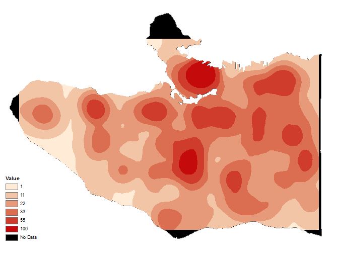
Figure 6
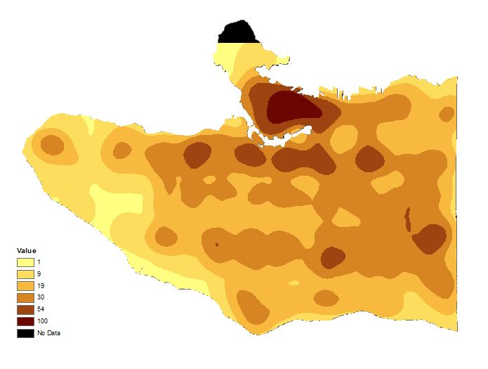
Figure 7
To get our population density layer, we used DA data and clipped it by VancouverMask to get just the city of Vancouver’s DA’s. We then calculated the population density, and added the population density as another column. We assigned friction values; high density areas have a high value (figure 8). We then converted this layer to a raster (figure 9) so that we can use the raster calculator. We set the cell size of this layer to 10×10 meters to match the cell size of the Tier1 and 2 final layers, so that the resolution of the resulting map will match.
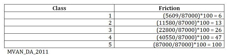
Figure 8
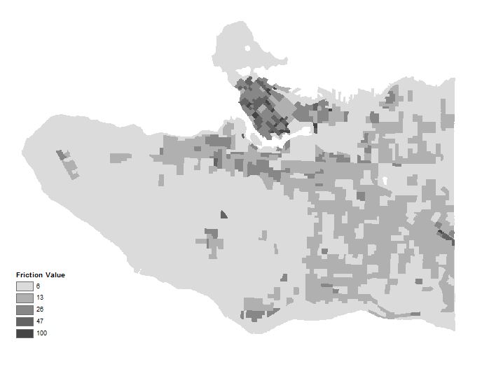
Figure 9
With our population density and kernel density layers, we used the Raster Calculator to conduct a weighted calculation. The Raster Calculator tool would be doing the same function as a Multi Criteria Evaluation (MCE). Tier 1 layers were ‘Most Dangerous’ and given a 0.49 weight. Tier 1 layers were ‘Dangerous’ and given 0.31. Population density was given 0.20 because due to less danger. This resulted in our Criteria_Final layer (figure 10).
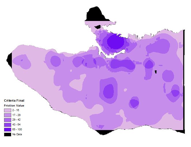
Figure 10
We need to do a least cost path that stays on the streets because we are going to be riding bikes so we decided to proportionately lower the friction value of the streets. To do this, we buffered the streets layer by 10m and gave it a friction value of 1. Then we took VancouverMask and erased the streets to get our Non_Street layer with a friction value of 2. We then merged the streets buffer with the Non_Street layer and converted it to raster called Vancouver_Raster (figure 11).
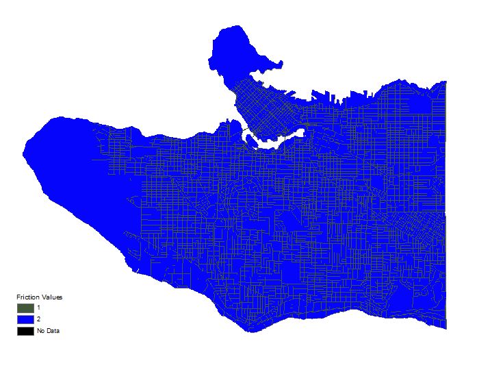
Figure 11
We then used Raster Calculator to bring together Vancouver_Raster and Criteria_Final to get our Final_Friction layer (figure 12). We can then being the cost path analysis.
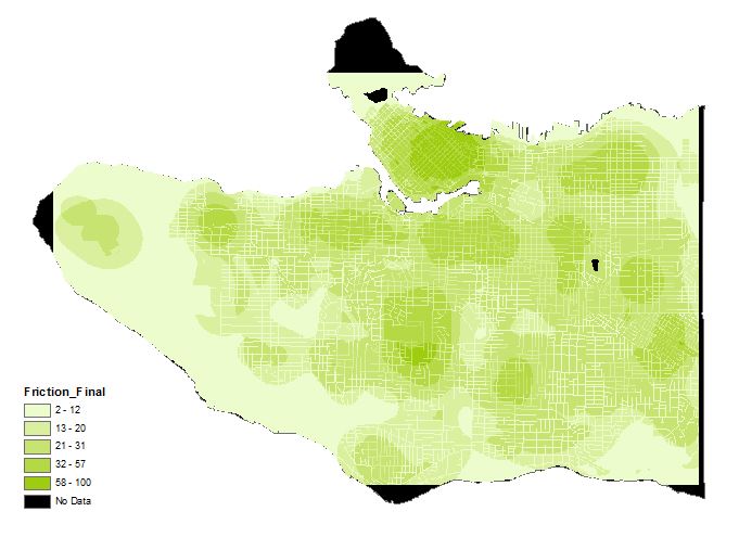
Figure 12
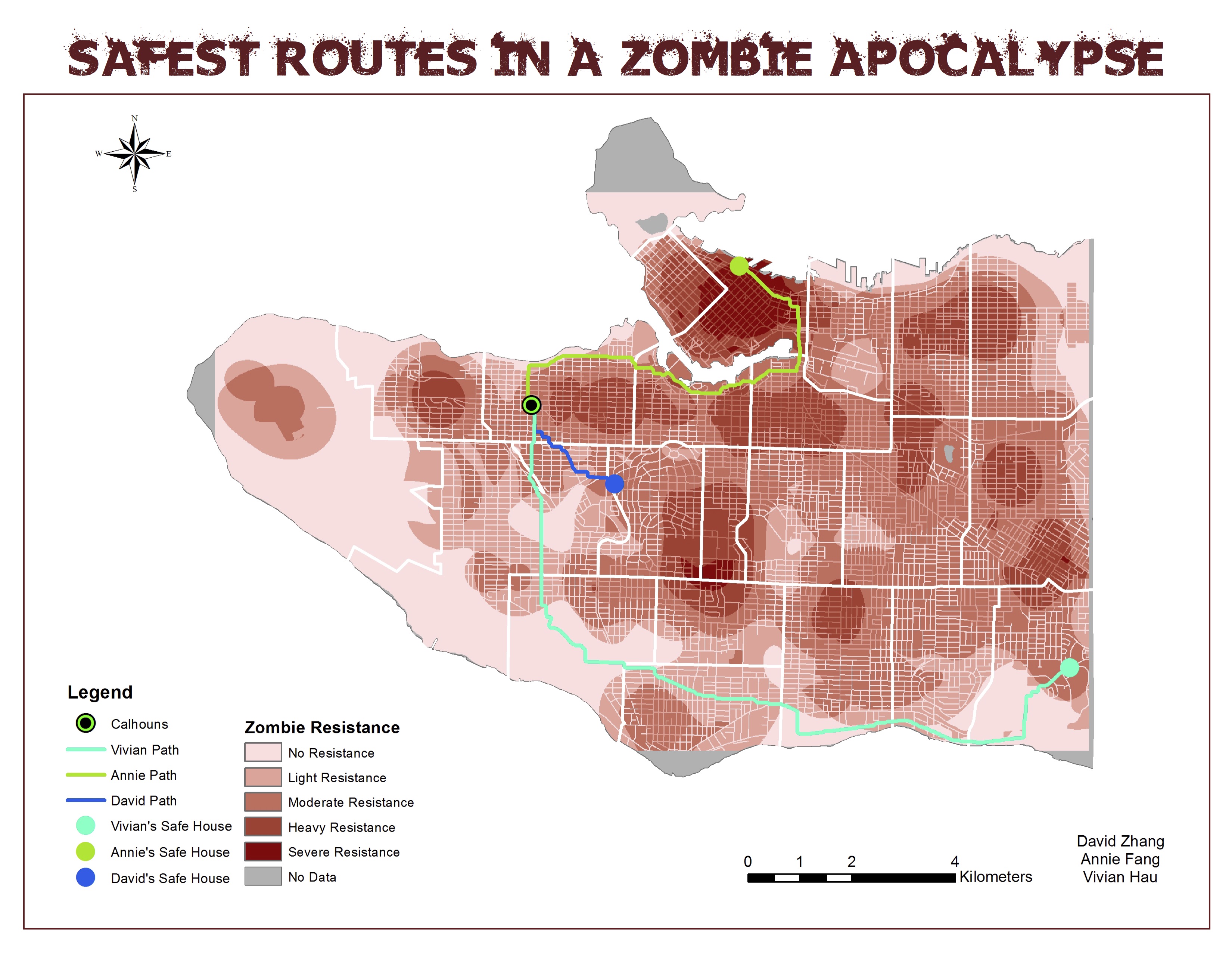
We decided to make a least cost path to find the safest route home. We made three separate layers to our respective homes. Our starting point, Calhouns had its own layer. We used editor to find our homes and Calhouns by address. We made a cost path to each of our homes and converted the resulting raster path to polygon. We then presented our three cost paths and Final_Friction as our final map (figure 13).