All posts by jeremy schipper

Joanna Newsom’s “Sapokanikan”

Piotr Orlov from NPR asks “What the hell kind of word is ‘Sapokanikan‘?” He later answers, “when parsing the layers of lyrical meaning in Joanna Newsom’s new track wasn’t intriguing enough, there is first the matter of the title’s origin. ‘Sapokanikan‘ was the name of a Native American, Lenape village situated in lower Manhattan pre Dutch arrival, approximately where Greenwich Village now stands — which somewhat explains the accompanying Paul Thomas Anderson-directed video that finds Newsom wandering the streets and alleys of that New York neighborhood historically associated with cultural change.”

Director Paul Thomas Anderson is known for both his full length feature films (Magnolia (1999), There Will Be Blood (2007), and Inherent Vice (2014) – the latter of which features Newsom as a narrator and minor character) and for his music videos for artists including Radiohead, Fiona Apple, and Aimee Mann. The video gives the feeling of Anderson’s trademark long-takes (uninterrupted shots that track character movement without breaks or edits) without actually giving the shots themselves. Instead, a series of tracking shots follow Newsom around lower Manhattan and Central Park, through bodegas and bouts of unsuspecting crowds. The video can be read as a mobile exercise in mapping and layering the city, in which a history of the city is rewritten over and over again in both real-time (the filming of the video) and in subsequent viewings and performances.

There’s a nice moment at the end of the video in which a change of musical tone is matched by a modification in setting and visual tone, as Newsom – presumably by coincidence – encounters an emergency scene. In her words, “Sapokanikan is a ragtimey encomium to the forces of remembrance, forgetting, accretion, concealment, amendment, erasure, distortion, canonization, obsolescence and immortality.” That certainly clears things up.

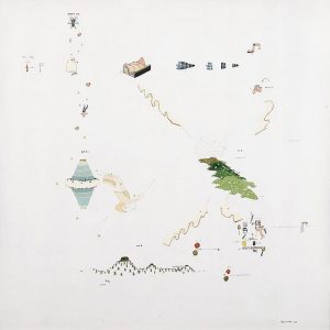
It’s also worth noting that Newsom often switches away from conventional musical notation in her songwriting process in favour of her own system of written icons and shapes, including half- and full-moons, stars, and other cosmic symbols.

MyBlockNYC

Here’s a great website that allows NYC residents  to record a video from their block and to geotag it to a map of the city. The majority of the vides were created by students in middle school and high school.

The site was exhibited at the MOMA as part of their “Talk To Me” exhibition in 2012, and was later included in the USA pavilion at the Venice Biennale in ‘Spontaneous Interventions‘.

I found the website to be a really fascinating as a way to look into the city’s often unexplored boroughs, including Staten Island and Queen’s.

MyBlock interactive Map

MyBlock overview

Mapping Narrative: ‘Building Stories’ by Chris Ware

Chris Ware’s ‘Building Stories‘ (2012) consists of fourteen “easily misplaced elements;” printed works that range in format from board game to booklet to broadsheet.  These fourteen texts can be pieced together to reveal a number of simultaneous yet disparate personal narratives of residents in a three-story brownstone in Chicago. The protagonist is an art school graduate with a prosthetic leg, who experiences years that oscillate between periods of creative unfulfillment, pest infestation (the bees get their own storyline), mourning, and maternal responsibilities.

Ware leaves the reader responsible to piece together his narratives for themselves, which creates an experience that is just as alienating as it is provocative. No one document contains its own complete narrative, and thus the reading of ‘Building Stories’ is by necessity an intertextual one.  Despite the autonomy given to the reader, I couldn’t help but feel a frustration, or a “fear of missing out” on the many narratives embedded within the set.

The piece is also noteworthy in its privileging of spatial and environmental design over more accessible techniques of illustration. In his NYT review, Douglas Wolk remarks that, “The organizing principle of ‘Building Stories’ is architecture, and — even more than he usually does — Ware renders places and events alike as architectural diagrams. He’s certain of every detail of these rooms, and tends to splay their furnishings out diagonally to show how they fit together.”

Further, this work can be linked to discussions of mapping processes in our class through a passage within James Corner’s “The Agency of Mapping…,” in which he lists the “Game-board” as a “thematic development of mapping in contemporary design practice […] conceived as shared working surfaces upon which various competing constituencies are invited to meet to work out their differences” (Corner 96).

In short, the work is a great example of how different narratives can co-exist in a variety of formats and media while still maintaining a cohesive message greater than the sum of its parts.

Data Doppelgängers

Today’s conversation about the map of Napoleon and the Russian Campaign of 1812 made me question how fully we can trust the correlation between sets of data in maps and graphs (i.e. the seemingly direct relationship between temperature and death rates). Surely there must have been other factors at hand.

‘Spurious Correlations’ an absurd website that links sets of nearly identical, yet completely unrelated sets of data.

Example pairings of spurious data pairings include:

  • Divorce rate in Maine compared with Per capita consumption of margarine (US)
  • Age of Miss America with Murders by steam, hot vapours and hot objects
  • Per capita consumption of cheese (US) with Number of people who died by becoming tangled in their bedsheets

See more uncanny pairings here.

Janet Cardiff & George Bures Miller’s Audio / Video Walks

Canadian sound artists Janet Cardiff and George Bures Miller have developed a series of audio and video walks that occupy the disconnect between space as a lived phenomenon and a recorded map.

Within the work, visitors are invited to trace the same route that Cardiff herself had completed within a particular space (here, Alter Bahnhof in Germany), experiencing her own audio commentary and “live” video recordings through the space.

The work becomes complicated and provocative through its focus on time-based media within the diegetic world of the video. Cardiff brings the viewer’s attention to the ephemeral and fleeting live performance of buskers and ballerinas (which are unlikely present in the contemporaneous setting the viewer occupies) , just as she focuses on historic maps and encased documents within the site, which themselves make visible the lapse between past and present.

What else does this call to mind for you? What other examples are there of maps that exploit the potential of portable and new media?

Has anyone actually experienced one her and Miller’s “live” works before?

Read more about Cardiff and Miller here:

‘Pleasure Principals: The Art of Janet Cardiff and George Bures Miller’, Border Crossings (2001)

An investigation of a physical installation by the duo, and Cardiff’s discussion of the “physical aspect of sound.”

‘Janet Cardiff by Atom Egoyan’, BOMB Magazine (2002)

An interview with Cardiff by the Canadian filmmaker.

Janet Cardiff, George Bures Miller and the Power of Sound, The New York Times (2012)

A NYT profile on the artists and their personal and professional partnership.

Authograph Projection creates a more “accurate” world map

This past year the “Authagraph projection” projection map won the Good Design Award in Japan.  This type of map provides significantly less distortion than the Mercator projection, and works by splitting up the earth’s surface into 96 triangulations. This type of mapping has been used in Japanese textbooks for over a decade, and was invented by Hajime Narukawa in 1999.

The most striking differences in the the Authagraph projection compared to the Mercator is the size of Africa (which is actually much larger than North America), and the apparently meager sizes of both Greenland and Antarctica.

In addition to its increased accuracy, the Authagraph projection won the  award for its series of constructible maps that can be formed into cones or spheres.

Still, the map appears to possess some limitations; namely the distortion and  decreased legibility of the lines of latitude and longitude, which bend and run of the boundaries of the page. Can anyone else think of limitations with the Authagraph projection? Do you believe it will be (or should be) adopted for widespread use beyond Japan?

Further reading:

‘A More Accurate World Map Wins Prestigious Japanese Design Award’ (2016)

AuthaGraph

Gianfranco Baruchello’s “Infinite Small Systems”

A beautiful series by artist Gianfranco Baruchello, who illustrates objects and creates a non-linear map of associated objects, systems, and flows.

Many of these maps “explore the relationships between the value of the artistic and the agricultural product and […] investigate the concept of work and how the economical laws regulate it.” In other words, these maps argue that small and quotidien can have vast and far-reaching impacts and origins. Based on the most recent James Corner reading, this work can be identified an example of a “rhizomatic” map, a concept borrowed from Deleuze & Guattari.

The whole series can be viewed via the following link: http://socks-studio.com/2015/06/30/gianfranco-baruchellos-infinite-small-systems/