Today’s conversation about the map of Napoleon and the Russian Campaign of 1812 made me question how fully we can trust the correlation between sets of data in maps and graphs (i.e. the seemingly direct relationship between temperature and death rates). Surely there must have been other factors at hand.
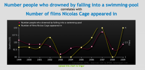
‘Spurious Correlations’ an absurd website that links sets of nearly identical, yet completely unrelated sets of data.
Example pairings of spurious data pairings include:
- Divorce rate in Maine compared with Per capita consumption of margarine (US)
- Age of Miss America with Murders by steam, hot vapours and hot objects
- Per capita consumption of cheese (US) with Number of people who died by becoming tangled in their bedsheets
See more uncanny pairings here.
 Follow
These are hilarious! #mappingexposed #whosetruthisitanyways?