Text as a Method for Mapping (what is a map?)

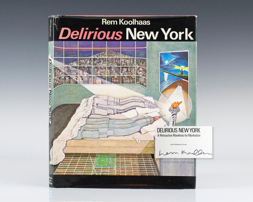
REM KOOLHAAS, Delirious New York, The Monacelli Press: 1978, 320p.

Illustration “Flagrant Delit“ by Madelon Vriesendorp

Through text and narrative first, then illustrations, Rem Koolhaas bring us, among other things, in the discovery of this vertical city where  function does not follow form, where the outside contrasts with the inside. It is instead the delirious and chaotic realities of congested Manhattan that we can start to imagine and locate, as for  the example of the “Downtown Athletic Club”. Here peculiar programs take place whose only relationship is the physical place; it is not surprising that the description of the floor is not linear. Images opposed and/or overlaid each others to create a rich mental map where real facts blend with speculation; there is enough space for your own interpretation.

We could perhaps also considered Delirious New York as “vertical mapping” since there is a great emphasize on the skyscrapers. However, this dimensional reality is inherently related to the existence of the grid, which works as a fixed armature and where every block transformed into an island making New York a sort of archipelago. As Koolhaas argued: “The Grid’s two dimensional discipline also creates undreamt-of freedom for three-dimensional anarchy” (p.15). (For the presentation I have added the City of the Captive Globe illustration to show the uniqueness of each block).

But Koolhaus mapping narrative goes beyond the content of the manifesto, since the structure of the book itself becomes a map. The book’s structure follows the logic of the grid where each chapter represents a different block: Coney Island, The Skyscraper, Rockefeller Centre, and The Europeans.

However, through the celebration of New York’s skyscrapers and ludique history is also the celebration of capitalism : the social, the vulnerable, often women, are forgotten. It is perhaps an apolitical manifesto.

Politics & Power: The Map as a Tool

A map of the British and French dominions in North America, with the roads, distances, limits, and extent of the settlements, humbly inscribed to the Right Honourable the Earl of Halifax, and the other Right Honourable the Lords Commissioners for Trade & Plantations.

Commonly Referred to as The Mitchell Map of North America, it is not navigational but political showing both the passage of time and shifts of power. More than most maps, the bias and intention of both the author and his patron are explicit.

  • Completed in 1755
  • Depicting North America but created in London
  • Printed Engraving
  • Drawn by John Mitchell
  • Engraved by Thomas Kitchin
  • Published by Andrew Millar
  • For the Earl of Halifax to promote his position in Parliament: no compromise with the French, building up to the Seven-Years’ War/French and Indian War
  • 6′-5″ x 4′-6″ tiled on 8 sheets
  • 1:2,000,000
  • Mercator Projection

Issues of political importance as evidenced by the map:

  • Place names transitioning from Native to English
  • Native names beyond the European sphere of influence clearly marked as irrelevant
  • British military victories over the Spanish and Natives marked
  • Iroquois territory coloured red as British although they were technically only allies
  • Acadia transitioning to Nova Scotia as a result of war on the European continent 40 years earlier
  • Perceived territorial disputed with the French are marked (Halifax needs a justification for war)
  • Inaccuracies extend the Mississippi river all the way to the 50th parallel meaning the Canada/US border was not properly established in the area until 1843

Although technically inaccurate, a copy of this map was used to establish the borders of the United States at the Treaty of Paris in 1783. It has been used as recently as 1980 to settle a fisheries dispute off the coasts of Nova Scotia and Maine.

http://tile.loc.gov/image-services/iiif/service:gmd:gmd3:g3300:g3300:ar004000/full/pct:12.5/0/default.jpg

Full resolution map can be found here: https://www.loc.gov/resource/g3300.ar004000/

Cylinder – Sounds Translated into Objects

TranslatTranslaAndy Huntington and Drew Allan
Cylinder (Series), 2003
3D Printed Plastic
20-40 cm

Huntington and Allan developed software that translates sound into STL files to be 3D printed. With this technology, they were able to map the auditory complexity of spaces, music and moments into  visual and tactile objects. What is not apparent in this body of work is how scale comes into play. The small size of the objects suggests that the designers were limited by the size of their printers and that because of this, the scale that the sounds are printed at differs. The project “grew out of a desire to create truly complex objects which hint at the overwhelming detail present in nature,” and it is safe to say that the designers did succeed in producing complex objects but perhaps not ones that reflect nature. Some of the moments that they recorded like a breath, a Saturday market in Italy or Martin Luther King’s “free at last” are representative and provide a visual and tactile map of moments in the human experience. Not only can these objects help to illustrate the energy of a sound or a room but they serve as artifacts that can help us map out these moments that have passed.


01 – Julia Presentation 1_sm

02 -Julia Presentation 1_sm

SPOILER ALERT! TUESDAY’S PRESENTATION ON GOOGLE EARTH AS A MAPPING ICON

https://www.youtube.com/watch?v=GkhZKaltQu8

Video: Google Maps: Hyperlapse Around the World (2017)

In the world today it is arguable that information is becoming more commonly absorbed through a rapid succession of images. In this video created February 8th 2017 Lebanese born Italian graphic artist ‘IDEANDO’ AKA Matteo Archondis utilizes the power of Google Earth’s mapping data fusion of US Geological Surveying, satellite imagery, and 45-degree aerial imagery to capture 6 European sites, 5 places in North America, and 2 in Asia. They are captured in 3305 screenshots using a frame-by-frame technique. This representational style is not unlike that of the Eameses’ multiscreen introduced at the 1959 American Exhibition in Moscow  (Colomina, 2007, pg.15-20) that forces the viewer to selectively absorb information from the densely concentrated amount of geographical images being shown, arguably a skill that the millennial generation has more naturally adopted from the technology of the World Wide Web. It also plays with the idea of scale similar to the 1977 Eames short film ‘Powers of Ten’ in the use of ‘zooming’ inward and outward throughout this virtual Earth. These realms of technology, representation, and scale in the context of this video question the idea of a map as icon. An icon of how the 21st century uses a map on a daily basis, and how technology can start to 3-dimensionally inform the ways maps are used and understood around the globe.

Works Cited:

Beatriz Colomina, “Enclosed by Images: The Eameses’ Multimedia  Architecture,” Grey Room 2 (2001): 6-29.

Powers of ten, 1977. Dir. Charles Eames and Ray Eames. Prod. Charles Eames and Ray Eames. By Elmer Bernstein and Philip Morrison. Pyramid Films, 1977. Powers of Ten (1977). Eames Office. Web. <https://www.youtube.com/watch?v=0fKBhvDjuy0>.

CANADA-INDIAN AND INUIT COMMUNITIES BRITISH COLUMBIA

Polyconic Projection
SCALE 1:2,000,000
3rd EDITION MARCH 1992
PRODUCED BY ENERGY, MINES AND RESOURCES CANADA

The text located at the top of the map (to the right of the main title) reads:

INDIAN AND INUIT COMMUNITIES

There are no Inuit Settlements or Other Indian or Inuit Communities in British Columbia.

Note:

No definite statement of the precise legal status of Indian Reserve or Settlement land can be made without extensive enumeration of particular cases. In general terms, an Indian Reserve is a tract of land the legal title to which is vested in Her Majesty, and which has been set apart for the use and benefit of an Indian Band. The Indian Reserves are administered under the terms of the Indian Act, R.S.C. 1970.

Indian or Inuit Settlements, although situated on Crown Land, are not subject to the terms of the Indian Act.

Other Indian or Inuit Communities represent distinct centres of native population.

No information is shown for Reserves, Settlements or Other Communities outside the Province of British Columbia.

Location information for Indian and Inuit Communities is based on data available as of October, 1990.

This map was prepared in consultation with officials of Canada Centre for Surveying, Legal Surveys Division, Energy, Mines and Resources Canada, Vancouver.

INFORMATION SOURCES:

Canada, Energy, Mines and Resources, Surveying and Mapping Branch, National Atlas Map No. NADM-5, 1984, Ottawa. Legal Surveys Division, Index Map of Indian Reserve in B.C., Unpublished, 1990, Vancouver. Legal Surveys Division, Indian Reserve and Band Name Computer Database for B.C., 1990, Vancouver. Canada Gazetteer Atlas, Macmillan of Canada, 1980

COMPUTER CARTOGRAPHY AND PLOTTING:

G.M. Johnson and Associates Ltd., Vancouver, B.C., Canada (604) 682-7074

DIGITAL BASE MAP:

Province of B.C., Ministry of Forests, Timber Harvesting Branch, Victoria, B.C., Canada.

A case-study research project-Pokemon Go-Luk Chung Ling

It is a map of imagination.

Pokemon Go is a locational based mobile game. In the virtual Pokemon world, players will become a Pokemon trainers. Through their mobile screens, they can see virtual stops widely distributed on physical cityscape and they are called Pokststops.  These stops allow players to obtain virtual supplement for doing virtual activities like Pokeballs for catching Pokemon and medicine for injured Pokemon after battling.  As a locational based game, gamers have to physically arrive the stop and spin the ring of each stop on their screens. Also, the spectrum of the three-dimensional map is responding to the real-time location of the players. The primal purpose of the map is used for navigating the players to surrounding stops in order to continue their adventure. Such real-time interaction and physical engagement make the players believing they are really in the Pokemon world that they dreamed of in their childhood.

Another factor helps stimulating our imagination is the creation of the Pokestops. They are created in a crowd-sourcing method providing valuable Volunteered geographic information.(VGI)  The operator called for players’ participation to create a landmarks which are educationally or historically significant, unique art or architecture, hidden local gem and networking places. Participants can snap the selected city object with GPS on, entitle the photo and share to the operator.  It allows human act as sensor network to process data collection.

We all love brain-storming as we believe everyone will have something valuable to contribute. The bottom up formation of Pokestops allow people to discover the cityscape with a new perspective contributed by the crowd. As a result, we re-discover a lot of forgotten substances around us which are in fact existing and interesting but used to not come to our eyes.

Temporary conversion_Insurgent Cartograpgy

DN_Asignment 1_Temporary conversion 1.0

Deconstructing & Assembling

As a point of departure to deciphering the Temporary Conversion map, it is deconstructed into different layers. These layers are then used as faces of a box, and are thus packaged anew.

The packaging mimics the inherent functioning of maps as tools and mediums which package selected information and data in intentional manners to reveal or hide information.

This revelation is paralleled in the box, as the original map is revealed within the box.

Game of Thrones: made with cogs and wheels

Games of Thrones opening credits
First aired: April 17, 2011
Location: Westeros (fictional) | created in Santa Monica, CA (digital)
Media: CG model built in Maya (made to look like natural materials)
Title designer: Angus Wall, with a team of 25-30 people
Original size/scale: intended for widescreen home TV’s
Projection system: map projected on the interior of a sphere
Target audience: fans of the Game of Thrones books

Readers of the Game of Thrones novels flip to the map at the front of the book if they need to orient themselves in the fantasy world of Westeros – and in the same way, viewers of the Game of Thrones television series watch the opening credits at the beginning of each episode. This opening sequence translates the printed map into an animated landscape that sets the tone for the show. Now with an animated form, the map is in a constant state of flux and change, just as characters and cities likewise change within the narrative. Very few title sequences are the same from episode to episode, just as nothing remains static for very long in Westeros. The gears and intricate mechanisms working beneath the surface of the map also represent the hidden and interlocking schemes of the characters vying for the throne – using the form of the map to help tell the show’s story in a new way.

http://www.artofthetitle.com/title/game-of-thrones/

Halprin’s Score: Symbolization of the Creative Process

Enlarge

Halprin
Source: http://graphbooks.com/image/books/_1200/Halprin.jpg

[Halprin Workshops]. Halprin, Lawrence, et al.

Experimental Workshop Score for the UC Berkeley Art Museum (1971).

Lawrence Halprin
Paper, 13 x 22″

The late Lawrence Halprin used scores as a means to visualize his creative process. By graphically communicating the abstract,  Halprin creates an open map that invites collaborators to become involved in the process.

SonaR

SonaR
A Map of Orange Cell Phone Activity in Paris

https://vimeo.com/157655906

Year Completed: 2016
Location: Paris
Media: Video
Authors: Catherine Ramus, Cezary Ziemlich, Pascal Taillard, Marc Brice, Orange Labs

Information+ Exhibition June
16–17, 2016, at Emily Carr University of Art + Design in Vancouver, BC, Canada.

The SonaR project visualizes the Orange cell phone activity in Paris in three different days: a normal day, “Je suis Charlie” Rally Day, and New Year’s Eve. Each point on the map represents for a cell tower. The brightness of that point shows the level of activity of that cell tower. The data is collected from Orange, a mobile phone operator in France.

On January 11, 2015, “Je suis Charlie” Rally Day, 3.7 million people gathered on Place de la Repbulique and marched towards Place de la Nation in tribute to those killed by terrorists. We can easily find photos, videos and news reports of this rally. However, the video of SonaR project recorded this event from a different angle. We can see from the video that before 8:30, only very few people used their cell phone. Then the cell phone activity gradually increased in the morning but is still evenly distributed, which is not surprising because that day is Sunday. People start gathering at Place de la Repbulique from noon. At 3 pm, cell phone activity reaches the climax. After that, the brightest part moved towards Place de la Nation and disappeared gradually at 7 pm.

This video only uses the data of Orange cell phone users, so the activity of other mobile phone companies is not shown. The parks, river bank and railway areas are not shown on the map. The accuracy of the map is also limited by the location of the cell towers. The brightness of any point on the screen doesn’t reflect the level of cell phone activity on that point. The map is only accurate if you look at the overall trend, not specific points.