May 10th – studies of rocks (one-a-day project).
I tried to take some photos of beach stones, but my first attempt, against a backdrop of mossy bricks, looked awful. Back to the drawing board, literally, where I reworked an old experimental painting of rocks to use as a background. Since it’s from a decade ago I can’t remember exactly what I used or what I was thinking of at the time, but it appears to be of some sort of plaster that didn’t adhere too well, and heavily gouged. Taking all my gray and black acrylics I proceeded to make a new dark background. As most of the acrylics hadn’t been opened in 11 years they were in pretty poor shape and required the removing of heavy plastic gunk and remixing. Although I took photos of the background, it really isn’t very pretty, so I’ll skip those shots. The acrylics I rescued: Mars Black, Payne’s Grey (deep bluish grey), stainless steel (silvery metallic), a pre-mixed grey (more about that later), fluorescent blue, cobalt blue. What was interesting is that the particles of silver from the stainless steel registered as little white stars in the background of the photos.
-
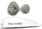
- stone inspiration
-
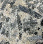
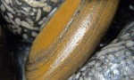
- stone inspiration
-
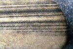
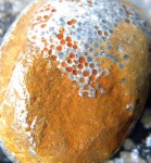
- stone inspiration
-
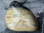
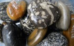
- stone inspiration
-
- stone inspiration
-
- stone-inspiration
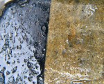
I have some more thinking to do about photographing the rocks themselves. I splashed water on them to make the patterns show up but this caused a shiny super reflective surface. Perhaps a better camera with a polarizing filter will show up the patterns better.