Course Introduction
The introductory lecture introduced us to the three fields that we would focus on for the semester: landscape ecology, health geography, and crime analysis. In these areas, geography acts like a ‘key’ to understanding the patterns and places that provide context for understanding phenomena. Geography provides the where, why, and how for processes under observation. When using GIScience for management purposes, this context is important because you need to know the spatial data to manage it and need to know how spatial and aspatial analyses differ. Briefly, landscape ecology looks at how landscape structure affects the abundance and distribution of organisms. Health geography looks at the role of place, space, and community in shaping health outcomes and health care delivery. Crime analysis looks at the systematic and analytical provision of timely and pertinent information relative to crime patterns and trends. As we are always reminded in geography: where things are (and aren’t) matter!
Tutorial 1: Spatial Stats using Modelbuilder
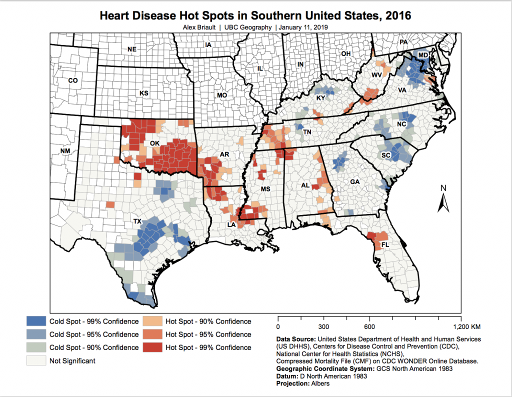
This week’s lab time was time to complete a tutorial using ModelBuilder in ArcMap. Using heart disease data downloaded from CDC Wonder, we ultimately created an animated yearly hot spot analysis map displaying heart disease mortality in the southeastern United States. First, we had to prepare our downloaded data using Notepad and Excel before importing it into ArcMap. In ArcMap, we calculated the rate of heart disease as deaths divided population. Before running our hot spot analysis, we created a spatial weights matrix file. Using ModelBuilder, we created two models: one to separate our data by year and the second to create hot spot maps for each year. The final result was an animated map showing the changes in heart disease mortality from 1999-2016 but we handed in a map showing a single year’s data which can be seen here.
Why is ‘geography’ important?
This lecture continued to expand on the importance of geography as discussed in the course introduction and focused on scale, spatial autocorrelation, kriging, and the modifiable areal unit problem (MAUP). Scale is important because there is no single natural scale at which phenomena should be studied and the scale at which phenomena are studied can greatly affect the results. Spatial autocorrelation is a statistical method used to determine correlation and can be positive, meaning that there is correlation, or negative, meaning that there is no correlation. Kriging is a method of spatial interpolation which relies on structural, spatially correlated, and random noise components to predict where phenomenon will be found based on the analysis. MAUP is an issue that we have become very familiar with over the course of UBC’s GIS-based courses. MAUP refers to how data and results can be modified by the scale at which they are observed. The example illustrating MAUP that I always think of it housing prices in Vancouver by census tract. Because the census tract bordering Stanley Park includes the park, a map showing housing prices will show Stanley Park as having high housing costs despite the fact that it is a park and has no housing.
Lab 1: Exploring Fragstats
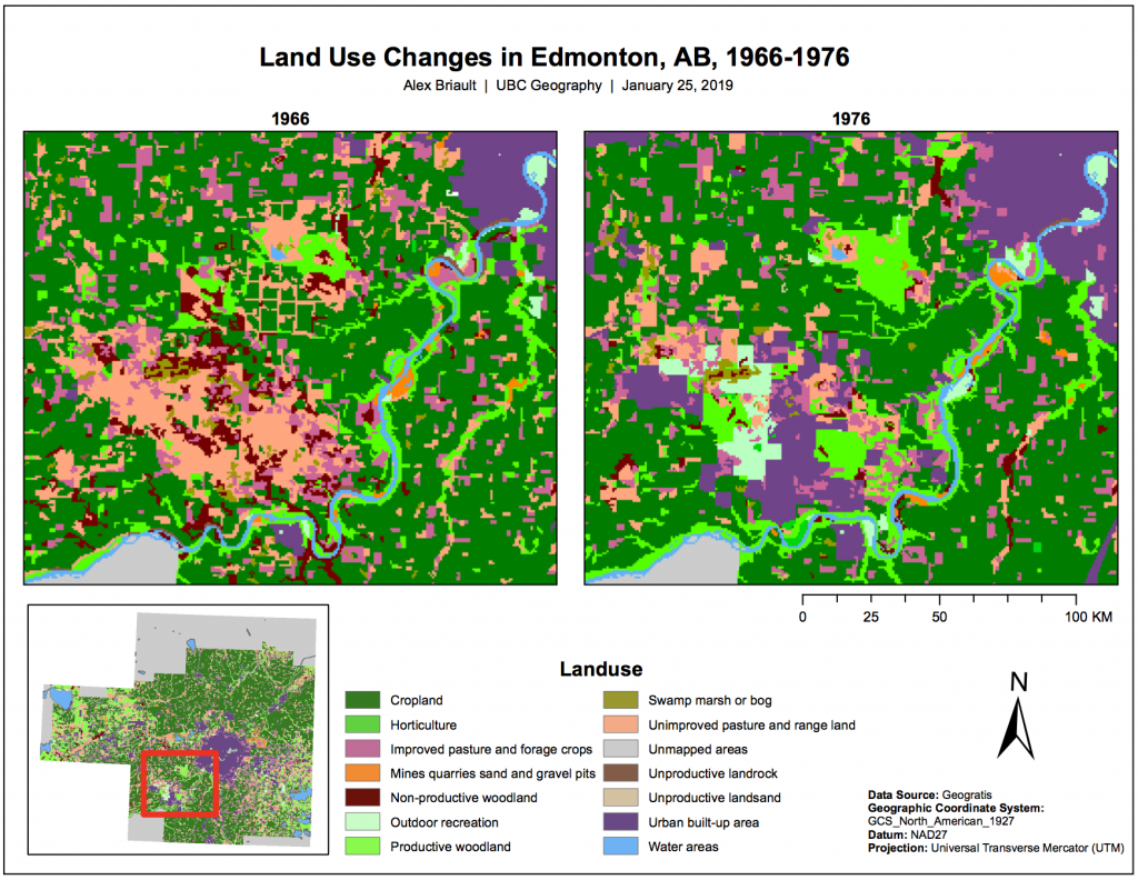
In our first lab, we used Fragstats to explore landuse change over time in Edmonton, AB. Click here to read my report. Click here to read my lab report written for a city council to read. Below is the final map I created.
Understanding landscape metrics: patterns and processes
Unfortunately, I missed this lecture. The lecture slides are available here if you want to take a look at what was discussed!
Statistics: A review
This week we reviewed statistics, specifically those that are used most often in geography and GIS. Correlation, specifically spatial autocorrelation is an important method of statistical analysis in GIS. Regression analysis is also another important method. Regression analysis methods like OLS (ordinary least squares) or GWR (geographically weighted regression) allow GIS users to examine their data and look at dependent and independent variables to attempt to explain a phenomenon.
Lab 2: Introduction to Geographically Weighted Regression
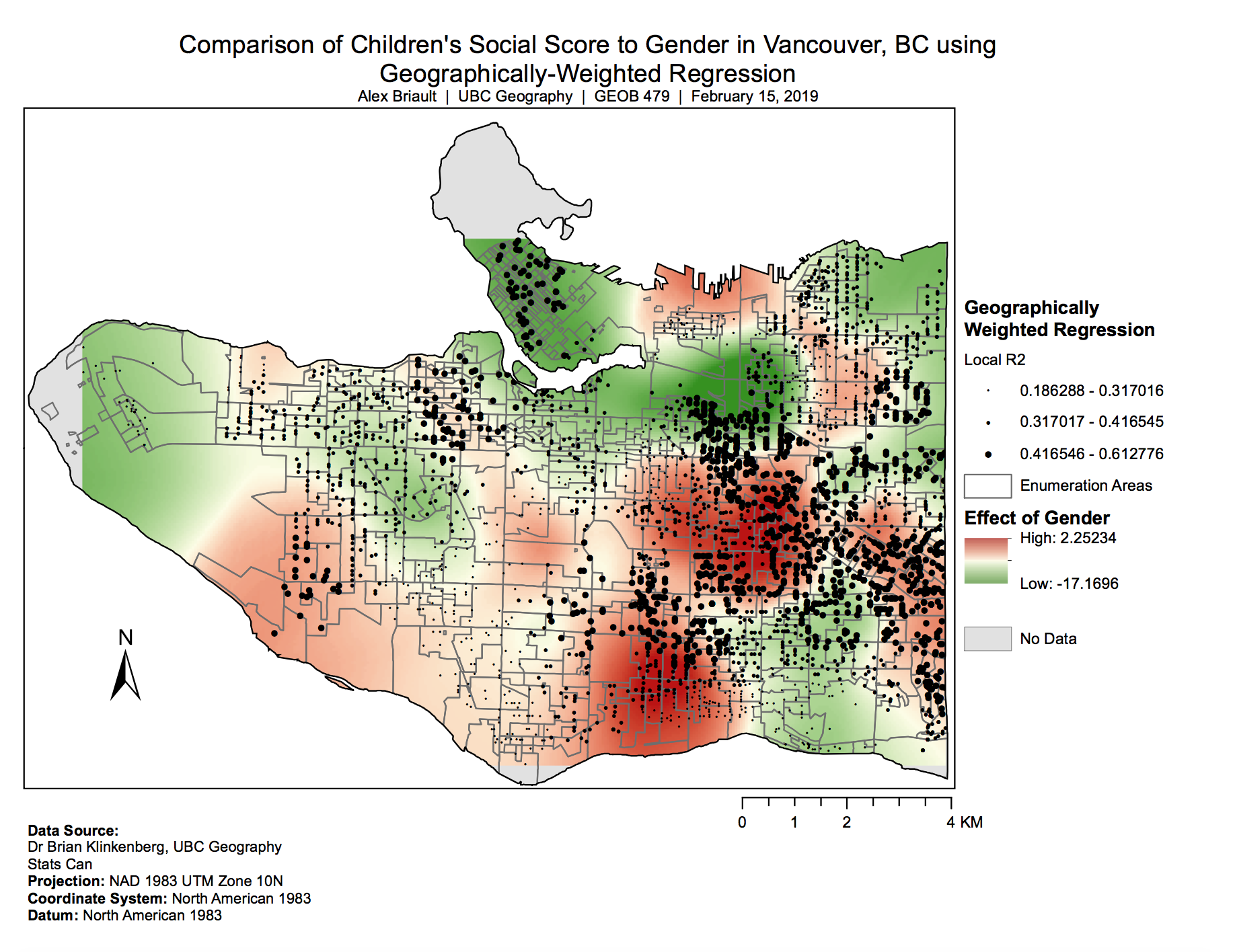
In this lab, we were introduced to Geographically Weighted Regression (GWR) as a method to examine spatial correlation between a dependent and independent variable at the local scale rather than just at the global scale (i.e., as OLS regression produces). We examined the impact of various variables on children’s social scores. To read my report, click here.
Lab 2: GWR analysis
Presentations on Landscape Ecology
This week we held class presentations on our chosen landscape ecology papers.
One presentation looked at how the spatial diversity of wetlands at different scales can explain the prevalence of West Nile Virus in humans. The main takeaways this presentation found with this paper were that size, connectivity, and climate matters. Countries with smaller wetland sizes had higher rates of disease outbreak while countries with lower connectivity between wetlands also had higher rates than countries with greater connectivity. The existence of wetlands also matters as countries with more wetlands that are semi-permanent had much higher rates of disease during droughts than countries that had fewer semi-permanent wetlands.
What is Health Geography?
This lecture explored the important relationship geography has with health. We began by learning some background, namely the difference between medical geography and health geography. Medical geography can more simply be said to be from the doctor’s point of view while health geography is from the patient’s point of view. The main criticism of medical geography is that is misses part of the bigger picture of health and healthcare. There are five strands of health geography 1) spatial patterning of disease and health, 2) spatial patterning of service provision, 3) humanistic approaches to “medical geography”, 4) structuralist/critical/materialist approaches to “medical geography”, and 5) cultural approaches to “medical geography”. The spatial patterning of disease/health dates back to the 1850s when John Snow mapped cholera outbreaks and identified the contaminated water pump. The spatial patterning of service provision can show patterns of utilization and or inequality in supply and use but it does assume that individuals are “optimizers” who always make rational decisions. It also assumes that availability of health care services is a determinant of health and assumes that the distance decay effect will influence health care access. The humanistic approach takes a qualitative view but makes several assumptions, namely that illness is “socially constructed,” that individuals are “satisficers” meaning that they do not act rationally, and that the perception of health is the major determinant of “health.” The structuralist etc. approach looks to examine inequalities in health and assumes that the structure of social/political/economic systems is the key determinant of health and variations in health. The cultural approach seeks out therapeutic landscapes and health promotions through reframing health in positive terms and assumes that “place” is an important determinant of health.
GIS in health geography
This lecture was a continuation of the previous one but unfortunately I missed this lecture. To see what was discussed, click here to see the slides!
FME Workshop
This week’s lab time was used for a presentation about a program called FME. I thought it was a very fascinating presentation because the FME software allows for a variety of processes and can be used to better manage large databases or large amounts of data.
The Participatory Biocitizen
This lecture was quite interesting as it focused on how individuals or groups of individuals lead health research rather than doctors or other health professionals leading it. Much like volunteer-gathered-information, the biocitizen is concerned with collecting data and making it available to everyone, rather than only to a select few researchers. People participate as biocitizens in a variety of ways from blogging, contributing to health apps like sick weather, or contributing DNA to databases like 23andMe. Biocitizens may also attempt to “hack” medical devices or their own health to further optimize it or to make it more accessible to others (such as insulin pumps). This lecture concluded with a discussion about how we felt about sharing such person data through the apps/databases mentioned or through phone apps or fitness trackers like Fitbits or Apple watches. As a person who wears a fitness tracker, I like seeing the data and use it for planning or improving workouts.
Lab 3: Introduction to CrimeStat
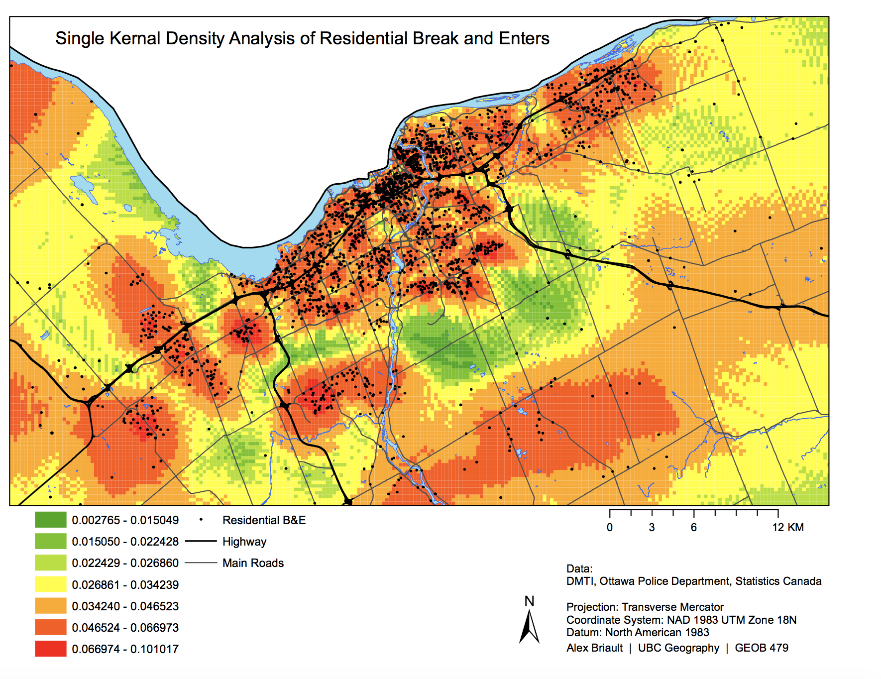
This lab introduced us to using CrimeStats to examine crime data. We looked at break and enter data for residential and commercial areas and car thefts in the Ottawa area of Ontario. Below is one of the maps produced for this lab.
Presentations on Health Geography
This week we held presentations for our chosen papers for health geography.
Two presentations piqued my interest the most. One was about spatial access to health care in Costa Rica and its equity. Costa Rica has universal, publicly-funded health care and the second highest life expectancy at birth in the Americas. Despite this, access to health care faces long wait times, high costs of travelling to receive care, a perception of low quality care, and bureaucratic red tape. The spatial analysis performed in the paper presented on was critiqued for using a data set that may not have been fully complete, accurate, free of error, or bias.
Is crime related to geography?
Unfortunately, I missed this lecture. The lecture slides are available here if you want to see what was discussed!
Use of GIS by fire departments
This lecture focused on how fire departments use GIS. The lecture was based on the city of Calgary. GIS is used by the city of Calgary for risk analysis, response mapping, operational decision making, station planning, apparatus deployment, and station relocation. I found it very interesting all the different ways that GIS is used by fire departments (so much so that I definitely looked to see if there were any GIS-related jobs in the Richmond Fire Department after class!). In particular, I found GIS’ use in risk analysis interesting. Risk data is collected on paper maps and colour-coded by parcel. The colours used are based on high probability-low consequence, high probability-high consequence, low probability-low consequence, and low probability-high consequence. Using these risk maps, risk can then be assessed to determine the following:
- structures at risk
- proximity loss – are there many buildings very close together that could result in multiple fires?
- oil and gas production and proposals for new sites
- exposed buildings
- challenge areas – following a 5000 gallons (water) per minute fire flow analysis
- historical fire loss
- 6 minute response time and 10 minute response time zones
- adherence to NFDA 1710 regulations
- medical responses and responses to motor vehicle crashes
Presentations on Crime analysis
This week we held presentations for our chosen crime and GIS papers.
One presentation I found interesting was about graffiti in Sydney, Australia. Incidences of graffiti were framed by the authors as examples of the broken window theory where if a crime occurs and it is not resolved or fixed then it invites more crime as it appears that no one is monitoring the area or that no one cares about it. The paper used nearest neighbour and hot spot analyses to map instances of graffiti. The critique the presenting student shared for this paper was that by focusing on sites where graffiti was removed only, the data was skewed and that an emerging hot spot analysis could have been done to observe changes in graffiti incidences after the implementation of the graffiti removal program.