By Alberto Mendoza Galina and Meg Mittelstedt
In the article “Sudan – battling between forces of civil war and climate change” John Vidal shows two main approaches to explaining civil conflict in Sudan: one focused on climate change and food security and the other one founded on governance issues triggered by historical tensions, proliferation of arms and lack of democracy.
While Vidal indicates that conflict in Sudan is a complex issue, his main assertion is that climate change is exacerbating the conflict.
We found data to evaluate his assertions, which we have presented below in several visualizations.
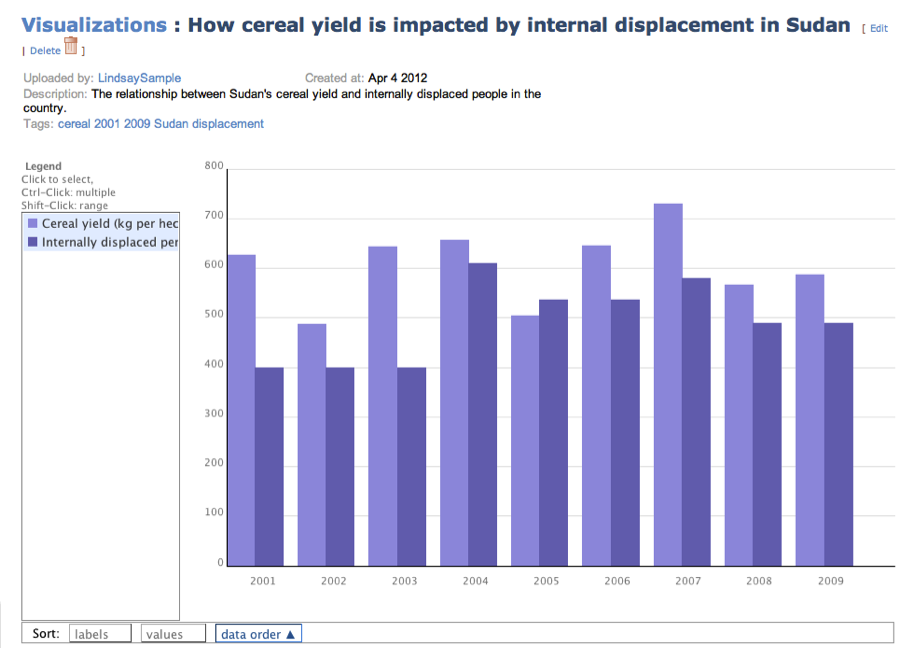
We examined three different variables related to food security: agricultural food production per capita, food consumption per capita expressed in kilocalories consumed per day and an indirect measure of food availability, also known as food security, which is the prevalence of undernourishment shown as percentage of the population.
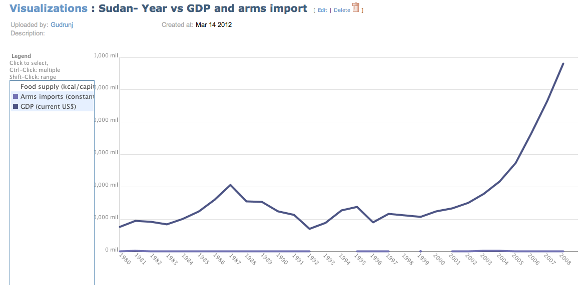
Graph 1. Sudan Indicators on Food Security
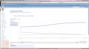
Graph 1. Sudan Indicators on Food Security
Graph 1, Sudan Indicators on Food Security, shows a comparison of different indicators of food production, per capita food production and prevalence of undernourishment in percentage of population between 1992-2010.
Despite the article’s assumptions that civil war is caused in part by climate change and food security issues, the trend in food production per capita and food consumption per capita is on the rise in Sudan. Furthermore, data indicates a steady decrease in undernourishment prevalence in Sudan, from almost 40 per cent of the population being undernourished to 22 per cent by 2007. All these indicators point to food being more available. This data does not support food security as one of the determining factors of Sudan’s civil war.
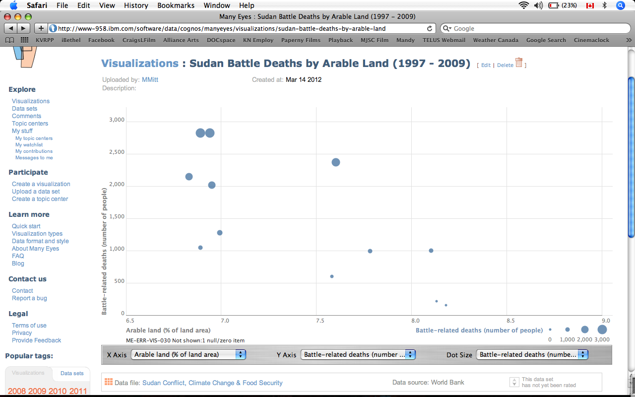
However, on the other hand, the Sudan Battle Deaths by Arable Land table may tell a different story. According to this data, the number of deaths in civil war increases in years where there is less available arable land. In general, from 2002 onwards, arable tends to increase in Sudan, and battle deaths decrease.
Graph 2.- Sudan Battle Deaths by Arable Land.
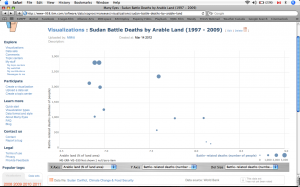
Graph 2- Sudan Battle Deaths by Arable Land.
The increase in arable land may explain the increased trend in food production and food supply demonstrated in Graph 1, as well as the decrease in undernourishment. However, it also demonstrates that climate change (which should reduce available arable land) and food security do not explain the full story of conflict in Sudan. There must be other variables involved.
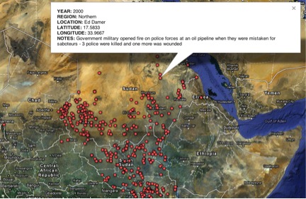
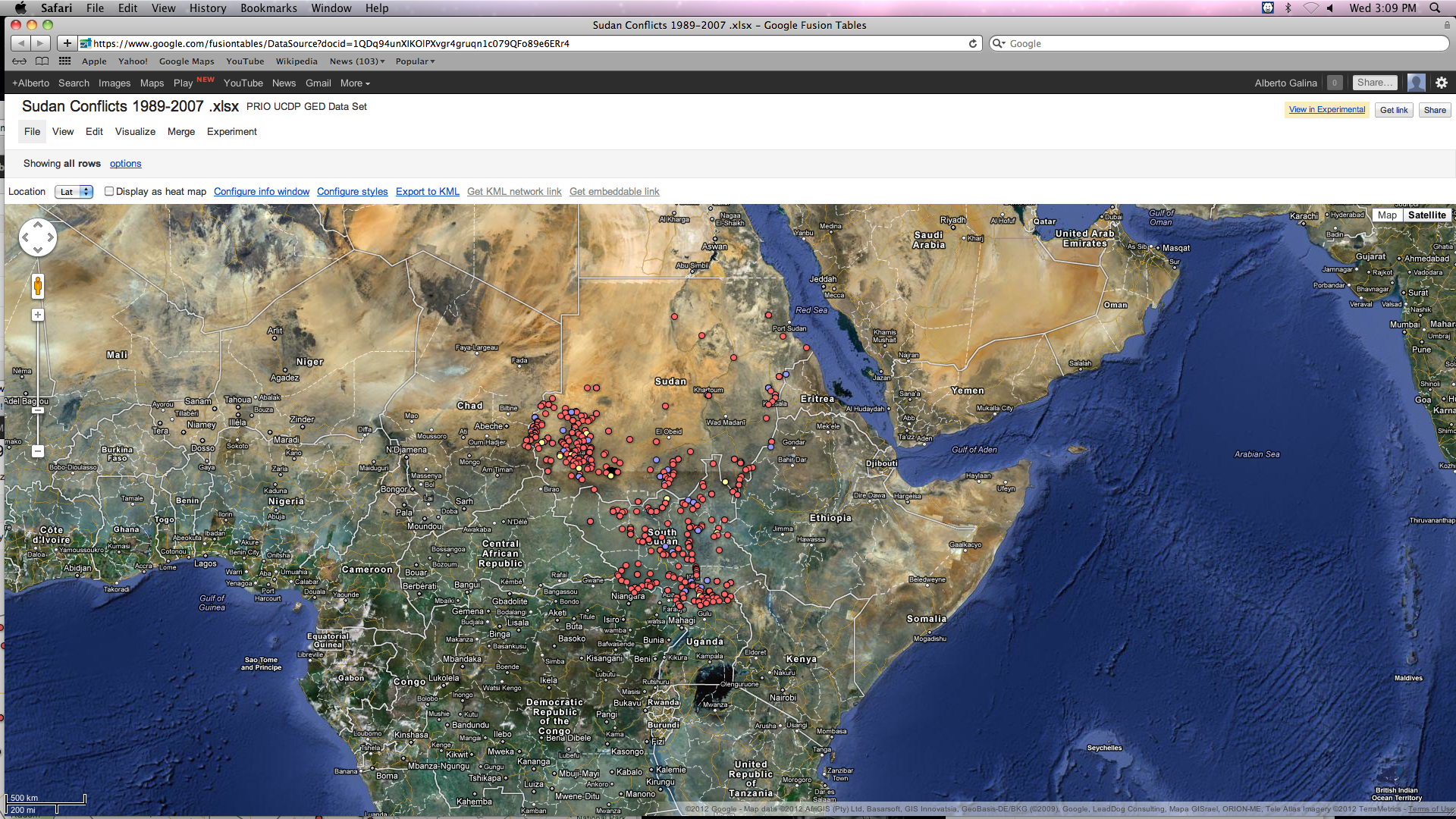
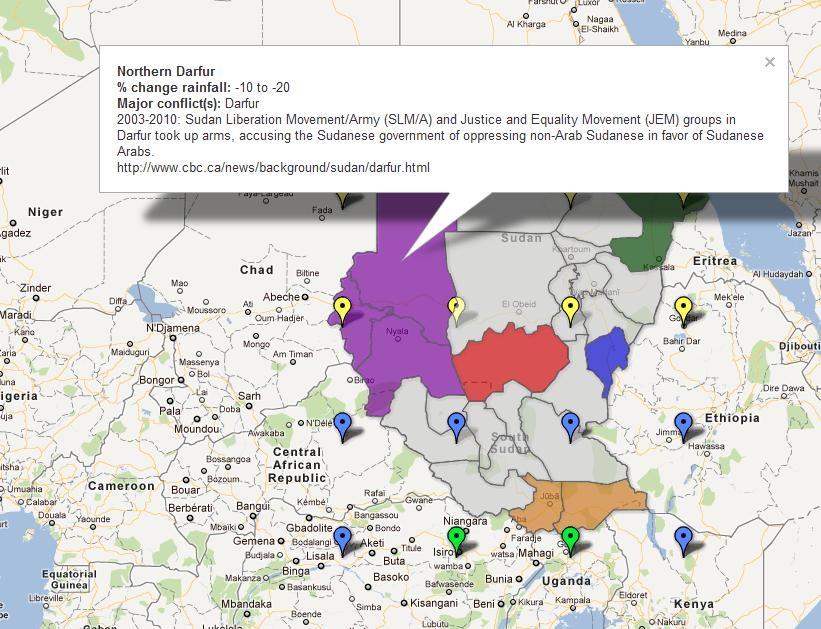
Map 1. Sudan Conflicts 1989 – 2007
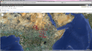
Map 1. Sudan Conflicts 1989 - 2007
This Google map shows the locations where conflicts occurred in Sudan indicating the groups involved: whether militia, rebel groups or civilians between 1989 and 2007.
The map shows that the highest concentration of battle deaths and actual clashes occurred in southern Sudan, including the border regions with Chad, Central Africa Republic, Uganda, Ethiopia and Eritrea.