This is an oldie, but a goodie…here is what the table looks like, but you need to click on the link to get the full effect.

And, a link to reviews of tools for data visualization.
constructing a good life through the exploration of value and valuing
This is an oldie, but a goodie…here is what the table looks like, but you need to click on the link to get the full effect.
And, a link to reviews of tools for data visualization.
There is no one right way to do an evaluation plan, but there are some fairly standard components to an evaluation plan. Like,
This template from CDC is a good place to start: evaluation plan outline. And the Evaluation Toolkit created by the Pell Institute provides direction as well. But also consider whether alternative formats for evaluation plans might be more effective, like this visual evaluation plan strategy using DoView described by Paul Duigan.
Because evaluation plans are meant to clearly outline what the evaluation will focus on and how it will be done tables, charts, figures and graphics often communicate more succinctly than prose.
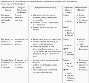 For example, describing the program and what it is supposed to accomplish might look like this.
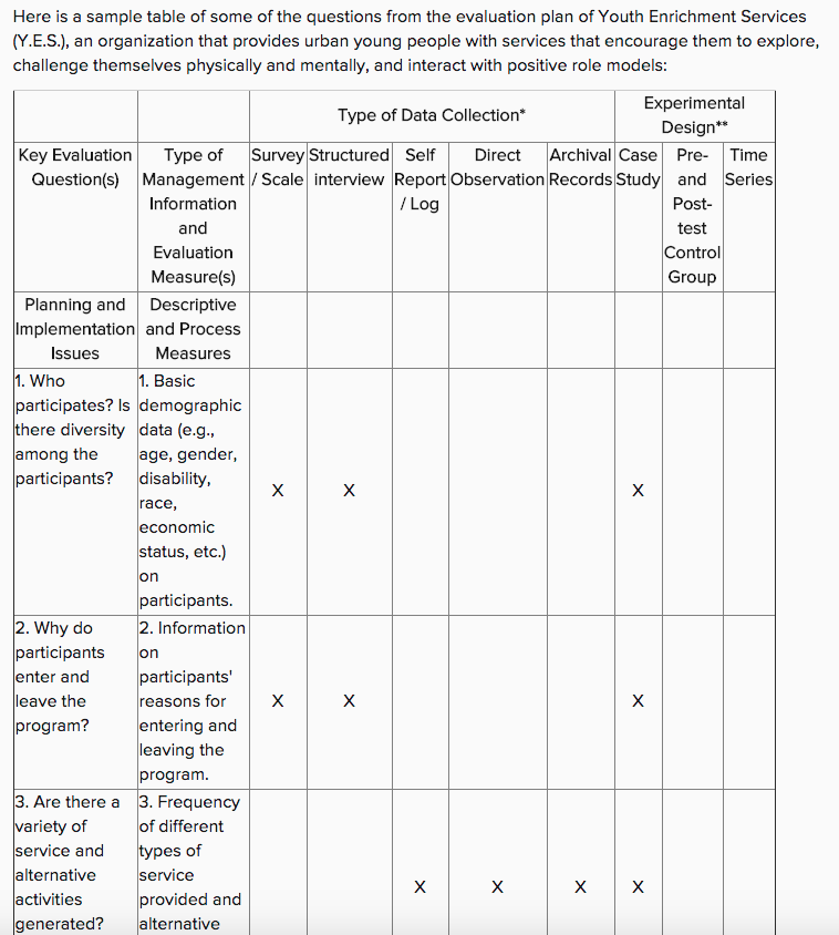 And, evaluation questions, methods and even the overall evaluation design might look like this.
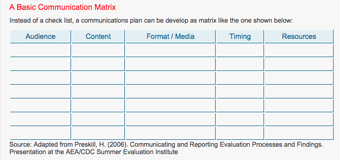 And, a communication plan might look like this.
The ability to capture the big picture visually is also helpful and communicates the overall plan. Here are a few examples from Bethany Laursen, which Sheila Robinson shared on Evaltalk.
Just a quick note on a free app (pro version available, of course) to create maps with your data.
BatchGeo allows you to create Google Maps with your data ~ location plus other data (like prevalence, test scores, crimes).
Not an endorsement, just a suggestion.
While the distinction between formative and summative evaluation is often drawn too sharply, there is a real distinction. For formative evaluation to really be formative, there needs to be a steady flow of evaluative feedback that allows for corrections along the way… that is, to do what ever is being done better, both in the present and into the future.
Compare two approaches to formative evaluation ~ real time evaluation and digital portfolios of student learning.
Real Time Evaluation

http://reliefweb.int/report/nepal/nepal-gorkha-earthquake-2015-internal-real-time-evaluation-emergency-health-response
An evaluation approach that captures this is “real time evaluation,” an idea that appears often in humanitarian relief efforts. With a disastrous situation that demands rapid alleviation of suffering comes the need for quick information about whether that suffering is indeed being alleviated, and if it isn’t then what might be done in order to do so. RTE emphasizes timely evaluation feedback to strengthen program design and implementation, some common features are:
Digital Portfolios of Student Learning
While traditional report cards have long been the mainstay in reporting student learning technology that allows for ongoing feedback about what and how students are learning are now common. Digital portfolios are collections of evidence managed by users and shared electronically, often on the web but increasingly through other social media platforms. One example is Fresh Grade, an app that facilitates documenting and sharing learning activities and outcomes. Common features of digital portfolios are: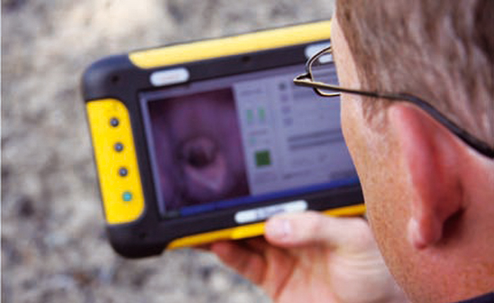
What can we learn from these examples?
RTE is often done under difficult circumstances with limited ability to collect data first hand and thus is content with ‘quick and dirty’ results. Disaster situations make it onerous to be in the field and evaluation relies on reports from the field (observations of aid workers, sector staff in the area, and so on). On the other hand, classrooms and other educational settings are easy to access, but the data about learning activities and outcomes are similar to reports from the field. Digital portfolios and especially the real time apps (like Fresh Grade) provide immediate evidence of what is going on and what is being accomplished. Apps allow students and teachers to create and share information on an ongoing basis, but permit editing and adding to the record over time. If we think about an individual student’s learning as a model for a program, perhaps this technology has something to offer formative program evaluation.
RTE could use an app or web based platform (most are available for smart phones and tablets, and there are a number of web-based tools that might serve this purpose: Evernote, Google drive, Three Ring) so those on the ground could provide data about what is happening by sending photographs, interviews, observations, documents, and so on to evaluators who are unable to collect data firsthand. Connectivity may be an issue in some situations, but even erratic connection would allow for varied and compelling data to be shared. In non-emergency situations this wouldn’t be a problem. Technology that allows for sharing information easily and often may increase the likelihood adjustments can be made and thus the purpose of formative evaluation realized.
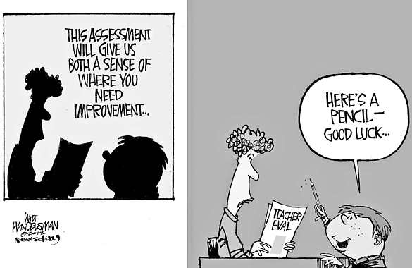 Student evaluations of teaching (SET) are standard fare in higher education where there is often relatively little information available to judge what is supposed to be a major part of professors’ work. There are often long end of course surveys students complete, covering everything from whether the content was relevant to the professor’s competence to whether students felt fairly treated. Putting students in a role as observers of what happens in classes isn’t a bad idea, and I’ve written about the Measures of Effective Teaching Project here. Not everything that is asked of students is clearly in their realm though, such as whether the professor knows his/her stuff, and much more care should be given to asking students to observe what is observable and experienced specifically by them. This matters when the data from these surveys are used to make career decisions about professors. The overall evaluation process for tenure, promotion, merit pay, and continuing appointment involve more components than teaching and indeed scholarship (publishing) is often compensatory and can nullify a poor teaching evaluation. But that’s another post, for another day.
A recent study at NC State points to a specific, and serious, problem with student evals of teaching: they are gender biased. One of the basic issues in instrument construction is validity and it would appear student evaluations of teaching aren’t living up to this expectation.
“The ratings that students give instructors are really important, because they’re used to guide higher education decisions related to hiring, promotions and tenure,” says Lillian MacNell, lead author of a paper on the work and a Ph.D. student in sociology at NC State. “And if the results of these evaluations are inherently biased against women, we need to find ways to address that problem.”
Benjamin Schmitt, an assistant professor of history at Northeastern University, who is interested in data visualization has given us what might be the most useful data to see the effects of gender bias. He used Rate My Professor as the data source describing his analysis here, and before you get all uppity about this there is at least some evidence of a reasonably high correlation between ratings on RMP and institutional SETs. Schmitt has created an interactive chart to explore gender, discipline and student ratings. It’s pretty amazing… and eye-opening. I’ve clipped just a few examples when different terms are used to search the data base. Apparently male professors in psychology might have futures as stand up comedians, all education professors are so caring any of them might be the next Mother Teresa, and all philosophy profs are brilliant but men more so than women. Not all descriptors are gender biased… attractive, for example, leads us to believe education professors are the least attractive (ouch!) while the hotties are female criminal justice and male philosophy profs… but a surprisingly consistent pattern of gender bias against women across disciplines is apparent.
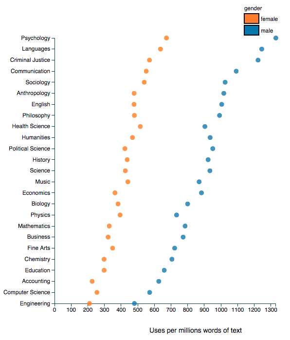
search for FUNNY
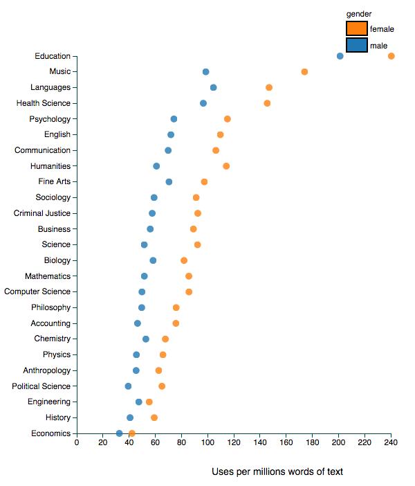
using CARING
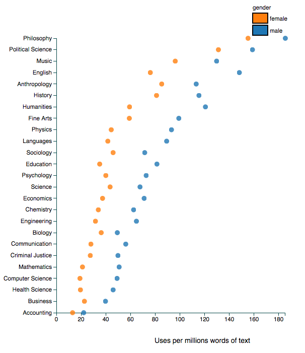
BRILLIANT as the search term
Explore this interactive chart and be amazed, even appalled. You’ll find that men are more likely to be seen as a star, knowledgeable or awesome and women are more likely to be seen as bossy, disorganized, annoying and to play favourites, whilst being either nicer or ruder than men. (Wait, is that rudely nice OR nicely rude?)
But then ask if the student ratings have any basis in fact. Are philosophy professors really more brilliant than professors in accounting, business or health sciences? Do women across all disciplines lack a sense of humour? In other words, the problem with these ratings are complex and layered… gender bias, for sure; truth value, disputable. And yet, faculty committees and higher ed administrations persist in using such flawed data or at least continue to symbolically offer it up as grounds for important personnel decision making.
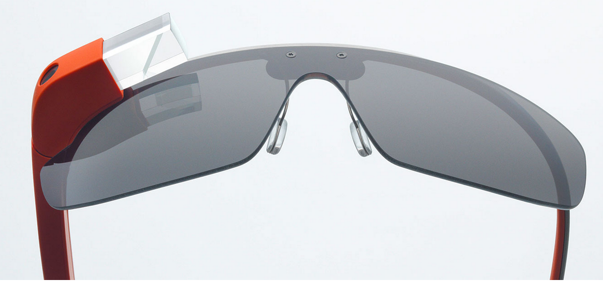 Doctors, forensic scientists, and police officers have been early adopters of Google Glass as a way of collecting data, of recording events that matter to their professional practice. This recording device is double edged: on the one hand they make the transmission of surveillance data incredible easy (maybe too easy), but on the other hand the data might be used to evaluate the performance of the surgeon, physician or police officer wearing them. So personnel evaluation might evolve with a data record of actual performance ~ you can see the quality of the surgery performed or the propriety of an arrest.
Some evaluators spend considerable time in programmatic contexts collecting observational data. One wonders if recording devices that just come along with us and record what is going on might be useful for evaluators. For example, the GoPro, strapped to your head or chest, is now standard equipment for sports enthusiasts to capture their accomplishments or nature enthusiasts their surroundings. It might well be the means to record that program activity or meeting, but it might also be a bit intrusive.
Google Glass is definitely more stylish, less obtrusive, and provides interactive capabilities. It’s in the beta stage, what Google calls the Explorer Program and if a space is available you could be an early adopter for the cost $1500, that is if you live in the USA. In short you tell it what to do, take a picture or video, which you can share, send a message, look up information. The example below shows some of its capabilities. Imagine an evaluation context that would allow you to record what you see, do and to share and connect with program stakeholders.
Google Glass has been controversial when people wear them as a matter of course in their daily lives creating exaggerated tensions in an already surveillance rich society (smart phones being the obvious device). But used in an evaluation context, where people have accepted that events, interactions, and talk will be recorded, these controversies might be obviated.

The Video Girls for Change project uses the Most Significant Change approach to evaluate programming for girls in various developing countries, and uses video summaries to communicate the findings from the evaluations.
The Most Significant Change technique is a form of participatory monitoring and evaluation that directly involves the voices and perspectives of beneficiaries. Essentially the Most Significant Change process involves the collection of stories of significant change from the field, followed by the systematic selection of the most significant of these stories by panels of designated community members and other stakeholders.
Participatory video is an accessible, flexible medium for recording community stories of change. With InsightShare’s games and excercises and experiential learning approach participants can rapidly learn video skills, allowing people to tell their Most Significant Change stories in a familiar context and to someone they trust. The process itself is fun, direct and the results can be played and reviewed immediately. It also helps to avoid situations where project staff or external evaluators speak on behalf of communities, allowing intended beneficieries to speak for themselves.
When participatory video and the Most Significant Change technique are skilfully brought together, the human stories behind development projects can be captured in an accessible form, even for those with low levels of literacy. These combined methodologies promote peer-to-peer learning, collective reflection, triangulation and wide distribution of these important stories. Participatory video allows for everyone to get involved, contribute, feel, and respond to, other people’s stories and can strengthen community ties and identification with developmental objectives.
While I’m not sure exactly how this translates to research or evaluation, this display of the spread of an ‘idea’ (more accurately a Facebook post of Marvin the Martian) is interesting and compelling. Having recently struggled with meaningful ways to present social network data to project staff, this makes me wonder if there are similar animated ways to illustrate the nature and evolution of SNA maps.

Allison, A., & Forngia, T. (1992). The grad student’s guide to getting published. New York: Prentice Hall.
American Psychological Association. (2009). Publication manual of the American Psychological Associations (6th ed.). Washington, DC.
Becker, H. S., & Richards, P. (2007). Writing for social scientists: How to start and finish your thesis, book, or article (2nd ed.). Chicago: University of Chicago Press.
Bridgewater, C. A., Bornstein, P. H., & Walkenbach, J. (1981). Ethical issues in the assignment of publication credit. American Psychologist, 36, 524-525.
Clifford, J. & Marcus, G. E. (1986). Writing culture. Berkeley, CA: University of California Press.
Frost, P. J., & Taylor, M. S. (Eds.). (1996). Rhythms of academic life: Personal accounts of careers in academia. Thousand Oaks, CA: Sage.
Fuchs, L. S., & Fuchs, D. (1993). Writing research reports for publication: Recommendations for new authors. Remedial and Special Education, 14(3), 39-46.
Geertz, C. (1989). Works and lives: The anthropologist as writer. Boston: Polity Press.
Klingner, J. K., Scanlon, D. & Pressley, M. (2005). How to publish in scholarly journals. Educational Researcher, 34(8), 14-21.
Matkin, R. E., & Riggar, T. F. (1991). Persist and publish: Helpful hints for academic writing and publishing. Niwot, CO: University of Colorado Press.
University of Chicago Press. (2003). The Chicago manual of style (15th ed.). Chicago: University of Chicago Press.
Strunk, W. J., & White, E. B. (2005). The elements of style (3rd. Ed.). Boston: Allyn & Bacon. [NOTE: Treat yourself and get the edition illustrated by Maira Kalman.]
Truss, L. (2004). Eats, shoots and leaves: Why, commas really do make a difference! New York: Gotham.
Wolcott, H. F. (2008). Writing up qualitative research (3rd edition). Thousand Oaks, CA: Sage.
There can be no doubt that technology can make the work of evaluation easier and the array of software and applications is evergrowing. Check out the AEA365 blog and search for technology related posts… there are plenty. The challenge for evaluators will be thoughtful use of technology and avoiding technology driven evaluation practices. One of the best examples of technology driving and structuring thinking, knowledge construction and presentation is Powerpoint… Microsoft has created simple software that too often control what counts as information. Edward Tufte’s critique of ppt, PowerPoint Does Rocket Science–and Better Techniques for Technical Reports, is required reading for anyone who has ever or will ever use powerpoint.
Today Apple revealed the availability of, Look For, an iphone app for recording classroom observations of teaching and it is marketed as a tool for teacher evaluation. With a quick click (and some added notes if you like) principals can record whether teachers are “making subject matter meaningful” or “facilitating the learning process.” The promo for Look For says the app has the following features:
-Create unlimited observations
-Sort observations by school, teacher, subject and date
-Select from hundreds of qualification points within 6 basic categories
-Easily email and share reports and progress instantly
-Track teacher progress through each of the 6 instructional categories
-Supports state and national standards

Everyone wants technology to make their lives and jobs easier, and principals are no exception. But is this like ppt? An app that pre-defines and standardizes what counts as good teaching and limits sensitivity to context may be time saving, but does it promote good evaluation? Establishing criteria is key to good evaluation, but this is and ought to be a slippery part of the process… we cannot and should not know all of the relevant criteria a priori and we ought to be open to recognizing good and bad making attributes of teaching in situ. Principals and teachers need to be able to recognize and acknowledge what is not easily or necessarily captured by the 6 instructional categories.
So maybe Look For is a good app, but only if used in a critical way… true for all technology.