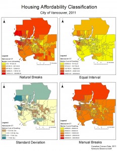
If I were a journalist I would choose the map that uses the Natural Breaks classification method to display to my audience. It is the most visually appealing map and has both distinct areas of both affordable and non-affordable housing costs and would give me as a journalist lots to talk about, although it might not be the best suited map for the type of data present. If I were a real estate agent I would choose the map using the Equal Interval classification method to present to prospective homebuyers near UBC. It is the only map from which it can be concluded that UBC is actually a very affordable area, which is not true, but appears so from the colour distribution. Choosing any other map it would make much harder for me to sell anyone homes near UBC. There are a lot of ethical implication for these choices as both of them, especially the second one choose the classification method based on the personal benefits that can be achieved and not necessarily the most accurate representation of the actual trend.
