Having completed an introductory course to geographic information science I have learnt how to operate the ArcMaps software and gather and filter through datasets needed for an analysis. More importantly this course has taught me to how to distinguish good GIS analysis from bad. Through analyzing datasets and producing maps as part of this course, I demonstrated an understanding of the importance of ethical considerations when analyzing and displaying data.
Please see below for samples of work.
When data is projected into a different coordinate system, distances (length), areas (size), angles (shapes of objects) and direction (rhumb lines) can be deformed. In order to fix misaligned and improperly referenced spatial data, first review the properties of all the files in ArcCatalog. Determine if any of the layers are missing a coordinate system or are projected in the wrong one. Then fix all the problematic layers by displaying them in the common/recommended projection for the area of study. To do that go to ArcCatalog -> Catalog Tree -> Description or ArcMap -> Layer Properties -> check General and Coordinate System. Before adding the layers to ArcMap it is important to make sure all of them are displayed properly. You can do this by previewing them in ArcCatalog beforehand or changing projection in ArcMap, then deleting the layer and adding it again for it to display properly.
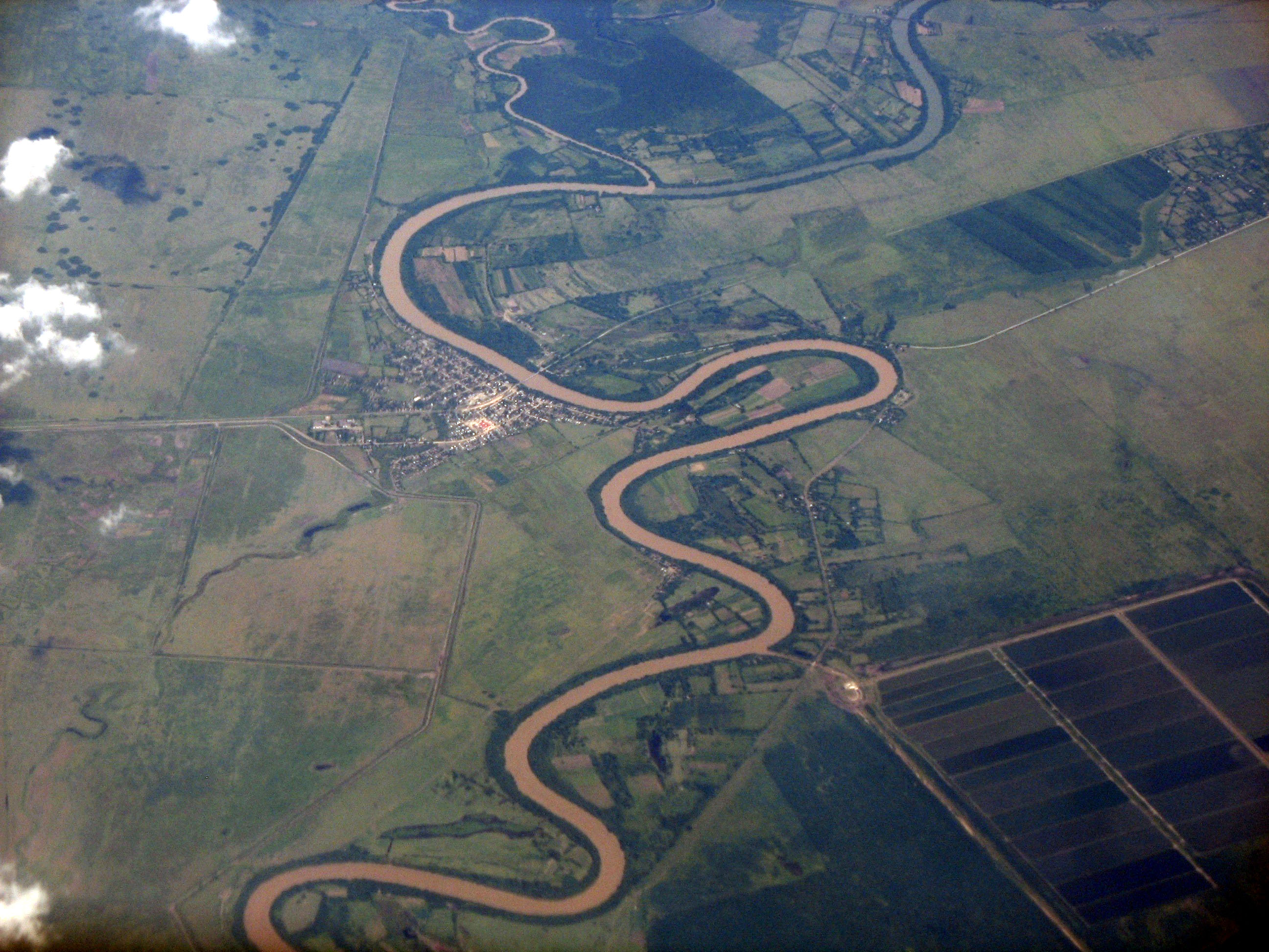
Cuato River in Cuba
Using remotely sensed Landsat data for geographic analysis can be advantageous in a number of ways. Looking at such data over a period of time allows to observe changes in the landscape and compare them to previous years or different locations. It can be used to compare the landscape before and after a major flood, earthquake or volcano eruption or monitor stream, wind or glacial erosion over the years. If there is a stream close to human settlements it may be required to monitor the extent of cut bank retreat and the change in river sinuosity. For example, gathering the Landsat data of the Cuato river in Cuba over a period of a few decades would allow to compare the images from different years and determine the rate of erosion and in time predict if any oxbow lakes would form and where to prevent property damage and casualties. It would be best to gather the data from all different seasons as that would also give additional information on when the most erosion is happening.
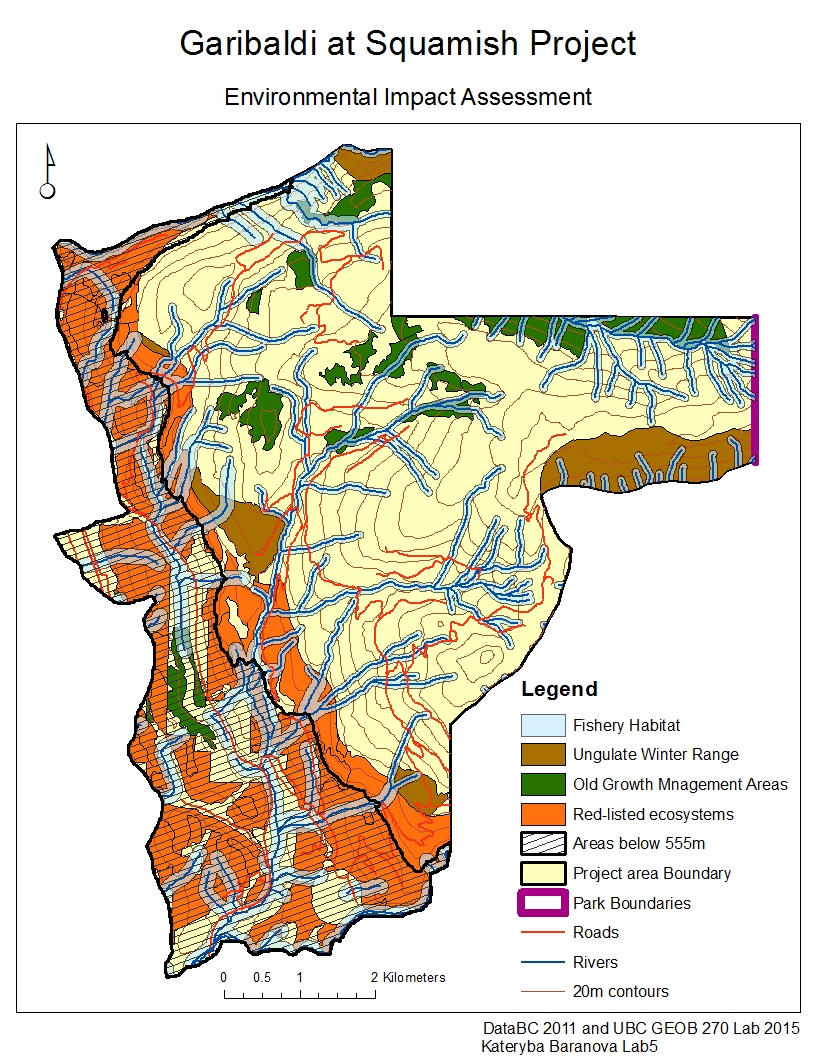
As a natural resource planner, the Northland Properties and Aquilini Investment Group of Vancouver hired me to work on the Garibaldi at Squamish year-round ski resort project proposal. My main objectives were to evaluate the feasibility and environmental impacts of proceeding with the project. In order to accomplish that and demonstrate my results I produced a map that represents the ungulate winter range, riparian areas, old growth management areas, red-listed ecosystems and park boundaries, as well as areas below 555m and nearby roads.
First I conducted an analysis of vulnerable environmental areas in order to exclude them from the project construction area. I gathered data on ungulate winter range, fish bearing streams, old growth forest areas and the terrestrial ecosystem mapping and then used only the data that falls within the project proposal boundaries for further analysis. First I divided the project area to represent areas that are below and above 555m, the area below 555m is shaded to stand out from the rest. Then I identified the areas of ungulate winter range and old growth forest and highlighted them with brown and dark green colours respectively. For fish bearing streams I selected the areas of 50m around streams that are above 555m and 100m around streams below 555m and highlighted them light blue to demonstrate the riparian areas within the project area. I also located red-listed species from the terrestrial ecosystem mapping data and highlighted them orange on the map. Lastly I added the roads layer, which are indicated a red lines to demonstrate already existing transportation routs that can be used for the project.
From my analysis I found that the areas, within the proposed project boundary area, unsuitable for the construction of the ski resort constitute about 55.54% of the total area. 29.92% of the area was below 555m, 6.79% was old growth forest management areas, 7.89% was the ungulate winter range areas, 24.83% was the red-listed species and 30.13% was the riparian zones.
In my opinion the two greatest concerns to the project development is that there is a significant area (29.92% of total project area) that is below 555m and would not get enough snow to maintain a ski resort. This is a very difficult concern to mitigate as it would be very costly to artificially add snow in order for the ski resort to run. The second concern is that the riparian zones also take up a lot of space (30.13%) and besides just that, they also break up the whole area, making it hard to develop a ski resort.
I personally do not believe that the project should be allowed to continue for a number of reasons. First of all there is very little space to construct the ski resort without building onto the areas that I determined unsuitable for construction. The available area, which is only 44.46% of the original proposed area, is all broken up into small segments of land by the riparian zones. It would be extremely difficult and costly to build a ski resort around all the riparian areas and have a route to it. Furthermore, taking into account climate change and rising average temperatures, the 555m boundary line for elevation that is able to maintain enough snow during the skiing season, would most likely rise higher, leaving even less available building space. Lastly, the analysis conducted did not account for noise, light and other pollution from the ski resort and how that might affect the overall wellbeing of endangered species in proximity. Overall, there are too many acquired costs and environmental risks associated with continuing with the project that in my opinion it is simply not worth it.
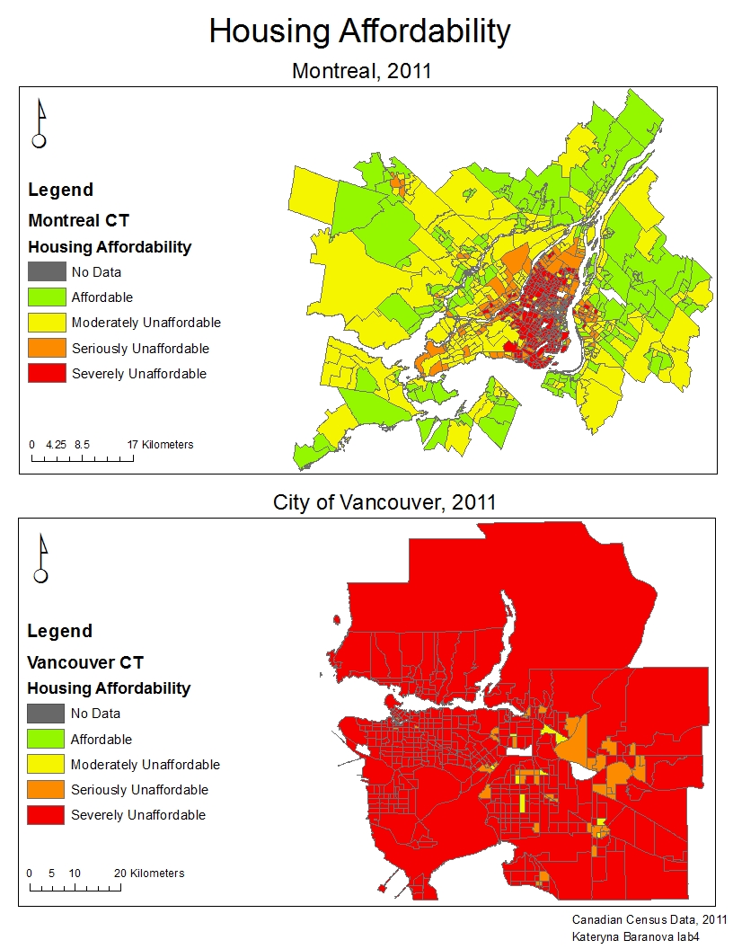
Housing affordability is measuring the cost of housing that is normalized over income. It is a better measurement of affordability than housing cost alone because it takes into account how much money people make and if they can actually afford a house based on what they earn yearly. It also makes it more accurate to compare the affordability of two cities, especially with sizeable population differences.
The four main housing affordability categories represented in this map are: affordable, moderately unaffordable, seriously unaffordable and severely unaffordable. There is also a No Data category to represent the areas where census data was not gathered. The affordability rating categories were determined by the 11th Annual Demographia International Housing Affordability Survey. In my opinion they can be “trusted” because they are assigned using the median multiple which is consistent internationally over the years.
Affordability overall is a good measure of a city’s livability because it indicates if the average person can afford certain goods and gives an idea of how the city is doing in terms of poverty. However, there are still a lot of other factors that influence livability, but would not be reflected in the affordability and it is important to keep that in mind when doing such evaluations.
The purpose of our GEOB 270 final project was to determine and quantify how much of the agricultural land reserve in the Central Kootenay Region is actually available and suitable for agriculture by applying data analysis tools learnt throughout the course.
The team was organized using meistertask, a free online project management software, that allowed to coordinate the work, set deadlines and assign tasks. A google doc was also used that permitted the team to edit the report and work on it all together without having to plan additional meetings.
My personal most valuable contribution to the team project was compiling all the maps and making sure that they all are consistent in their format, easily viewable and understandable and representative of the features in question. The maps can be found in the Central Kootenay Final Project Report under appendix C. I would also really like to thank my team member David Waine for organizing all the data and finalizing the analysis of the Central Kootenay ALR. His work can be viewed by downloading the Central Kootenay Final Project Shapefile that indicates all the land within the ALR that is suitable for agriculture.
As a result of completing the assessment of the ALR of Central Kootenay I have learnt and discovered a broad range of things. I learnt that although the ALR is land that is set aside by the provincial government for agriculture, it cannot all be used for that purpose due to and already existing landuse of some of the areas or unsuitable slope and can be severely limited by poor soil capabilities. A new GIS analysis tool that has not been taught previously in the class and that I discovered by doing this project is Mosaic to DEM. It allows to connect all the different tiles of the DEM into one area that fits over the project area.
To complete the analysis part of our final project, we had to orchestrate a lot of group meetings in order to carry out our work successfully and without delays as it was very interdependable in its nature. It helped to have one person responsible for storing all the data. Our group was able to accessed some publicly available data which was convenient, however such data lacked metadata and this raised a question of reliability of the source.

If I were a journalist I would choose the map that uses the Natural Breaks classification method to display to my audience. It is the most visually appealing map and has both distinct areas of both affordable and non-affordable housing costs and would give me as a journalist lots to talk about, although it might not be the best suited map for the type of data present. If I were a real estate agent I would choose the map using the Equal Interval classification method to present to prospective homebuyers near UBC. It is the only map from which it can be concluded that UBC is actually a very affordable area, which is not true, but appears so from the colour distribution. Choosing any other map it would make much harder for me to sell anyone homes near UBC. There are a lot of ethical implication for these choices as both of them, especially the second one choose the classification method based on the personal benefits that can be achieved and not necessarily the most accurate representation of the actual trend.