In this lab I used IDRISI software to process images of Central Massachusetts in 1986 and 1994 and analyze the land cover changes that resulted between those two years. See table and images below for results of the land cover changes:
| Land Cover Type | Net Change (km2) |
| Mixed Forest | – 125.72 (loss) |
| Deciduous Forest | – 65.51 (loss) |
| Open Land | + 10.51 (gain) |
| Pasture | – 30.75 (loss) |
| Cropland | – 56.42 (loss) |
| Barren/Waste Disposal/Mining | – 10.25 (loss) |
| Other Urban | + 9.56 (gain) |
| Residential (>2 acre) | + 159.04 (gain) |
| Residential (<2 acre + multi-family) | + 86.28 (gain) |
| Industrial/Commercial | + 30.04 (gain) |
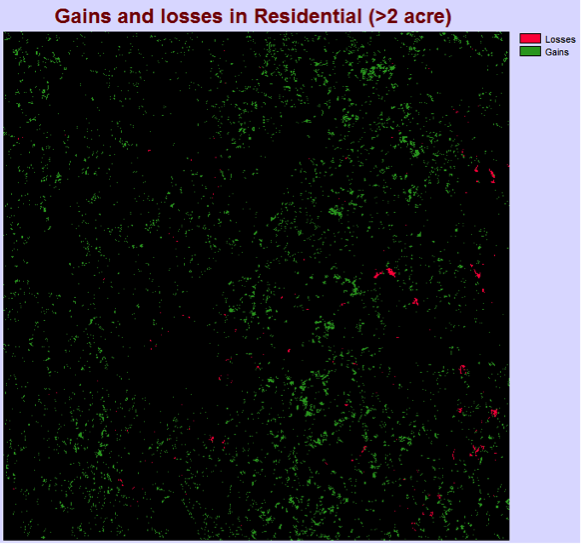
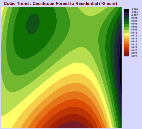
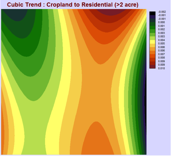
Between the years of 1986 and 1994 the Central Massachusetts area mostly gained in the residential (>2 acre) land cover. The largest gains in the residential (>2 acre) occurred in the north to south strip of land, slightly to the east of the observed area. Also some significant gains can be seen in the southwest corner of the area. Most of the losses for this area are on the very eastern side with a bit of losses, but mostly no change found slightly west of the strip of gains. After observing the contributors to net change in residential (>2 acres) graph, the three major contributing land covers are deciduous forest, mixed forest and cropland.
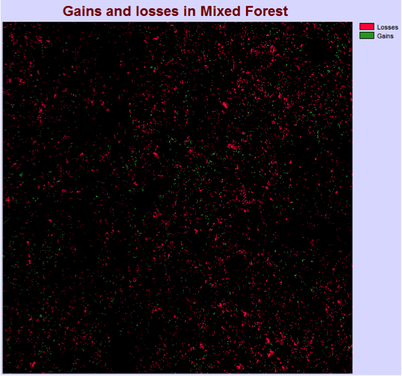
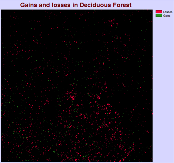
From the map above depicting gains and losses in the deciduous forest land cover it can be seen that this land cover had a net loss of area. Most of the losses are concentrated in the southern part and the trend for gains is very spread out and hard to identify. A net loss can also be observed in the mixed forest area with most of it occurring in the southeast and northeast parts. Some of the gains seem to be more concentrated in the very central and southwest areas.
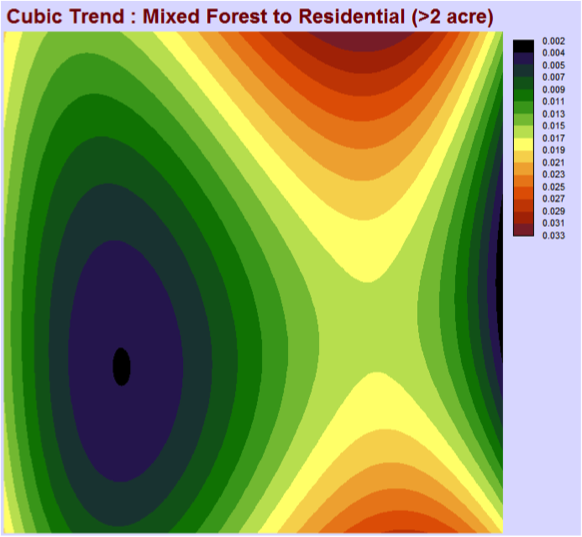
After constructing the cubic trend maps that depict the changes from deciduous forest, mixed forest and cropland to residential (>2 acre) we can observe which areas and land covers contributed the most to a net gain in the residential (>2 acre). The major contribution from the deciduous forest occurs in the south, which corresponds both to the major losses cluster in deciduous forest and a gains cluster in the residential as discussed above. A similar correspondence can be seen from the mixed forest trend that contributed the most in the south and north east areas and is reflected in the gains and losses for mixed forest and residential. The cropland land cover contributed to residential (>2 acre) the most in the south to north stretch of land with most change occurring at the extremes and some in the southwest.
If all three cubic trend maps of deciduous forest, mixed forest and cropland were combined together to form one, it would mirror the gains distribution of residential (>2 acre). Therefore from our analysis we can conclude that the gains in residential (>2 acre) came from the deciduous forest, mixed forest and cropland land covers, which is consistent with the graph of contributors to net change in residential (>2 acre). Also, most of the losses in the deciduous and mixed forest land covers were due to residential development that created gains in the residential (>2 acre) land cover.
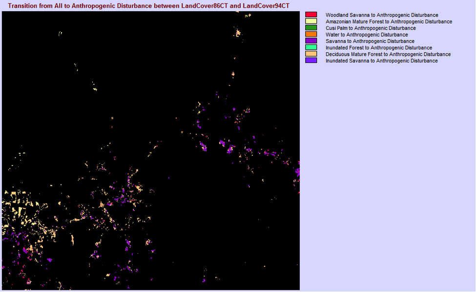
- 365.6 km2 have been lost to anthropogenic disturbance between 1986 and 1994.
- 16249 cells out of 911001 total cells lost to anthropogenic disturbance is 1.78% of the total area of the image.
- The four major land cover classes that are being converted to anthropogenic disturbance are:
- Deciduous Mature Forest – 196.99 km2 lost
- Savanna – 113.78 km2 lost
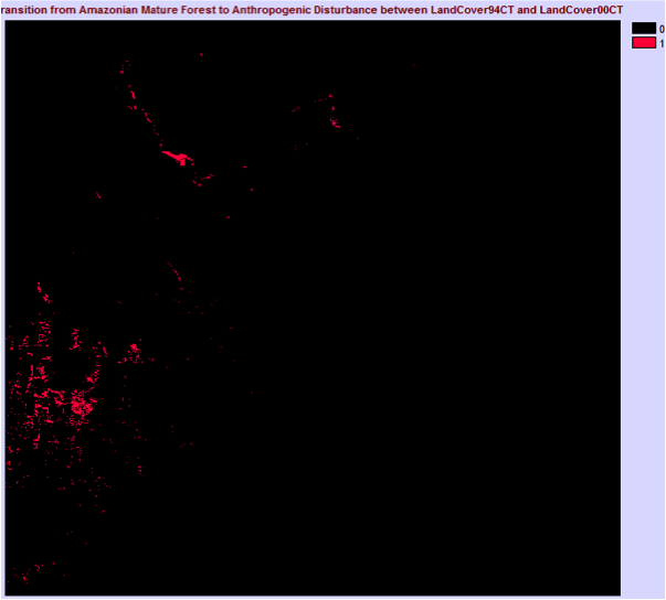
- Amazonian Mature Forest – 32.00 km2 lost
- Woodland Savanna – 18.97 km2 lost
- The legend classes in the ungeneralized map are:
- Woodland Savanna to Anthropogenic Disturbance
- Amazonian Mature Forest to Anthropogenic Disturbance
- Cusi Palm to Anthropogenic Disturbance
- Water to Anthropogenic Disturbance
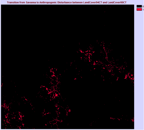
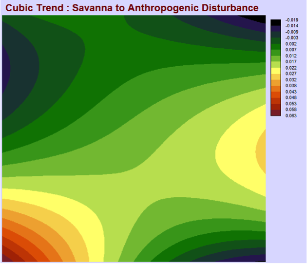
- Savanna to Anthropogenic Disturbance
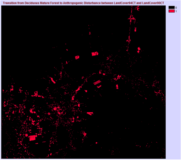
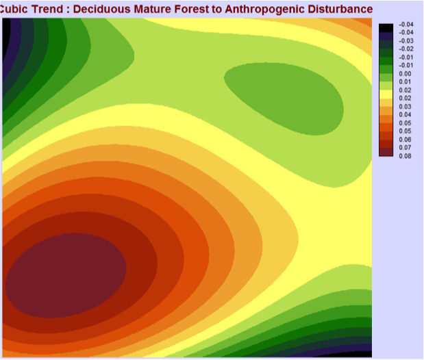
- Deciduous Mature Forest to Anthropogenic Disturbance
- Inundated Savanna to Anthropogenic Disturbance
- The legend classes in the generalized map are:
- Woodland Savanna to Anthropogenic Disturbance
- Amazonian Mature Forest to Anthropogenic Disturbance
- Savanna to Anthropogenic Disturbance
- Deciduous Mature Forest to Anthropogenic Disturbance
These results are expected because when examining the change analysis graph it is clearly visible that only 4 classes significantly decrease and 1 significantly increases. The total area of changes that have been emitted in the second generalized map are 3.87 km2 or 387 ha.
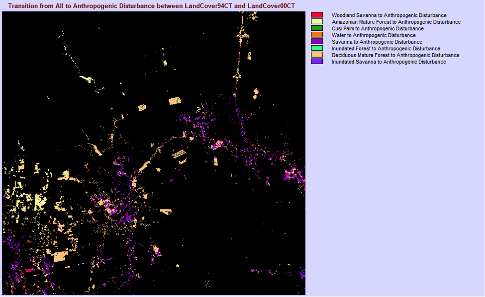
After doing the same analysis for images of the same region between the years of 1994 and 2000 the below results were found:
- 948.89 km2 have been lost to anthropogenic disturbance between 1994 and 2000.
- 42173 cells out of 911001 total cells lost to anthropogenic disturbance is 4.63% of the total area of the image
| Area lost to anthropogenic disturbance | ||
| Major Land Cover Classes | From 1986 to 1994 (km2) | From 1994 to 2000 (km2) |
| Deciduous Mature Forest | 196.99 | 517.16 |
| Savanna | 113.78 | 234.65 |
| Amazonian Mature Forest | 32.00 | 104.22 |
| Woodland Savanna | 18.97 | 48.31 |
| Area lost to anthropogenic disturbance | ||
| Other Land Cover Classes | From 1986 to 1994 (km2) | From 1994 to 2000 (km2) |
| Inundated Savanna | 1.17 | 11.7 |
| Inundated Forest | 0 | 1.03 |
| Water | 2.09 | 6.55 |
| Cusi Palm | 0.61 | 4.54 |
Some of the most notable differences that occurred in the transitions between the two sets of years is that the anthropogenic disturbances land cover increased due to losses in other land covers at least twice as much between the 6 year period from 1994 to 2000 than over the 8 year period from 1986 to 1994. From these changes we can see the rapid expansion of human developments.
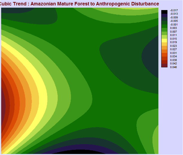
The maps above represent losses in a certain land cover to anthropogenic disturbance between the years of 1994 and 2000 and the associated cubic trends.
The first map depicts the transition of savanna to anthropogenic disturbance between 1994 and 2000. Major losses to the savanna land cover can be seen in the southwest and east parts of the area. These losses are also reflected in the cubic trend. The map depicting the transition of deciduous mature forest to anthropogenic disturbance reflects losses to the forest land cover from the most southwest part to the northeast, with the most change happening in the southwest. The cubic trend reflects the dramatic change in the southwest, but does not really extend to the northeast. The transition from Amazonian mature forest to anthropogenic disturbance shows losses in the forest cover mainly in the west part of the area. The cubic trend also shows the greatest change in the west with little to no change at all in other areas.
After examining the cubic trends for all three land covers it is evident that most of the changes to anthropogenic disturbance happened in the southeast. This reflects the development and expansion of the city between 1994 and 2000 at the expense of the savanna, Amazonian mature forest and deciduous mature forest land covers.
From the map depicting the losses in deciduous mature forest to anthropogenic disturbance certain spatial development trends can be recognized. After closely examining the map it is evident that deciduous mature forest has been cut down in the northeast part of the area to be replaced by a road. In the same map, the clearly outlined blocks of deciduous forest loss must have been lost to such anthropogenic activities as logging or forest clearing for farming or agriculture.
In the maps that portray the losses of the savanna and Amazonian mature forest land cover types to anthropogenic disturbance, the nature of the anthropogenic disturbance is not as clear as in the deciduous mature forest losses. However, since most changes happen around the core of the city, they are most likely the development of human settlements and the expansion of the city boundaries. Combining these maps with the losses in the deciduous mature forest land cover it can be seen that the supposedly human settlements are mostly clustered around what we determined to be a road as mentioned above.
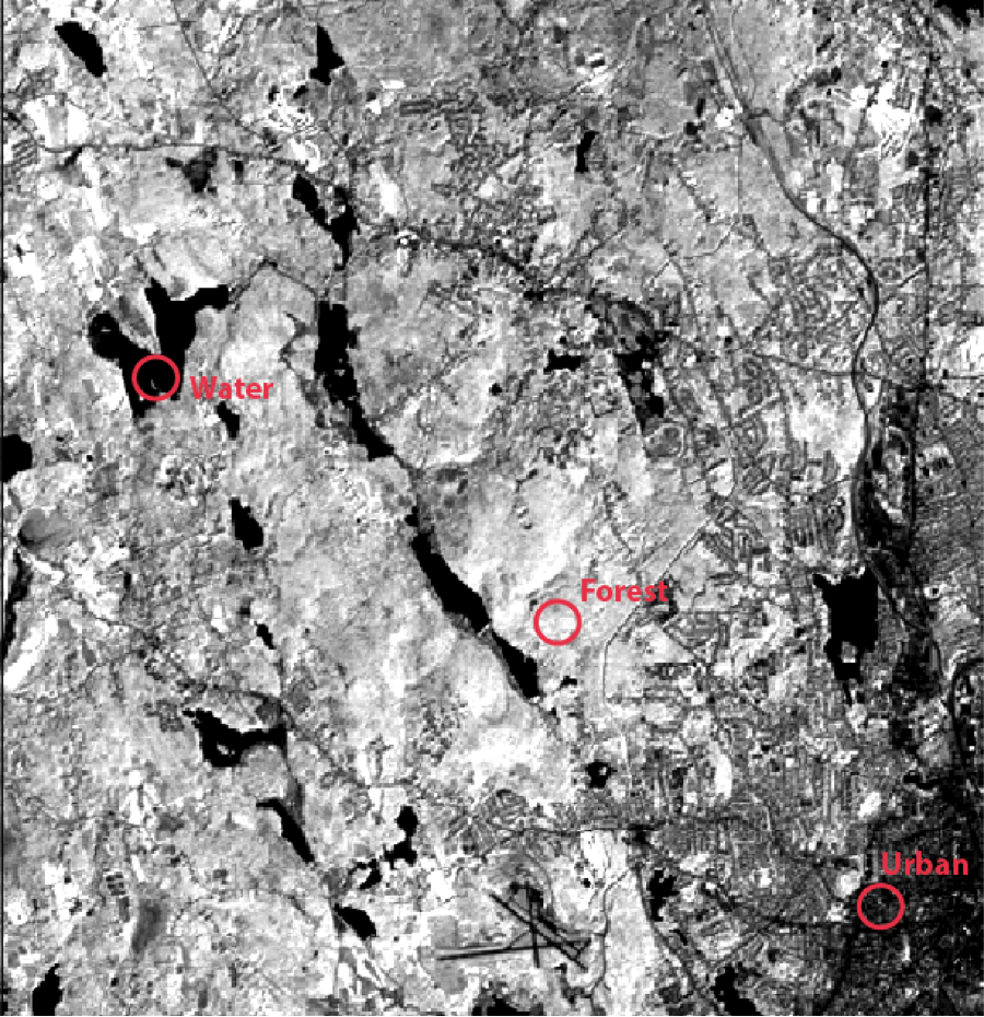
The values in TM4SAT5 should not be used when creating spectral response curves, because it is a composite image of HOW87TM1, HOW87TM2, HOW87TM3 and HOW87TM4. This composite image has been created to increase the contrast of the display image, the values have been stretched and no longer represent the true reflectance values of the pixels, therefore only the original images should be used in creating a spectral reflectance curve.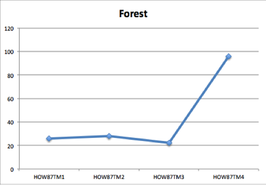
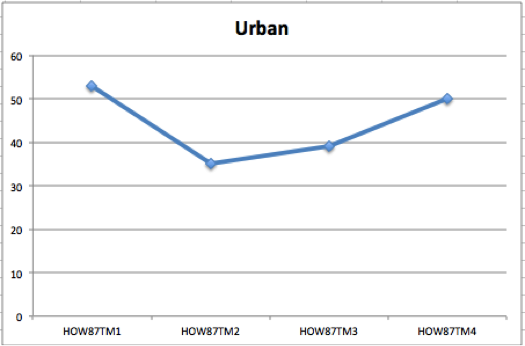

Image enhancement tools can be very useful in redisplaying an image so that it provides more visual information. However, when an image is altered in such a way, the true data is altered and is no longer accurate, so it cannot provide much quantitative meaning. For example, when constructing spectral reflectance curves like in the exercise above, you would need to determine and differentiate between the different area types like water and urban. In the original image it is very hard to do so because of the low contrast of the displayed image. The enhanced image can provide you with the information that allows you to differentiate. However, the reflectance values cannot be used from the enhanced image, so the original image will be able to provide more meaning.
The DESTRIPE image enhancer like most image enhancers alters the reflectance values of the pixels. The operation calculates the means and standard deviation for the entire image and then for each individual detector. Afterwards, the output from each detector is scaled to match that of the entire image.
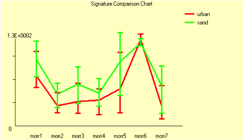
- The band values of urban and sand are very similar, however those of sand are consistently slightly higher than the respective band values of urban in all but one band. In the Thermal IR band, the value for urban is slightly greater than that of sand. As the error bars overlap for all the bands, these distinctions are not of significant enough value.
- The sand reflectance curve has slightly less overall variability between the bands than urban. Both reflectance curves have high value variability between Mid IR and Thermal IR.
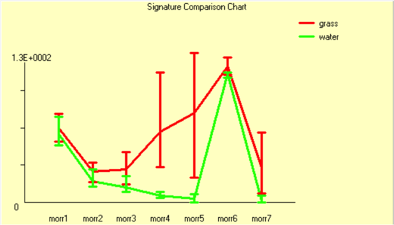
- The band values of grass are higher than those of water in every band. There is also very high uncertainty for the band values of grass in the Near Red and Mid IR bands. And there is overall very low uncertainty for the band values of water.
- The variability between bands in the reflectance curve of water is relatively smooth with the exception of the very high value in the Thermal IR band. There is greater variability in the grass reflectance values with a peak in Thermal IR.
When looking at the grass signature there is a detectable “red edge” as the values in the IR spectrum increase rapidly.
The values in the Thermal IR band are very high and relatively the same for all four reflectance curves.
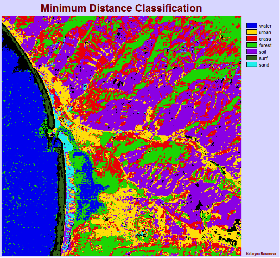
- Total number of pixels: 262,144 = 100%
- Not classified: 9,332 = 3.56%
- Water: 45,476 = 17.35%
- Urban: 31,907 = 12.17%
- Grass: 47,367 = 18.07%
- Forest: 50,487 = 19.26%
- Soil: 70,663 = 26.96%
- Surf: 3,232 = 1.23%
- Sand: 3,670 = 1.40%
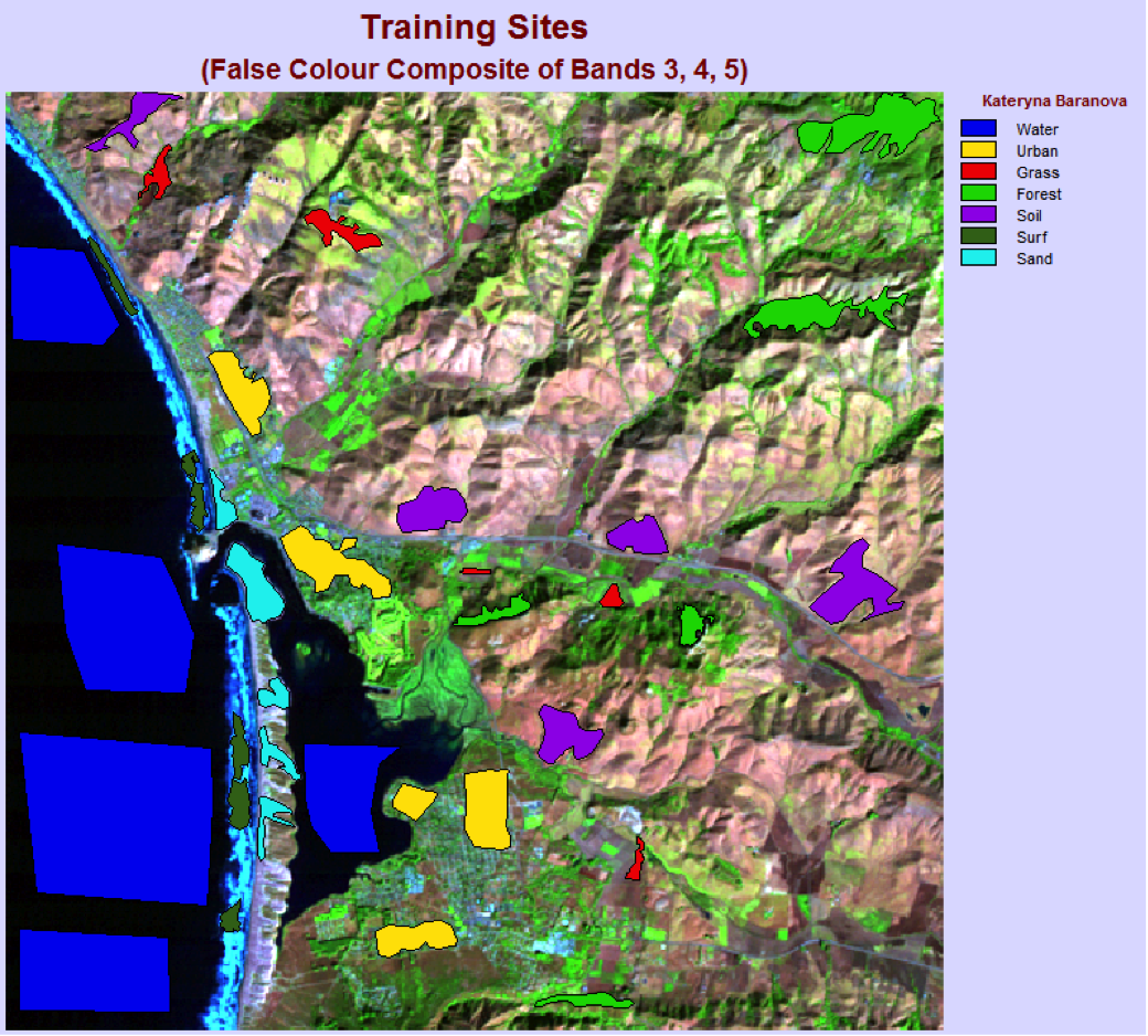
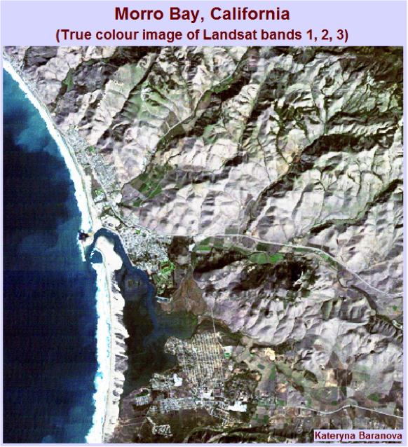
The minimum distance classification output image is similar to the original Morr345 image in that in both images the water surface is distinguishable from the land mass and the general outline of the shore is recognizable. From the classified image we can also see the location of major urban developments and see that most of the land cover is bare soil.
The classification appears to have failed in the bay and ocean areas because a lot of the pixels were classified as forest, where it is obviously water. It is very hard to find what the shape of the bay looks like from this classified image and there are pixels classified as urban land cover in the mountainous areas where it is most likely supposed to be either sand or soil.
The maximum likelihood classification method does a better job of successfully classifying pixels into land categories in this case. This is a “fair” comparison of the two methods as they are both compared to the same original image from which we can deduce how accurate each classification is. The urban, part of the surf areas and the coastal areas adjacent to the urban ones are consistently misclassified.
Urban is most commonly misclassified as the sand land cover and sometimes also as the soil. Urban is so poorly classified because it is very non-uniform and pixels within that class have very different spectral response patterns, making them difficult to classify.
To improve the classification accuracy, a higher quantity of more precise training sites can be selected.
In the ocean areas of morr123, vertical striping can be detected. The composite image is 24 bits because the data type of each of the original bands is byte = 8 bits. It does not make sense for the composite image to be 16 bits, because it is composed of 3 channels.
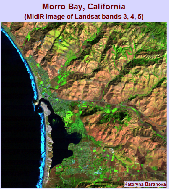
The morr345 image is the “most informative” in terms of vegetation greenness, brightness and moisture content because it uses bands 3, 4 and 5. Band 5 is the best at indicating vegetation and soil moisture and band 4 is most useful for determining biomass content, delineating water bodies and soil moisture. The true colour image is composed of bands 1, 2 and 3 which do not capture soil or vegetation moisture, but are useful for coastal water mapping and vegetation and cultural feature identification. The false colour image is composed of bands 2, 3 and 4 which capture some soil moisture, but the spectral resolution of the image is not very high. For a dry and mountainous area as the Morro Bay, the MidIR image proves to be the “most informative”.
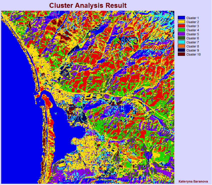
Only the first ten classes appear to be relevant because they contain more than 2,600 pixels each.
Cluster 1 – Water/moisture
Cluster 2 – Sand/Urban
Cluster 3 – Highlands
Cluster 4 – Slopes
Cluster 5 – Valleys
Cluster 6 – Dirt
Cluster 7 – Lowlands
Cluster 8 – Hill ridges
Cluster 9 – Vegetation
Cluster 10 – Vegetation/slopes
The classified image allows distinguishing most of the major features as in the true colour image. The spectral resolution of the images is very different and the true colour image contains much more detail. In the classified image some features are grouped together so it is hard to distinguish between some of them. From both of the images you can get a general understanding of the relief. However if you are unfamiliar with the area it will be very hard to interpret the classified image.
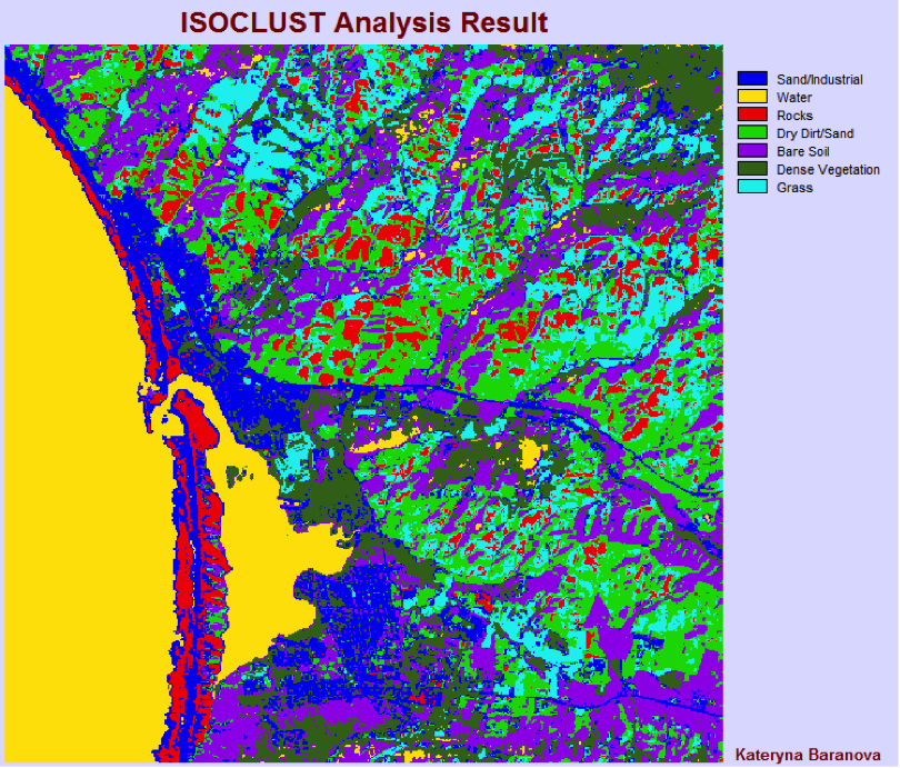
The dark blue colour appears in the near shore areas as well as the city, so it most likely representing sand/industrial. The ocean and bay are yellow, so that cluster must represent water bodies. Red is found on the long strip of beach as well as further inland and comparing the areas with google maps, it seems to represent pebbles/rock. The bright green is found inland where on google maps there seems to be very dry soil, desert like type land, so I classified it as dry dirt/sand. The purple cluster appears around the city and roads and also further inland, there are no special features to be observed in those areas, so I concluded it is most likely just bare soil. Dark green appears where there is forest, so it must represent vegetation. The light blue appears in sparsely vegetated areas and looks like it represents grass.
In the Isoclast analysis image, features are easier to identify than those in the cluster analysis. The Cluster analysis seems very chaotic and hard to understand in comparison. Therefore I feel like the Isoclust routine provides the best output.