Skip to content
Dec 3 / LinXin

What’s on Malaysia TV

I browsed through Amelia‘s marketing blog and I found that she posted an entry about Malaysia! I was indeed so amazed by the year of production of those ads! Looking at those really did make me feel homesick too. And I actually went to youtube to search for more feelings of home. =) Here I wanna share a few more recent commercials that I really like, exclusively available in Malaysia only!

YouTube Preview Image

“Percintaan Tan Hong Ming” – Tan Hong Ming’s Love.

This ads is about the little crush that Tan Hong Ming has on a girl called Umi. The ad shows the innocence that children have that they have never thought about they are of different races.

YouTube Preview Image

How do you spell Dinosaur?

Again, this talks about the racial issue again. I remembered my canadian lecturer in Malaysia told me that he was surprised to find that he has to declare what his race is in Malaysia. The message that the first two ads try to convey is to promote the harmonious relationship and equality among different races (there are many races in Malaysia: The 3 biggest groups are Malay, Chinese and Indian.) I was in fact touched when I first saw this on TV. The innocence that children have on everything indirectly portrays how complicated the adult’s world are. All the social crisis or issues that we have mean nothing to children. Although it talks negatively about Malaysia, I was touched by the meaningful message that delivers me some thoughts about our society.

YouTube Preview Image

Malaysia Idol

Lyrycs:

Free~ Free~

Susu Segar, Susu Segar, it’s fresh and good~

A milk a day, a milk a day, it’s all to make your day!

Ah! Roti, Roti, Roti, Roti, make you strong like me! Come here auntie, buy my roti, you can even eat it plain!

Kopi susu, any susu, goes with anything! Ah!

Roti Kaya, Roti Sardine, Any roti also can!

Instead of using celebrities, the organizer of Malaysia Idol used common people and convenience goods that Malaysians usually have in the ad to approach the population. I remember that I learned a theory “people like me” claims that ad can sometimes approach people better by associating the ad with the common characteristics that everyone has, which will trigger and receive better response from the large population! I totally agree with that. I like how “ordinary” but down-the-earth the ad is. =D

YouTube Preview Image

This is a Chinese New Year greeting ad. Again it uses the “common people” theme to deliver message to every Malaysians about the family love, especially parents’ love to us. After watching this I will had some sort of guilty feelings for ignoring and avoiding parents sometimes despite how much they love us.

YouTube Preview Image

Coca cola advertisement customized for Malaysians! I like the most when it add “la” after sentences because Malaysians often like to end the conversation with “la”. *Pay attention to the sentence, “for the culture la!” XD I miss speaking  “la” in Malaysia.

YouTube Preview Image

Lastly, this ad talks about the censorship in Malaysia, which is… we cannot show armpit in TV! This is in fact quite amusing. Don’t ask me why. We just can’t do that. May be it is deemed as impolite? Haha.

*I’m not purposely making this post s long, I’m just too excited to show how Malaysia is! It is not the best place in the world, but it’s a place that I will always call home.*

Nov 28 / LinXin

Small business Saturday: Support your local business!!

I found I have addicted in reading several marketing blogs that I spend soooooo much time clicking the links on the sidebar on those blogs. I love especially the advertisements they posted and commented on, and their unique ideas about business that I have never thought of. MUCH much more interesting than reading textbooks. Haha.

Here I wanna share a video, which talks about Small Business Saturday! Big retailers have Black Friday and online merchants have Cyber Monday, now America came out a new idea that urges people to support their local small businesses through Small business Saturday! From now on every Saturday after Thanksgiving will be Small Business Saturday. It indeed will help boosting the local businesses a lot because those are which people often forget when seasonal discounts and promotions come. People always anticipate discounts and rebates from big retailers or fancy brands such as Banana Republic, Apple, GAP, ZARA and so on that small businesses are ignored and left behind. So instead of having most of the money flows to big retailers,  the America starts this campaign to adjust the gap that wealth becomes wealthier and poor becomes poorer. So to create awareness, American Express (the one who started this idea) uses a few promotional strategies to launch this shopping event, including advertising (posted below), PR (business talks on TV, email interview, retailers interview, “like” the “Small Business Saturday” page on Facebook and $1 will be donated Girls Inc., etc.), and personal selling which you will be served when you get into the stores. Sales promotion is provided not only to consumers but also small business owners – whoever sign up for the shopping event will get $100 advertising credit on Facebook! Sounds pretty cool as Facebook has always been the popular site for business to advertise. What about direct marketing? Uhmmmmm… perhaps it has conducted direct communication through electronic media like email to reach people? I’m not sure about this though. =) One thing that I definitely know is that, because small businesses often don’t have enough budget to advertise for their brands, the campaign that generates primary demands will certainly help the local economy as a whole.

YouTube Preview Image

Love the slogan: Shop small. It’s gonna be huge =)

*Slogan is sweet, short, reflective and easy to remember!*

YouTube Preview Image

http://www.openforum.com/idea-hub/topics/innovation/video/small-business-saturday-shop-local

Nov 27 / LinXin

Simple works best : Focus on your top task!

I read an article titled “Why websites suck”. It talks about the huge flaw that websites have is that they are too flashy, graphic-heavy, and complicated to access. The best website, the author suggests, is the one that people manage to finish their top tasks on that particular website in an efficient and simple manner. Top task simply means the main objective that the website serves. For example, Amazon’s top task is to get buyers get what they want without much hassles dealing with the side bars, pop-up windows, flashy images etc. So, if people who want to buy a table, they end up on a page that’s absolutely focuses on table.

A very good claim I learned from the article is this: “Every website failure I’ve come across is the organization wanting the customer to fit around how it’s organized, how it thinks, and the language that it uses. By contrast, great websites organize around the customer. It pays attentions to your needs.

It is so true not only about web design, but products too. Imagine if a product or service is designed to have customers fitted with its features, versus the one designed to fit around customer’s needs, which will more likely be successful? In a value-driven society nowadays, you will realize customer orientation would be one of the company objectives that cannot be forgotten, because if customers don’t perceive value in your products/services, you will definitely lose in the intense competition. A huge mistake that companies will often have is that they are eager to introduce something incredible that everyone will embrace, something so unique that, they forget to think about how that innovation fits into customers’ needs, and that often leads to failure.

A very good example that the article cites is Apple. It says, Ipod started with focusing on making its top task – playing music – something super easy and simple, and people went crazy with it. While other products that offer complex features don’t work out so well. It’s best to have one top task, maximum 5, anything goes beyond that may start getting confusing.

Another example that I could think of is Ferrari. It makes super fancy and high-end sports vehicles, and only that. It’s never connected with the word “affordable”, yet people are crazily dumping in money just to own it. Its top task, I would say, is to be as expensive as possible! Same applies to Harley Davidson mentioned in our class, which some of its top tasks is to build classic and stylish heavy-weighted motorcycles.

*You may read more about top task on this site: http://www.openforum.com/idea-hub/topics/the-world/article/why-websites-suck-guy-kawasaki.

Nov 21 / LinXin

The Silent language of success

Do you believe that silent language could be more effective in delivering message than verbal language? I do! Look at the ads below:

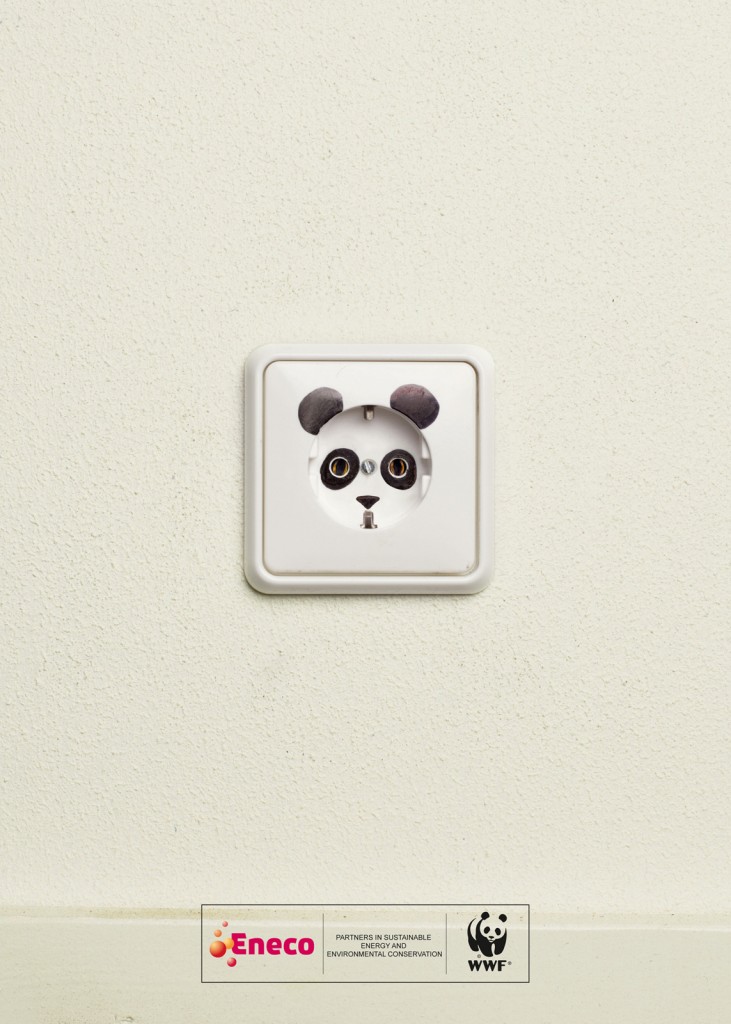
First look at the socket. It is tacitly understood that the ads is talking about energy (or may be electricity). You may not have idea what it is to do with panda. A decoration? And when you read further down, there’s a WWF label with its recognizable icon – the panda. So audience will immediately read what the ads says: Please help save species through power-saving! So save more power guys if you love panda =) (of course, for other animals’s sake as well)

The advertisement is so easy and simple that it doesn’t include headlines and body text to convey its messages. It attracts audience’s attention with only one simple colour on the background that helps focusing our attention on the image. The branding is linked so well with the image that people can quickly catch up and interpret what’s on the advertisement.

Must we have lots of graphics, colours, motions and texts to create compelling message? Definitely not! Creativity could be as simple and powerful as this.

Creativity not = complexity

I’ve later found some nice print ads with similar themes that I wanna share with you guys:

The washing power is so powerful that even the shadow of the clothes turns white! Although it is obvious that the image has been edited in photoshop, people can instantly know the function of the product: White, White, and White! No other message blends into the ads, so the message can be understood rather quickly.

This is the print ads from The Economists, the magazine that talks mainly about world news, politics, economics and business. Your first glance might not realize that the brain is made up of a number of magazine. Look nearer!! The subtle meaning may take time to comprehend. But I love the “smart” feeling that it gives.

No comment. =) Just brilliant.

Again, this is another ads with subtle details. Don’t get it? Think why McDonalds makes the font so BIG that it cannot be fit into the space!!!!!

For this one, you’ll need a bit of knowledge about cultural buildings. If you realize the reflection is actually a mosque – the Arabic/Islamic central building for worship. It simply means Naber Kaffee is soooooo Arabic!

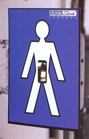
*Do you observe that the ads above have no single words describing the products, just a big picture with little variation in colours? Those are often my favourites!*

However, there are also some that I think the messages encoded are… not so nice may be?

The slogan is “always keep the content in its original bottle.” The product advertised is Anne Cream, cream hair remover. Got a hint? I actually looked through the and ads slogan a few times, and meditated for a while, then I got the message that perhaps the guy keeps the hair remover cream in other face moisturizing bottle, that he uses it without noticing that. The ads is way too subtle that it makes the message hard to interpret (may be I’m slow). Also, I don’t quite see how it advertises the greatness of the product.

This is “Road” from Nike. Nice colour blended together. But is this an… ads? It may be a picture. I may mistook it as print ads.

My first impression was: What IS THIS! It looks… unappealing to me. I totally didn’t get why there are so many horrible faces on the ads. After I read through the comments posted by others, only I noticed that those are juices spilled out from the desserts. Perhaps the juices should look more like juices??

Nov 14 / LinXin

I was lovin’ it

It’s Mcdonald again!!! But this advertisement does nothing about promoting or talking positively about Mcdonald’s; it targets at Mcdonald’s high-fat and high-calories menu instead.

YouTube Preview Image

After watching this ad, I supposed this would impose severe negative impact on Mcdonald’s sales, on burgers particularly, but in fact McDonald sales had gone up!

Wonder why? The adverse effect that the ad had created? Consumers want to be “on their way” earlier? New trend to have burger no matter how unhealthy it is?

No!

The answer is, McDonalds wheeled out a range of alternative to its famous burgers! So its sales had gone up because of the alternatives, not because of the burgers. What a smart act. Perceiving that its sales on burgers is gonna go down, it adopted the strategy of introducing substitutes to burgers. Burgers are unhealthy? Buy others then! Instead of focusing on how to clarify the nutrition that a burger could provide, McDonalds rather gathered its resources on promotional activities on new menu. Why argue? Rolling out the alternatives saved McDonalds not only from economic downturns and the negative impacts that the TV ads could have brought to its sales, but also it made Mcdonald’s financial stats looks so much better, while other firms worrying about the negative figures in their reports. It is a smart decision that kills two birds with one stone. However, introducing new product at this stage poses a great risk to take – firms have to be cautious that consumers will become more price sensitive during economic downtown, so they might not buy new alternative released. As it might have targeted the right market or positioned its products correctly (low-cost happy meals perhaps?), the new release eventually brought a boost in McDonalds’ sales.

http://www.abs-cbnnews.com/lifestyle/09/16/10/i-was-lovin-it-television-ad-enrages-mcdonalds

Nov 8 / LinXin

Everyone Saves for Something!

YouTube Preview Image

It is often a big headache for marketers to reposition a product or brand like Cheeseburger that has been established in the global market for quite a while and already in its maturity stage. Realizing the trend that people won’t spend additional bucks on fast food, McDonald eventually came out a penetration strategy, telling people that how much they can save on 2 Cheeseburgers and spend what they save on things they desire.

It shifts McDonald’s position further down in low-cost fast food category (being even lower-cost), however I don’t perceive the change of it’s position to even lower price equals lower quality (it isn’t that low, though. The price still somehow captures what consumer’s value on burgers. So charging a bit higher is necessary). In fact, the save-your-money promotional campaign that McDonald now embraces adds great value to its products – It’s fun, and it saves you money! I start wondering how low a Big Mac’s price would be in the future, as McDonald’s keeps lowering the price of its burgers (and size shrinking as well, huh!).

I love the way how it came out the creative promotional idea by wrapping all the stuffs with the Big Mac’s wrap. For people who have watched this video, when they see things are wrapped in Big Mac’s paper, they instantly get the message that, “Look, having Big Mac can save you bucks to get this!” For people who haven’t known the promotional activity, the act must have gotten their attention and people would want to find out what’s happening in McDonald’s!

Nov 1 / LinXin

About Mac

My beloved Toshiba had bid farewell to me last weekend. I was so sad indeed, that I thought it would be able to be my inspirational partner for another 3 years. It lived a remarkable life that inspired me greatly. I will miss my lappy dearly.=(

Life has to go on though. I cannot immerse myself too long in bereavement. So I spent my weekend on researching my new potential partner. I narrowed down my choices to Macbook Air and Macbook Pro. I recalled my friend Chang Jie has posted comments about Macbook Air (Tamar showed that in class). After reading through his comments I somehow disagree with a few points. Firstly, I find it very inconvenient to have only one USB port. After plugging in mouse I can’t connect mac air to other electronics like printer. Also, without the driver, it makes life more difficult when installing softwares that come in CD or DVD. Perhaps there are some ways to deal with these problems well, but currently I’m not educated on how to solve these problems, plus it’s time-consuming to do that. I was initially tempted by its beautiful solid design and amazingly small and light body; however as a traditional laptop user, Macbook Air will only be in my evoked set (marketing term!) when I want something fancy, light and highly portable. So in the end, I chose Macbook Pro! Will be receiving my little pretty partner in a few days more. Yipppeee! =)

Oct 24 / LinXin

Women VS. Men

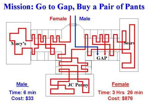
I hate what this picture depicts, but it’s a real fact about women…

http://primepuzzle.com/leeslightest/shopping.html

After some meditation, I still have no clues why women tend to shop and buy more than men do, even though I am actually one of them. To answers my question, I went to google “why women shop”.

From Girl.com, I knew that women tend to shop more nowadays because they are more financially independent, better educated, and I think most importantly, they are better in being able to make their own decisions. But men have those characteristics too! Men have been financially independent, educated and able to make their decisions, but why they tend to do shopping a lot lesser than women? I went on to continue searching the answer.

Then I have found an article in Businessweek.com talking about the rising female consume power. It says that even though women earn “only 78 cents for every dollar a men gets, they make more than 80% of buying decisions in all homes. Unlike men, women incline to do more research, shop more and are less likely to be influenced by ads.” This surprised me a little because I always thought women often do impulse buying; but instead, they don’t. As women always play the role of caregivers, it is no wonder they make mostly all the buying decisions at home. It could be that men are too lazy to look for goods that they always rely on women to do shopping for them, the “desire” to shop has been declining from day to day. So I took men’s laziness as one of the answers.

Also, I found that men don’t actually value the shopping experience like women, because they always think they have something more important to do (like playing video games since they wake up till they sleep on weekend). That in fact is so true because I once asked for my housemate’s help to carry a big bag of groceries and he handled that back to me after a while, and the stunning reason he gave me was he felt embarrassed to carry that around. Women view shopping as something interpersonal, engaging and satisfying, but apparently men don’t see it that way. The different perspectives that both genders have greatly contribute to the reasons why women shop more – imagine they still have to shop on behalf on men!

Oct 17 / LinXin

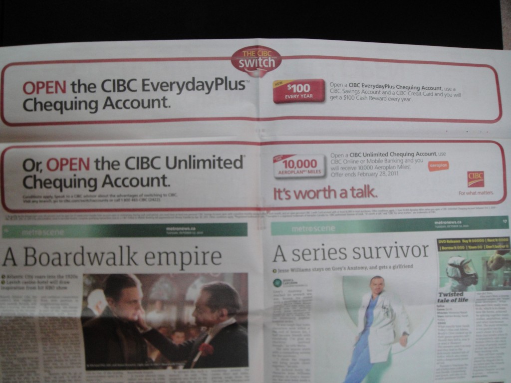
When I was reading Van Metro…

I found this!

Why??

Curiosity drove me

to flip the sheet

Perhaps it’s not something new on newspaper

But it gave me a little fun and smile while reading!

Oct 17 / LinXin

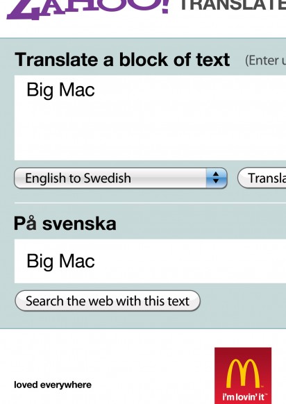
What is Big Mac?

Ever wonder what Big Mac is in other languages?

McDonald’s: BigMac is BigMac

The message: Despite the differences in culture, languages, traditional values, demography and etc., Big Mac remains to be Big Mac. =) Simply but salient, Mcdonald’s positions its products to be irreplaceable in the market, not even its product names. Want to get Big Mac? Go Mcdonald’s!

It is one of the thousands interesting and insightful advertisements I found in “I Believe in Advertisement” advertising blog. Not much words you could find in the blog, it’s all flooded with advertising pictures and videos from the globe. It serves mainly as a reference point for advertising professionals. I would strongly recommend this blog to people who don’t like reading (like me)! =D Get a blast with ads!

Spam prevention powered by Akismet