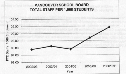
As part of the preliminary budget proposal the VSB presentation used a striking graphic that showed the increase in the ratio of staff to students over the past five years. The graph, as presented was visually convincing -clearly there has been a significant increase in the ratio. But, does the graph really tell the truth about the date?
VSB have an interest in justifying staffing cuts. The way in which the report presents the material a causal observer could be forgiven for thinking that indeed there has been a significant jump in staffing levels. However . . . .
The VSB Graphic
The difficult with this graph, though, is it is designed (either consciously or unconsciously) to convince; it’s not designed to explain. As noted in the Encyclopedia of Educational Technology
All too often graphs are used to confuse or deceive the unwary or naive viewer. Excellent graphs, those with graphical integrity, withstand such scrutiny and truthfully inform the viewer. They effectively explore complicated data and are tools for learning about, and gaining insight into, quantitative information.
A couple of points:
- restricting the vertical axis to values of between 92 and 104 visually emphasizes the increase in the ratio giving the impression that this has been a major increase
- accompanying explanatory text (see pages 6-7) draws attention to this increase in staffing and compares it to other districts without providing any contextualizing information other than saying that staffing in VSB is relatively higher than the comparison districts (which were not named).
- while the five year window is a common one it does not allow for an effective understanding of long term trends. Perhaps this momentary increase is a return to what was normal in period preceding the data represented in the chart; perhaps not. Nonetheless, the five year window is a very shallow time frame to suggest changes.
Here’s a more ‘objective’ representation of the data.
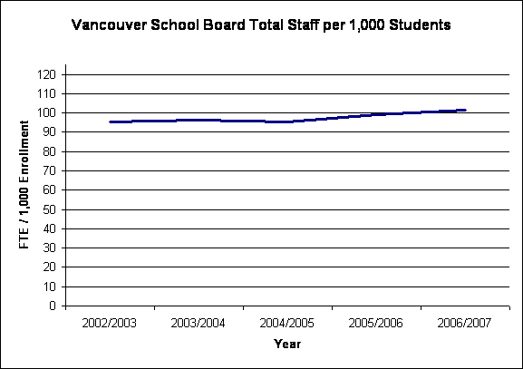
From this graph it would seem that there has been no significant change over the five year period at all. It is important to point out that there are difficulties comparing these two graphs visually. The VSB graph is the equivalent of cropping away all but the section of most interest and blowing it up in size. The second graph show the entire range, but could be accused of minimizing the impact (which it does). At the end of the day one needs to be confident that the way in which data is represented does tell the truth about the data.
The VSB graphics are important because they aren’t simply a piece of meaningless homework my children have been asked to do. These graphs are representations of real people and, when all is said and done, the VSB graph is being used to justifying ending a real person’s employment. This is the explanatory device that will be used to explain cutting supervision aids, cutting teaching assistants, cutting teachers, cutting administrators.
I don’t think it is too much to ask that the graphs are honest representations.
Pingback: In Support of Public Education » Blog Archive » VSB Proposes Job Cuts to Meet Funding Deficit