This week I expanded on the work I did last week using the zonal statistics calculated for the lava flows in Craters of the Moon. In order to search for interesting lava flows and trends in the data, I plotted the mean values of the various data layers that I collected zonal statistics from (based on the geologic units layer) in ArcMap. These include: RADARSAT-2 Circular Polarization Ratio (CPR) and intensity, AIRSAR Circular Polarization Ratio (CPR) and intensity, emissivity, apparent thermal inertia (ATI), albedo and elevation. I plotted the data sets in the form of X-Y scatterplots in various combinations. In order to see specifically where certain lava flows are located in different scatterplots, I placed data labels of the geologic unit corresponding to the data points.
In Excel, there is no way to plot unique data labels from another column that is not part of the X or Y data columns without adding a macro. A macro is used for automating a repetitive task in Excel so that it can be repeated over and over. I learned how to create an X-Y scatterplot with labels using a macro from this very helpful youtube video:
The link to the macro that can be used to add data labels to X-Y scatterplot data can be found here. This macro only works on Excel data in the form of cell A containing the data label, B the X-values and C the Y-values and is incredibly useful. Once the data is in this format and the macro is copied and pasted into the Visual Basic application window in Excel and saved as a .xlsm (a Microsoft Excel macro enabled spreadsheet), it can be accessed and then used on scatterplots from the Developer Tab.
Initially, the graphs I created contained data from all the zones in the area. An example of one of these initial graphs is below, comparing RADARSAT-2 Mean Intensity and RADARSAT-2 Mean CPR values.
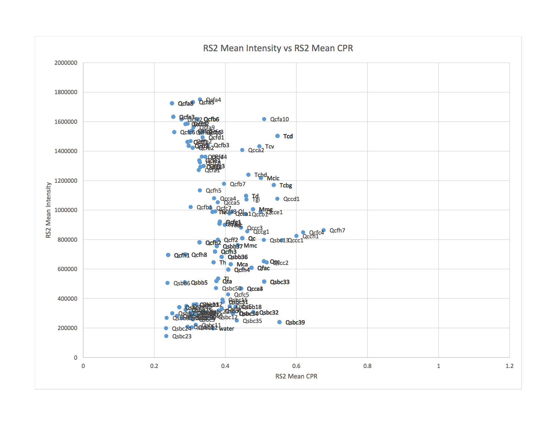
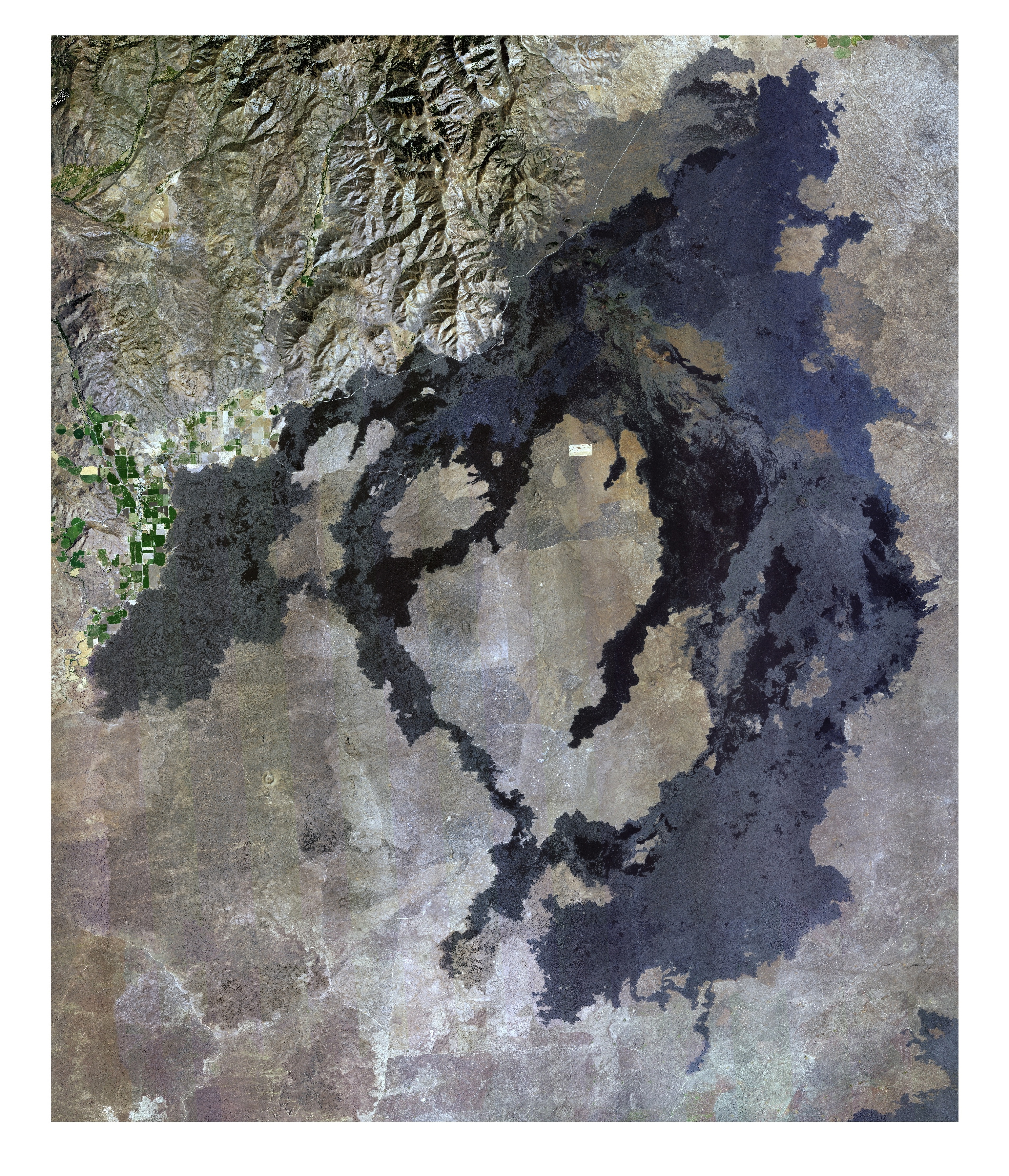
This graph is showing some clustering of flows in two areas that have the similar CPR values but differ in intensity. It is difficult to see which flows these are from the graph above because of the large concentration of data points and labels placed over top of one another. Furthermore, included in this graph are areas containing very old lava flows, lots of vegetation and water. In order to look at a less cluttered version of this graph, I made a new spreadsheet and kept data from only the major, younger lava flows, eliminating all unnecessary zones. The younger flows are the ones appearing significantly darker than everything else in the National Agriculture Imagery Program (NAIP) image below:
The graph that resulted from this was much less cluttered:
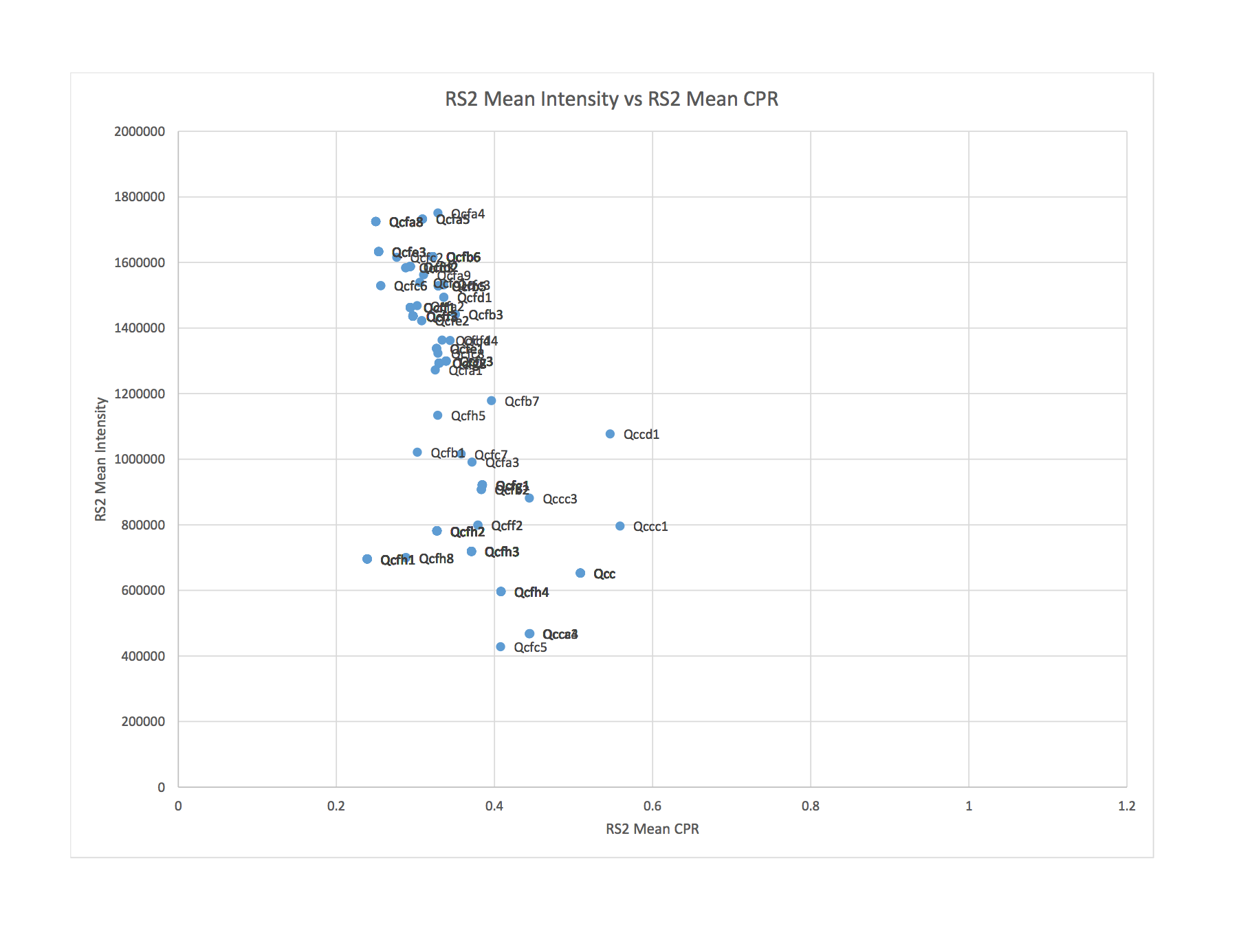
This graph also shows that the areas of lower intensity that had similar CPR values were mostly the older flows contained in our study area that we are less interested in.
The next step will be to spend time looking at the graphs closely, in an attempt to find interesting lava flows. I will also be figuring out how to highlight the flows that are contained within a much smaller area (zones that can be visited for ground truthing) in a different colour from the other data points, and seeing where they are located on various graphs.
RADARSAT-2 Data and Products (c) MacDonald, Dettwiler and Associates, Ltd. (2015) – All Rights Reserved. RADARSAT is an official trademark of the Canadian Space Agency.
Catherine
June 23, 2016 — 12:19 pm
Hmm. The fact that lower intensity flows have higher CPR leads me to think that this is a vegetation issue. Vegetation tends to have high CPR. What does this plot look like for AIRSAR data?