I worked with census data from Statistics Canada to visualize housing affordability in Metro Vancouver. I created two maps: the first shows the difference created by using different quantitative classification methods, and the second compares housing affordability in Vancouver between 2011 and 2016.
Quantitative Data Classification
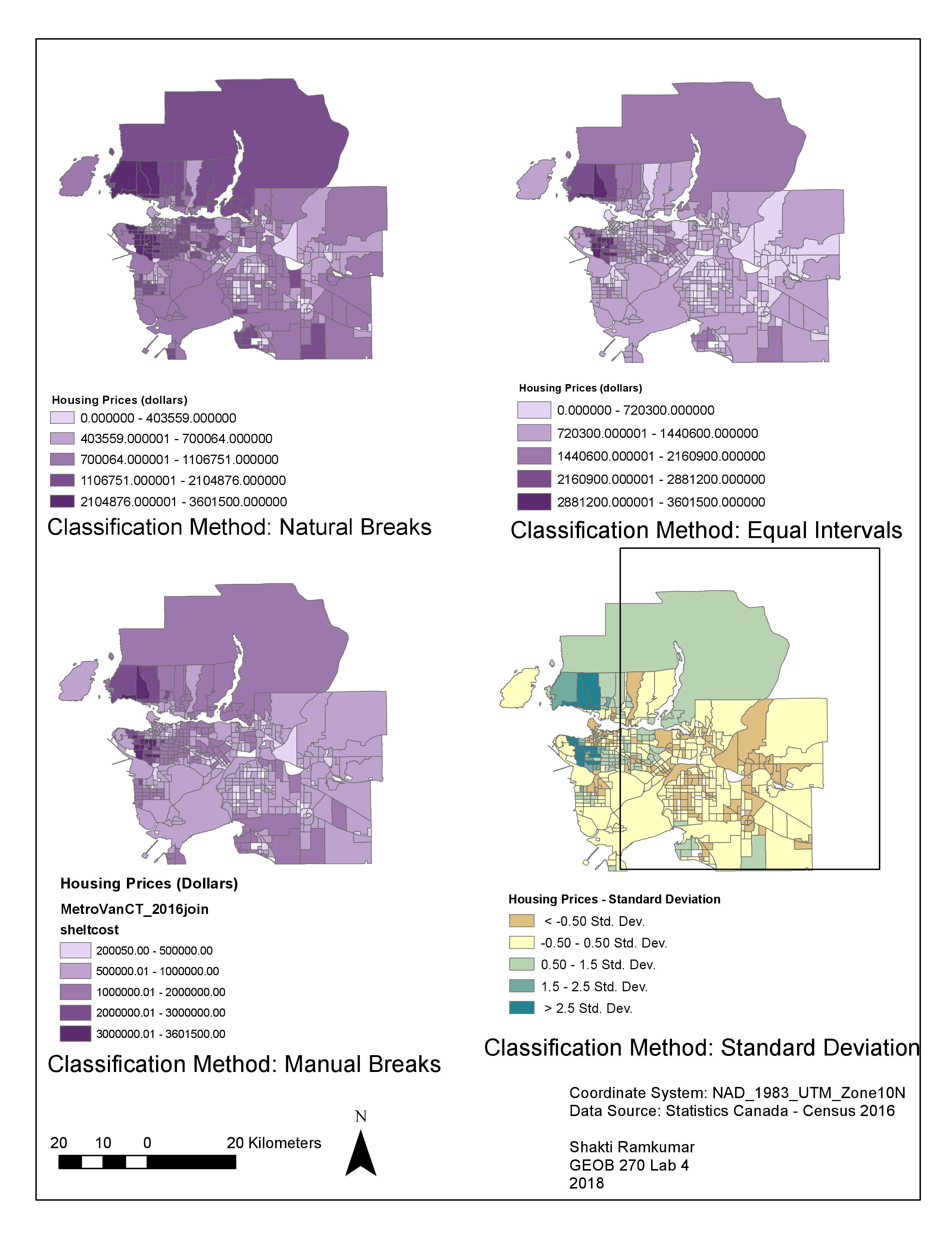
There are 4 methods of quantitative data classification:
- Natural Breaks: Data is split into classes automatically based on natural trends in the data. This is a commonsense method to visualize a normal data set, but often data are too scattered. This method is also not useful for comparing multiple maps each built from different information.
- Equal Interval: Data is split into equal-width classes. This method doesn’t take into consideration the distribution of the data, so it can create an unequal distribution of observations, or create classes with no data. This is best applied to familiar and uniform data ranges such as percentages and temperature, rather than housing costs. In this case, Equal Interval classification is misleading, as it appears that there are only a few expensive areas in Vancouver, when we know that much of the city is unaffordable for most people.
- Standard Deviation: Data is classified based on how much each feature’s attribute varies from the mean. This can be useful for a normally distributed data set where the purpose is to show deviation from average. In this case, it is not the most useful classification method, as Vancouver’s ‘average’ housing price is likely extremely skewed by expensive outliers, and it is not easy for the reader to see immediately how they could interpret that half the map is considered ‘below average’.
- Manual Breaks: The map creator can specify the number of classes and set ranges appropriate for the data. This method could be useful to compare maps across different locations with a standardized criteria, or if there are intuitive thresholds to highlight in the data range. This is a useful method for housing affordability, as housing is typically considered ‘unaffordable’ if residents spent more than 30% of their income on shelter costs. If income was factored in to the maps below, this would be a useful classification method.
Housing Affordability
The maps below compare housing prices in Vancouver between 2011 and 2012. The data used is from the 2011 and 2016 Canadian Census, collected by Statistics Canada.
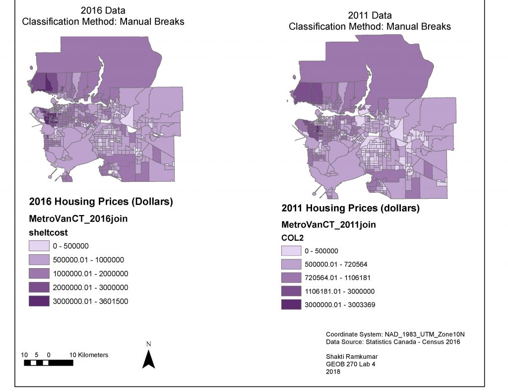
The housing prices displayed in the map is data on ‘Shelter cost’ collected in the census, which is the median cost of private dwellings, estimated by the owner. While this shows a particular aspect of housing affordability (value of private dwellings), it does not display the many other factors that are critical to assessing a city’s overall affordability. For example, we don’t see information about income in the city, and how that relates to this distribution of housing prices. A shelter-cost-to-income ratio would give a more holistic assessment of affordability. Additional data about the extent and cost of rental housing, statistics on homelessness and displacement, and information on trends in wages would further inform a comprehensive understanding of housing affordability in Vancouver.
Accomplishment Statement
I learned to access and download Census data, and use it for GIS analysis by adding it to a geodatabase. I joined tabular and spatial datasets in ArcGIS to visualize and classify quantitative information.