Culture Jam

Culture Jam

Original:

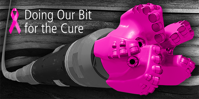
The Susan G. Komen foundation (formerly known as Susan G. Komen for the Cure) is the largest non-profit breast cancer awareness and research organization in the world, and one of the main forces behind the ubiquitous ‘pink ribbon’ campaigns. Even before I learned about the foundation itself, I knew about the pink ribbon campaign, and have participated in multiple fundraisers and charity initiatives myself throughout my time in elementary and high school. While pink ribbon-branded advertisements and products are numerous, from Blenz coffee cups to special pink Tictacs, the ad I have chosen for my Culture Jam is a partnership between the Komen foundation and Baker Hughes, a General Electric company (known as BHGE) operating in the oil and gas sector. In addition to a $100,000 donation to the Komen foundation, BHGE produced pink drill bits to be used for hydraulic fracturing (fracking) to raise awareness of breast cancer. The partnership also came with the advertisement above, “Doing Our Bit for the Cure”. As a young person concerned about the impacts of fracking on climate change and the environment, from its effects on soil and ground water to the methane flaring that occurs during the process, I was a little in disbelief at the dissonance between the charity’s mission to cure a disease and the idea that pink drill bits are helpful to the cause.

This ad ties into our exploration of intersectionality and interlocking forms of oppression. In my understanding of intersectionality, it is impossible to isolate “purely” feminist issues – they are inextricably tied to issues of race, sexuality, gender presentation, socioeconomic backgrounds, and other facets of people’s identities and lived experiences. With that in mind, I found it unsettling that the Komen foundation is (perhaps inadvertently) supporting harmful environmental activities which often have a disproportionate impact on poor and marginalized communities. A recent study in Science magazine which examined more than 1.1 million birth records in Pennsylvania, found evidence of negative health effects of in utero exposure to fracking sites within 3 kilomtres of the mother’s residence. The environmental justice issues connected to activities like fracking are also very much feminist issues, and cannot be separated from the Komen foundation’s overall mission to help and empower women.

Jammed:

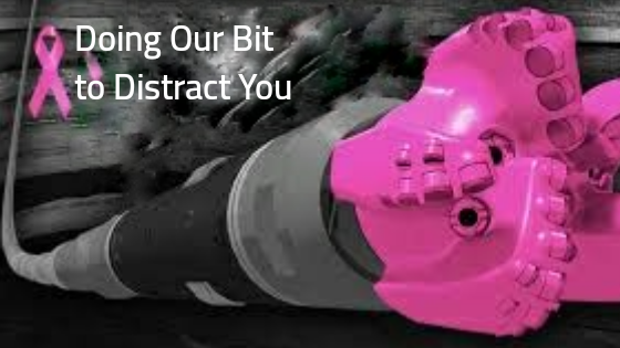
For my jammed version, I made two changes. First, I changed the text to “Doing Our Bit to Distract You” and second, I tried to create a slight image disturbance in the background to represent a methane flare. Burning off excess methane is one of the activities often following hydraulic fracturing, as the methane would be too expensive to store and transport to be used as fuel. Of course, this releases greenhouse gas emissions into the air, which contributes to climate change, but also may contribute to poor air quality for folks living near the flaring sites. The changed text, “Doing Our Bit to Distract You” refers to BHGE donating what really is just a “bit” – $100,000 is very little for a company of that size – towards a good cause, to distract the public from the substance of their activities, which involve enhancing fossil fuel extraction, including hydraulic fracturing.

Source: https://www.cleanwateraction.org/2016/01/28/protecting-our-air-methane

I also meant to show the ‘pink ribbon’ that also makes up the Komen foundation’s logo as part of the ‘distraction’, in addition to the distraction by BHGE, which is why I kept the ribbon in the image. In my research for this assignment, I gained valuable insight from the work of writer and activist Barbara Ehrenreich, particularly her 2010 piece in The Guardian, “Smile! You’ve got cancer”. In it, Ehrenreich speaks about her journey with breast cancer, specifically the often confusing and isolating experience of taking part in the “cheerfulness” of breast cancer culture. She writes about the pressure for women to be heroic and overwhelmingly positive through their treatment, and her concern about the many entities who aim to cash in on the movement. While finding solidarity in online survivor networks, Ehrenreich also writes about the risk of fully buying in a sugar-coated “pink ribbon culture”, that it can cause women to repress understandable feelings like anger and denial and can cause others to overlook critical issues in women’s health. Ehrenreich concludes that pinkwashing and heroic survivor narratives can perpetuate the harmful idea that there is a right and wrong way to experience breast cancer, and can close off space for diversity and disagreement, which I believe is a valid critique that can be extended to some of the Komen foundation’s work, including this particular pink ribbon partnership.


Peer Review: An Example

Summary

Throughout the Technical Writing course, we completed peer reviews for various assignments in our writing teams. The main purpose of a peer review is to provide feedback on writing style, flow, grammar and content clarity. It can be difficult to spot errors or areas for improvement in your own writing, so having a peer see the work with fresh eyes can help improve the final product. The following is an example of a Peer Review document, the most extensive one written in this course. I reviewed my team member’s draft formal report, and organized my review such that each heading and subheading directly mirrors that of my peer’s report. Creating a custom template that mirrors the original document helps the reviewer and the recipient to easily navigate the review and implement suggestions they find useful.

Peer Review of Draft Formal Report

TO: Erin Grace
FROM: Shakti Ramkumar
DATE: Dec 3rd, 2018
SUBJECT: Peer Review of Formal Report Draft

Dear Erin,

Thank you for your work writing and conducting research on “Increasing Cost Effectiveness while Maintaining Quality at Farmer’s Apprentice Restaurant: A Comparative Analysis.” Upon reviewing the document, the following suggestions for each section are provided to help improve clarity and focus on the intended audience, as well as tips for formatting. The Peer Review has also been sent to you as a Word document in an email, as it may be more readable in that format. Hopefully this review helpful in preparing your final report.

GENERAL FEEDBACK

The greatest strength of the report is its focused and specific topic, which has allowed you dive deep in your surveys and analysis to pinpoint appropriate solutions. The overall design and style of the report are very clear and graphics are used effectively to convey pertinent information.

 SPECIFIC FEEDBACK

Title Page:

  • A clear title
  • Author’s name and reader’s name
  • The date
  • Clear identification that this is a draft

Table of Contents:

  • Follows the sections of the report
  • One suggestion is to format the Table of Contents so that subheadings are indented one level to the right of the main heading to make it easier to read. An easy way to do this is by highlighting section titles in your report and formatting them as Heading 1 (for main heading), Heading 2 (for next subheading – for example, “Staff Surveys” and “Customer Surveys”) and Heading 3 (“Staff Work Satisfaction”, for example). If the titles in the report are formatted this way, when you update the Word-generated Table of Contents it should do the indenting appropriately.

INTRODUCTION

Background:

  • This introduction was very helpful for someone unfamiliar with restaurant practices. However when drafting the final report, the reader will be the General Manager Farmer’s Apprentice, so shortening the ‘Background’ section could orient it more towards a reader who is already familiar with this restaurant or the restaurant business in general. Considering the question from the Instructor’s Blog, “does my reader already know this information?” could be helpful.
  • The final paragraph on significant financial strain is direct and well-written and conveys the challenges you will address in this report.

Purpose and Scope:

  • Listing the “3 major topics” in either bullet form or as you did in the introduction with numbers in parentheses could help visually make it easier to read.
  • The purpose is clearly stated, and is realistic and specific.

Methods of Research:

  • The first two sentences “58 customers of Farmer’s Apprentice…” and “28 staff members…” could be rephrased so that they begin with words rather than numbers, to follow best principles in formal writing. A suggested rewrite could be “A survey was conducted among 58 customers…” and “A survey of 28 staff members was created to analyze…”
  • If you plan to include the Interview Questions in the final report, this section could be a good place to point to that part of the Appendix.
  • The secondary research section is well-written.

Limitations:

  • This section was very informative and highlights some of the greater challenges in addressing the issue of customer service and staff satisfaction. If it is difficult to collect information for you as a researcher, it must present the same challenges to upper management at these businesses for them to accurately assess how their business is performing in various aspects.
  • One suggestion for this section is to differentiate between the first set of limitations that has to do with customers and staff feeling uncomfortable, and the second set of limitations which is the sample size. The reason for this is the sample size (theoretically) could be increased simply with additional time, whereas the first limitation is more difficult to avoid for researchers like yourself and requires its own solution.
  • This section could also be moved towards the end of the report, rather than in the Introduction.

DATA SECTION

  • Great introduction that identifies the timeframe the surveys and reiterates the sample size.
  • The sentence “As aforementioned there were limitations with the research, but enough data was successfully collected to inform the recommendations” could be removed to make this introduction more concise, but also because it downplays the really impressive amount and quality of data collected and visualized in the next sections.

Staff Surveys:

  • First sentence summarizes the survey results generally, which is good.
  • This paragraph could be removed: As Figure 1 illustrates, most staff felt either very satisfied (50%) or satisfied (32%) at work with staff incentives as the most common indicator (46%) (see Figure 2). Other sources of work satisfaction were: quality of product and integrity of the restaurant (29%), customers (11%) and other (14%) (see Figure 2). The reason for this is that the graphics provide a very clear breakdown of the percentages, which are much more accessible to the reader presented in a visual format as you have done than in sentences. Following our instructions to “assume your reader is a very busy person”, the subsequent visuals are more helpful.
  • Instead a shorter sentence could just say “Staff were asked to rate their general work satisfaction (see Figure 1) and source of work satisfaction (see Figure 2)”.
  • Figures are clearly labeled and effectively deployed to convey important information.
  • Similar to the layout of Figures 1-3, Figures 4 and 5 would benefit from a layout where they are directly beside the text explaining that figure, rather than placed on their own.

Customer Surveys:

  • This section is concise, and the Figures are impressive and helpful to understanding.
  • Figures are not labeled in this section, so just a reminder for the final report.
  • Summary paragraph is great.

Interview with Carlin Sandor:

  • Bullet points are an effective way to convey information learned from the interview.
  • One suggestion in proofreading for the final report is to ensure that as much as possible, bullet points start with the same tenses/types of words. For example, under Staff Incentives, there is currently both “Possibility to scale back staff trips/parties” and “Possible to reduce staff meals”.
    • Under Financial Wellbeing “Unsure where to direct…” and under Economical Products “Not sure that it would…”
    • Standardizing these words would improve the flow of this section.
  • Avoiding big chunks of text and inserting bullets or a numbered list produces an easier to read document.

CONCLUSION

Summary of Findings:

  • This section clearly summarizes the findings from the three forms of primary research conducted.
  • Secondary research hasn’t been addressed so far after being mentioned in the beginning of the report, but in the final draft, there could also be a paragraph summarizing the secondary research and your main findings from that.

Recommendations:

  • Great use of “YOU” language.
  • Subheadings are used in effective ways to break up text
  • The solutions to lower inventory levels and eliminating a repetitive schedule are specific and focused, and achievable.
  • The citation to “Laube and Erickson” indicates secondary research, but unclear how this research influenced the recommendations.

Overall, this report provides specific and valuable recommendations that could be implemented by Farmer’s Apprentice. There is a wealth of data collected and displayed, which are persuasive to the reader in leading to the same conclusions. To summarize, re-formatting the Table of Contents to more clearly display subheadings would make it faster for the reader to identify relevant sections of the report. Including findings from secondary research, and a list of references in MLA format would follow through from the stated Methods of Research. Finally, orienting the Background section to a less general reader and towards Carlin Sandor specifically would improve the conciseness of that section.

I really enjoyed reading this report, and learned a lot about restaurant management and the challenges and opportunities to improve financial efficiency at service-oriented businesses. I hope that my suggestions are useful in creating your final draft.

Best,
Shakti

Formal Report Proposal

Summary

Before starting a research project and report, it is important to write a research proposal to define the key research question, the scope of the research, and to ensure the report’s outline meets the needs of the reader. In this case,  I created a proposal that identifies the goals, scope, and methodology of my research project in the form of a memo to the instructor, in order to obtain approval to proceed with the project.

Proposal

To: Dr. Erika Paterson
From: Shakti Ramkumar
Date: October 13, 2018
Subject: Proposal for Improving UBC’s Food Sustainability Commitments

 Introduction

The University of British Columbia has identified sustainability as one of its key institutional priorities, outlined on UBC’s main website and in UBC’s recently released Strategic Plan, which is intended to be a guiding document that shapes the development of the university for the next century. Additionally, UBC’s Climate Action Plan has a target of reaching 100% net zero greenhouse gas (GHG) emissions, with a baseline of 2007 levels, by 2050.

With these strong commitments made to sustainability, UBC aims to serve as an example to other institutions around the world. However, one aspect of sustainability that is missing from UBC’s climate action commitments is the issue of food.

Statement of Problem

Industrial agriculture and fishing operations are a major contributor to the production of greenhouse gas emissions, deforestation, and have harmful impacts ecosystems that are often irreversible. Yet, this connection between food systems and climate change is not explicitly addressed in UBC’s Climate Action Plan.

Food insecurity and access to affordable sustainable food is also a growing issue for students, yet the Sustainable Food Guide is outdated, featuring vendors that no longer exist, and also does not provide tangible information on pricing and ecological footprints that would be useful to students on a day-to-day basis.

Proposed Solution

One solution to highlight the links between food and climate change is to incorporate evidence-based information about sustainable food systems UBC’s Climate Action Plan. This would be significant because these documents inform where funding is allocated for innovative emissions-reductions projects, future research priorities, and for student-focused initiatives. However, recognizing that institutional change can take a long time to trickle down, a simultaneous student-centered approach is also necessary. For this, I propose a re-issuing of the Sustainable Food Guide, to update it for 2018 and make it easily accessible for students.

Scope

To assess the feasibility of improving UBC’s food sustainability initiatives, I plan to pursue the following six areas of inquiry:

  1. What are UBC’s current strategies and commitments to improve the sustainability of food systems locally and globally at the following levels?
    1. Operational: UBC’s procurement strategies, vendors’ priorities, price setting
    2. Research and Academic: research clusters, courses, designated staff, professors exploring food sustainability
  2. What do students know about sustainable food initiatives on campus, particularly the Sustainable Food Guide?
  3. What food-related issues do students care about that extend beyond campus?
  4. What would encourage more students to make use of the Sustainable Food Guide in their decision-making?
  5. How were students consulted in the creation of UBC’s Sustainable Food Guide and other food sustainability initiatives?
  6. What are the pathways available to students and student groups to lobby for changes to UBC’s climate change and sustainability commitments?

Methods

My first area of inquiry will involve a deep dive into publicly available information on UBC’s website to summarize UBC’s current food sustainability initiatives, and to identify staff and researchers in the field who may be useful to interview. To address my areas of inquiry 2-4, I will need to speak directly with students. In order to connect with more students at once, I plan to reach out to a diverse set of student groups or representatives, rather than focus only on a survey for individuals.

For my final two areas of inquiry, I will speak with staff from UBC Sustainability, UBC Farm, and Campus & Community Planning to get a clear picture of how thoroughly UBC conducts student consultation.

My Qualifications

I have been studying food sustainability and food security in my discipline of Geography at UBC, as well as independently in my extracurricular work. I worked on a food security strategy and asset map for the City of Surrey’s Department of Sustainability, where I realized that high-level strategies and commitments need to be directly actionable for the public in order to be successful.

I have also been involved with sustainability groups on campus for several years, serving as the Co-Director of Common Energy UBC, and as a member of the Sustainability Collective. With the Sustainability Collective, we successfully advocated for climate change and climate justice to be included in UBC’s strategic plan, so I gained some experience in identifying and speaking with staff during that process.

Conclusion

The issue of food sustainability is a necessary addition to UBC’s climate change action c Food sustainability commitments. Food sustainability initiatives at universities also to be centered on principles of equity and inclusion, ensuring that all 50,000 students at the institution have access to useful information. Improving student outreach tools such as the Sustainable Food Guide is one step to take towards this goal. With your approval, I hope to begin research on this project.

Writing Letters of Complaint and Adjustment

Summary

In society, many of us simultaneously maintain roles as civilians, consumers, employees, family members and colleagues. In all of these roles, effectively communicating and responding to complaints and bad news is an important skill to build good relationships, or repair ones that are at risk. In this assignment, I crafted a ‘complaint letter’ that described faulty products I received from an electronics company, and a response letter from the company that attempted to resolve the unfortunate situation. These response letters are sometimes called ‘adjustment’ letters in the technical writing field. The main technical writing skill used is the ‘Writing with You’ attitude, where the writer must prioritize the needs and situation of the reader rather than placing themselves as the most important subject in the correspondence. The following example also shows how to write without using condescending language or harsh imperative verbs, while still maintaining clarity and minimizing ambiguity.

Letter 1: Complaint Letter

Shakti Ramkumar
A and K Mining Ltd.
Vancouver, BC
P.O. Box 45678

November 10, 2018

BC Computers
2629 West Mall
Vancouver, BC

Dear BC Computers:

Last week, I placed an order for eight NavCom 1 devices to be delivered to A and K Mining offices by November 10th, in time for an off-site project commencing December 3rd. Upon delivery, I noticed that three out of eight devices were damaged, with detached outer casings and one with a chip on the glass front. As my colleagues will be using the devices for specialized field projects, it is important that all eight devices are in perfect condition.

A and K Mining has been a longtime customer of BC Computers, and we have always had exceptional service and received high quality products. We look forward to resolving this issue and ensuring that systems are put in place to avoid similar situations.

To resolve this issue, we would like to request that some or all of the damaged NavCom 1 devices are replaced before December 3rd, as that is the last possible date before our company’s project begins off-site.

Thank you for your urgent attention to this order.

Best,
Shakti Ramkumar

*********************************

Letter 2: Bad News Letter or Adjustment Letter

BC Computers
2629 West Mall
Vancouver, BC
(604) 123 – 4567

November 12, 2018

Shakti Ramkumar
A and K Mining Ltd.
Vancouver, BC
P.O. Box 45678

Subject: Regarding damaged NavCom 1 units

Dear Ms. Ramkumar:

We received notice this morning that three out of eight NavCom 1 devices shipped to A and K Mining Exploration Ltd. arrived in a damaged condition. We would like to apologize for this situation, as the quality of our products and your satisfaction are our highest priorities. We have taken several measures to ascertain the cause of the damage to ensure it does not occur again.

We have checked with the technicians at our manufacturing unit, who ensured us that all eight NavCom 1 units complied with design standards upon testing. We have also reviewed the quality control records of our shipped products and confirmed that all devices were in satisfactory condition when loaded onto the delivery trucks. We have attached a copy of these quality control reports for your review.

Our investigation into the matter leads us to conclude that the damage to the three units must have occurred during transport and delivery. We will be working with Pacific Transport, our longtime carrier, to determine where and how the damage occurred and make any changes to the process as needed.

In the meantime, we would like to replace your three damaged devices, with complementary shipping and handling. We currently have two completed NavCom 1 units in our inventory, which will be shipped to A and K Mining Exploration Ltd. immediately and will arrive in time for your departure to Northern BC on March 3rd for your on-site evaluation. As for the third device, please let us know immediately whether all eight devices will be required on the departure date of December 3rd. If so, we will work overtime to produce the final unit and have it shipped to your preferred location by December 3rd.   If the third device is not needed for March 3rd, we would like to offer you a 10% discount on this order, as a gesture of goodwill.

We are grateful for A and K Mining’s ongoing partnership with BC Computers, and we look forward to assisting you with your projects.

Kind regards,

J. Watson

Jim Watson

Self-Assessment Reflection

In this blog entry, I will reflect on my learning process and work over the past term in English 301, as well as explore how my skills and strengths support my future goals. As this is an all-encompassing reflection, it will be quite broad. To see more specific reflections on various aspects of communication and writing, see this index of my reflections throughout the course. See also this post for a reflection on the design process for this Web Folio.

Learning Process

I have discovered that I am very much an applied learner, in two ways. First, I learn best by applying concepts to create something tangible – whether that is a report employing certain writing techniques and best practices, or a map employing technical features I’ve recently learned. Second, I learn best by forming connections to other teachings, courses, extracurricular work, and current events. For example, in this course, I reflected deeply on the ‘Writing with YOU’ principles and business communication principles by connecting it with what I have learned in Geography about the need to critically assess the biases and perspectives of the author. I applied this by making sure that I do not represent as universal what is merely my own opinion, and that I recognize sources errors and biases whenever possible throughout my assignments. Realizing that I learn best by forming meaningful connections, I connected the topic of my Final Report (on Improving UBC’s Food Sustainability Commitments) to my extracurricular work and interests. Building on my experience with advocating for climate action at UBC, I took on my most challenging project yet, which I was able to capture in a unique way through creating a Formal Report.

Strengths and Weaknesses in Assignments

Looking through my assignments this term, I have identified three strengths in my work: being creative and expressive within the restrictions of the assignment form, critically analyzing myself at multiple stages, and making efforts to select interesting topics. These strengths have helped me to stay engaged in the course. As this was my first time taking an online course, I was concerned that I would find it hard to stay engaged throughout the term without the benefit of interacting with the class in person. However, spending some extra time on choosing assignment topics I felt were truly interesting, and to push myself to be creative even if the assignment form didn’t always encourage it (such as a memo, or email). My main weaknesses are organizing my Team Forum posts, and at times being too wordy. One thing I struggled with this term was keeping up with the Team Forum, Facebook group, Facebook group chat (for my writing team), and a blog all at once, while balancing my other courses. I posted my assignments in the wrong place when in a rush, which I’m sure created unnecessary inconvenience for our instructor. I also could improve on writing fewer words, letting go of the need to be comprehensive in favour of being engaging.

Impact on Future Goals

Throughout this term, I have learned how to work effectively with a team without ever meeting. This is a useful skill in today’s world. I often have to work with teams remotely in my job at Student Energy, and the systematic process of peer review and clear communication memos are incredibly useful skills that I hope to integrate into my future work with remote teams. I also learned the importance of storytelling – both about my work and about myself. After nearly six years of having a completely blank Linkedin profile and an out of date resume, creating these in this course, as well as a complete Web Portfolio, was an opportunity to highlight my work experience and career interests in ways I never would have otherwise. This process helped me to see running themes and ideas in my own work and life choices that I had never noticed before, which was exciting!

Reflecting on the Web Folio Design Process

This was my first time designing a personal portfolio of any sort, let alone a digital one. When creating my Web Folio, I developed a list of four major areas of consideration to guide my design process:

  1. Creative self expression
  2. Audience
  3. User-friendly navigation
  4. Highlighting relevant academic and professional experience

Creative self-expression

It was important to me that my Web Folio was an honest reflection of myself in every way possible, from the type of content highlighted to the aesthetic components selected. Formal documents like resumes and transcripts so often have little space to show originality, creativity, and fun. A Web Folio presents an opportunity to showcase these aspects of my personality – they may not have earned me a grade in university, but they are essential components I bring to all my goals and work! I expressed myself in several ways throughout this Web Folio. The most obvious might be the colloquial, friendly language I used on my Home page. I chose this type of playful language deliberately, as I have learned throughout my degree to challenge the idea that stuffy, conventional academic writing is the only way to convey credibility – in fact, this belief has historically left out many valuable forms of communication that has occurred through storytelling, oral histories, art and creative nonfiction . There is plenty of academic language for readers to navigate in my sample work, so I chose to create a concise and fun home page to show my range of writing.

For my Home page banner, I selected a striking image of an iceberg that I photographed on my expedition to Antarctica in 2014, because it represents a life-changing moment that still drives my work in climate action and sustainability, which is a key theme throughout the posts on my portfolio. I created a logo featuring a cartoon rendering of me as a Rosie the Riveter-esque figure, to represent my passion for justice and equity. I chose the image to be without a defined face, to show that so much of my work is collaborative and supported by my communities, rather than suggesting that I take ownership. The image is placed on a background of two intersecting circles, which symbolizes that I am a product of the intersection of many identities and the diverse ways of knowing that comes with each. I embedded my original logo in the banner, and also made a custom site icon that continued the same colour scheme and design elements that occur throughout the website. 

While these may seem like minute details, they show my detail-oriented personality and also help my Web Folio to be as professional as possible.


Audience

Nearing the end of my undergraduate degree, I am exploring options for further studies at the postgraduate level, as well as interesting work opportunities. As I have not settled on a direction, I chose to create my Web Folio to display the wide range of things I have learned in my university career – which are not at all restricted to the letters and numbers on my academic transcript.

One way I considered my audience was to choose clear and descriptive titles for all of my posts, whether they were ENGL 301 assignments or other work I chose to highlight. This is important, as to an external audience, a post titled “ENGL301 Report” would mean very little, and might discourage the reader from clicking. However, a report titled “Report on Food Sustainability Commitments at UBC” is immediately clear and more inviting. I also included brief summaries on each page, to give busy readers an idea of the full contents of the page or post.

I also chose to differentiate the language used in my ‘About Me’, ‘Resume’ and Linkedin Profile pages. I did this deliberately, as each of these three pages are three different ways to learn about my experience and interests. In my About Me page, I use more personal, prose-like language to give the reader a sense of who I am as a learner, and what my broad interests are. In my Resume page, I use bullet points and performance metrics when possible, as resumes are often reviewed for only a few seconds and the most important information needs to be clearly visible. In my Linkedin page, I have more information about my courses, a succinct and memorable profile summary, and short paragraphs describing my unique roles in each of my professional experiences.

Summarizing pages through various levels of abstraction (Introductions, Summaries, link descriptions) and crafting pages using diverse language forms to provide useful information for many types of readers are some of the ways I considered ‘Audience’ in creating my Web Folio.

User-Friendly Navigation

The main drop-down menu uses logically organized subcategories to guide users through the website’s pages and posts. The Home page also shows a summary of each of the main pages, allowing readers to see a snippet of the posts contained within, to draw readers to different sections. Additionally, the Home page is anchored by an attractive visual, to further encourage engagement with the website.

Highlighting relevant academic and professional experience

I chose to highlight my work in geographic information science, as it involves both academic and technical skills that are highly relevant to my Geography degree. I selected four of my best projects to display, with appropriate project summaries, visuals, and most importantly, an ‘Accomplishment Statement’ at the end of each post that concisely summarizes the technical skills I’ve acquired from that project, which would be useful to any employer looking through my portfolio. I also created a Professional Development Reflection post to summarize my key takeaways in terms of interpersonal skills and project management skills, as these are often overlooked in technical fields, but are nonetheless crucially important.

Professional Development Reflection

Working with ArcGIS in GEOB 270 helped me rediscover my curiosity and enthusiasm for learning to work with new software, which I haven’t had an opportunity to do since my very first programming course back in first year, and even further back, when I made short films for fun in high school. Through the five labs, I learned how to transform overwhelming data into an accessible visual final product, and the advantages of doing so. I found myself spending many hours beyond the weekly labs trying out different variations to organize and visualize data than was suggested in the labs just for fun, and troubleshooting by researching on my own when things (inevitably) fell apart. I learned that I am very detail-oriented and have a knack for finding creative and efficient ways to do tasks, by combining best practices from the many resources and helpful GIS experts online. If I could do the course again, I wish I could have made the time to think of and pursue an original research question for the final project with my team, as I think selecting a research topic and defining its parameters is a challenge unto itself. From our lessons on ethics, I learned how data can be used to argue so many different perspectives, and construct very specific narratives. It would have been an interesting exercise to examine if/how our own subjective decisions on topic selection influenced the final product.

Final Project: Rental Housing Affordability of Four Canadian Universities

Rental Housing Affordability of Four Canadian Universities

My team of three chose to compare rental housing affordability surrounding four Canadian universities: UBC, the University of Alberta, McGill University and York University. Our Abstract highlighting our process and main findings can be found at the end of this post, along with a sample of our maps.

See our complete report and all maps here: GEOB 270 Final Project

We had three main goals for this project:

  1. Use GIS to visually display housing affordability, which we defined as a ratio of median income to median cost of rented dwellings.
  2. Use GIS to display concentrations of youth throughout the city, to determine if there was a correlation between areas with unaffordable housing and high concentrations of young people.
  3. Compare average tuition costs at each of the four universities, to get a sense of overall affordability at each university.

Project Management

All three of us were involved in the data acquisition, GIS analysis, and report writing parts of the project. We began by meeting in the lab to start to work on one of the cities together, where we were able to make decisions about which census data to download, how to set up our maps, and finalize the scope of our GIS analysis. After this initial meeting, we each worked independently on affordability and age maps for one particular city, though often at the same time in the lab. I found this process to be efficient, as we could ask each other questions and troubleshoot, and also ensure that we were following similar procedures in terms of map design so that the four cities’ maps could be compared.

Learning

This topic was interesting for me as someone who has experienced both living on campus and doing the 1 hour+ commute that so many UBC students do. Housing affordability was also the hot topic in the past municipal election, including affordability challenges for young people – I even wrote about it for the Ubyssey. One thing I learned by doing this project is to always take a more critical look at the many statistics, maps and charts used to advocate for any point of view, which I realized I did not do at all when following the debates during the election. For example, some visuals that appeared during the election claimed it was a ‘buyers’ market’ based on falling home prices, while others warned of rapidly increasing unaffordability. Having to wrestle with questions on how to measure affordability and how to draw accurate conclusions from data has taught me to sift through data and visuals more critically.

We also learned that there is a data gap to accurately compare university affordability, because we only had access to Census data for median income and concentrations of youth aged 15-29 for the entire Vancouver population. University surveys (when they were available) often used uneven criteria or did not directly collect the data we were looking for, so there is a data gap that we stumbled upon through completing this project. This data gap and challenges in comparing university affordability could of interest to various departments at UBC – for example, the AMS, which conducts an annual Academic Experience Survey and has a mandate to advocate for affordability, or UBC’s Planning department, which has studied Student Housing Demand.

Some interesting GIS analysis techniques we used was in creating our ‘Buffer Zone’ maps where we analyzed affordability and age distribution within 8km buffers surrounding each university and had to clip census data to the buffers, and also clearly show in our map design that we are only looking at a specific selected area.

Managing data within the team was a challenge, as we often worked on different components of the project at different times. We settled on uploading our complete project file to Google Drive at the end of each work session, which was effective, but quite a slow process. In future, I would advise creating a system to track changes and versions by 1) a naming convention for .mxd files that indicates its edit date or version, 2) noting which parts of the project were completed at what time in a shared Google Doc and 3) storing up-to-date project files on a USB, rather than relying on the H: drive or Google Drive.

Abstract
This project compares the rental housing affordability of four Canadian universities: The University of British Columbia (UBC) (Vancouver, BC), University of Alberta (UA) (Edmonton, AB), McGill University (MGL) (Montréal, QC) and York University (YU) (Toronto, ON). A Geographic Information System (GIS) was used to visualize rental housing affordability surrounding each university, defined in this project as the ratio between median income and median cost of rented dwellings. Specific attention is given to areas within 8 km of each university, as research shows many students prefer to live within this commuting distance. To compare the four cities, maps were created to display the concentration of university-aged students (defined broadly as ages 15-29) in each city compared to the wider population. The spatial distribution of university-aged students and rental housing affordability in those areas was compared. Average annual tuition costs at each university were also compared, as an additional factor influencing overall university affordability. This analysis shows that McGill is the most affordable university to attend in terms of rental housing affordability, followed by the University of Alberta, and York University, with the University of British Columbia being the least affordable.

An example of the four maps produced for each city.
Click to enlarge.

York University Affordability Map – full city (Toronto), and within the 8 km buffer zone surrounding the university


York University Age Map – concentration of people aged 15-29 within the full city, and within the 8 km buffer zone surrounding York University

Planning for Flooding/Storm Surge

In this project, I created four maps to highlight the areas in Metro Vancouver that face a risk of flooding or a storm surge during a potential extreme weather event. The flooding danger zone selected was all areas that lie below 8 m elevation, up to 1 km inland from the shoreline. The third and fourth maps also display roads and schools that would be affected by potential flooding, as well as the site of the new St. Paul’s hospital. To highlight these zones on the map, I used digital elevation models (DEM) data for Metro Vancouver and specifically the False Creek area represented as a raster, and vector data layers that displayed the Metro Vancouver shoreline, roads, and schools.

The first map shows all low elevation areas in Metro Vancouver (<8m), created by classifying the DEM raster.

The second map shows potential flooding areas, which are all low elevation areas up to 1 km inland from the shoreline. I created a 1km buffer around the shoreline and conducted a buffer proximity analysis by intersecting the low elevation areas with the 1 km buffer to display areas of potential flooding risk.

The third map highlights the major roads that fall within the flood risk area. I found that nearly 200km of highways and expressways would be affected by potential flooding.
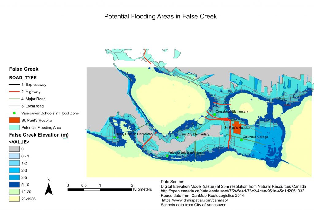
The final map focuses specifically on the False Creek area, highlighting roads and schools in the potential flood risk zone, as well as the proposed location of St. Paul’s Hospital.

Schools in flood zone:
Columbia College
Crosstown Elementary
Elsie Roy Elementary
False Creek Elementary
Henry Hudson Elementary
Royal Canadian College


In the fourth map, the Digital Elevation Model used has a higher resolution (smaller pixel size) of 1m, compared to the 25m DEM resolution used for the previous maps. A finer resolution is important in this case, as the 1m DEM map displays more of the variation in elevation and more detailed shoreline features. The differences between 3-10m are more apparent in the DEM file with finer resolution, which may not be necessary when looking at a very large region such as Metro Vancouver or BC, but are necessary when studying a smaller area such as False Creek. Using a coarser resolution DEM could result in error, because it may not precisely highlight flood prone areas on a block or neighbourhood scale.

Accomplishment Statement

In Lab 3, I learned how to work with two different types of spatial data: raster data and vector data. I used Conversion Tools in ArcGIS to convert a raster into a vector in order to identify common information between the two layers. I also isolated relevant sections of data by creating a buffer zone, and querying for certain criteria in the data attribute tables. Finally, I learned how to create new features such as polygons, by using the ArcGIS Editor tool.

Visualizing Housing Affordability in Metro Vancouver

I worked with census data from Statistics Canada to visualize housing affordability in Metro Vancouver. I created two maps: the first shows the difference created by using different quantitative classification methods, and the second compares housing affordability in Vancouver between 2011 and 2016.

Quantitative Data Classification

There are 4 methods of quantitative data classification:

  1. Natural Breaks: Data is split into classes automatically based on natural trends in the data. This is a commonsense method to visualize a normal data set, but often data are too scattered. This method is also not useful for comparing multiple maps each built from different information.
  2. Equal Interval: Data is split into equal-width classes. This method doesn’t take into consideration the distribution of the data, so it can create an unequal distribution of observations, or create classes with no data. This is best applied to familiar and uniform data ranges such as percentages and temperature, rather than housing costs. In this case, Equal Interval classification is misleading, as it appears that there are only a few expensive areas in Vancouver, when we know that much of the city is unaffordable for most people.
  3. Standard Deviation: Data is classified based on how much each feature’s attribute varies from the mean. This can be useful for a normally distributed data set where the purpose is to show deviation from average. In this case, it is not the most useful classification method, as Vancouver’s ‘average’ housing price is likely extremely skewed by expensive outliers, and it is not easy for the reader to see immediately how they could interpret that half the map is considered ‘below average’.
  4. Manual Breaks: The map creator can specify the number of classes and set ranges appropriate for the data. This method could be useful to compare maps across different locations with a standardized criteria, or if there are intuitive thresholds to highlight in the data range. This is a useful method for housing affordability, as housing is typically considered ‘unaffordable’ if residents spent more than 30% of their income on shelter costs. If income was factored in to the maps below, this would be a useful classification method.

Housing Affordability

The maps below compare housing prices in Vancouver between 2011 and 2012. The data used is from the 2011 and 2016 Canadian Census, collected by Statistics Canada.

The housing prices displayed in the map is data on ‘Shelter cost’ collected in the census, which is the median cost of private dwellings, estimated by the owner. While this shows a particular aspect of housing affordability (value of private dwellings), it does not display the many other factors that are critical to assessing a city’s overall affordability. For example, we don’t see information about income in the city, and how that relates to this distribution of housing prices. A shelter-cost-to-income ratio would give a more holistic assessment of affordability. Additional data about the extent and cost of rental housing, statistics on homelessness and displacement, and information on trends in wages would further inform a comprehensive understanding of housing affordability in Vancouver.

Accomplishment Statement
I learned to access and download Census data, and use it for GIS analysis by adding it to a geodatabase. I joined tabular and spatial datasets in ArcGIS to visualize and classify quantitative information.

Spam prevention powered by Akismet