This was my first time designing a personal portfolio of any sort, let alone a digital one. When creating my Web Folio, I developed a list of four major areas of consideration to guide my design process:
- Creative self expression
- Audience
- User-friendly navigation
- Highlighting relevant academic and professional experience
Creative self-expression
It was important to me that my Web Folio was an honest reflection of myself in every way possible, from the type of content highlighted to the aesthetic components selected. Formal documents like resumes and transcripts so often have little space to show originality, creativity, and fun. A Web Folio presents an opportunity to showcase these aspects of my personality – they may not have earned me a grade in university, but they are essential components I bring to all my goals and work! I expressed myself in several ways throughout this Web Folio. The most obvious might be the colloquial, friendly language I used on my Home page. I chose this type of playful language deliberately, as I have learned throughout my degree to challenge the idea that stuffy, conventional academic writing is the only way to convey credibility – in fact, this belief has historically left out many valuable forms of communication that has occurred through storytelling, oral histories, art and creative nonfiction . There is plenty of academic language for readers to navigate in my sample work, so I chose to create a concise and fun home page to show my range of writing.
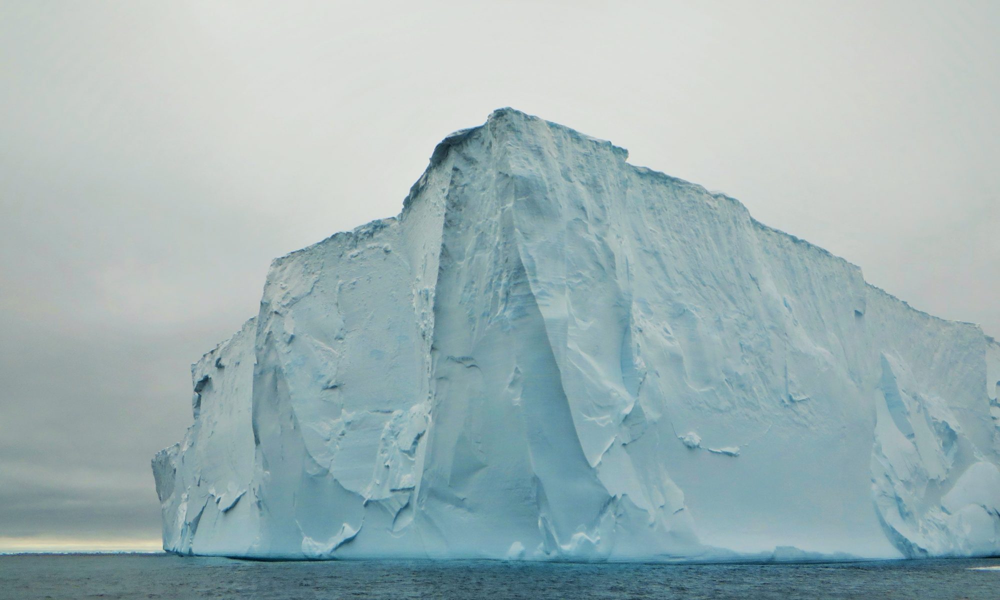
For my Home page banner, I selected a striking image of an iceberg that I photographed on my expedition to Antarctica in 2014, because it represents a life-changing moment that still drives my work in climate action and sustainability, which is a key theme throughout the posts on my portfolio. I created a logo featuring a cartoon ![]() rendering of me as a Rosie the Riveter-esque figure, to represent my passion for justice and equity. I chose the image to be without a defined face, to show that so much of my work is collaborative and supported by my communities, rather than suggesting that I take ownership. The image is placed on a background of two intersecting circles, which symbolizes that I am a product of the intersection of many identities and the diverse ways of knowing that comes with each. I embedded my original logo in the banner, and also made a custom site icon that continued the same colour scheme and design elements that occur throughout the website.
rendering of me as a Rosie the Riveter-esque figure, to represent my passion for justice and equity. I chose the image to be without a defined face, to show that so much of my work is collaborative and supported by my communities, rather than suggesting that I take ownership. The image is placed on a background of two intersecting circles, which symbolizes that I am a product of the intersection of many identities and the diverse ways of knowing that comes with each. I embedded my original logo in the banner, and also made a custom site icon that continued the same colour scheme and design elements that occur throughout the website.
While these may seem like minute details, they show my detail-oriented personality and also help my Web Folio to be as professional as possible.
![]()
Audience
Nearing the end of my undergraduate degree, I am exploring options for further studies at the postgraduate level, as well as interesting work opportunities. As I have not settled on a direction, I chose to create my Web Folio to display the wide range of things I have learned in my university career – which are not at all restricted to the letters and numbers on my academic transcript.
One way I considered my audience was to choose clear and descriptive titles for all of my posts, whether they were ENGL 301 assignments or other work I chose to highlight. This is important, as to an external audience, a post titled “ENGL301 Report” would mean very little, and might discourage the reader from clicking. However, a report titled “Report on Food Sustainability Commitments at UBC” is immediately clear and more inviting. I also included brief summaries on each page, to give busy readers an idea of the full contents of the page or post.
I also chose to differentiate the language used in my ‘About Me’, ‘Resume’ and Linkedin Profile pages. I did this deliberately, as each of these three pages are three different ways to learn about my experience and interests. In my About Me page, I use more personal, prose-like language to give the reader a sense of who I am as a learner, and what my broad interests are. In my Resume page, I use bullet points and performance metrics when possible, as resumes are often reviewed for only a few seconds and the most important information needs to be clearly visible. In my Linkedin page, I have more information about my courses, a succinct and memorable profile summary, and short paragraphs describing my unique roles in each of my professional experiences.
Summarizing pages through various levels of abstraction (Introductions, Summaries, link descriptions) and crafting pages using diverse language forms to provide useful information for many types of readers are some of the ways I considered ‘Audience’ in creating my Web Folio.
User-Friendly Navigation
The main drop-down menu uses logically organized subcategories to guide users through the website’s pages and posts. The Home page also shows a summary of each of the main pages, allowing readers to see a snippet of the posts contained within, to draw readers to different sections. Additionally, the Home page is anchored by an attractive visual, to further encourage engagement with the website.
Highlighting relevant academic and professional experience
I chose to highlight my work in geographic information science, as it involves both academic and technical skills that are highly relevant to my Geography degree. I selected four of my best projects to display, with appropriate project summaries, visuals, and most importantly, an ‘Accomplishment Statement’ at the end of each post that concisely summarizes the technical skills I’ve acquired from that project, which would be useful to any employer looking through my portfolio. I also created a Professional Development Reflection post to summarize my key takeaways in terms of interpersonal skills and project management skills, as these are often overlooked in technical fields, but are nonetheless crucially important.![]()