A Guest Blog post by MFA Design student Mandi Lau who’s set designer for our upcoming production of Sarah Rhul’s Dead Man’s Cell Phone ~
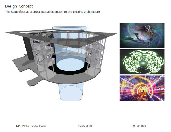
The use of the arena configuration in the Telus Studio Theatre is an honest and direct response to the existing architecture. From my recent lighting design experience in the space for The Madonna Painter, I noticed a lot of great qualities, as well as unique design potentials that set apart the Telus from all other black box or conventional proscenium style of theatres.
The Telus has quite a few flaws as a theatre in terms of practicality (ie. the lack of an overhead grid and efficient rigging system etc.), but nonetheless, it is a very interesting and special piece of architecture. For example, the unique “flexibility” of the Telus comes from the 12 movable towers that hold the audience seating, but such quality is only true to the extent that half of those remain attached to each other to form a semi-arena of box style seating, which there is no escape from.
The fact that there are three separate floors of seating in each tower creates an enormous sense of height and closure within such a small space. This imposing sense of height is not only to be felt by the performers but most importantly impacts greatly on how the audience perceives the space for the duration of the performance.
Most often for the audience members on the towers, they have to sit on the edge of their seats and lean on the ledge that surrounds the seats (in groups of 4) for the entire show in order to be able to see what is happening down below on “stage”.
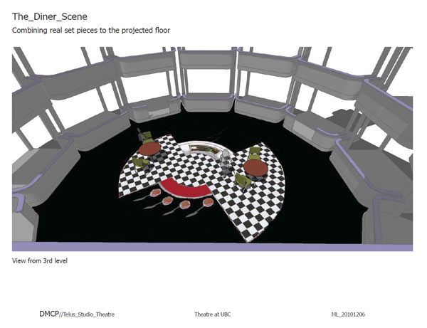
If those unique spatial features of the theatre are appropriately utilized and appreciated, it could reward any production with a great theatrical experience rather than imposing a rigidly fixed set into the already limiting space. For this reason, I want to take this special opportunity and emphasize designing on the ground, embracing the floor that is already existing as the central focal point of the space.
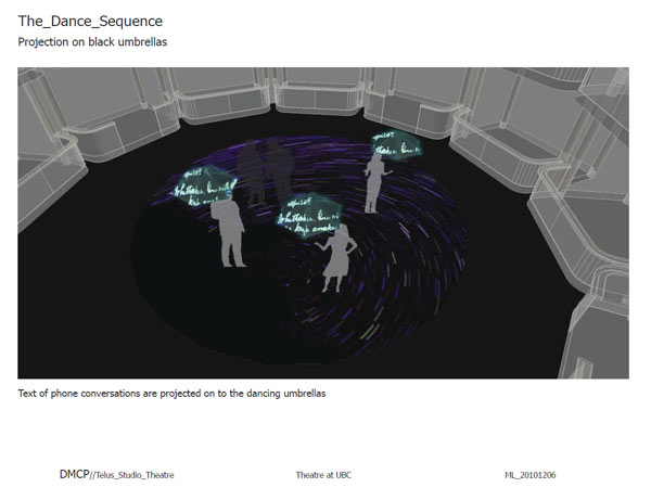
This, in turn, will create a theatrical experience that is unique to the Telus. It is also an exploration and experiment to challenge the conventional “forth-wall-picture-frame” perception of theatrical spaces with a minimalist set and projected stage floor. The use of light and multimedia imagery from multiple projectors will morph and sculpt the space into different locales as the story unfolds. The design of the set and the stage itself only exist for the duration of the play, making all a temporal experience just as any live performance. ~ Mandi Lau
Note: Dead Man’s Cell Phone opens January 20, 2011. To see production photos, designers’ portfolio and more go to the Dead Man’s Cell Phone show site. Tickets are Reg. $22/Senior $15/Student $10 and are available online.


