Skip navigation

Monthly Archives: February 2017

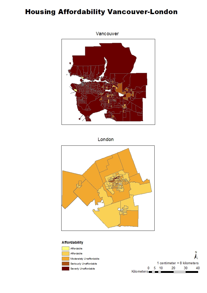
Housing affordability here is going to take into account the housing cost by household income, because every single city has a higher or lower income. This usually happens because larger cities have a higher income like Vancouver in this case compared to a smaller one like London. Moreover, to make data accurate and correspondent to this concept, we have to normalize the cost of housing by income for any city.

The housing affordability ratings are determined by the “Demographia International Housing Affordability Survey”. These ratings are divided into four categories and basically they define how affordable or unaffordable housing is in a specific area: affordable 3.0 & under, moderately unaffordable 3.1 to 4.0, seriously unaffordable 4.1 to 5.0 severely unaffordable 5.1 & over. However, the source where a map comes from has to be trustworthy, otherwise the data could be manipulated for personal interests.

At last, affordability is a good indicator of city’s livability because it takes into account the house cost by income, leading to an accurate indicator of how affordable a city could be or not independently of its geographical location, size, or economic situation.

There are many ways to classify and represent data in maps, and every single method will influence the interpretation of the data. These classification methods are useful when it comes to specific purposes; where a user needs to communicate certain information to a certain type of public.  Moreover, talking about ethical implications regarding these methods, there are many ways of representing a map for different circumstances, and as long as the data remains true to the source, then it should not be a problem the method used to classify it. Finally, in the image below there are four examples of different classification methods: Natural Breaks, Equal Interval, Manual Break and Standard Deviation.

These four maps about housing cost in Vancouver include data that is classified by four different methods, so the user can decide where is the best scenario to utilize them. For example, If I would be a journalist, I would choose the Standard Deviation map because that one shows the difference between the attribute value of an entity with the medium, and this would help to emphasize the values that are above or below the medium. If I would be a real estate agent, I would opt for the Manual Breaks map because it allows me to manipulate and emphasize data in the way that I want my clients to understand the information.


Vancouver health care and educational facilities at risk list:

The health care facilities in risk are; False Creek Residence, Broadway Pentecostal Lodge,and Yaletown House Society. And the educational facilities are; Emily Carr Institude of Art and Design, Henry Hudson Elementary, False Creek Elementary, St Anthony of Padua, and Ecole Rose des Vents.

These areas were defined by performing an analysis of areas in Vancouver at 1km shorline distance, that were up to ten meters above the sea level.

St. Paul’s Hospital at Risk

The new location of St. Paul’s Hospital at Risk is at potential flooding risk as the image shows. It is entirely inside of the flooding region.

Spam prevention powered by Akismet