In my essay on Blake’s “Introduction” in The Songs of Innocence, I focused on the use of colour scheme and religious symbolism that relate to the overarching themes of purity, Boehme’s contraries and the consequences of human creativity. Due to word limit and possible confusion, I omitted my discussion on the use of symmetry and will thus record my thoughts on it below:
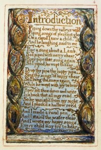
Illustration for “Introduction” from Songs of innocence
Much research claims that the human mind is attracted to symmetrical figures, whether this is with architecture or other humans. Often, the immaculate and heavily detailed bilateral replication means that symmetry is associated with perfection.
How does this affect the companion engraving to Blake’s illustration of “Introduction” in The Songs of Innocence? Although there doesn’t seem to be much content graphologically, the use of symmetry at first glance is evident. As an experienced engraver, Blake subtly alludes to the idea of perfection through the use of symmetry. The clear and even contrasting distinctions in colour – particularly between the dark green vines and the light blue background create clear barriers or divisions that are mirrored on both sides reinforcing this symmetry. Whereas artists may use multiple axis’s of symmetry to connote perfection, note that the use of symmetry here is only on a vertical axis due to the use of colours.
As a romanticist that was often critical of religious institutions however, and one of the first authors that mixed both graphology and typography, Blake utilized his illustrations in order to forge a more subtle meaning behind his composition. A closer inspection of the illustration reveals that the illustration is not as symmetrical as it seems from the first glance. The top of the vines split in different directions and different tones are used to highlight them. Moreover, the figures drawn within the spiraling vines are distinct and individual from one another, further highlighting the sense of asymmetry.
In my essay, I explain how the boy on the cloud is a divine being of some kind, and Blake uses colour in the introduction to criticize the linear view of the Gods. Blake may have believed that the Gods themselves should not always seem pure, as there are contraries in everything. This is reproduced in this illustration – not only does the “Introduction” have significant religious symbolism and may be Blake’s written commentary on the Gods, but the illustration also doubles as Blake’s visual commentary. In particular, the use of the vertical axis emphasizes the upward flow of the illustration, where upward is often connotative of heaven or the God’s domain. Moreover, the shift of colours from blue to white as the viewer’s eye moves upward reinforces this claim as white is often symbolic of purity, and thus the Gods.
Whereas symmetry is symbolic of perfection, asymmetry can be symbolic of imperfection. Blake seems to suggest visually then, that the Gods should not be viewed purely as absolutely perfect and divine but also imperfect. Through the understanding of Blake’s beliefs during the context of production, we can unveil a more complex and contrary understanding of his illustration.
Note: for some reason copying this from word doc. means I can’t really change the indentation – sorry about that!