In Part One of our Mascot Madness series, we—
that is to say, KAI & TAYLOR of Confidential, TREVOR (Features) and JUSTIN (Coordinating) of the Ubyssey, and NEAL of Insiders—
laid out the CUS’s nefarious plan to make their faculty seem cute and cuddly by designing a new mascot. Naturally, we had some things to say about the submitted designs: namely, that they’re all unrepentant, derivative hogwash. SERIOUSLY YOU TRACED A DISNEY LLAMA WTF
After the jump, we’ll be taking on six more submissions—three of which are men in suits! Way to buck the trend, guys.
Arden the Eagle
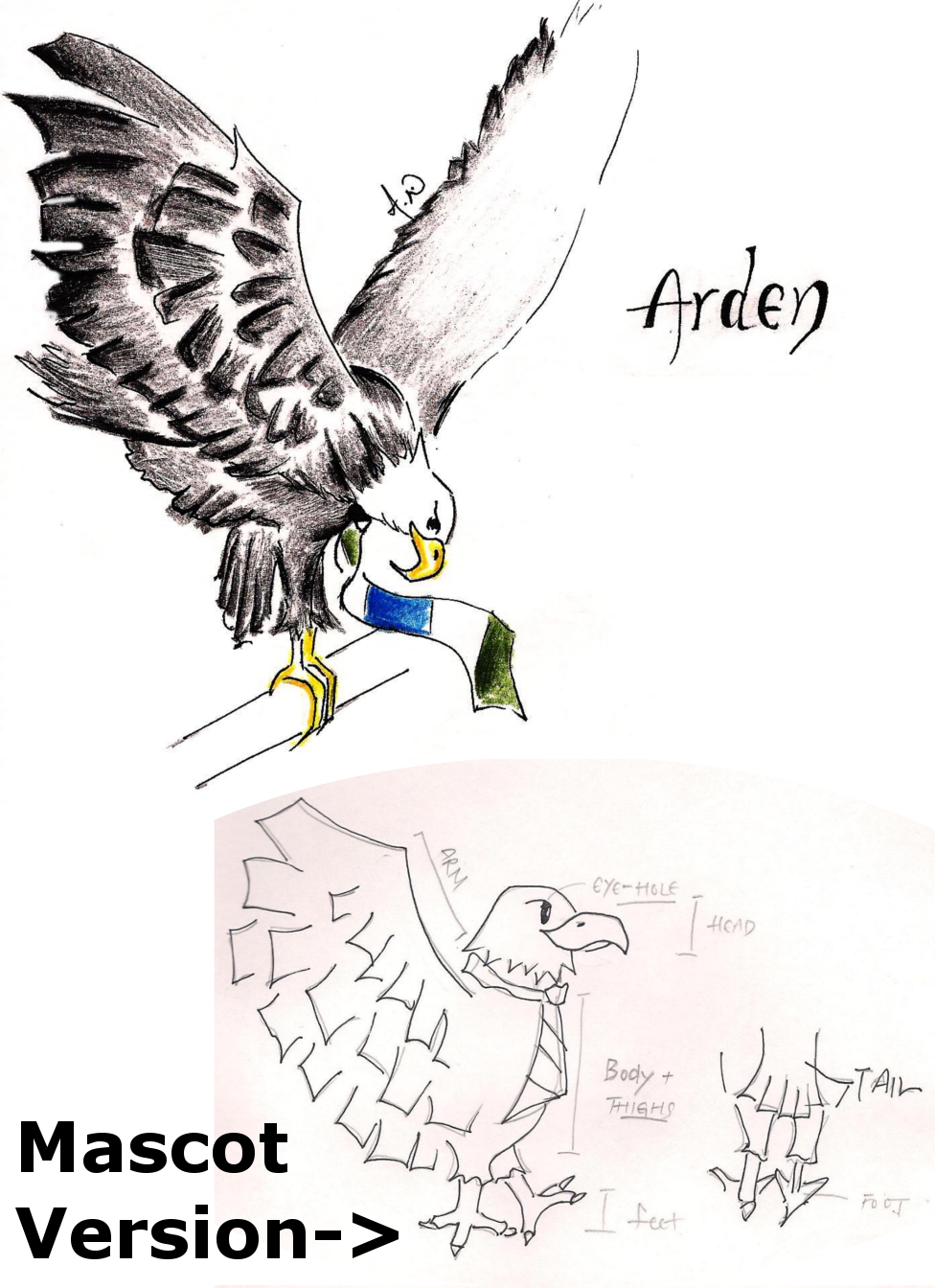
Actual quotes from Arden’s ‘bio’ describe him/her/it as:
“the most powerful bird that has ever graced the limitless sky.”
“preys fall quickly in the hands of this almighty creature.”
“eagle’s strength and charisma is admired by all.”
Soooo that makes this the official “we’re loud and proud narcissistic pricks who will one day OWN you” mascot. Unlike all the others, we suppose. But at least our glorious Commerce overlords will have, uh, grace. And charisma! That’s gonna make earning 1% of what your company’s CEO does so much more bearable in future.
Worthless art school diploma rating: It looks like an eagle, we guess. Bonus points for including a “mascot version” complete with a diagram of where the tail would be. Just in case the designers would be confused. What, is this the same teenage girl that did that gawdawful phoenix?? OH, WE’RE SO ON TO YOU, Miss Noble Anthropomorphized Avian Creatures 2010. $$$
Post-ironic stereotype reclamation: Again with the ties. And while the eagle itself isn’t inherently funny, the description that went with it is. Some more excerpts:
“With respect to Sauder students, each of us are potential leaders in the future.”
“Like an eagle we can make precise decisions that can benefit the company or our careers.”
Um, yeah. You do that. $$$$
Jawbs the Shark

Jawbs, the only graduate (or part-time) student mascot, is true to life—he definitely looks like one of the sad, slightly doughy, defeated-looking graduate students you see trudging to Sauder, contemplating where it all went wrong and how they ended up devoting ten plus years of their life to number-crunching. Apparently Jawbs “can open doors that didn’t even exist before,” because he’s all mature and shit. Unfortunately, Jawbs can’t open doors that do exist. Note the hands—or lack thereof. Also, Jawbs’ version of “letting loose” is putting a T-shirt over a dress shirt and hanging out with undergrads. Rebel!
Worthless art school diploma rating: You know what’s great? Microsoft Paint. Its “fill” tool is great. Sadly, it doesn’t have “draw legs to scale” or “draw nose to scale” or “remove creepy eyelids” as tools. Otherwise, this drawing would also be great. Also, the ever-present tie. $
Post-ironic stereotype reclamation: Sharks are the sort of animal one would associate with Sauderites. Otherwise, another one that screams “weird” and “deformed” above all else. $
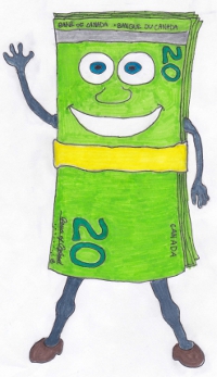
It’s a pile of money. With a smiley face. And soul-sucking eyes. “To many people he’s just a stack of cash, but to Commerce students he’s what business is ALL ABOUT!” The lack of self-awareness is wonderful. A true capitalist mascot would be made of thousand-dollar bills, or possibly hundreds. But twenties? Not a sign you’re getting ahead in the world. Realistic expectations in a down-turning economy, perhaps? The arm up is a sure sign that Kenny represents the new CUS fee, their own money waving goodbye. Also, we would’ve gone with “Johnny Cash” as his name, but that’s just us.
Worthless art school diploma rating: Knobby knees, scrawny arms, a weird high-heel/hoof combination for shoes—it’s obvious Kenny’s expenditures go to something other than fashion. The money clip is a clever insinuation of prestige, and adds a dash of colour. Also, props for making the bill bilingual. $$$
Post-ironic stereotype reclamation: What is Commerce about? Money. Only money. That’s it. That’s all there is to life, really. Glad we cleared that up, and got all that awkwardness out of the way. $$$$$
Mr. Com-Earth
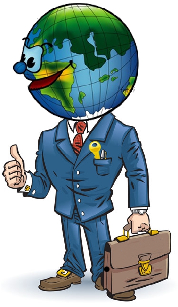
Mr. Com-Earth: he’s a whole new world of buzzwords!
Look, we understand that you’re trying to promote a global, international kinda image here. Kudos on the sustainability shoutout; loving that you’ve made corporate responsibility a selling point. But really, you think you’re fooling anyone with that GOLDEN KEY in his front pocket? Oh yeah, I bet that’s just generic symbology. No keener societies here, no sirree.
Global buzzword time aside, this is just the same old shit, different package. Maybe in a couple years you guys can design an innovative second mascot for Sauder: Mrs. Com-Earth! She does the same things as Mr. Com-Earth, but her suit has a skirt, and there’s a big red bow stuck somewhere in the middle of Europe. Oh, and she gets paid two-thirds of what Mr. Com-Earth does oh shit feminism
Worthless art school diploma rating: There was a time when we might have bought that a Commerce kid drew this. But it seems much more likely that someone else was paid to do this. Look at that professional-style shading—the line width variation—the way the hands look like real person hands! Pac-Man eyes aside, way to go, Artwork Commissioner. Man, those Emily Carr kids are really hurting for money, huh? $$$$$
Post-ironic stereotype reclamation: Business suit, honour society, ugly gold accessories. BUT WAIT he’s got a globe for a head. Overall a weak submission and a mediocre idea which neither confirms nor denies our suspicions of Sauder—which means it may just be the best thing in this competition. $$$
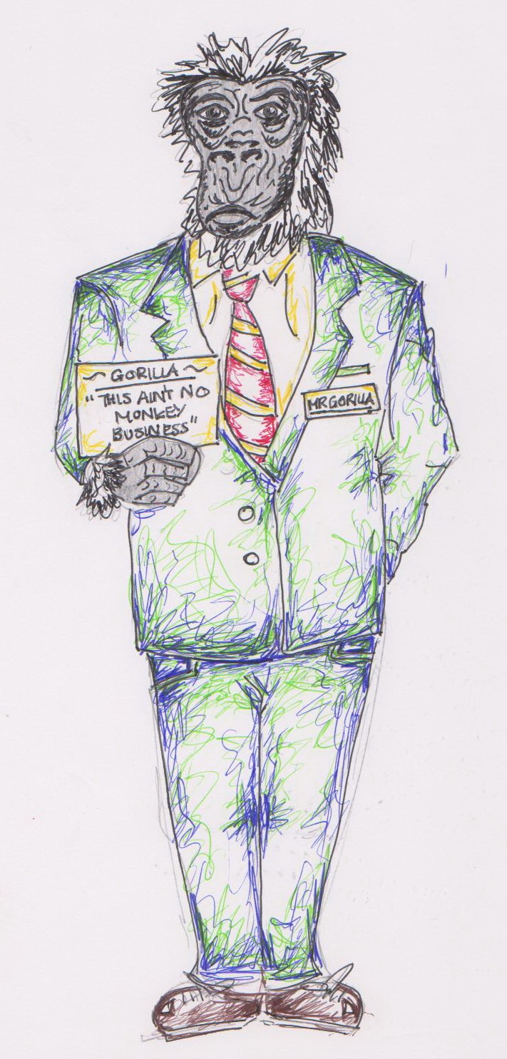
Guy #1: “So, we’ve drawn this awesome gorilla. Let’s send it in for the contest!”
Guy #2: “Dude, wait. We totally need a name for him.”
Guy #1: “Aw shit. I dunno, how about Jerry?”
Guy #2: “Nah, man, that’s lame.”
Guy #1: “Well, fuck it, you come up with an idea then!”
Guy #2: “This is bullshit, coming up with names. How about Mr. Gorilla?”
Guy #1: “Nice.”
Worthless art school diploma rating:
Guy #1: “Come on, we should actually draw in the colours.”
Guy #2; “Who the fuck am I, Picasso?”
Guy #1: “…Who the fuck is Picassa? Look, are we just gonna put it in with an incredibly detailed head and then nothing else?”
Guy #2: “Fine! You want colour?”
(Guy #2 angrily scribbles some blue, green and yellow onto the gorilla)
Guy #2: “There. We coloured it. Happy?”
Guy #1: “What about the shoes? Are those sneakers, or loafers, or-”
Guy #2: “SHUT UP” $$
Post-ironic stereotype reclamation: It points to the smug belief of Sauderites that they’re “the most intelligent mammal”, without being too obvious about it. Which, given most of the other submissions, is refreshing. Commerce kids aren’t the type for odd, self-deprecating signs though. $$
FUN TRIVIA: It’s “coarse,” you mouth-breathers, not “corse.” “Pursues,” not “persues.” God, don’t any of you future world leaders have spell-check? RAAAAGE
Mr. Trump the Sauder Suit
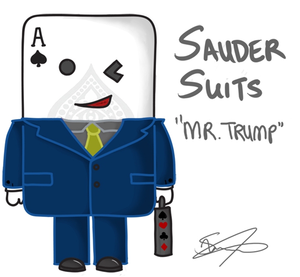
It’s The Donald, in playing card form. He’s going to “trump” competitors, be it in the business world or in high-stakes coke-fuelled backroom poker games. Keeping the pun train groaning into its station, “suit” has a double meaning here–it can be used to indicate that he is a spade-type playing card, or that he is currently wearing the garment/class indicator referred to as a “suit.” He knows how to “cut” through the cow-turd and “call a spade a spade.” Also, of all the cards in poker, the ace of spades is the best. As near as we can tell, the logic goes something like, “Mr. Trump will make a good mascot because none of these jokes are difficult to understand, and most of us went into Commerce because we like to think of ourselves as the future Donald Trumps of the world.” We’re so thrilled for you all.
FUN TRIVIA: Our practice of spelling out what is already painfully obvious about this mascot is pretty much exactly what the artist sent in for their discription, minus the cracks about drug abuse. We’d like to think that an Emily Carr student sent Mr. Trump in as a prank, but if that’s the case then we’d also like to think the same applies to the rest of these mascots. And frankly, we don’t think Emily Carr students care that much.
Worthless art school diploma rating: This mascot looks like it was created by some one who used to spend time with colouring books when they were young. That’s right, they were playing with crayons when they could have been concocting schemes to swindle their friends out of valuable trading cards. The fact that they left out Trump’s hideous bird-nest haircut is the mascot’s one saving grace, although it indicates they are unable to create shapes that are not squares, triangles, or spades. The fact that this artwork is signed, quite frankly, astounds us. What, you were afraid someone was going to steal it? $$
Post-ironic stereotype reclamation: It’s Donald Trump, but in poker form. So, basically, it’s their god. $$$$$
Come back tomorrow for the third and final part of our Mascot Madness feature, which we will definitely not be calling “Revenge of the Sith.” We promise.
http://static.guim.co.uk/sys-images/Guardian/Pix/online/2010/5/19/1274290165633/The-2012-Olympic-and-Para-005.jpg
I think I love you all a little too much now…
Bahahahhhaaaaa.
That is all.
This is the best peice of writing I’ve seen since AMS elections.
Definitely brought a few laughs here in an office of the corporate world