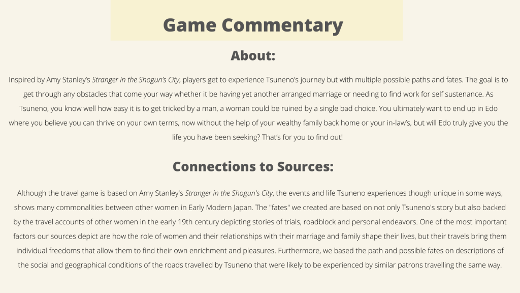
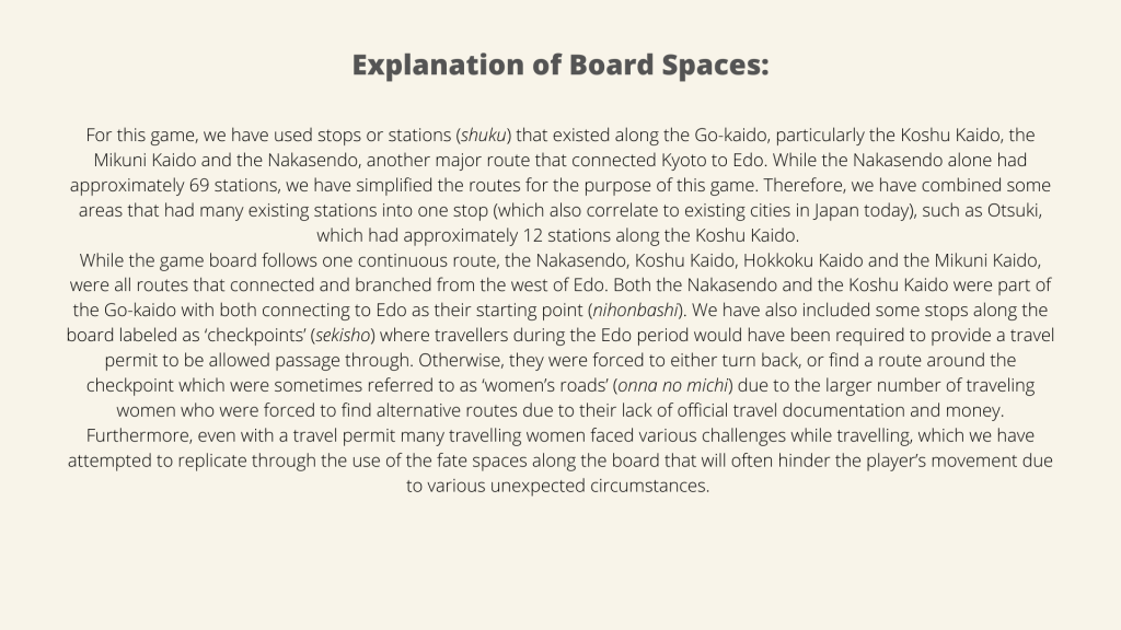
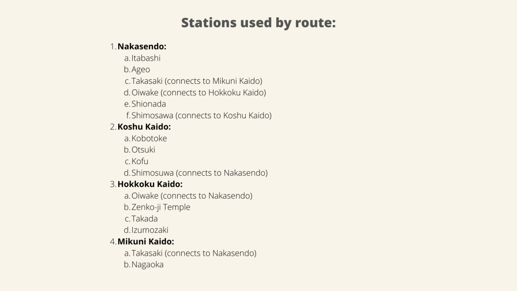
Andy, Anh, Shoni and Hiroshi


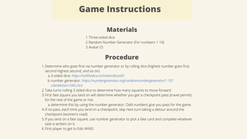
Click here for number generator
A course website for Christina Laffin's students
Andy, Anh, Shoni and Hiroshi
Click here for number generator
Maps defined: Blog entry 1
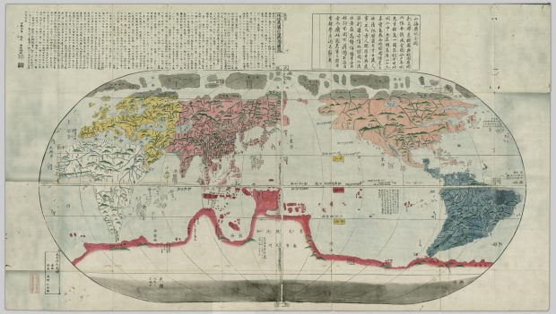
Onigiri: Chikyū bankoku sankai yochi zenzusetsu (1790)
https://open.library.ubc.ca/collections/tokugawa/items/1.0213204
Anh Luu
2/24/2021
(a) Mary Elizabeth Berry, “Maps Are Strange,” Japan in Print
“A map is a form of graphic representation that takes as its frame of reference the physical environment, which it normally treats from an aerial perspective, with some attention to verifiable spatial distribution. Furthermore, a map relies on a combination of codes—particularly an iconic code—to construct that environment.”
(b) James Corner, “The Agency of Mapping”
“Mapping is a fantastic cultural project, creating and building the world as much as measuring and describing it.”
For my response, I decided to discuss two map definitions. One from Mary Elizabeth Berry (a) and one from James Corner (b). The reason being that Berry’s definition focusses on the physical environment and codes used to represent it, and Corner’s definition focusses on the cultural viewpoint. These are two very noticeably different definitions, however I felt from my first impression of this map that it embodies both, especially since it is a world map. My initial impressions of this map had me quite fascinated, firstly because I grew up in Canada the world map I am used to has the focus of North America on the left side. This also brings my eyes to become more attentive to where all of the continents are placed and how they are represented through colours and iconic codes. I think this map is great to observe since it reminds me that the way the world is perceived is different for everyone and always changing!
I will discuss Berry’s definition in harmony with Corner’s definition. As defined by Berry, a map relies on a combination of codes – particularly an iconic code – to construct that environment. We can see from this world map that it relies on plenty of iconic codes to represent the environment. Mountainous areas are represented by icons of green mountains. We know that this probably does not mean that the kinds of mountains are distinguished by colour since the mountains are not coloured in with other colours like grey or brown, but only green. From that we can draw back to Corner’s definition concerning cultural contributions to maps and think about if the map creator, Nagakubo Seikisui is familiar with green mountains as the reasoning behind the iconic code of green mountains rather than grey or brown mountains. If the creator had the opportunity to discover or witness more mountains than the ones he’s seen locally or in the places he has travelled, would the iconic codes to represent mountains be different, or possible revised once more? Looking at other iconic codes we notice that rivers are clearly outlined and a darker blue and other bodies of water such as lakes and oceans are a lighter blue, which is a familiar sight in maps. There are patches of dots along the shorelines and islands, which I am not sure what they represent, but they can definitely be recognized as an iconic code with the means of representing something that should be there. Something else we notice is that land is separated by respective colours. It is not clear whether the colours have certain cultural meanings behind them, but we know for sure they play part as an iconic code separating the continents from one another. However, the north and south are coloured in grey, and from that we can assume that represents the different poles or the cold feature of those regions.
Since this map is called “revised map of the world”, it makes me wonder if the cultural views are changed in order for this map to be created as revised version, derived from what would have been an original or a previous version of the map. Would a continent being drawn bigger represent a cultural viewpoint regarding with what degree of importance that it holds? Or another theory I would have is about the undiscovered and ambiguity of the area, if the region is unknown and not much about it is heard of would it just be drawn bigger or smaller with not too much reasoning behind it? Thinking about this and the many revised versions that can come about from a map from “fantastic cultural” world building is really fascinating and we can see a lot of reflections from the cultural viewpoint of the map creator and the world as they see it.