Category Archives: Maps Assignment
Tōkaidō gojūsantsugi ichiran: map vs art
“The major difference between maps and pictures is that maps are products of land surveys that far exceed the perceptible realm of a given observer, thus they cover a wide expansion of a territory …The role of the reader is to decipher this data, in order to extract or to learn from it information that is beyond his/her faculties of direct perception. Pictures, on the other hand, are conventionally meant to be looked at as a whole —thus in their macro-scale—and usually correspond—or conventionally allude— to the artist’s perception, that is offered as a new visual perception to the viewer. Looking closely at the broad body of material that is labeled as road-maps of Edo and early Meiji Japan, it is not unusual to find elaborate imagery integrated with symbols of cartography. These maps are stylistically and functionally open
carrying many influences from the visual arts. At the same time, if a map is a map because of its accurate depiction of a space, many pictures may be found to have more qualities of maps than artifacts actually labeled as maps.” (Traganou, p.24-25)
https://open.library.ubc.ca/collections/tokugawa/items/1.0216572#p0z-5r0f:tokaido
So far in this course, we have been given the challenge of deciphering what maps really are. Are they constructed “theories” as Turbull said, or “a form of graphic representation that takes as its frame of reference the physical environment” as stated by Berry? Without really considering the implications of defining what it is or its purpose, I would assume that most people think of a map simply as a tool that guides its reader from point A to point B. However, as I mentioned in my previous response, maps can only be defined using a culmination of all of the different aspects (cultural, sociopolitical, geographical, etc.) that are contained in the various definitions available. The map I will be focusing on today, the Tōkaidō gojūsantsugi ichiran, is from the Edo period (1839), and actually seems to defy traditional conceptions of what a map is meant to do/be.
In this week’s reading, one paragraph in particular stood out to me. In this paragraph (quoted above the beginning of this response), Traganou attempts to unequivocally distinguish maps from pictures. However, as they state in the reading as well as what we can see from the Tōkaidō gojūsantsugi ichiran map, the distinctions were often blurred in the maps of the Edo period (of course, this blurred distinction is not at all exclusive to Edo maps). The most important aspects I gathered from Traganou’s distinction are that maps “far exceed the perceptible realm of a given observer” and that pictures are supposed to be “looked at as a whole” and that they “allude to the artist’s perception”. These distinctions, while valid in most cases, are seemingly defied in an innumerable number of cases. In the example of the aforementioned Tokaido map, while the scope is definitely greater than an individual’s immediate perception, there is plenty of artistic injection, and could easily be “looked at as a whole” work of art.
In the last sentence of the aforementioned quote, Traganou states the paradoxical nature of such distinctions made in the former portion of the paragraph. Are maps supposed to be an accurate depiction of geographical space that is meant to be deciphered by the reader? In that case, what makes the depiction of Kyoto in the Tōkaidō gojūsantsugi ichiran any more “map-like” than, let’s say, an accurate overhead painting of the city? Is the latter technically considered a map at this point?
Looking at the Tōkaidō gojūsantsugi ichiran, we can immediately tell that this map is not necessarily an accurate representation of geographical spaces, nor would it be particularly useful in guiding a traveler attempting to travel to Kyoto. On the other hand, the map has artistic flair and beauty to spare. I would much rather hang this particular map up on my wall as a decoration to admire than to be stranded with it as a tool somewhere on the Tokaido route in Edo Japan. If I were to classify this work, I would definitely lean in the direction of art over map. However, artistic style is a cultural phenomenon in itself, and once again this map shows us that maps are much more than simply a tool for geographical navigation.
The appreciation of the map Tōkaidō bunken nozu
Quoting from the Traganou:
The major characteristic of the map is its combining precise topographical descriptions with vigorous details of life. Indeed, the illustrations added by Moronobu transformed the map into a vivid pictorial illustration of the culture of traveling in the Edo period. Such illustrations focus on the celebrated ‘floating’ aspects of the culture of the road, elements that are ephemeral and changeable. The map depicts various types of travelers, including daimyō processions and commoners traveling back and forth, as well as incidents for which the Tōkaidō was well known in popular culture. It is interesting to note the close similarities in the ways figures of travelers are drawn between this map and the Dōchūki of 1655, a guidebook that was published a few years before Tōkaidō bunken ezu’s first edition, which will be examined in the following chapter (see Figure 18). The map also depicts meteorological conditions such as the Ōi River in flood, snow on Mount Fuji and rain in Hara, which is a typical preoccupation of ukiyo-e iconography. A major difference between this map and our contemporary geographical standards is the depiction of certain, important geographical elements more than once. As Nitschke has noticed, Mount Fuji appears on the map more than ten times at spots from which it is visible (Nitschke 1993:54). To this we should add the repeated appearance of Mount Ōyama, famous in the popular mythology of Edo (Traganou, 38).
The Tōkaidō as a megalopolis plays an essential role throughout the history of Japanese cultural geography and anthropology. Therefore, many maps depict the route information of the Tōkaidō, which provides travel information for people and easy to carry on the road. Despite maps that guide the route for people on the road, it has another type of maps that highly meticulously make with the painting of details. This kind of map is usually a kind of painting artwork and very lengthy, which is not easy for people to carry on the road. Tōkaidō bunken nozu is a proportional map of the Tōkaidō, which is one of the most popular maps of the Edo Era. Tōkaidō bunken nozu is a map that uses the description of the terrain as the background depicts the details of people’s lives. The whole map is divided into five folded volumes with the continuity of art appreciation. Although the rivers, mountains, and other essential landmarks are carefully marked on the map, it is still perceived that this map’s goal is not to help people find the route, mainly based on there is no minutia depict of streets and alleys. In particular, this map is more like a guidebook that provides local entertainment and traditional customs for tourists. For example, the map accurately marks the four directions and tagging all the local famous scenic spots, such as post station, rivers, mountains. The local entertainment buildings, such as teahouse, temples, and shrines, are also marks on the map.
Moreover, there are many impressive figures of vivid people drawn on the map. Some of them are passers-by in a hurry walking on the road alone. Some wealthy people were carried along the road in sedan chairs by servants. On the docks, some people are moving their luggage for the boat. These vivid and detailed depictions tell the real-life of traveling in the Edo era and convey culture and convention to people through the map.
Furthermore, these elements make this map more likely to be a travel guidebook, promoting local customs and practices to tourists, such as point out beautiful scenery, highlight the recreation facilities and the local way of life. Besides, another detail is the repeated appearance of Mount Fuji on the map. First, it might because there were no many high buildings and large mansions at that time, and due to the height id Mount Fuji, it is more likely for people to see it from different directions. The more reasonable guess is selecting these places corresponds to Mount Fuji’s stereotypical representations as seen in meisho literature and arts (Traganou, 38). Therefore, this map combines the accurate description of the terrain and the vivid detail of people’s lives, making the map an artwork with delight to view and cultural diffusion.
An Itinerary map of the Tōkaidō Highway (1654)
Tokaido michiyuki no zu (Itinerary map of the Tōkaidō Highway) doi: http://dx.doi.org/10.14288/1.0167749
“Mandala maps show the routes as curved lines and include scenes of the road as if they were viewed from a distant high viewpoint. Mandalas prioritize the temporal and symbolic dimension of space, being thus clearly ‘meta-traveling’ artifacts. They often impose elements of geometrical order on the flowering landscape (Lee et al. 1983:144) and bring together distant landmarks through the use of the cloud-pattern, the technique of reversed perspective or of variable viewpoints. Their curved schemes may also reflect the Chinese doctrine of attributing malign influences to straight lines (Yee 1987:154). Tōkaidō michiyuki no zu (Itinerary map of the Tōkaidō road) (Figure 3), the oldest surviving printed road-map of the Tōkaidō, is a mandala thought to have been published in 1654 (Unno 1987:422). Although accuracy is not its main concern, practical information such as distances between post-stations and lists of fares for travelers using horses is provided. Late Edo period panoramas such as Katsushika Hokusai’s (1760–1849) (Plate 4) and Kuwagata Shōi (?–1855) (Figure 9) are also considered by Unno as belonging to the mandala category. They present a much stronger awareness of cartographic precision, however, as will be explained later in this chapter.” (Traganou, 28)
Tōkaidō michiyuki no zu is a map categorized as a mandala. Mandalas present the area in long curved lines from a distant view from an angle from above. The aesthetic art style is clear in the design of this map. The use of space and landscape are elaborate to demonstrate the just vast distance of the Tōkaidō. The winding and curving road looks as if it could go on forever. The actual distance from start to end is not clear but the names of the stops and prices listed demonstrate that the focus is on the locations along the road rather than the final destination. In some ways it reminds me of a guidebook for a city. Traganou likens dōchūki to a similar guidebook. Listing the prices for food at a cute café, or a recommendation for a place to stay the night. However, the Tōkaidō michiyuki no zu lacks the more elaborate text a guidebook might have. While mentioned earlier in the chapter, the interest in curved lines is linked to Chinese aesthetics rather the security concerns that Tokugawa took into consideration during the building of the road. The way the road branches and splits only to rejoin later on is quite unexpected for me. I would have assumed for this to be considered a different road. In addition, the map shows this bright red highlighted section of the road, this representing the Tōkaidō, yet at points it is obscured thanks to the mountains or perhaps valleys, and I find the aesthetic choice of aerial view but obscured to be a little strange. The use of colour as well is interesting. Other than the main road, the mountains are coloured brown with green tops while the water bays are a light blue. The folds in the scan imply the map was to be folded several times, and there doesn’t seem to be any cut offs or different saturation in colour which indicates a wood block print. I wonder if each of these maps are drawn by hand? It seems a little impractical however if it is seen more of a piece of art rather than a functional map, the practicality is less of a concern. Traganou does discuss practical aspects of this map such as the prices provided and the distances between post-stations on the other hand so perhaps my thoughts are lacking. The only standard type facing looks like the stampings of the cardinal directions and the map title at the top in a border.
Coding in Chikyū bankoku sankai yochi zenzusetsu
Maps are definitely one of those concepts that are hard to confine with one definition. In fact, I think that all of the different definitions that we discussed in class are not only relevant, but necessary in building a wider perspective with which we can view maps. Corner says that maps are “a fantastic cultural project, creating and building the world as much as measuring and describing it”, while Turnbull says “Maps are theories and they are socially and culturally constructed.” These definitions are indeed true in the sense that maps hold tremendous cultural significance and also biases, respective of whoever the maps were created by and who they were created for. A simple example is how different geographical regions throughout history had centred themselves in their worldview, or how sizes of certain regions are exaggerated while others depicted much smaller than we now know them to be. The definition I will be focusing on today is that of Berry, who claims that maps are “a form of graphic representation that takes as its frame of reference the physical environment, which it normally treats from an aerial perspective, with some attention to verifiable spatial distribution. Furthermore, a map relies on a combination of codes—particularly an iconic code—to construct that environment.” And particularly, I will be looking at what kind of coding is visible in the Chikyū bankoku sankai yochi zenzusetsu map from 1790.
Most of the coding that we can see in this map is quite straightforward. First of all, I am not quite clear on whether this map would be considered topographical or topological. The map does not necessarily denote the different gradients of elevation as topographical would suggest. On the other hand, it also does not resemble the sort of symbolic representation that we associate with topological maps. That being said, the first bit of coding that is very obvious in this map are the mountains. I would assume that the green inverted W-shapes scattered across the land masses are meant to denote any regions that are mountainous. Do these generic symbols of elevated regions mean that the map is topographical? I am under the impression that legitimately topographical maps show much more detail in changes in elevation, while the mountains in this map seem to be more symbolic. That being said, this sort of coding is very effective for the reader, in that most likely anyone who saw this map, having no prior knowledge of the coding system, would recognize the green shapes as mountains. Another clear example are the blue lines that run through the land masses. These seem to denote rivers, and once again, most people would likely arrive at this conclusion upon first viewing this map.
Now, the more interesting bits of coding have to do with the visible biases(?) that we can see in the map. First of all, how do we know which sections of the map are meant to represent land masses and which are meant to be ocean? We know that the colored areas are land, but this is largely because we already have a pre-existing image of the world map in our minds. If not, we could potentially perceive the colored regions to be oceans, that the green hills are islands, and that the blue lines are simply common routes taken by boat. Furthermore, why are the different sections of said land colored differently? Using the knowledge we have about the world and from maps we’ve seen previously, we can assume that this is to separate the world into geopolitical regions. But is there a reason for the specific colours? That I can not answer for sure.
Finally, the most intriguing aspect of the “coding” that I saw in this map comes from the respective sizes of certain areas. Most blatantly, Japan is centred in the Map, which is to be expected. What is more interesting to me however, are the absolutely massive sizes of Europe and the Americas in this map. Particularly interesting to me, was that Europe and Africa were drawn to be relative in size, which we know is not actually the case. It may be important to note that this map was a copy of one brought to Japan by Matteo Ricci. To me, it seems as though there many have been a political agenda behind the depictions of certain areas being drawn larger than life, while others not so much. But then, why is Antarctica drawn to be literally a third of the entire earth, and a short boat ride away from the southern tip of Africa?
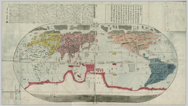
Maps Defined Entry 1: Chikyū bankoku sankai yochi zenzusetsu (1790)
Maps defined: Blog entry 1
Onigiri: Chikyū bankoku sankai yochi zenzusetsu (1790)
https://open.library.ubc.ca/collections/tokugawa/items/1.0213204
Anh Luu
2/24/2021
(a) Mary Elizabeth Berry, “Maps Are Strange,” Japan in Print
“A map is a form of graphic representation that takes as its frame of reference the physical environment, which it normally treats from an aerial perspective, with some attention to verifiable spatial distribution. Furthermore, a map relies on a combination of codes—particularly an iconic code—to construct that environment.”
(b) James Corner, “The Agency of Mapping”
“Mapping is a fantastic cultural project, creating and building the world as much as measuring and describing it.”
For my response, I decided to discuss two map definitions. One from Mary Elizabeth Berry (a) and one from James Corner (b). The reason being that Berry’s definition focusses on the physical environment and codes used to represent it, and Corner’s definition focusses on the cultural viewpoint. These are two very noticeably different definitions, however I felt from my first impression of this map that it embodies both, especially since it is a world map. My initial impressions of this map had me quite fascinated, firstly because I grew up in Canada the world map I am used to has the focus of North America on the left side. This also brings my eyes to become more attentive to where all of the continents are placed and how they are represented through colours and iconic codes. I think this map is great to observe since it reminds me that the way the world is perceived is different for everyone and always changing!
I will discuss Berry’s definition in harmony with Corner’s definition. As defined by Berry, a map relies on a combination of codes – particularly an iconic code – to construct that environment. We can see from this world map that it relies on plenty of iconic codes to represent the environment. Mountainous areas are represented by icons of green mountains. We know that this probably does not mean that the kinds of mountains are distinguished by colour since the mountains are not coloured in with other colours like grey or brown, but only green. From that we can draw back to Corner’s definition concerning cultural contributions to maps and think about if the map creator, Nagakubo Seikisui is familiar with green mountains as the reasoning behind the iconic code of green mountains rather than grey or brown mountains. If the creator had the opportunity to discover or witness more mountains than the ones he’s seen locally or in the places he has travelled, would the iconic codes to represent mountains be different, or possible revised once more? Looking at other iconic codes we notice that rivers are clearly outlined and a darker blue and other bodies of water such as lakes and oceans are a lighter blue, which is a familiar sight in maps. There are patches of dots along the shorelines and islands, which I am not sure what they represent, but they can definitely be recognized as an iconic code with the means of representing something that should be there. Something else we notice is that land is separated by respective colours. It is not clear whether the colours have certain cultural meanings behind them, but we know for sure they play part as an iconic code separating the continents from one another. However, the north and south are coloured in grey, and from that we can assume that represents the different poles or the cold feature of those regions.
Since this map is called “revised map of the world”, it makes me wonder if the cultural views are changed in order for this map to be created as revised version, derived from what would have been an original or a previous version of the map. Would a continent being drawn bigger represent a cultural viewpoint regarding with what degree of importance that it holds? Or another theory I would have is about the undiscovered and ambiguity of the area, if the region is unknown and not much about it is heard of would it just be drawn bigger or smaller with not too much reasoning behind it? Thinking about this and the many revised versions that can come about from a map from “fantastic cultural” world building is really fascinating and we can see a lot of reflections from the cultural viewpoint of the map creator and the world as they see it.
Chikyu bankoku sankai yochi zenzusetsu
Nagakubo’s map, the chikyu bankoku sankai yochi zenzusetsu, is a world map from 1790 based off Matteo Ricci’s world map. While Nagakubo’s map looks very different from today’s modern world maps, the continents and regions are still very identifiable in terms of general shape and location. The map utilizes various coding, such as colour, lines, writing, and images, to identify major landscapes and borders. The continents are separated using colour and major mountain ranges are depicted through out the map, as well as bodies of water such as rivers and seas, which are also labeled in some cases with writing. However, visual labels are only reserved for land masses and there is a lack of visual coding for major cities and countries (excluding the use of writing). The map also utilizes longitude and latitude lines that are superimposed subtly onto the map.
In comparison to the world maps that exist today, the continent sizes of Nagakubo’s map differ to large degree. North and South America are treated with equal sizing to Asia and contribute for almost the same amount of visual space within the map. Europe is also portrayed to be of almost equal size to Asia, while Asia appears smaller than its real size due to the enlarging of the other continents. The reason of the continent sizing is most likely due to Matteo Ricci’s map that was used in reference, which also portrayed North American and Europe larger than they really are in relation to the other continents. This distorting of continent sizes may be correlated to eurocentrism of the time, thus imposing a larger and more “important” Europe into a world context. It is interesting that Antarctica is given a “larger than life” visual representation on Nagakubo’s map, imposing about a quarter of space of the entire map. Regarding why Antarctica is treated as such as a large landscape, it may be due to an “unknown” factor, as Antarctica had not yet been explored at the time of this map’s creation.
Nagakubo’s map seems to be missing various elements to it, such as Australia. It is interesting that, if Australia were to be added, the entire map would require shifting in order to accommodate for it. The map seems to be shrunk near the north and south poles, where Africa and South America directly beside Antarctica’s border. The sizing of the continents seems to fit perfectly within the frame they were placed in, providing a “whole” or “complete” feeling, where no one part of the map holds a more significant amount of space than the other (except for Antarctica). Perhaps the continents were resized simply so they could fit equally within the map with equal treatment and visual importance. While the map is not very effective in displaying proper size relevance, it does portray all (most) of the continents in an environment that allows for visual understanding of the different regions and their locations around the world and providing a sense of placement within the world for the people who viewed it.
Maps defined–Chikyū bankoku sankai yochi zenzusetsu (1790)
In “Maps are Strange,” Berry (2006) describes a map as a graphic representation where a combination of codes is used to construct the environment. In premodern and early modern mapmaking art, the most common codes could be classified as iconic, linguistic, and presentational. This essay will focus on these codes and their appearance in the chosen map. The selected map is the 1790 Chikyū bankoku sankai yochi zenzusetsu, roughly translated to Sekisui’s map of the world.
Berry asserts that constructing a map is vital in helping the audience pick out and create important constructs concerning that space. For example, Sekisui’s map of the world has Asia (or rather China) in the middle. This is significantly different from popular maps, such as the Mercator projecting. This map puts Africa and Europe, with America and Asia on the sides, at the center to indicate the power relations bestowed by colonialism and modern-day politics, which involves an underdeveloped Africa due to European and White imperialism. Similarly, Sekisui’s map of the world alludes to China’s centrality in the world. In the old days, China referred to itself as the central kingdom surrounded by its tributes, such as Choson Korea and Japan. By putting China at the center, the map creator communicates that China was the most powerful empire, and the world revolved around it just like colonialism made Europe the king.
According to Berry (2006), the iconic code inventories the environment by communicating the features of a space the mapmaker chose to represent. Sometimes, the map might have a key to help the audience understand the representation and logic used. The most common iconic signs are line, which indicates things that take a linear or line appearance, such as roads and rivers, figures, such as triangles to mean a mountain or circles to suggest cities, and color blocks to show significant differences between signs, such as deep or shallow tints to signify power differences.
The chosen map shows these three codes in profound ways. For example, lines are particularly easy to identify in contents and regions that are not densely populated, such as Africa (white), Europe (yellow), North American (slightly reddish), and South America (bluish). South America has more lines than other continents. These lines appear to signify rivers rather than roads because, in 1790, not many roads would have been highly developed, as extensively as indicated in this map.
This map has many figures. Most are hard to understand due to clarity issues within the diagram and the Chinese letters that often have a Japanese feeling. However, one can see raised regions to mean mountains, joined raised places to signify a range, and the dots to indicate population. Notice how Asia has more dots than other areas, thus asserting its status as the most populous empire in humankind’s history.
Last but not least are the hues to indicate differences. For instance, the map creator used white for Africa, yellow for Europe, red for Asia, orange-red for North America, dark blue for South America, and dark red for the Antarctic border. It is hard to determine why these colors were used. However, drawing from the history of Europe and Asia, such as the spread of Christianity and colonization, one can argue that Europe and China were in perfect contradiction to one other despite their growing visibility in global politics. Although the map has a Japanese effect, the relative powerlessness of Japan at that time, including self-isolation and its relations with China indicate that China was more powerful.
Berry (2006) argues that codes show three more features: stability, generic, and versatility. First, stability means that a particular element within a map will mean the same thing every time it appears on the map. For example, the lines in each continent indicate rivers. I arrive at this conclusion because the lines occur and increase in frequency when the raised figures showing mountains are present and many. That is why South America has more lines, but short and irregular, possibly suggesting a river basin or system, such as Amazon. In Africa, the lines are more continuous and last longer, indicating many long rivers, such as the Nile.
Second, generic refers to the “limited, fixed, and putatively standard variables” (p. 64) that remove the life from each representation and imbue it with generic characteristics, such as lines to indicate rivers and dots to mean people, regardless of the unique aspects of each region.
Third, versatility speaks to the representation of finely visible and invisible things, such as social constructs or environmental concepts. For instance, many rivers and high places in South America could allude to its fertility. In contrast, the widespread representation of this in Africa could indicate that some regions are wet, whereas the vast spaces in the center are either drier or unexplored. Unexplored is a better perspective considering that even though the map indicates that the Antarctic region is unpopulated, the areas below Africa and South America have lighter hues to indicate their unexplored nature. Again these are just speculations as the map’s keys are not clear.
Maps Defined – Chikyū ichiranzu
The 1783 map Chikyū ichiranzu by Genran Nakane, shows several aspects that support David Turnbull’s quote from his book Maps Are Territories where he says that “maps are theories and they are socially and culturally constructed.”
Firstly, we can see that Japan is not only centred in the middle of the map as the focus point, but it is also much bigger than its actual size, especially in comparison to other countries such as China. The cartographer’s choices show an intentional or unintentional bias and reflect the idea that Japan has higher importance than the other countries.
While the choice of size for Japan might simply have been a practical one, made to fit the different prefectures on the map, it would still show subconscious social and cultural constructs. Japan has enough cultural importance to the cartographer that they felt the need to further divide it into prefectures while they did not feel the need to do that for other places. Except for Japan, the only country that is further divided is China, which, except for the Dutch East India Company, was Japan’s only trading partner at that time.
Beyond that, the concept of borders itself, may it be between prefectures or countries, is socially and culturally constructed. These borders are not physical barriers most of the time (with the exception of mountain ranges, rivers or oceans perhaps) – they can only exist if people give them the social and cultural significance to exist. Nothing will stop a person from crossing borders between different countries other than another person who is made to believe that these borders exist in the first place.
It is also interesting that Europe is the least detailed continent. Surprisingly, the Netherlands is not highlighted, even though the Dutch East India Company was one of Japan’s very few trade partners. The United Kingdom and Ireland, on the other hand, are distinct from the rest of Europe even though there was no formal relationship. The blankness of Europe could also be a culturally constructed part of the map. As the area where the Jesuit missionaries had come from, it could have intentionally been left less detailed since the map was made more than 100 years after the ban on Christianity had been put in place.Perhaps showing less interest in the region was an approach taken due to persecution of Christians that had already been rooted in society and the possible subsequent diffidence of Europe. The only other area that is also not detailed is the big area on the bottom of the map below that I can only guess to be Antarctica (even though it expands all the way up to Asia, engulfing the area Australia would be found in).
I could not find a map legend, or at least not one that I could understand, making the map only accessible to people of the same cultural sphere as the cartographer. It was meant for people who either spoke and could read the same language or who would have understood the map based on shared cultures and understandings.
The map defined-Bankoku sōzu
There are several interesting codes in the Bankoku sōzu (1600), such as
iconic and presentational codes. Firstly, the map uses irregularly shaped icons to establish
boundaries between areas. Wrapping the whole map with oval lines and using a black and white
line separates the map in the middle, dividing the map into four parts according to the East,
West, North, and South. Moreover, there are some presentational codes in the map; for example,
the map uses different colors to label regions and nations, especially, the map uses dark blue to
paint Japan’s area. The association of the color might because of Japan is an island country and
surrounded by the ocean; therefore, the map uses dark blue to represent Japan. Also, the scripts
on the map are fascinating, such as marks the cities of China, particularly, it indicates the Ming
Dynasty that China was going through at the time of 1600s, and marks with two Chinese
characters in the area of the capital city Nanking. It is worth mentioning that China is the only
country that tags different cities on the whole map. In this way, all these codes bring many
associations of the implication relationship between China and Japan, such as the two countries
are close to business trade and cultural exchange, so Japanese are familiar with China’s
geography, and they can draw the map of China. Besides, there is a fascinating script write on
the part of the South area, ” 自是南方地人到者少故未審其人物如何.” The English translation
is that few people come to the South, so they cannot depict the picture. Therefore, the code
defines the South area as a mysterious region on the map, encouraging people to take adventure
attitudes toward this space.
Furthermore, the map of Bankoku sōzu (1600) has “fantastic cultural” world-building.
The title of the map was written by the Chinese character “萬國縂圖, ” the translation is a
general map of ten thousand nations, which is the embryonic form of the World Map, and it
shows that people begin to realize the importance of cultural interaction with the whole world.
The map has drawn forty boxes of people from various places with different races and
appearances. Some of these people are based on reality to depict, such as China and some
Western countries. It gives the details of the clothing, tools, and physical features, proving some
particular cultural exchanges and interactions between these countries and Japan.
On the other hand, some people on the map are more likely based on ancient
mythology development. For example, dwarfs and cannibals, specifically, the Chinese tag,
mentions that the cannibal only eats men but not women, which curious where these legends
come from or might that back to the ancient time there are ethnic groups that actually
cannibalism. The genetic problems could also cause dwarfs and giants, especially the giant
kingdom’s location marked on the map as “長人.”
In conclusion, whether these fabulous legends are true or not, this map represents
the most advanced world cultural interaction at that time. It delivered the message that Japan’s
awareness of world civilization and expresses curiosity of unknown space of the world and the
desire to explore more areas.