 Data visualization is a hot topic in analytics right now. There are lots of great tools out there–Tableau is one of the trendiest right now, and it has lots of helpful features. However, the fanciest tools will do you no good at all if your graph doesn’t convey any information.
Principle 1: Have a clear story to tell
-
Know what your audience should get out of looking at your chart. Thinking about what the central message is will help you communicate it more clearly.
-
Related: know your audience. Your client may expect to see things described using their own internal jargon (“total return to work days paid”, to take an example from a recent project), but if you’re presenting to a general audience you would need to re-label the same figures to use more general language (“time until return to work” for example). Also, remember that different levels of detail are appropriate for different audiences, and modify your labels accordingly.
Principle 2: Use the right tool for the job
- Depending on the audience and the kind of data you’re working with, you might want to use any of a number of different graph types. Here is a flow chart to help you pick the most appropriate one.
- Make sure you’re using graphic elements sensibly. For example, if you have a scatter plot where each point represents a group, it’s better to use the size of the marker to represent the size of the group and the colour to represent other characteristics than the other way around.
Principle 3: Compare, don’t show
At the heart of quantitative reasoning is a single question: Compared to what? Avoid relying on the viewer’s memory to make comparisons. Instead, enforce visual comparisons within the eyespan.
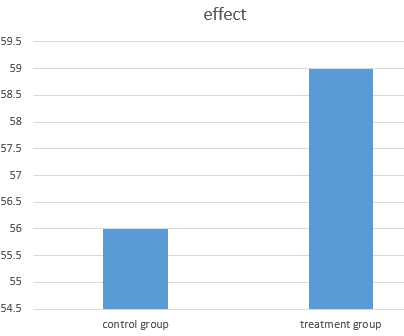
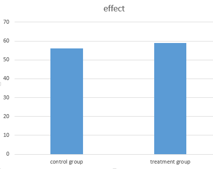
- Make sure that your graph is laid out in such a way as to suggest the correct comparisons! In particular, be careful about axis ranges: most of the time your axes should start at the origin; it can be misleading to do otherwise.
Excel’s default y-axis range:
Same data with the y axis set to start at zero:
- Base level: showing a base level allows the user to have more context to evaluate the data presented. (In this case the base level is shown in a pale colour so as to not be visually distracting.)
-
Scatter plots depict relationships between two variables. They are effective with large datasets and to highlight patterns or correlations. However, the reader may assume a cause-and-effect relationship between the X and Y axes even when there isn’t one. Also note that they are not appropriate for very large data sets where many points may overlap. In those cases, contour plots or 2d coloured bins are more appropriate. See the suggestions in “details” here.
-
Small multiples consists of a single design repeated several times within the eyespan, each example showing a different value of the independent variable(s). Displays of related information should be horizontally and vertically aligned so the eye can see patterns across related variables. They should not have unintended alignments that suggest misleading or irrelevant comparisons. Also, when using multiple similar graphs, make sure that colour is used consistently: it’s misleading to the reader if the same colour means different things in different graphs. Another reason to use small multiples is that low density visuals lead to spreading information out over many screens or slides, causing users to get lost in an information maze. Having information adjacent in space avoids the “where am I?” problem.
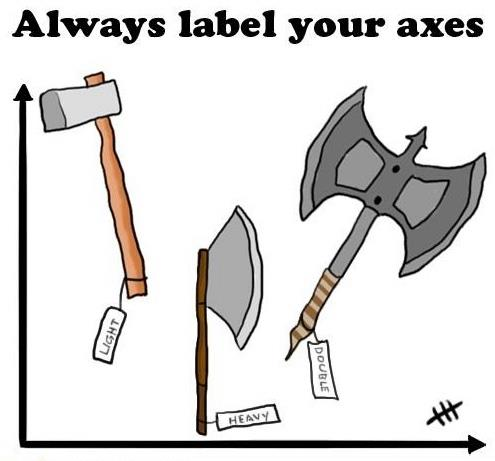 Principle 4: Use labels
- Label your axes: state the variable name and units.
- Choose a title that puts your results in context. Note however that all text on the image must add information. Having a title of the form “Y variable vs. X variable” simply repeats what the reader would learn from the axis labels. Rule of thumb: never use “vs.” in the title of a graph.
- Add a text box near the figure describing the data source and giving references if needed, if the figure is shown on a slide. In a document, a figure caption achieves the same purpose.
- Make sure that all of your text can be read and understood by your intended audience: avoid abbreviations; write out a variable name in full even if it’s abbreviated in the database. Also make sure that the font size is large enough to be read.
Principle 5: Avoid clutter
- Gridlines: they’re an Excel default but 9 times out of 10 they don’t add anything
- Extra digits in numbers (in axis labels or text boxes or tables) are a kind of clutter–make sure that you show the appropriate number of significant figures. If you write a number as 8.30005 you’re telling the reader that it matters that the number is 8.30005 and not 8.30006–nor just 8.3. Be certain that you’re not giving meaningless detail.
- Never use 3-d graphs (pie charts or bar charts, for example; sometimes x-y-z plots are helpful). This is a case where a special effect can get in the way of comprehension.
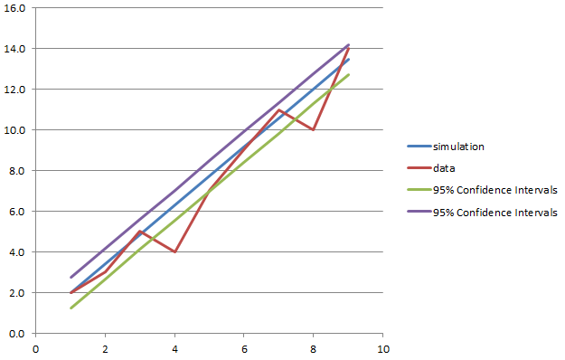
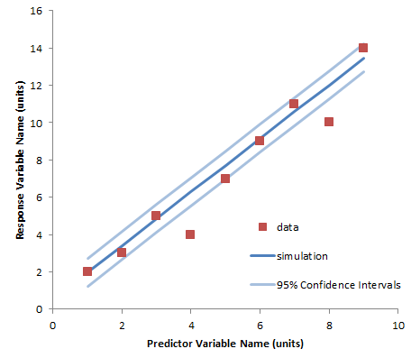
How you present your information can make a big difference to how easy the information is to digest. Here is the same information, presented two ways: first using Excel’s defaults for an x-y plot, and then using more carefully chosen colours and labels.
Links to more detailed guides:
- A nice succinct summary of Tufte’s classic book, The Visual Display of Quantitative Information is here. The book itself is available in the COE library.
- This slide show goes through the same material with some useful examples.
- A few more examples of the same principles are here.
- A data blogger’s thoughts on which rules to absolutely not break is here.
- This is a really thoughtful walk-through of some important principles for honest data visualization–check out the whole course from which this paper is drawn: Calling Bullshit.
Here are a few random useful tips and tricks:
- A cheat sheet for the R package ggplot.
- A tutorial for putting multiple bar charts (histograms) on the same Excel graph. (This is way harder than it needs to be!)
- Adding a series of contours to a scatter plot in R can make the patterns easier to see. Another set of demos is here.
- An interesting blog with many tips for visualization in Excel: Charts and Graphs | chandoo.org
- A comedian weighs in on how to do powerpoint wrong–this is actually good advice! (In the font analysis he left out Comic Sans–perhaps because it’s just too easy to mock.)
Here’s another helpful infographic on selecting graph types: http://extremepresentation.typepad.com/blog/2006/09/choosing_a_good.html
Here are 2 tutorials for getting started with the ggplot2 package for data visualization:
(1) https://www.datacamp.com/courses/data-visualization-with-ggplot2-1
(2) https://www.datacamp.com/courses/data-visualization-with-ggplot2-2