by Alex Dueck
In the first Python session you covered some of Pandas’ basic data handling functionality by experimenting with a couple of standard sample data sets. But what if the data we need is spread across multiple tables with different structures, and what if we don’t have all of the attributes (columns) we need? These problems (not to mention missing data, inconsistent values, high abstraction, inaccurate data, etc.) are typical in real-world analytics projects. The diagram below illustrates a typical data handling process that seeks to address these problems (this is by no means an industry standard, but I have found it helpful for organizing my Python scripts).
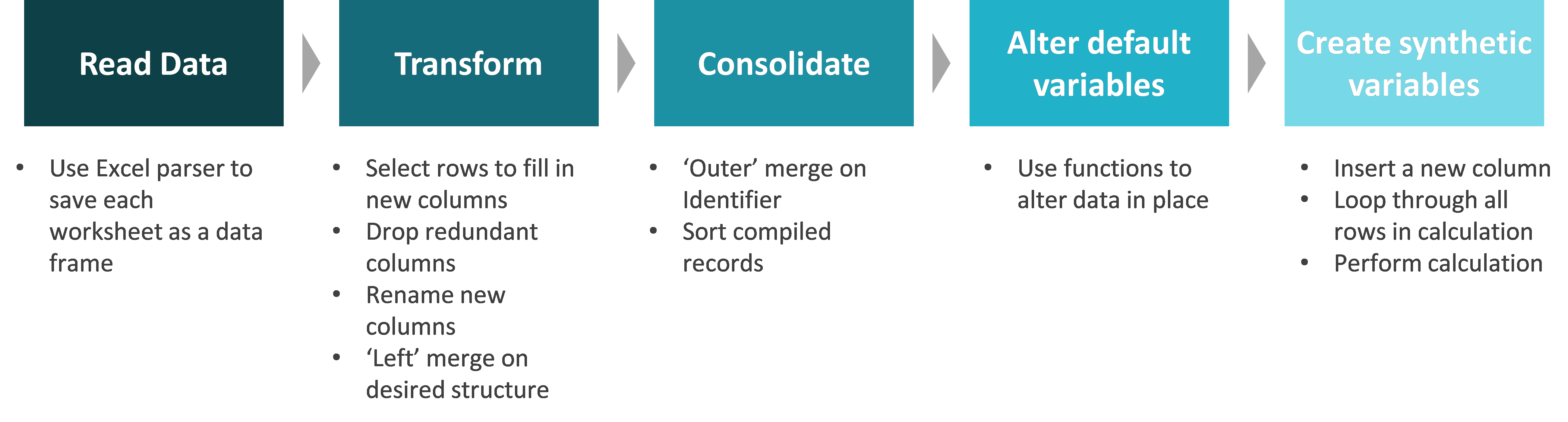
Recommended Data Handling Process
Key Pandas Functionality: Merge and Apply-Lambda-Row
In order to execute this process, we first need to learn a couple handy methods in Python: Pandas’ Merge function, and a hybrid function I’ve called “Apply-Lambda-Row”.
Pandas’ Merge
Pandas’ merge function provides standard database join operations between DataFrame objects which are very similar to those provided by SQL. The implication is that you can get all of the robust data handling capability you would have in SQL without the headache of setting up a database. The table below summarizes the different types of merges, and subsequent images give examples of each merge using two sample tables.
| Merge method | SQL Join Name | Description |
| left | LEFT OUTER JOIN | Use keys from left frame only |
| right | RIGHT OUTER JOIN | Use keys from right frame only |
| outer | FULL OUTER JOIN | Use union of keys from both frames |
| inner | INNER JOIN | Use intersection of keys from both frames |
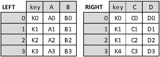
Two Tables Called LEFT and RIGHT
Sample code:
Result = pd.merge(LEFT, RIGHT, how=’left’, on=’key’) #Left merge LEFT on RIGHT
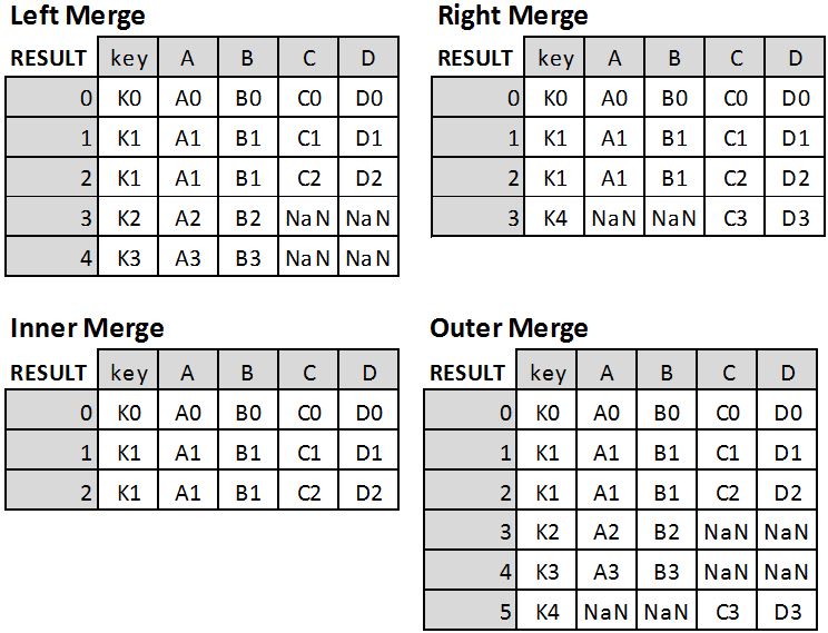
Four different merge results
If you want to merge based on two key columns, then the ‘on’ argument becomes: on=[‘key1’, ‘key2’].
Refer to the documentation referenced at the end of this post for additional detail on the Merge function.
Pandas’ Apply-Lambda-Row
This hybrid method is actually the combination of two different operations: the ‘Apply’ function and the ‘Lambda’ expression (using the ‘Row’ in a DataFrame as the argument). Because it’s so specific, no substantive documentation on this particular combination of functions exists online. Nevertheless, it is incredibly useful for creating new columns which are calculated as a “function” of other columns (i.e. creating synthetic attributes).
You saw ‘Apply’ in the first python session, but now it gets a bit more complicated. As for the ‘Lambda’ bit, you can read up on the details in one of the references at the bottom of this post, but it is essentially an expression which allows us to declare a simple, one-off function in a single line of code that can be applied immediately within that code structure. The ‘Row’ part simply tells Lambda that its arguments are all the values within the row of a DataFrame.
For example, the pseudo code below says: ‘Apply’ this ‘Lambda’ function using values from the ‘Row’ in the DataFrame called ‘df’ for each row in the DataFrame. Note that axis=1 tells ‘Apply’ that we’re applying this function across the row rather than the column.
NewColumn = df.apply(lambda row: <Function Expression>, axis=1)
The function expression can be anything, but it makes most sense to use it for logical expressions rather than calculations (which can be done in a much simpler way as you saw in the first Python Session). A sample logical expression might be:
‘True’ if (row[‘ColA’]==’ABC’)&(row[‘ColB’]==’XYZ’) else ‘False’
Now that we’ve learned the Merge and Apply-Lambda-Row methods, we’re ready to look at an example of applying the data handling process.
Example Data Handling Process
Suppose that we have 14 days of weather data spread across three different tables (each in separate worksheets of the same Excel file). Tables 1 and 3 are structured with one unique row for each day, and Table 2 has at most two rows per day: one for the temperature in Fahrenheit, and another for the humidity rating. Twist: there is no temperature reading for Day 8 and no humidity reading for Day 10 (missing rows). The first four rows of each table are shown below:
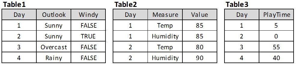
Weather tables
Suppose that we are interested in learning about what factors are indicative of whether or not we will play tennis for more than 45 minutes. In terms of data handling, we need to:
- Read in all of the tables,
- Transform Table 2 to align with the other two tables,
- Consolidate the three tables together, and
- Alter the PlayTime variable to be a binary variable indicating whether it is > 45 or ≤ 45.
You will find the following code excerpts in the Python file called: AssembleWeatherDW.py (zipped). The data source file is called WeatherData.xlsx.
READ DATA
We read in the tables with the following commands:
xls = pd.ExcelFile(‘WeatherData.xlsx’) #initialize pandas excel reader (pandas referred to as pd)
Table1 = xls.parse(‘Table1’) #this is now a pandas DataFrame; pandas operations apply
Table2 = xls.parse(‘Table2’)
Table3 = xls.parse (‘Table3’)
TRANSFORM
In order to transform Table2, we first make a single-column DataFrame having one row for each day (there other methods of transformation so if you have a better one feel free to use it). We will use this copy as a “spine” for our transformed DataFrame. This can be done many ways, but one easy way is to take a copy of Table1 (since we know it has exactly one row for each day):
Days = Table1.copy(deep=True) #must use this .copy method; Days = Table1 is a two-way assignment
Days = Days[[‘Day’]] #Drop all columns from this new DataFrame except ‘Day’
Next we make a new DataFrame called ‘Temps’ which we create as a subset of Table2 by taking only the temperature reading rows (note that this new table will only have 13 rows because Day 8 is missing):
Temps = Table2[(Table2[‘Measure’] == ‘Temp’)] #get all rows from Table2 where Measure is Temp
Temps = Temps[[‘Day’, ‘Value’]] #just keep Day and Value – don’t need Measure any more
Temps.columns = [‘Day’, ‘Temp’] #rename Value to ‘Temp’
We do the same thing for the Humidity readings (code omitted), and then merge the two new DataFrames ‘Temps’ and ‘Humids’ onto our “spine” DataFrame to create a new version of Table2:
NewTable2 = pd.merge(Days, Temps, how=’left’, on=’Day’) #Left merge Temps on Days
NewTable2 = pd.merge(NewTable2, Humids, how=’left’, on=’Day’) #Left merge Humids on NewTable2
We have to use left-merge because both ‘Temps’ and ‘Humids’ are missing a row; if we used right-merge our data warehouse would be missing rows for days 8 and 10 (in this case we’d prefer to have a missing cell than to throw out the whole row).
CONSOLIDATE
Now that all of our three tables are in the same structure, we can consolidate them into a single data warehouse. In this case all of our tables have the same set of join keys (days), so it doesn’t matter which merge we use. In general though, it’s good to use the outer-merge to make sure that you don’t lose data that might be useful: if you have a small data set, it’s better to have sparse data than to throw out rows.
Table12 = pd.merge(Table1, NewTable2, how=’outer’, on=’Day’) #bring Table1 and NewTable2 together
allData = pd.merge(Table12, Table3, how=’outer’, on=’Day’) #bring Table3 together with the others
ALTER/SYNTHETIC
The last data handling operation we need to perform is to change the ‘PlayTime’ attribute to a binary attribute called ‘Play45+?’ which will indicate whether or not more than 45 minutes are played. According to the process outlined above, this should be considered an ‘Alter’ step because we’re simply changing an attribute from one definition to another, but since you’ll need to use the ‘Synthetic’ process for the in-class assignments, I’ve used code which creates Play45+? as if it were a synthetic attribute and then I delete the redundant ‘PlayTime’ attribute. Note that synthetic attributes are usually calculated as a function of more than one attribute as in the example shown above, but the distinction is trivial.
Rule45=lambda row: ‘True’ if (row[‘PlayTime’]>45) else ‘False’ #define the rule to be applied to each row
allData.insert(1, ‘Play45+?’, allData.apply(Rule45, axis=1)) #insert the new binary ‘Play45+?’ column according to rule above
allData.drop(‘PlayTime’,axis=1,inplace=True) #drop the ‘PlayTime’ column
I’ve broken the Apply-Lambda operation into two lines for the sake of readability: the first line defines the Lamba function, and the second line inserts a new column in position 1 called ‘Play45+?’ according to that function.
The third line simply drops the ‘PlayTime’ attribute. We have to use the ‘inplace=True’ parameter because the drop operation is not assigned to a left-hand-side variable; an alternative with ‘inplace=False’ (which is the default) would be:
allData = allData.drop(‘PlayTime’,axis=1) #drop the ‘PlayTime’ column
PRINT DATA WAREHOUSE
The last step is to simply save the data warehouse to a csv file:
allData.to_csv(‘WeatherDW.csv’,index=False) #index=False prevents the row index from being saved
Your final data warehouse should look like this:
Weather data warehouse
 Data Mining in Orange Canvas
Now that we have all of our data in a consolidated data warehouse, we can have all sorts of fun with it – like feeding it to machine learning algorithms! One of the best machine learning techniques to start with are Decision Tree Learners.
Decision Tree Learners
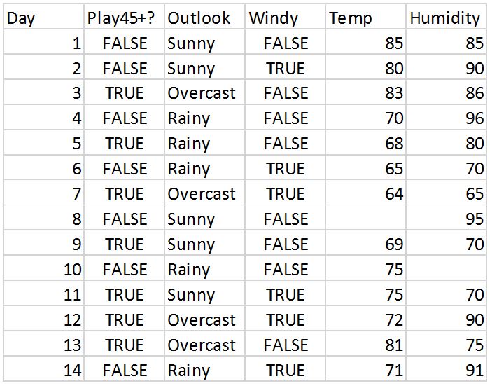
Decision Tree Learners are a class of data mining / machine learning algorithms which take a data set (structured like the weather data warehouse above) as input and construct a hierarchical set of rules (the classification model) that efficiently classify each instance in the data set with a target class value (e.g. Play45+? = True) according to patterns present in the other non-class attributes (e.g. Outlook). If the tree is left “unpruned” it will be constructed so that each instance is classified 100% correctly. If it is pruned, the “leaf” nodes in the tree will classify according to the majority class value that reach that leaf. There are a number of different algorithms which can be used to construct trees, but in essence, they all try to put the most “informative” attribute at the top of the tree (the “root node”) and then divide the population into subsets, picking the next most informative attribute for the subset that traverses each branch from the root node. Each algorithm will define “informative” differently, but the ultimate aim is to differentiate the target classes (e.g. True or False) with as few branches as possible. The image below provides a simplified example of a decision tree which might be constructed for a simplified version of our problem.
Simplified decision tree
A brief note on prediction vs. rule induction
Predicting the future has been all the rage in the business world for some time now. You can imagine that if we had a really good input data set, and a robust decision tree, we could use it to make predictions about whether we would play for more than 45 minutes on Day 15 and Day 16 according to the weather forecast for those days. If we wanted to get a sense of how confident we could be in those predictions, we could build a decision tree model with Days 1-10 (the “training set”), and test how well the model predicts the known outcome for Days 11-14 (the “test set”). Ideally we would have much more data, and we would use a much more robust method of estimating prediction accuracy than the one just described (see 10X10-fold cross validation if you’re interested), but that topic is not our concern today. Prediction is fundamentally different from our current purpose for using machine learning, which is to learn about patterns in the data with respect to the target class. This is called “rule induction”. When inducing rules, we build the decision tree with our entire data set, and then visually inspect the tree to extract “rules” which can help us better understand the combinations of attribute values which are indicative of particular target classes: e.g. Rule: if it’s raining and there are strong winds, we won’t play for long. The distinction between prediction and rule induction is very important to understand when putting either of these methods into practice.
Example of rule induction using decision trees in Orange Canvas
Now that we have the background out of the way, we can apply a decision tree learner to our weather data using Orange Canvass. When you open Orange, you’ll have a blank canvas as shown below.
Orange Canvas – blank canvas
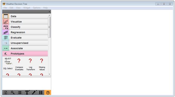
To load your weather data warehouse, click the Data tab, drag the ‘File’ widget onto the canvas, and navigate to your file. You will need to change the file extension to .csv in the Windows Explorer dialogue box in order to see your file in its directory (the default file type is tab-delimited).
Orange Canvas – file widget
Close the File dialogue box. Then drag the ‘Select Attributes’ widget onto the canvas, and connect the two widgets by clicking and dragging your cursor from the right side of the ‘File’ widget to the left side of the ‘Select Attributes’ widget. Double-click this widget, and drag the ‘Play45+?’ Attribute into the ‘Class’ field. Move the Day attribute to the ‘Meta Attributes’ box; we don’t want the tree to be able to use this attribute (it will use it spuriously if given the chance). You can experiment by removing some of the other attributes into the ‘Available attributes’ field. Click ‘Apply’ and close the dialogue box.
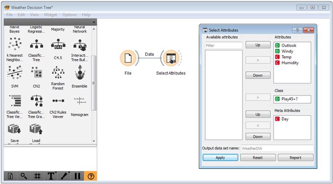
Orange canvas – select attribute widget
Next, click on the ‘Classify’ menu, and drag the ‘Classification Tree’ widget onto the canvas, connecting it to the ‘Select Attributes’ widget. If you double-click the ‘Classification Tree’ widget you can change its parameters, though it’s best to do this once you can actually see the tree that is produced.
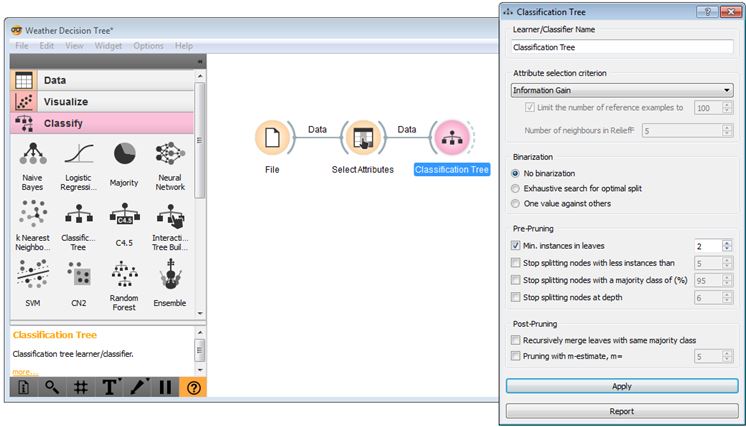
Orange Canvas – Classification Tree widget
To do that, click and drag the ‘Classification Tree Graph’ widget onto the canvas and connect it to the ‘Classification Tree’ widget as shown below.
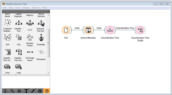
Orange Canvas – Classification Tree Graph
Double-click the ‘Classification Tree Graph’ widget to view the tree. The result should look like the one below (if your parameters match mine above). You can change the colours used by the graph to be more intuitive (like Red/Green) by clicking Set Colors and reselecting ‘Majority class probability’ as the ‘Node Color’. Check the ‘Number of instances’ box to see how many instances “pass through” each node. The pie graphs give an indication of the proportion of instances belonging to each target class value which pass through the node.
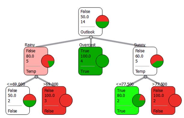
Orange Canvas – Classification Tree Graph result
This tree allows us to quickly learn about our tennis playing patterns: e.g. no matter what the other weather factors are, if the outlook is overcast, then it is very likely that we will play for more than 45 minutes. If it is rainy or sunny, then we have to check the temperature: if it’s sunny we can tolerate up to 77.5 degrees Fahrenheit, but if it is rainy we can only tolerate up to 69 degrees Fahrenheit. Notice that with the parameters I have chosen, the humidity is not used in this tree. If you take the ‘Min instances in leaves = 2’ condition off, you will see a larger decision tree. Fiddling with these parameters is all part of the experimentation process. We can also look at the impact of removing the Outlook attribute from the ‘Select Attributes’ widget to get an entirely different tree.
Reference Material
The blog post reading above is sufficient for completing the quiz and should be enough to complete the in-class exercises, but the following reference material might be helpful for advancing your understanding.
Pandas Merge
http://pandas.pydata.org/pandas-docs/stable/merging.html#database-style-dataframe-joining-merging
(Read the Database-style DataFrame joining/merging and Brief primer on merge methods (relational algebra) sections)
Pandas Apply-Lambda
http://pandas.pydata.org/pandas-docs/stable/generated/pandas.DataFrame.apply.html
(This is just the basic documentation for the “apply” operator)
https://pythonconquerstheuniverse.wordpress.com/2011/08/29/lambda_tutorial/
(Read up to, but not including the Why is lambda so confusing? section)
Data Mining (Machine Learning)
https://en.wikipedia.org/wiki/Machine_learning
(Read up to History and relationships to other fields)
https://en.wikipedia.org/wiki/Decision_tree_learning
(Read whole page; if this is too difficult to understand, google “Decision Tree Learning” and read some of the lecture slides posted)
Additional resource (not required): If you are interested in learning more about data mining / machine learning, I would strongly recommend Data Mining: Practical Machine Learning Tools and Techniques by I. H. Witten & E. Frank.
In-Class Activities (and Homework)
Your task is to repeat the same data handling process demonstrated above and then apply a decision tree learner to the resulting data warehouse, but this time using Human Resources data. Instead of learning about why we’ll play more or less tennis, we’re now interested in a more important question: which factors influence or indicate whether an employee is top-, mid-, or low-tier talent? HR Analytics is a burgeoning field in industry, and it’s only going to pick up steam as the war for top-talent wages on.
Note that all of the data is fictitious; some of it was taken from a publicly available online sample dataset, and the rest I generated with a series of random distributions, formulas, and some manual intervention.
Instructions:
- Download the data file (HRData), the mostly-completed Python script (AssembleHRDW (zipped) – you’ll need to extract the file) that you will use to assemble the data warehouse, and the memo template (HR Analytics Memo.docx). See WeatherDataAnalysis.xlsx for reference.
- Examine the data and script files. Look at the three different data tables to get a feel for them – does each employee have a performance evaluation for all four of the years? Also read through the functions and comments in the script. You’ll find that I’ve separated each of the processes from my “data handling process” into distinct functions – this helps with organization, but also with debugging (just comment out the line calling the function and it won’t run).
- The Python script needs to be completed. Wherever there is a ‘<??#??>’ you’ll need to fill in the blank. If you have a better way of accomplishing the same outcome, feel free to do so, but make sure it is in fact the same outcome.
- Once you have your data warehouse assembled, launch Orange Canvas and apply the decision tree learner to perform a rule induction analysis using ‘TalentTier’ as the target class. Make sure you take out attributes which the tree should not use (like performance evaluation data, names, IDs, etc.). Experiment with different decision tree parameters to get a sense of their impact on tree size and which attributes are selected near the top of the tree. Also experiment with removing and adding different attributes from being available to the tree.
- Find two different “rules” (or “findings”) in the tree which involve a combination of at least two different attributes (e.g. Accountants with Undergraduate degrees compared to those with Graduate degrees) which you find particularly interesting. Don’t just pick the first two things you see – look for findings that are interesting and worth investigating. Pretend I’m the VP of Human Resources and you’re an analyst coming to me with two interesting findings about the factors which differentiate our top performers from the bottom performers. To find something really interesting, you may want to remove a number of the less interesting attributes.
- Chances are these findings won’t be right at the top of the tree so at this point you can only be sure that they apply to a subset of the population. Investigate how well your findings generalize to the whole population by creating a graph or two in Excel (or Tableau if you wish). Then, write a few sentences explaining the finding, how you might interpret it (might be more than one way), and what kind of action you would propose to the VP of Human Resources (if no action, explain why).
- Submit your completed Python script, your data warehouse, and a brief memo using the template provided including: a screenshot of where in the decision tree you found each “rule”, a screenshot of the ‘Select Attributes’ window, copies of your charts and any statistics, and your discussion from #6 above for each of your findings (see memo template for layout). Name each of the files: ‘extension’.