“FIRST” Tablet Design Thinking
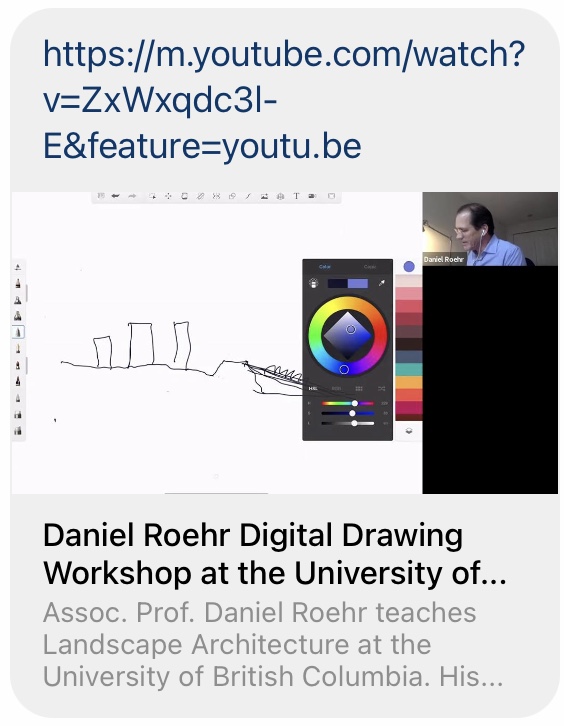
https://www.youtube.com/watch?v=ZxWxqdc3l-E&feature=youtu.be
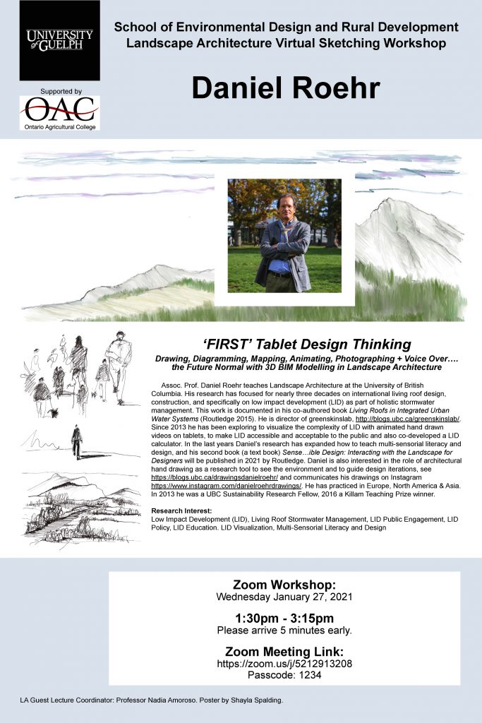
Daniel Roehr
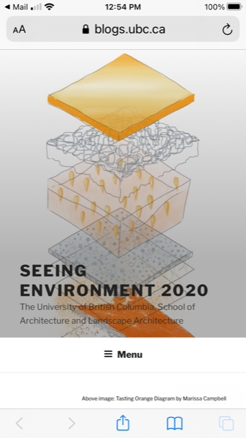
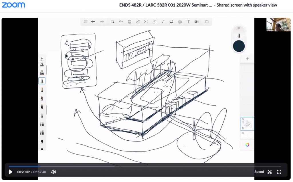
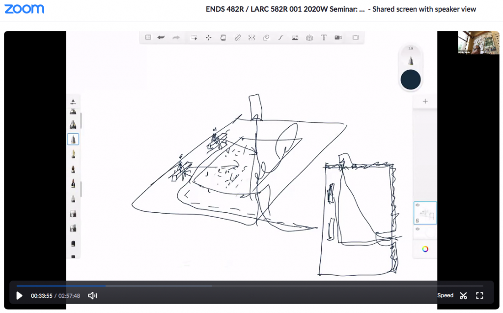
Teaching online can be exhausting, but it can also be supportive in learning. Students who are finding it difficult to draw beside their skilled peers in studio can practice remotely at their own pace, encouraging them to try to sketch without fear. Screen-sharing their sketches with their peers and instructor after trying alone, might reassure them to show and speak freely about their drawings, resulting in more sketching practice. If instructors record their ‘visualized’ tablet lectures, students can refer to them in their own time. Below are screenshot still images of the animated lectures of the Seeing Environment Seminar 2020 LARC 582R – UBC (Photos by Bruce Marchfelder, UBC).


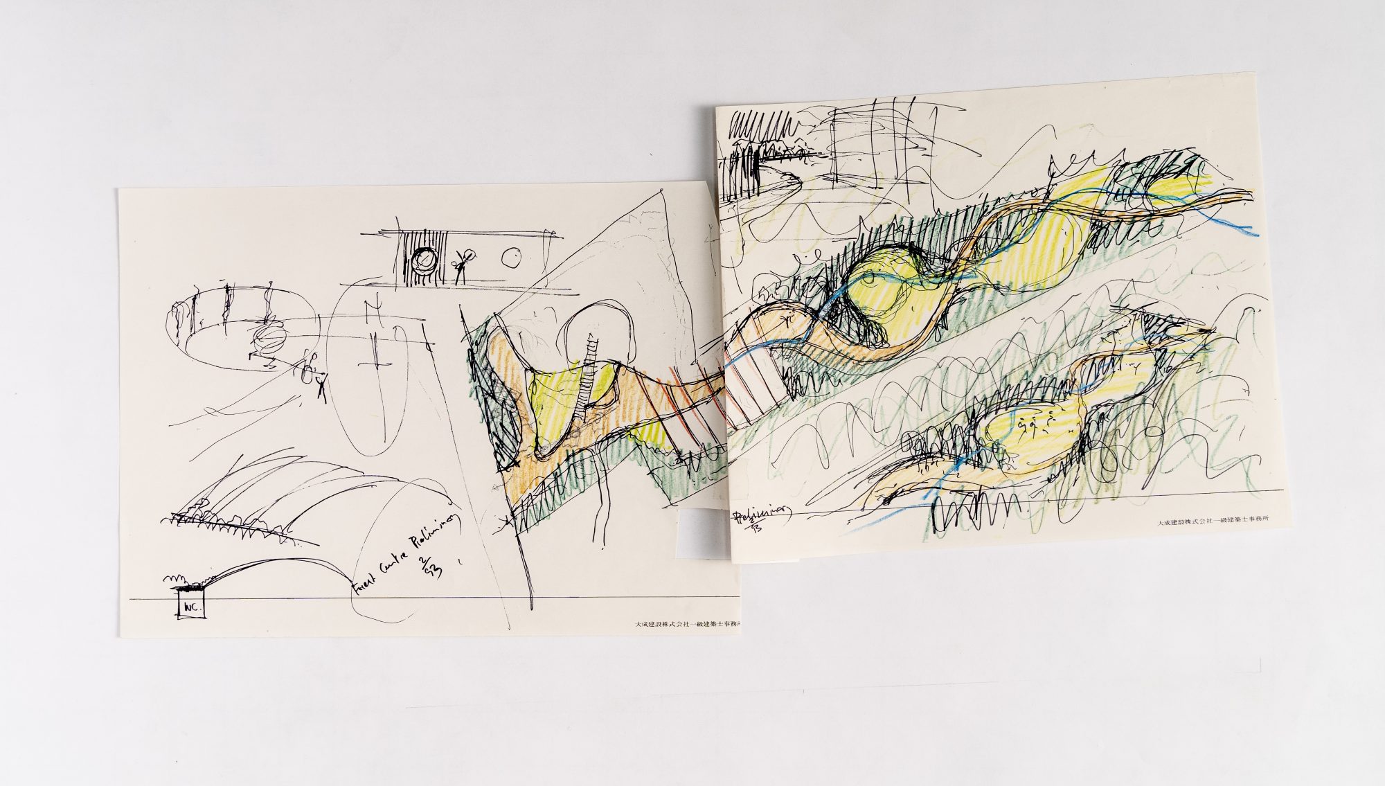
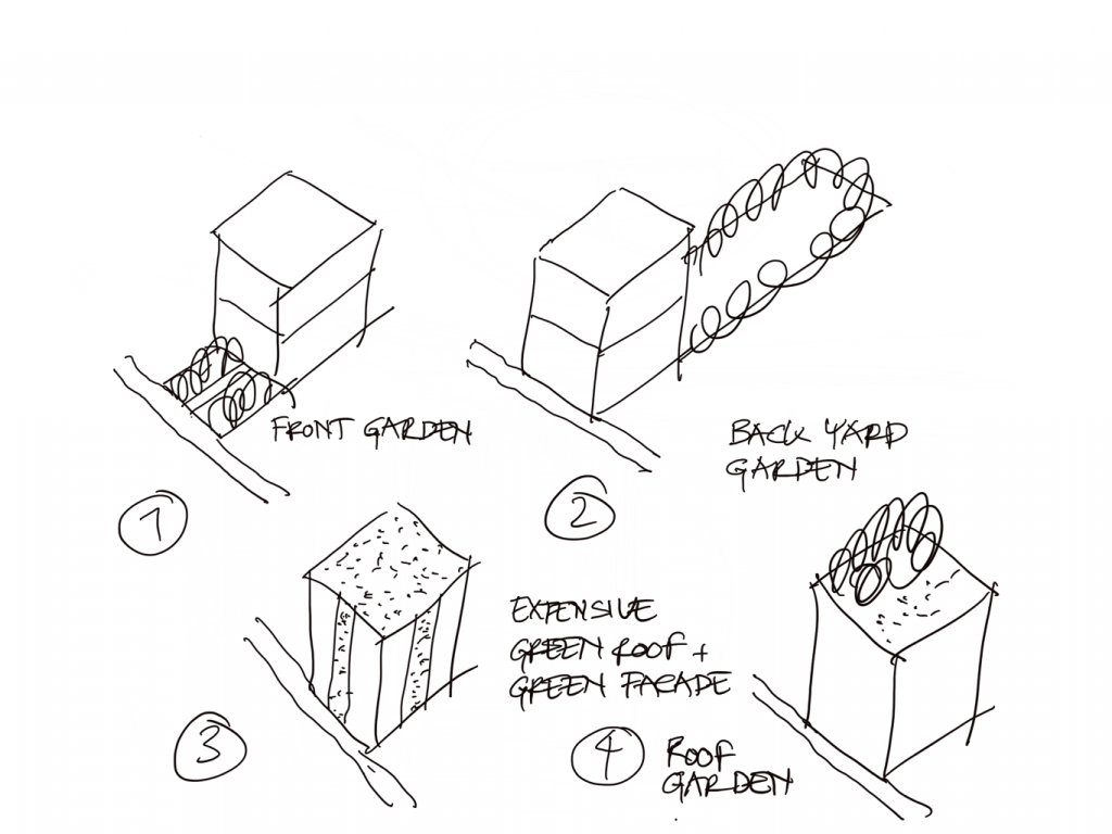
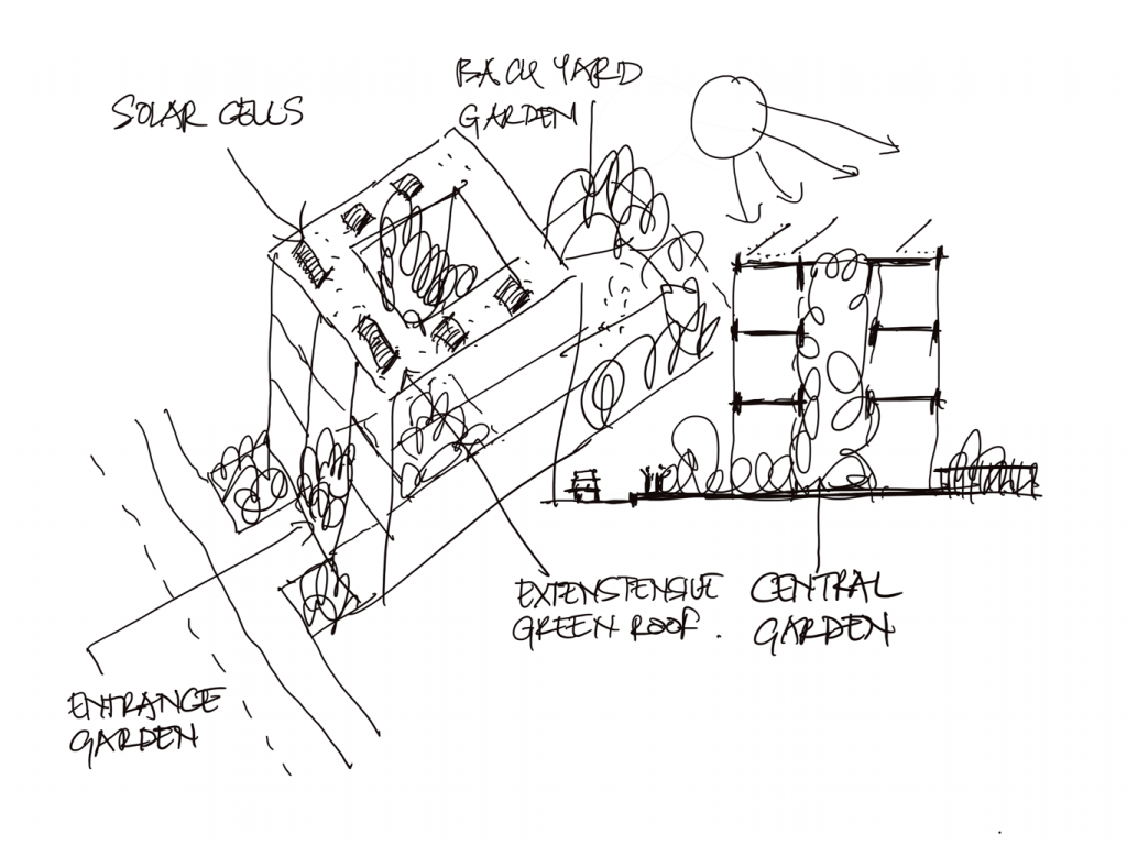
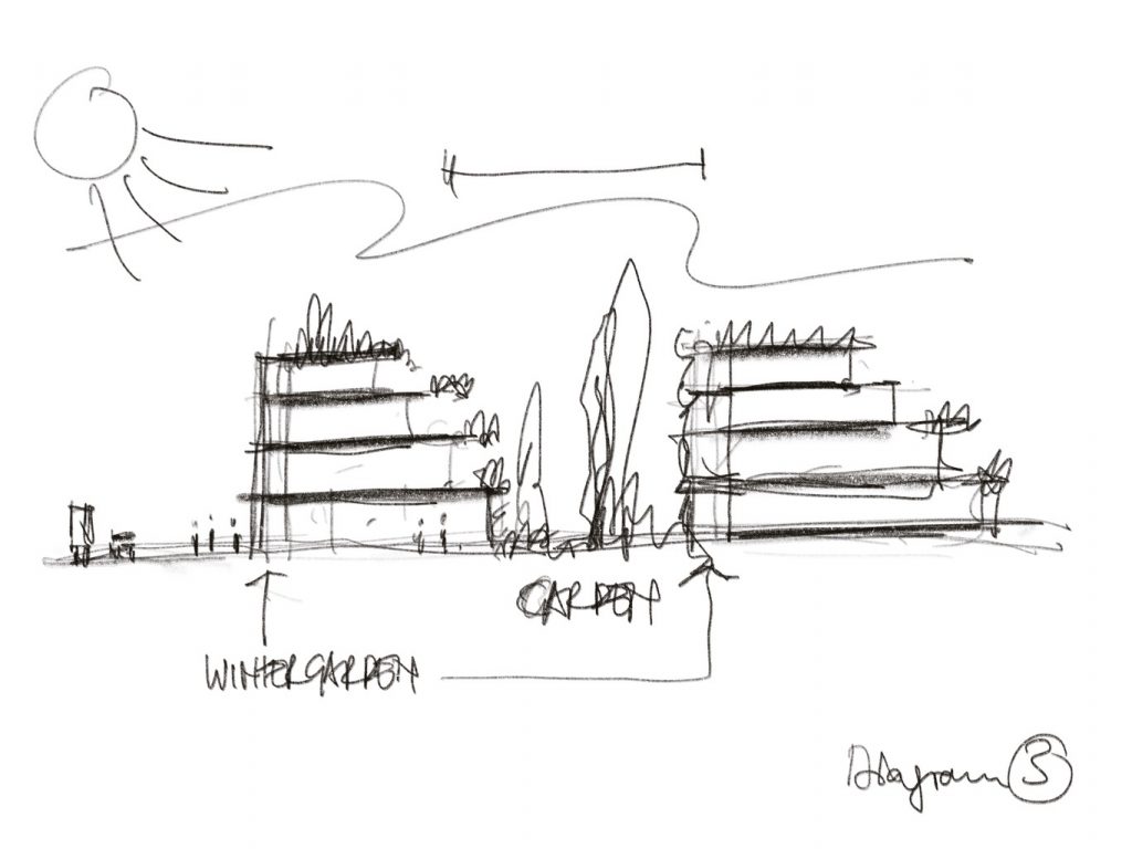
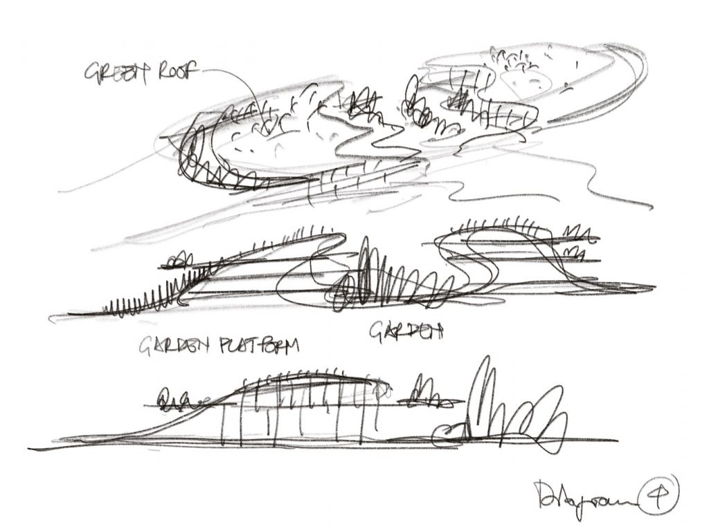
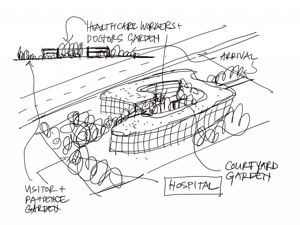
Using sketching to develop and communicate ideas for image renderings is not new. The examples shown are for a new journal article ‘Gardens are… Buildings’ to be published August 2020 in Landscape Architecture, BFU, China.
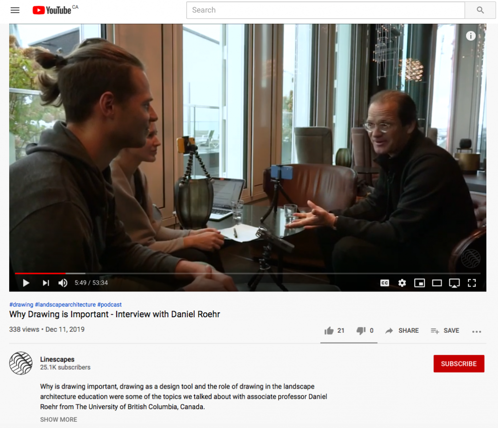
Sonja and Gasper of Linescapes Berlin interviewed me in October 2019 in Berlin about drawing. This is a 53 min long session on how I started drawing and why I believe it is crucial for design education and professionals to use hand drawing, even today with all the digital tools available. Have a look: https://www.youtube.com/watch?v=rRp-rwXCLyo&feature=youtu.be&app=desktop
Short animations drawn on a tablet are a fast, efficient and powerful tool to convey a message, a complex technical detail or diagram in visual and spatial two- or three-dimensional manner. Through the animation of coloured lines one can highlight how a system works. For example, the rainwater flowing movement and drainage behavior of water through an assembly of different living roof layers and down a drainpipe into a bio-retention area could be shown. The speed of the animation should allow for reading the annotations and the number of scenes should be minimal to keep the content focused. The videos should be short, about a minute long as the focus is on a concise design, message or technical function. Use darker colours as light ones will not read well if the animation is uploaded on a public video platform as they automatically reduce the file size such as YouTube. See INSTAGRAM: danielroehrdrawings for examples.
Letting your memory “draw” so to speak, visualizing your own observations through drawing during travels is a visual and cognitive way to memorize a place and learn through the drawing created, what was important for your brain to memorize as an observer or user. It is useful to wait a day or two for the observations to be processed by the brain. Drawing the sketches should be fast and focused on the overall structural and spatial experience of the place or landscape visited. Memory sketching is stored information and is drawn directly from the brain via the hand on paper while referential sketching (on site sketching) uses the brain as instant “image translator” judging the image detail which part seen should be drawn. Memory sketching avoids the anxiety of drawing exactly what one sees and focuses more on the overall atmosphere of a place. (Below android phone S Note digital sketches from Bath, England and on the train Bath to London, June 2019)
Eye-level and aerial perspectives are useful tools to develop and check spatial experience. The aerial perceptive is used to develop and visualize the spatial program while the eye-level perspective is useful to design the experience in the space. Materiality, colours, textures and human scale, for example, in relation to context can be explored. Aerial perspectives are not useful to explore human scale, as its more a bird’s experience, then a human one. They are however, useful to show the design in its surrounding context. Eye-level views on the other hand are a more realistic tool to design the spatial experience. It is also useful to show the whole design process in sequence in the concept phase as it will help developing and editing ideas and explain the design process to a client.