 Student evaluations of teaching (SET) are standard fare in higher education where there is often relatively little information available to judge what is supposed to be a major part of professors’ work. There are often long end of course surveys students complete, covering everything from whether the content was relevant to the professor’s competence to whether students felt fairly treated. Putting students in a role as observers of what happens in classes isn’t a bad idea, and I’ve written about the Measures of Effective Teaching Project here. Not everything that is asked of students is clearly in their realm though, such as whether the professor knows his/her stuff, and much more care should be given to asking students to observe what is observable and experienced specifically by them. This matters when the data from these surveys are used to make career decisions about professors. The overall evaluation process for tenure, promotion, merit pay, and continuing appointment involve more components than teaching and indeed scholarship (publishing) is often compensatory and can nullify a poor teaching evaluation. But that’s another post, for another day.
A recent study at NC State points to a specific, and serious, problem with student evals of teaching: they are gender biased. One of the basic issues in instrument construction is validity and it would appear student evaluations of teaching aren’t living up to this expectation.
“The ratings that students give instructors are really important, because they’re used to guide higher education decisions related to hiring, promotions and tenure,” says Lillian MacNell, lead author of a paper on the work and a Ph.D. student in sociology at NC State. “And if the results of these evaluations are inherently biased against women, we need to find ways to address that problem.”
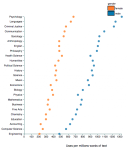
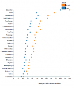
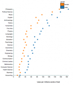
Benjamin Schmitt, an assistant professor of history at Northeastern University, who is interested in data visualization has given us what might be the most useful data to see the effects of gender bias. He used Rate My Professor as the data source describing his analysis here, and before you get all uppity about this there is at least some evidence of a reasonably high correlation between ratings on RMP and institutional SETs. Schmitt has created an interactive chart to explore gender, discipline and student ratings. It’s pretty amazing… and eye-opening. I’ve clipped just a few examples when different terms are used to search the data base. Apparently male professors in psychology might have futures as stand up comedians, all education professors are so caring any of them might be the next Mother Teresa, and all philosophy profs are brilliant but men more so than women. Not all descriptors are gender biased… attractive, for example, leads us to believe education professors are the least attractive (ouch!) while the hotties are female criminal justice and male philosophy profs… but a surprisingly consistent pattern of gender bias against women across disciplines is apparent.
Explore this interactive chart and be amazed, even appalled. You’ll find that men are more likely to be seen as a star, knowledgeable or awesome and women are more likely to be seen as bossy, disorganized, annoying and to play favourites, whilst being either nicer or ruder than men. (Wait, is that rudely nice OR nicely rude?)
But then ask if the student ratings have any basis in fact. Are philosophy professors really more brilliant than professors in accounting, business or health sciences? Do women across all disciplines lack a sense of humour? In other words, the problem with these ratings are complex and layered… gender bias, for sure; truth value, disputable. And yet, faculty committees and higher ed administrations persist in using such flawed data or at least continue to symbolically offer it up as grounds for important personnel decision making.
 Follow

