
“I don’t love it, but I think it will grow on me”
These are the words that came out Philip Knight’s mouth when he first saw the design for the iconic swoosh logo, designed by Carolyn Davidson for $35 in 1971. Here we are after over 4 decades, and the swoosh has taken over the world of sports and it probably has one of the most powerful brand images in the world.
Having worked in the graphic design field for years, I have always been amazed by logos, the power they have on projecting the brand image and the association they create over time with respect to the brand. Recently I read a book called “50 Best Logos Ever” which triggered my already-existing admiration for logo designs and I wanted to post about it. In this article, I wanted to focus on analyzing the design and the impact of one logo as opposed to going through that list and I thought that Nike would be a great example that represents the power of logos and branding.
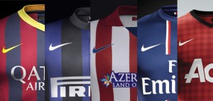 A logo is so much more than a visual design. It’s the symbol of the entire identity and the brand. It is on every single product, letterhead, business card, marketing collateral, signage and any other marketing communications medium. When Carolyn Davidson came up with one of the most simplistic logo design ideas for the Nike brand, she probably didn’t anticipate the brand to be where it is today and what the impact of her design would be. The swoosh is now so tightly tied to the Nike brand that the company stopped using the word “Nike” on its products, because the swoosh itself creates the association in everyone’s mind that they know what brand it is.
It is also interesting to observe the evolution of logos through time. As the art of graphic design became more sophisticated and computerized, the design concepts started changing with it. Just like the process itself, design techniques have become more advanced as well, taking into account consumer psychology by using colour themes to trigger certain emotions and project the brand image. A great example of this is to observe the evolution of the logo design for Shell Corporation. As seen in the timeline below, what started as a realistic drawing of a mussel shell kept evolving through time into a bi-coloured clip art type image, gradually simplified into a basic shell drawing. By 1971, the logo that we see today was initially designed by Raymond Loewy, who also designed the logos for BP and Exxon. The idea to create this new generation logo emerged when the company felt that its emblem was hard to recognize from a distance, especially seeing that the logo was primarily placed on the side of a road with traffic passing at speed. Over the next 3 decades this logo has become so recognizable that it is now being used without the company name to identify it, which marks a truly successful logo just like in the Nike case.

 After conducting a bit of a research on it, I found out that Craigslist was found by Craig Newmark in 1995 in San Francisco. He initially started it as an email service, sending lists of local events to his friends in the San Francisco area. Soon after the launch of the website based service, word of mouth led to a huge growth in subscribers and postings and Craigslist started expanding beyond San Francisco area and into Boston, Chocago, Los Angeles, New York, Portland, San Diego, Washington, DC, Sacramento, Atlanta, Austin, Denver and Vancouver.
 Coming back to the main question about the business model of Craigslist, there are a few interesting facts to note. First is that Craigslist is run by a very small group of people (just over 30 employees). Although it incorporated as a for-profit company in 1999, it is still putting a lot of emphasis on the relatively non-profit nature of its operations, hence the .org extension to the website. According to Alexa.com, the site has 20 billion page views every month, making it the 37th most visited website worldwide, and 10th most visited website among the websites in the US. These visits produce a total number of over 80 million classified ads per month, 2 of which are job postings, making the website the top classified ads service all across.
 With Facebook introducing the hashtag function recently, it is now officially a cross-platform functionality across all social media tools. It is ironic how something that was originally designed to organize tweets by grouping them into categories has now become a powerful marketing tool for businesses and even for individuals. It has become such an important tool now that independent websites such as twubs.com are being created in order to inform people of which hashtags are popular for which events, topics or people so that companies can use proper hashtags to reach the right users.
 It is often mentioned in motivational speeches that the Chinese word for “crisis” is composed of two characters representing “danger” and “opportunity”. Ever since I learned about this, I have been trying to find the opportunity in any major change in my life even if all I can see is the danger. Growing up in Turkey in a somewhat “protected” environment close to my family and friends, I was free from crisis. However, in 2007 after I graduated university, I faced the first major crisis of my life. I decided to move to Vancouver to pursue a diploma in business management. This move was not only a big move in terms of distance from home, but also in terms of leaving my safe, crisis free environment. Moving to Canada meant being completely on my own away from family and friends. It meant leaving everything behind and going to a completely strange place where I didn’t know anyone. Not to mention having the language barrier in the beginning and the general uncertainty of my life at the time. But, business management in Canada was the opportunity I wanted, so I went for it anyway.