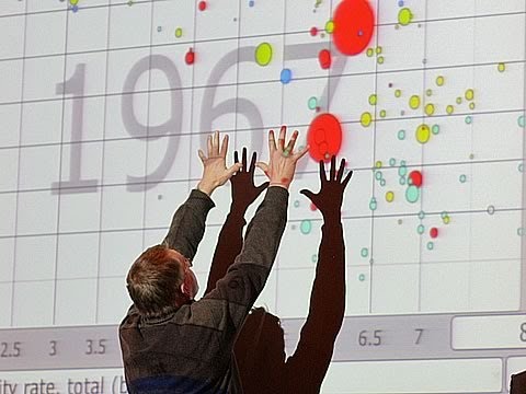
Hans Rosling’s TED presentation is an excellent example of how visualizing knowledge can challenge our stereotypes and taken for granted common nonsense. While the presentation utilizes large scale data bases to create the graphs, it is still an instructive example illustrating the importance of visualization and dynamic data presentation.

 Follow
