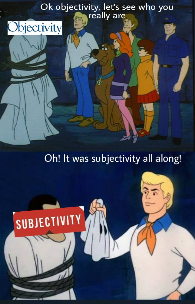
Subjectivity masked as objectivity is a common trope, it turns out, and not just in maps!
Geo-blog from MIT Senseable City Lab
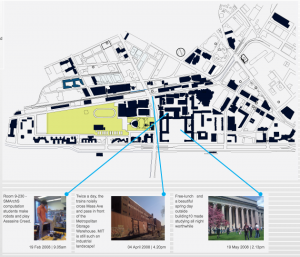
Geo-blog is a web-based platform for geo-tagging and sharing user generated content on the one hand and retrieving the shared, geo-tagged content based on current location on MIT campus at any given time on the other hand. The platform is open to MIT community for the content contribution part and open to public as a location-sensitive content viewing platform.
“Map designer Aris Venetikidis is fascinated by the maps we draw in our minds as we move around a city — less like street maps, more like schematics or wiring diagrams, abstract images of relationships between places. How can we learn from these mental maps to make better real ones? As a test case, he remakes the notorious Dublin bus map. (Filmed at TEDxDublin)”
A local visual artist, Natasha van Netten, explores mapping from a whale’s perspective:
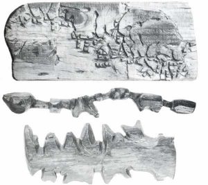
My current drawings and paintings revolve around the largest, most illusive creatures alive—whales. In the advancing field of Cetology (the study of whales) data is scarce and research is often speculative and hypothetical. My work translates this scientific information into a language of accumulated marks and brush strokes to give clinical data a visual meaning while exploring this mysterious space between known and unknown information. (van Netten)
In her series titled Cetacean: Chartwork (samples below), she inverts what is positive and what is negative between water and land forms. It makes me think of an interpretation of the Nolli map. One version can be occupied by humans, and another by whales.
To see more of her mapping work:
https://natashavannetten.com/cetcean-chartwork/
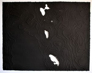
Dominica: -61.339, 15.447
22″ x 28″, India ink on embossed paper, 2016
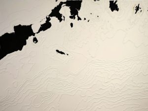
Bering Sea: -161.411°, 54.795°
22″x30″, gouache on embossed paper, 2015
Ted Talk to watch:
Good article to read:
https://www.theatlantic.com/entertainment/archive/2011/10/paula-scher-makes-enormous-maps-that-are-only-sort-of-right/246880/
We’ve looked at bias in mapping, how about mapping bias? And think about the power of maps to affect change.

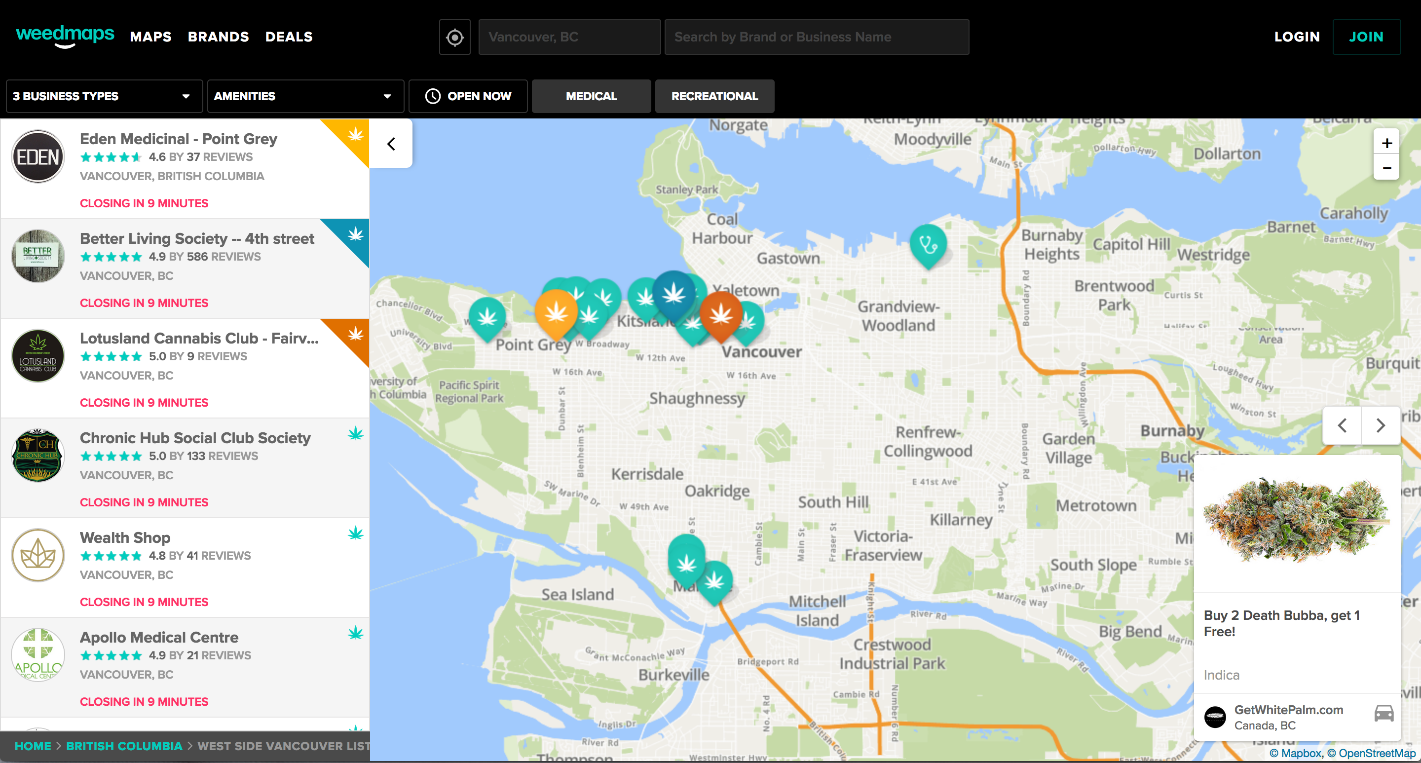
Disclosure: I’m not promoting or condoning this app- I just happened to see 2 billboards for it over the long weekend and thought it was funny enough to share it. The first “High Vancouver” billboard was spotted driving back into Vancouver from YVR, perhaps banking on cannabis tourists arriving to the city. The second was in Brewery Creek – an area full of breweries and a number of dispensaries.
Available in the App Store or visit directly here.
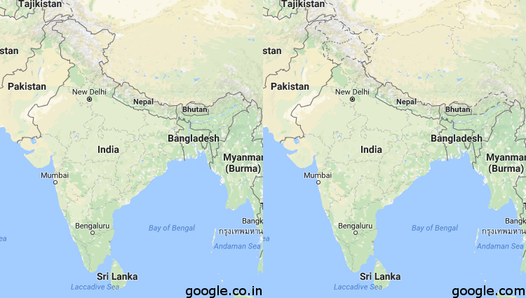
These two maps reflect the Indian Northern Border as depicted on Google.com (the American reflection of Google Maps) and Google.co.in (the Indian reflection of Google Maps). This ambiguity is hugely important and affects huge amounts of people. What are the implications when we take maps the Google maps to be objective and true?
Sam
https://i.redditmedia.com/Y9_kGExGF1M8Rjx_KdiRQgG9aeOO8dPuUoGaR5YiSfg.png?w=750&s=7503e960fa5b2fb16d751900801cc6e2
 Follow