Deconstruction
 Click on the image above to visit the interactive map.
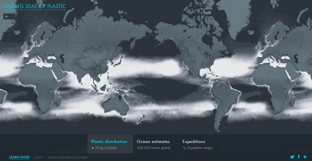
INTERACTIVE MAP: SAILING SEAS OF PLASTIC
This map shows an estimate of total number of plastic particles and their weight floating in the ocean. It visualizes the data collected from a series of exhibitions conducted in oceans around the world measuring the weight of plastic pollution in the water. This interactive map visualizes data and data modelling methods discussed in a publication called “Plastic Pollution in the World’s Oceans: More than 5 Trillion Plastic Pieces Weighing over 250,000 Tons Afloat at Sea“.
THE DATA
AQUIRE
This data was collected from 24 exhibitions from all oceans around the world from 2007-2013. They collected this data from net tows, then manually separated the plastic debris from natural ocean debris. As they could not collect and weigh all pieces of plastic, they categorized the plastic debris into 9 different categories, each category with an assigned mean weight, in order to determine the weight. They also collected data on ocean circulation based on wind speed, wind stress, heat flux, and precipitation; as well as data for travel speed for particle pollution.
PARSE
Plastic debris was categorized into 4 different size classes: Two micro plastic classes, one mesoblastic class, and one macroplastic class. They also measured count density and weight density on their exhibitions to create heat maps.
FILTER
MINE
Fragmentation rates were used to estimate the particle counts in other parts of the ocean. They created an oceanographic model, that assumes that amounts of plastic entering the ocean depend on 3 variables: Urban development within watersheds, coastal population density; and maritime activity.
THE REPRESENTATION
REPRESENT
A dot map was used to visualize the density of plastic in the ocean. One dot represents 20 kg of plastic. Exhibition routes were also represented, as well as count and weight density heat maps for these routes. Proportional symbols were used for total count and weight of plastic per ocean.
REFINE
They used the Mercator projection for this map, and world is centered on the Pacific Ocean. The colors are aesthetically pleasing, and the continents are not brightly or dominantly coloured as they are not the focus of this map. The white dots provide a good contrast against a dark background. The blue draws attention to other types of information, like exhibition routes as well as proportional symbols used for total count and weight of plastic per ocean. Basic symbolization features, like country and city names are included when zoomed in to the map, but they are not distracting to the eye, and can provide a reference to the map reader. The land elevation and rivers are also shown on this map, but does not draw attention away from the more important features on the map.
INTERACT
This map has zoomable features, which allows the map reader to view dots in large scale areas in more detail. Exhibition routes can be clicked on to view count density and weight density heatmaps on each point along the route. An interactive infographic was also provided to help the map reader visualize the data modelling method. There are several layers of legends on this map. The first legend is found along the bottom, listed with basic information on what the white dots represent, global ocean estimates, and symbolization exhibition for exhibition routes. By clicking on ocean estimates, you can view a proportional symbol graph of plastic count and weight per ocean, based on four class sizes. By clicking on exhibitions, the exhibition layer is toggled on, and each blue route can be clicked on to view heat map information on count density and weight density. A side tab “Exhibition Stages” can be clicked on to view an explanation on the heat maps, and by clicking on “LEARN MORE” you can see more information on how to read the visualization, about the study, and about the data modelling method.
BIASES IN VISUALIZATION
This map was shown in Mercator projection, which I don’t think was necessarily appropriate because it distorts the estimated polluted areas to be proportionally smaller. Entire areas of the ocean do not contain any data, which may also make the ocean seem less polluted than it really is. There is a legend with a scale of dot density to represent weight density of plastic. When zoomed out, the dot density for most areas seem highly dense, and not as dense when zoomed in. For areas of high dot density when zoomed in (most coastlines), this meaning is lost when you zoom out on the map (South east asia in particular). The layered effect of these legends allow the map reader to easily digest the information on this map, and allow the map user to understand different types of information before delving deeper to gain a further understanding. This map appears to be trustable, because of the amount of data and information provided.