Infographic
This infographic is informative, visually appealing, and easy for the map user to understand. Before entering the infographic, there is a short description of what the infographic entails. This is incredibly helpful for the map user, as it serves as an effective way of introducing the context of a map with immense amounts of data. Upon entering the infographic, the features are easily detected by the map perceiver. A map user would easily understand that this is a map of the world, and would be able to understand that there there seems to be more “persons of concern” in the centre based on circle concentration and size. My eyes were initially drawn to the cluster of circles on the map, then would scan the rest of the map to find the legend, number of persons of concern on the top left, then the time scale on the bottom. A large number is dominantly presented in the top left corner, which is useful for perceiving the message of the map. The message of the map is effectively conveyed, because the map user can easily understand that there is an increasing number of refugees over time. The color choices are pleasing to the eye, which is also important to grabbing the map user’s attention.
Although this infographic generally does a good job of showing where these persons of concern are going in the world, it does contain a lot of data that is not necessarily easy to see. These circles are clustered closely together, and it is difficult to see the size of all the pie chart slices. However, there is a zoom option on the map which helps the map user see this information more clearly. Each pie slice size is clearly stated in the legend of the map, so the map user can more easily read this information. Furthermore, you can also toggle each layer on and off.
Overall, I found that this map was very effective in conveying its message, despite containing a lot of data. The visual presentation and the initial descriptive blurb shown before opening the map, were effective in gaining the map user’s attention.
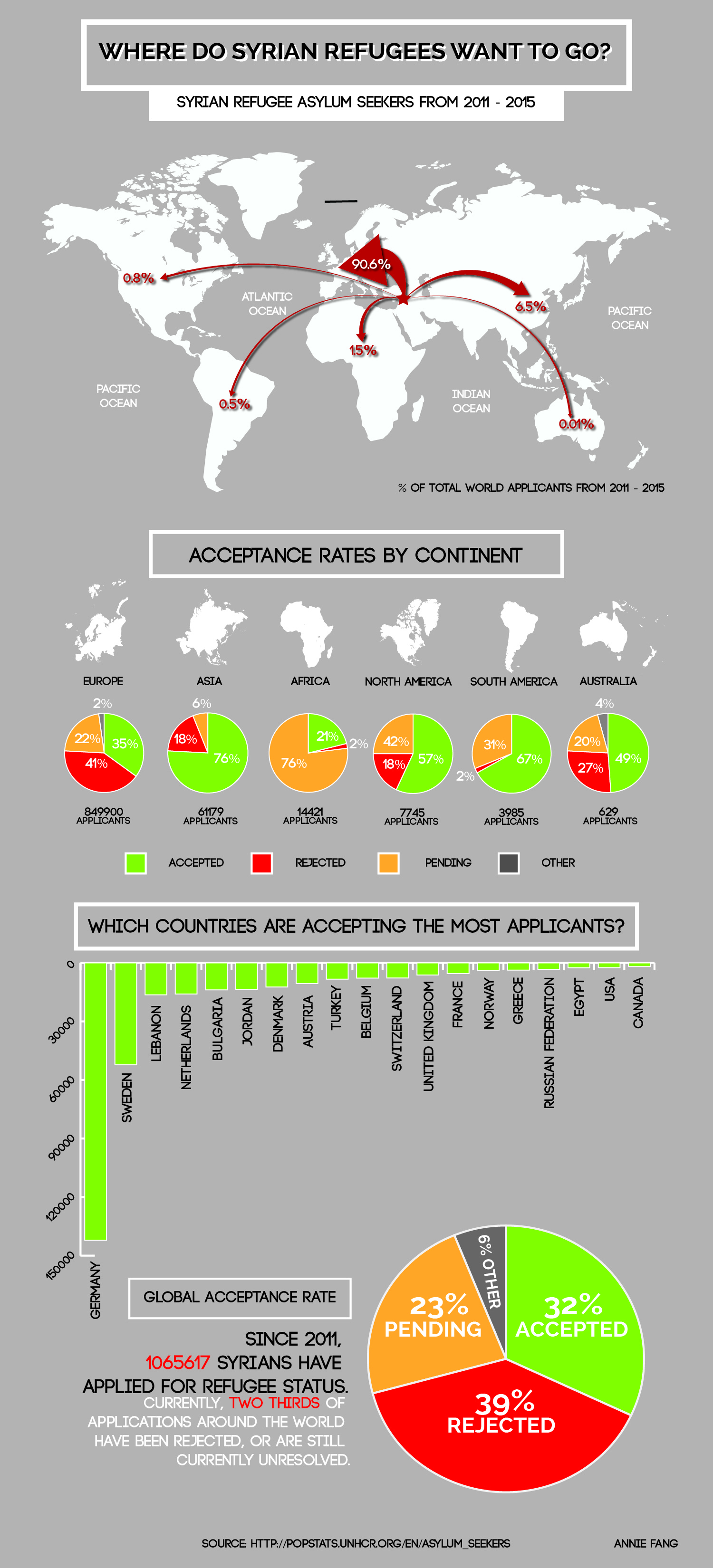
SYRIAN REFUGEE CRISIS
For my research in cartography class, I was asked to create an infographic on Syrian refugees seeking asylum in countries around the world.

This is the data I used. In the first tab, you will find the raw data collected from UNHR. Upon classifying the data, I decided to add up all the application numbers by country, continent, or world.