
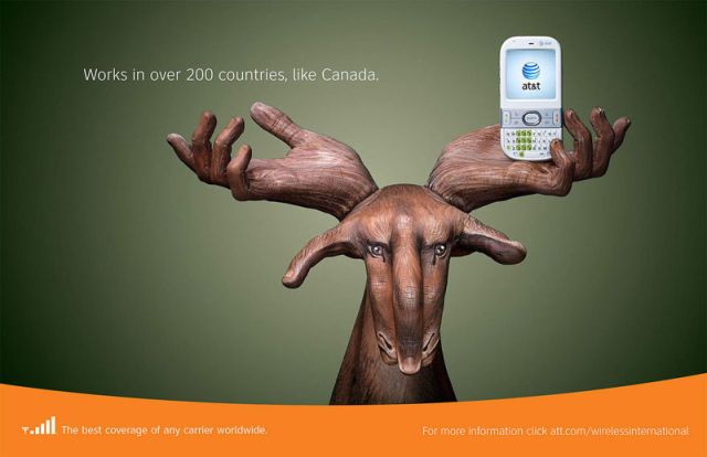
At & t is extremely creative in their promotional campaign. The company utilizes human hands to portrait animals, plants, tower, pepper, and other innovative items. In each ad drawing, the marketing mix of 4p’s is clearly delivered. For example, the portrait illustrated above, is a presentation of a Canadian moose from my interpretation. When associating Canada, we think about maple leaf, and Canadian moose. Moose is the largest member of the deer family, which symbolizes Canada being one of the largest countries worldwide. The three hands in sketching the moose signify reaching out from the four corners of the world. Hence, the sketch conveys the idea that the wireless coverage “works in over 200 countries, like Canada”. The hand holding the blackberry is clearly the product, and the company adds value to this product by associating moose with Canada. This gives a patriotic feeling for Canadians to use At & t because it adds value to the product. In addition, this unique promotion scheme has capture customers to feel a sense of belong and loyalty toward At & t. As a result, the company has channeled long term relationships with customers, as At & t launch itself into a value based era of marketing.