
In this lab, we were introduced to a free software called CrimeStat. It has more than 100 statistical routines for the spatial analysis of crime, and is designed to interface with most GIS programs so we are able to visualize our results and/or explore them further.
For our crime analysis, we examined (residential and commercial) break & enter crimes and car thefts in Ottawa-Nepean, Ontario. Within CrimeStat, we conducted the nearest neighbour analysis, Moran’s I correlogram, hot spot analysis, nearest neighbour hierarchical spatial clustering (Nnh) and risk-adjusted nearest neighbour hierarchical spatial clustering (Rnnh) routines, and kernel density estimations.
The nearest neighbour index (NNI) of crimes for Ottawa-Nepean were all less than 1.0 which suggests evidence of spatial clustering (Figure 1). This indicates that the observed average neighbour distances of crimes are more clustered than expected on the basis of chance; and are significant different (as per their p-value for both one tail and two tail tests). While the NNI values of all three types of crime are rather similar, the incidences of commercial break & enter (B&E) and car theft are slightly more spatially aggregated than residential B&E at the 1st order level. This tends to make sense since commercial land use areas are most often clustered together within a city (e.g., central business district or downtown), whereas residential land use areas are slightly less clustered than commercial land use areas within a city (e.g., different neighbourhoods). Car theft falls in between the B&Es since cars are generally found where people are found or located (i.e., commercial, residential, and so on). Furthermore, the results also show that the index does change as a function of the types of crime and the nearest neighbour order.
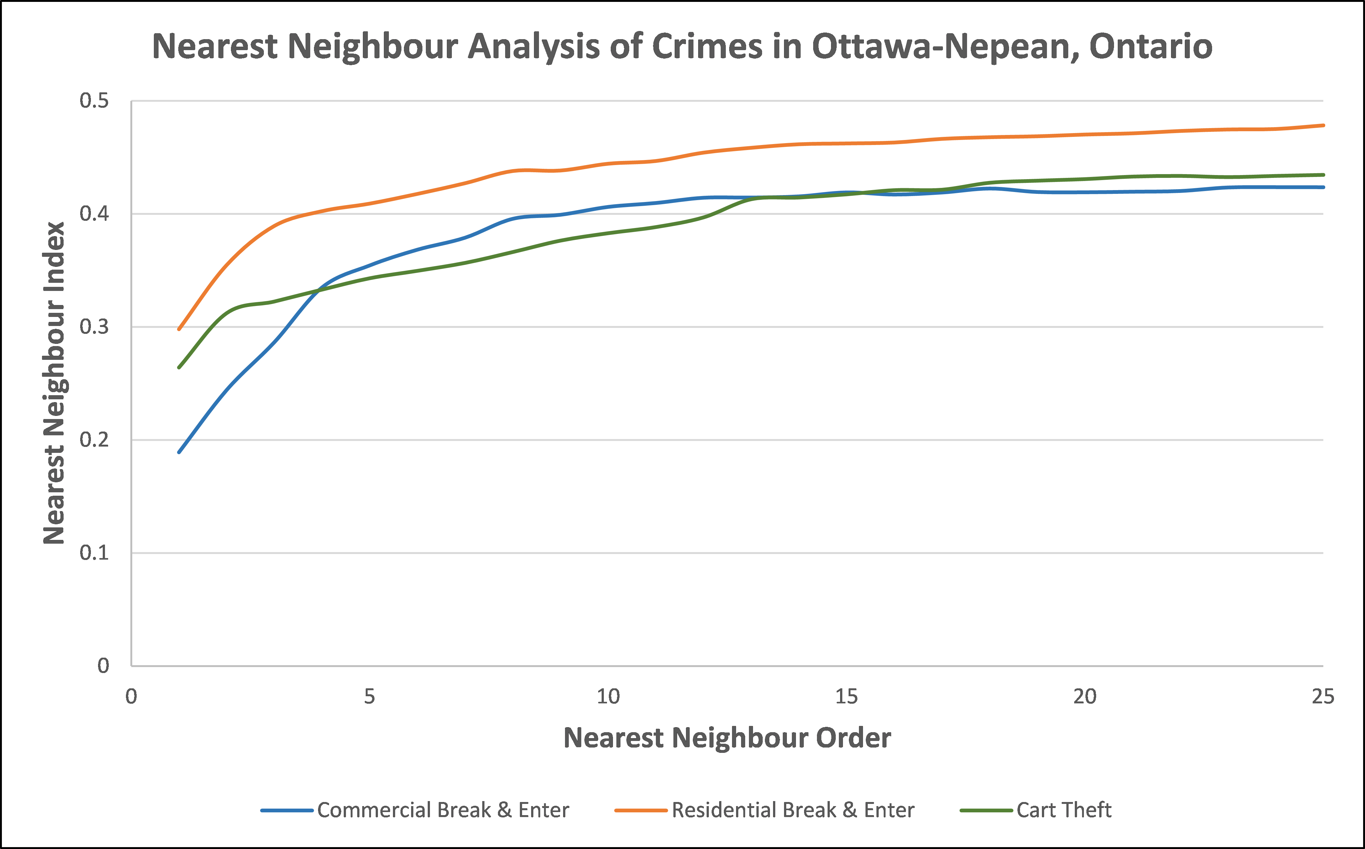
Another way to examine the spatial distribution of the incidents is to determine the spatial autocorrelation of the intensities of the crimes within the dissemination areas (DAs). While the nearest neighbour analysis considered the spatial patterns of the incidents (i.e., point patterns), spatial autocorrelation, specifically the Moran’s I statistic, considers whether the incidents are associated with the distribution of DAs (i.e., areal patterns). However, Moran’s I statistic is a global autocorrelation index which does not distinguish different subsets. Thus, an alternative approach is the Moran Correlogram which calculates the I value by different distance intervals, for which is set to 200 for our analyses. From this we find that the crimes tend to follow the trend demonstrated by the total population variable, suggesting incidents of crime are related to the population of DAs. Furthermore, we are again able to see that residential B&E indicates more evidence of clustering, i.e., spatial autocorrelation, than commercial B&E and car theft. As well, car theft indicates more spatial autocorrelation than commercial B&E. Thus, the result of the Moran Correlogram align with the result of the nearest neighbour analysis.
Since residential B&E demonstrated the most evidence of spatial clustering, or more spatial autocorrelation, a hot spot analysis, using fuzzy mode routine, was conducted to further examine the clusters of these incidents. The fuzzy mode routine allows users to define a small search radius around each location to include events that occur around or near that location, for which we have specified as 1000 meters in our analysis. This reduces the precision in measurement by identifying locations where a number of incidents may occur, but it allows for the identification of small hot spot areas (depicted by points) since cumulative count around a location may be high. Through this, we are able to identify that hot spot points are present in the residential neighbourhoods near the Ottawa River (i.e., LeBreton Flats neighbourhood), as well as near Downtown Ottawa, Chinatown, and Parliament Hill (i.e., the far east concentration shown on Map 1). For example, the concentration of the biggest, dark red dots indicating greater frequency of residential B&E incidents (between 187 to 247) are largely found within Chinatown. This is to be expected considering higher population density in addition to the large volume of people passing through these areas which relates to the Routine Activities Theory.
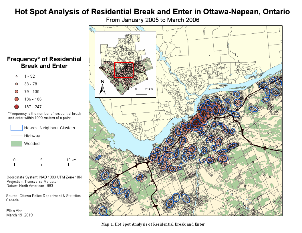
In addition, to identify hot spot areas, as opposed to individual points that are clustered, the nearest neighbour hierarchical clustering (Nnh) routine was conducted. This allows us to identify groups of incidents that are spatially close. From this, we see the blue ellipses on Map 1 representing the Nnh clusters. This allows us to easily visualize areas with similar residential B&E crime rate. While not all of the fuzzy mode hot spot points lie within the Nnh clusters, the points within the ellipses appear to have been clustered fairly well as I can see similar frequency ranges grouped together.
However, the identification of clusters using absolute data can at times produce misleading impressions since the underlying conditions are not known (e.g., higher population density in some neighbourhoods than in others). This could mean that the relative risk to a person in one area may be much less, or greater, for a person living in another area. From Map 1, we identified that hot spots of residential B&E incidents were clustered in and around more populated neighbourhoods and areas of Ottawa-Nepean, Ontario. So, applying risk-based techniques to account for such differences, if any, is useful in our analyses.
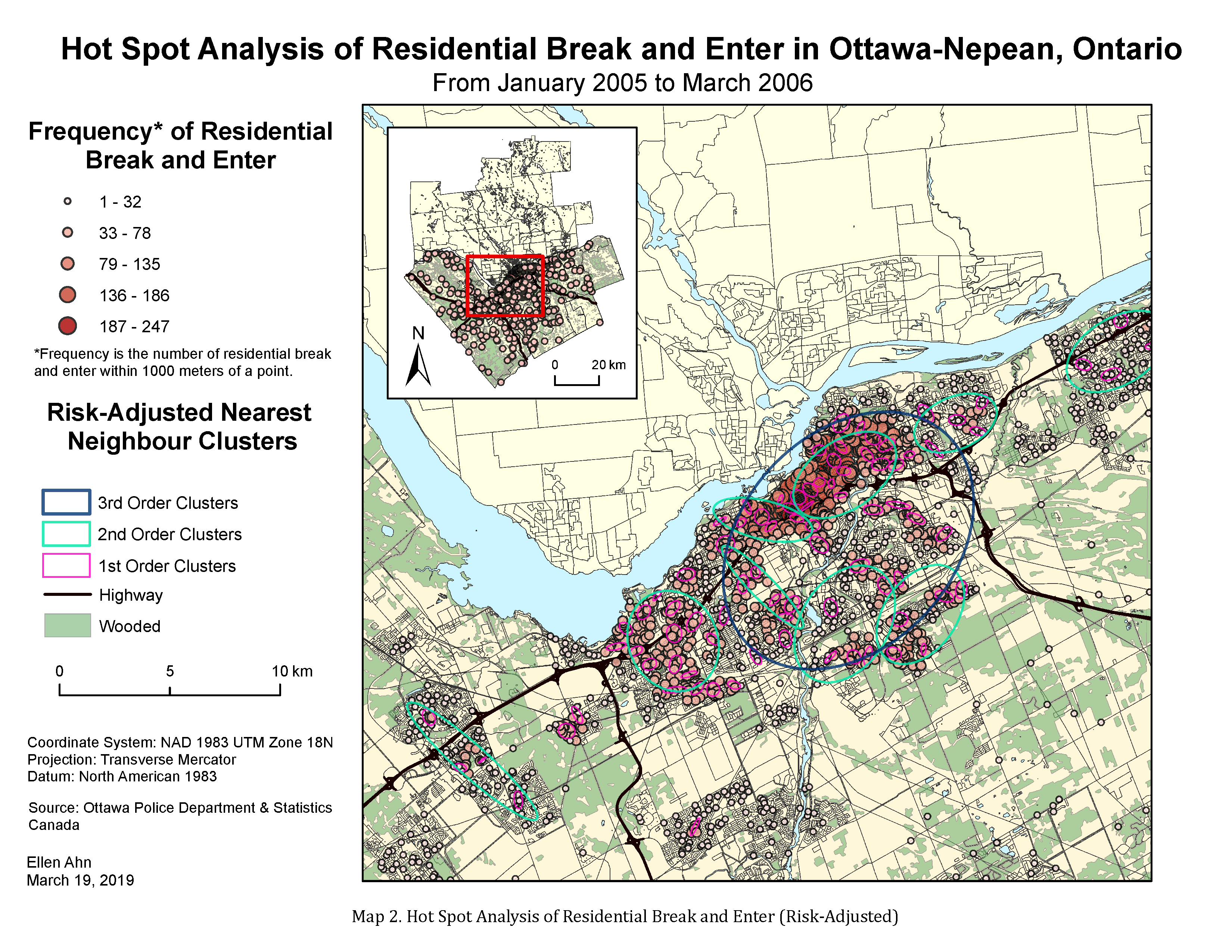
In Map 2, we can see the Risk-adjusted nearest neighbour hierarchical spatial clustering (Rnnh) grouped into 3 orders of clustering, i.e., 1st order, 2nd order, and 3rd order. The 1st order clusters show smaller clusters, by ellipses, of residential B&E incidents in the hot spots concentrated areas as shown previously while the 3rd order cluster shows much larger and one singular ellipse that group residential B&E incidents into one group. Overall, I find that the 2nd order clusters show a more comprehensive grouping of incidents since 1st order clusters are almost too small to capture the pattern occurring in the area whilst the 3rd order cluster appears to be too generalized. Furthermore, the 2nd order clusters are larger ellipses than the ellipses created by Nnh clustering. However, the groups created by both clustering routines appear to capture hot spot points within similar neighbourhoods and areas, except the higher-order Rnnh clustering did not create ellipses for southern areas on the map unlike Nnh clustering. So, I am able to see that the risk-adjusted technique did take into account the differences in population across a plane.
While this is not all the analysis carried for the lab (the list of all analyses were mentioned above previously), it demonstrates how we are able to analyze spatial patterning of crime in CrimeStat. While not included in this blog post, we were also able to explore the spatial and temporal patterning of crime through the Knox index, which was integrated into my final project analysis.