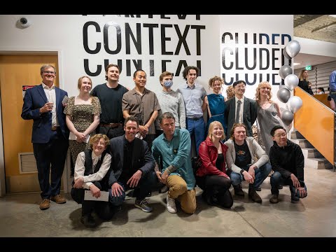
Context Not Included – Year End Show
Audrey Allan
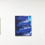
In my artwork, I draw inspiration from my surroundings, translating images and emotions into paintings. My practice involves creating immersive environments that engage viewers and invite interpretation. For me, abstraction serves as a ground to explore new materials and techniques, which allows me to embrace spontaneity in my process. The quick-drying properties of acrylic paint allows me to work in multiple layers, employing both traditional brushes and slightly more unconventional tools such as spray bottles. I often gravitate towards recurring subjects, drawing from album covers and film stills for color schemes and compositions. These serve as the basis for my abstract explorations of color fields, evolving organically throughout my sketches and final pieces. My painting Fundamentally Cold features slightly abstracted plant forms along with cyanotype photo printing process and UV screen print. This piece, much like the rest of my work, was inspired by pieces of media I have been consuming this year. I aim to have my paintings be direct translations of my emotions and interpretations in a way in which it is not essential that the viewers are familiar with my references, but rather that they may experience my reactions in a new context. My art is a reflection of the world around me, allowing me to express feelings and essences sampled from diverse sources. Ultimately, I aim for viewers to engage with my work on their own terms, finding their own meanings within it.
Cloud Angel
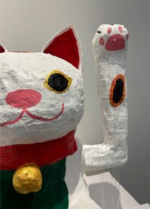
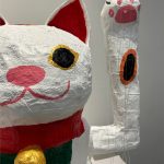
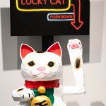
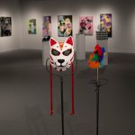
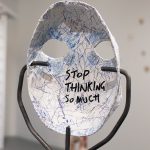
Leaning towards conceptual art, my mixed media works are forms of social critique based on my own experience in the contemporary and political world we navigate. I focus on how we embody gender, neurodivergence, capitalism and consumerism, as well as disregarded personal material such as passions, items, memories, childhood and trauma. Unbearable is a body of work exploring how my relationship with my father has shaped and defined me through bear motifs. “Bear,” “fierce” and “mighty/ powerful” have similar pronunciations in Chinese. These works compose most of Clautter — a collection of works which act as figurative pages in my unique junk journal, whose fundamentals as organized chaos allows an exploration of creative healing whilst challenging fine art conventions, because by nature, these processes are widely considered unaesthetic. The Art of Mask(ing) is a display of various masks — ranging from medical (functional) to cultural (artistic), and neurodivergent masking. In consideration that masks are relevant in our time period, I ask: “What am I masking for?” The answer varies since masking entails more than physically putting on a mask. Handmade masks represent the labour it takes to keep up with this multi-layered process. Placing various masks together also showcases how one adapts by wearing different ones accordingly. The Not-so-Lucky Cat reimagines the Lucky Cat found in businesses to signal fortune. The cute unsuspecting symbol challenges the idea that hard work equates to success (commonly defined as money) as we learn how wealth is accumulated through oppressing others. By subverting the lucky wave, it highlights our complicity in maintaining capitalism — which is based on a socio-economic hierarchy. Manually operating the arm forces people to go through with the possibility that our success is at the cost of others. Cloud is a multidisciplinary artist hailing from Singapore. After moving to London, U.K. for highschool, he started visually expressing himself with photography, but has expanded into various mediums upon entering art school in Canada. Cloud is completing his Bachelor of Fine Arts with a Visual Arts major, Cultural Studies minor, and a Communications and Rhetoric certificate.
Serena Arsenault
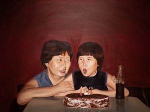
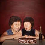
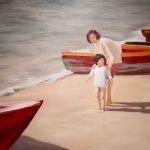
Serena Arsenault is a visual artist exploring realism and surrealism through oil painting. Her artistic practice is deeply rooted in the exploration of cultural identity. Drawing inspiration from old photographs of her mother’s childhood in Hong Kong, she began investigating these visual time capsules out of this desire to feel more connected with this side of her heritage. Serena grew up in Vernon, B.C. Never having been to Asia before, she often felt like an outsider. Confused with her own identity at times, she reached for these photographs in an attempt to feel more connected to her ethnic background. However, the same feeling of disconnection remained after recognizing how the images depicted memories that were not her own, nor could she recognize many of the people nor settings. This is how the idea of recontextualizing new narratives came to life. Serena’s process involves carefully selecting and deconstructing elements from the photographs — perhaps a gesture, a facial expression, or a particular object. These fragments serve as the building blocks for her own imagery, which then is manipulated and reinterpreted through the medium of oil painting. Through this process of collage and reconstruction, she is able to construct new narratives that transcend the specificity of the original photographs. In addition, by juxtaposing and layering different elements, she invites the viewers to explore the depths of imagination. What are you looking at? and What happens next? pull figures out from these photographs where they are then placed in a new setting that Serena creates. While exploring composition and space within the painting, she recontextualizes these fragments of the past within her own artistic vision. Serena is able to weave together disparate threads of narrative and emotion, forging new connections and meanings for herself. This interplay between reality and imagination, lies at the heart of Serena’s artistic practice.
Eunis Au
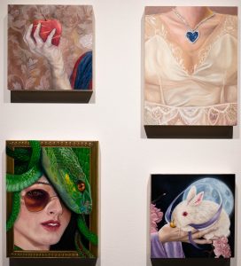
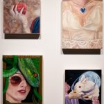
Tin Laam Au is an artist hailing from Hong Kong and currently immersed in studies at the University of British Columbia Okanagan. As a painter, my creativity unfolds through the interplay of oil and acrylic paints, which serve as a metaphor for the interplay of diverse cultures, relationships, and the tension of domestic spaces. What if She? is a series that beckons viewers into a fantastical world, reimagining pivotal choices for female characters across cultures. The images challenge preconceptions and redefine stereotypes, presenting women throughout history as rational thinkers and their own savior. The series draws on virtual characters such as Rose from Titanic and Medusa, and extends into portraits of my family and I. As a female artist receiving a multicultural, international education, I too am challenging cultural norms. My artistic process is influenced by the intersection of the two cultures that have most influenced me: Hong Kong and Canada, as well as the global impact of popular American media. My work fuses realism and imagination and is shaped by the realistic depictions of femininity portrayed by Canadian artist Mary Pratt. Her influence echoes in my piece Diamond Heart, where I reimagine Rose from Titanic, focusing on the intricate details of her wedding dress and the iconic Heart of Ocean necklace in order to signify the potential of a different pivotal decision to the one she makes in the story. To The Moon ventures into the realm of Chinese mythology during the Mid-autumn/Moon Festival, featuring Chang’e and her celestial companion, Yu Tu. This piece is a testament to my commitment to telling the stories of many cultures through my work. I invite viewers to observe, discover, and reflect on the ordinary scenes that parallel our own lives. My narratives offer a glimpse into the heightened moment of a choice, question preconceptions, and embrace the complexity of women as sovereign beings across diverse cultures.
Thomas Ayling
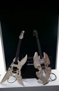
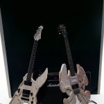
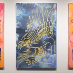
Thomas Ayling is a sculptural artist based in Kelowna whose practice focuses on audience participation through functional interactive art works. Beginning as a digital artist, Thomas developed an interest in sculpture throughout his schooling at UBC Okanagan. This interest carried into his hobby as a guitarist, leading him to begin luthiery. Thomas’ recent art focuses on combining luthiery with the world of fine art by creating visually unique guitars and encouraging his audience to try the instruments out for themselves as an act of participating with the artwork. Through this, Thomas attempts to further blur the line between art and craft by asking the question, “Are the guitars the art, or the audience? Perhaps both.” Seraphim and Nephlim are Thomas’ most recent participatory works, both of which are electric guitars with decorative bodies and custom paint work. Visually they are inspired by the biblical imagery often used in metal or progressive music, as well as the decorative guitars played by famous guitarists such as Prince’s “cloud” or Tim Henson’s custom Ibanez. On their own, Seraphim and Nephlim are fully functioning, playable guitars, both of which are intended to be played together, one leading and one for rhythm. For this purpose, the guitars are visually contrasted to each other while retaining similar elements such as the wings shown on the front of each. For exhibition, the guitars are set up with amps, either on their own or as a set with the purpose of allowing anyone in the gallery to pick up and begin playing as they see fit.
Carmen Bouvier
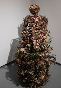
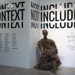
My name is Carmen Bouvier, and I am an artist with a focus on sculpture, notably with found materials. While I have always been fond of utilizing branches and other natural objects in my artwork in the past, my practice has led me to giving these materials a much larger focus. I aim to create my artwork solely from branches I find on the ground, from the places closest to me. During my many hours of gathering materials in the wooded areas near my home and campus, I find peace — time where I am alone with myself, where I can reflect upon myself and where I am mentally in my life. To me, the process of creation is always the most wonderful experience rather than actually concluding a project. I feel that when I am working on a piece, I am leaving many parts of myself and the circumstances in my life within those sculptures, leaving them inside like a sort of time capsule, or a personal diary written in a language only for myself. I can only hope that the emotion I feel while creating these sculptures, however abstract they may seem, can reach out to others as well and create a sort of unspoken connection between us. I try to impart empathy and compassion in my pieces — a sense of humanity, and the simple longing for connection and comfort. We are not much different from the materials I use — we are not permanent, and we will crumble with time, but it only makes this brief time all the more beautiful. There is something lovely in every branch, in an abandoned snail shell that was once a home, an intricately spindled pinecone, the pattern of a wasp nest — sometimes it simply requires a closer look. I hope that my art can inspire audiences to see beauty in the everyday as well, and appreciate what nature provides so readily. And that through my art, we can understand one another.
Chandler Burnett
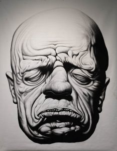
Hello to all who may see this, I am The Worm Farm (Chandler Burnett). I am a tattooist, painter, sculpture, and surrealism artist located in the Okanagan, currently based out of Kelowna. I am currently graduating from my fourth year in the Bachelor of Fine Arts program at UBCO. I have enjoyed drawing, sketching, and painting all my life and love to showcase my work. I am “the worm farm,” because this is my name upon entering the gateway of the labyrinth of my mind. The worms for me are the creativity, driving force of motivation, and the observers of the activity and thoughts in the landscape of my brain. The works that are created serve as a conduit for the visions we hope to put out into civilization. And their sole purpose is the aim to create a visual language that communicates my aesthetic interests and conversations I have observed and interacted with in real life. They are a symbiotic and mutualistic parasite in my head that I am thankful for everyday. I take large inspiration from local tattoo artists, surrealist artists, and classical painters/old masters. Drawing inspiration from many mediums and gathering information about human flesh through my work as a tattoo artist. Me and the worms are merely an entity exploring and observing unknown territory, an alien observer and creator. We hope to show you what lies beyond, as we serve you, the curious.
Taylor Carpenter
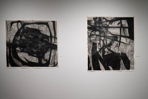
My name is Taylor Carpenter. I am a multi-media artist based in Lake Country B.C. My practice explores the dialogue that emerges through juxtaposing detailed rendering, and quick-gestural mark-making. I spent much of my childhood in a mundane suburban home in Edmonton, Alberta. Across from our dinner table in my family home hung a painting by Kim Norlin. A small wooden cabin sat across a calm lake, with a vast forest framing the home. Upon closer inspection of her work, I discovered tiny mundane moments. Rabbits bounced among the grass, deer hid behind distant trees, and owls sat in branches. Every meal I would spend time with that painting, surprising myself with what I could find. This interaction subconsciously has stuck with me throughout my art practice. My goal is to persuade my viewers to spend time with my work, discovering precious moments crowded among abstract gestural marks and intense graphic elements. I begin my process with mark-making. I look to modernists such as Wassily Kandinsky; studying how they command, yet intuitively allow their gestures to guide their art. I create countless sheets of pure gestural abstraction, that I then bring into the contemporary world through digital distortion. I specifically use the Lasso tool in Photoshop, I appreciate the aggressive, often annoying moments that emerge with this tool. My goal is not to make balanced compositions, rather I search for and collect moments that are created through this process and synthesize my findings into a singular collage. I recognize the work of early collage artists such as Pablo Picasso, who pioneered collage yet were confined to its materiality. Technology has allowed me to invite the medium into a contemporary space, celebrating gestures unique to digital distortion. My artistic practice consists of both traditional rendering and gestural mark-making. Addressing intimate moments that emerge through the collaboration between ink and graphite. I invite my viewers to immerse themselves in my work, to discover those small moments that are drowned by the aggressive composition.
Xavier Charbonneau & Helena Theben
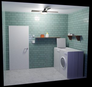
Our immersive virtual reality experience endeavors to transport participants into a digital realm that transcends mere observation, aiming to envelop them in a multisensory journey unlike any other. Inspired by our fascination with the evolving landscape of virtual reality, we set out to envision a future where the boundaries between physical and digital worlds blur into a seamless tapestry of experience. As Bachelor of Media Studies students, we seized the opportunity to harness the cutting-edge tools at our disposal, weaving together our newfound knowledge of emerging technologies to craft an art piece that engages every facet of the human senses. Through meticulous design and creative exploration, we endeavored to evoke a sensation of total immersion, inviting viewers to step beyond the confines of reality and into the boundless expanse of our imagination. Our commitment to environmental stewardship is at the forefront of our artistic endeavor. Keeping the planet in our hearts, we have conscientiously chosen to construct our physical space using recycled and thrifted materials, ensuring that our creative pursuit does not contribute to unnecessary waste. By repurposing materials and embracing sustainability, we strive to embody the principles of eco-consciousness in our artistic practice. Leveraging the power of technology, specifically the 3D modeling software Blender, and the game engine Unity, we seamlessly integrate our physical and virtual realities. This harmonious fusion allows us to transcend the constraints of traditional art forms, blurring the boundaries between the tangible and the digital. Our physical space, though sculpted as a bare bones representation, mirrors the immersive world we’ve created virtually. In ImmerXion, we invite you to embark on a transformative journey where the familiar and the fantastical converge in a display of innovation and imagination.
Ronnie Cheng
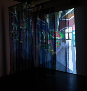
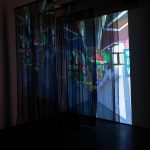
Neon signs were not just a part of the backdrop to my childhood, but they also served as guides and landmarks to help me get home. — Brian Sze-hang Kwok, Fading Neon Lights: An Archive of Hong Kong’s Visual Culture If orientations point us to the future, to what we are moving toward, then they also keep open the possibility of changing directions, of finding other paths, perhaps those that do not clear a common ground, where we can find hope in what goes astray. — Sara Ahmed, “Orientations: Toward a Queer Phenomenology” the lights will take you home is a media art installation piece, with 3D animation projected onto two perpendicular walls, presented with an immersive soundscape. Four panels of ceiling-to-floor tulle are suspended within the installation space, representing the fading and obstruction of memory. The piece revolves around my personal experience of feeling lost and disoriented. I grew up in Hong Kong until I left for university in the States at the age of 18. I then transferred to the University of British Columbia (Okanagan campus) amidst political turbulence in Hong Kong and a global pandemic. In the span of four years, I had 15 different living spaces. Therefore, “home” for me has changed rapidly in a short period of time. When Hong Kong — the most constant home I’ve had — starts to disintegrate in my mind’s eye, what is home? the lights will take you home is an amalgamation of the many feelings that I’ve had in recent years, feelings that I’ve found difficult to fully articulate. It’s a story about migration, loss, belonging. A love letter, a farewell letter, to Hong Kong. An expression of gratitude for community and the people who have lit my path. An attempt to grapple with graduation. Finally, a reassurance that as long as we follow the light, we will eventually find our ways to new homes. Ronnie Cheng is a Hong Konger interdisciplinary artist whose current practice focuses on film, animation, and creative writing. Ronnie is graduating from the Bachelor of Media Studies program with a minor in English.
Jenna Cooper
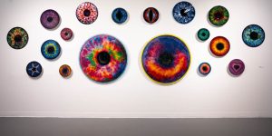
Digital painting & mixed media. 10”.
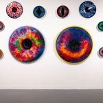
Jenna Cooper is an artist that is passionate for drawing illustrations both in digital and physical mediums. She enjoys creating bright color combinations to make works pop and finds a way to add some sparkle. She uses her own experiences, especially from traveling as her source of inspiration. Drawing eyes were some of my go-to drawing sketches growing up. I wasn’t sure why but it was something I enjoyed creating multiple times. And throughout the years, I have created artworks that display some type of illustration of a eye. When drawing eyes I am able to create so much variety in both looks, colors and expressions. Eyes are the jewel of the body as they are the most detailed, having the iris be filled with color hues, yet it is so small and delicate. Eyes speak louder than words and are how we are able to see the beautiful world around us. But having all the eyes on you can create some pressure on yourself as you are the center of someone’s main attention. Just looking into someone else’s eye can tell you a lot of a person and reflecting that they always have something they want to express. So to see multiple eyes being directed to yourself can cause a shift in emotion such as fear. Similar to divine eyes, the radient irises are never the same even if its on the same face. So this project is a series called “Scopophobia”, showing unique irises in a variety of sizes that were first digitally drawn and then printed so it can be layered in resin to create physical depth similar to a true iris. I will also be adding my own irises into the collection, drawing the details and design of both of them. Each iris has their own way of being unique such as in patterns, shades and in depth to make it feel like its never ending sight.
Liam Davidson & Bethany Hiebert
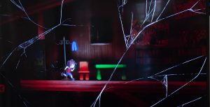
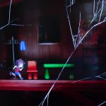
Kindred is a narrative platformer video game developed by Liam Davidson using artistic assets made by Bethany Hiebert. Liam is a digital artist, writer, and programmer passionate about bringing stories to life through interactive gaming media. Bethany is a graphic designer and traditional artist with a wide range of digital skills and a desire to blend the realms of art and technology. In Kindred, you take on the role of a mysterious ghostly force. When a curious young boy decides to follow you through the forest near his home, you must use your powers of possession to help the boy discover the body of his missing younger brother. Together, you will navigate across lakes, up cliffs, over treetops, and through the woods to uncover the truth behind your existence. The actions you take have the power to bring closure to your child companion or incite his demise. When you discover yourself to be the spirit of his brother, will you forever suffer the loneliness of your own loss or force him to join you in the afterlife? The consequences are yours to decide upon in this touching physics-based adventure and its multiple endings. This game is a nuanced exploration of brotherhood, grief, and childhood loss inspired by Liam’s own experiences with his younger brother and the distress he feels at the widening distance between them. Familial relationships can be cut short without warning; it is so important to strengthen those bonds while they are still there to be felt. Kindred’s art style is representative of this sentiment, melding cartoonish graphics with a dark atmosphere; a juxtaposition of childhood innocence with the tragedy that threatens to steal it away. Kindred is available now for download on Steam with full controller and keyboard support and will be accessible for a larger demographic to experience beyond the exhibition.
Katja Ewart
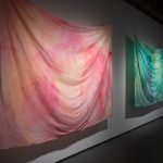
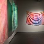
My recent work examines how an individual’s memories are influenced by landscape and environment. The intention of the work is to act as a gesture of gratitude towards the places and individuals who have shaped my memories, and also highlight the details of nature that go unnoticed in daily life. The imagery in the work is a collection of personal memories that I have created in British Columbia since moving from Alberta. By printing on organic textiles and large strips mulberry paper, the imagery of my memories is presented all at once, each image effecting and distorting another. The technical processes I use to create my work allow me to slow down and spend time with a photograph, even if the image was captured with less serious intentions in mind. I prefer creating my work with mediums that allow me to edit and alter the image physically rather than digitally, and I find it both rewarding and frustrating as both film photography and printmaking have a greater possibility for error. However, I have discovered that often, these accidents teach me a lesson. Other times, the accidents serendipitously change the work.
Kai Hagen
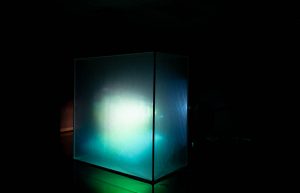
Media art installation. 6’x6’x3’.
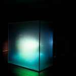
Kai Hagen is a multidisciplinary artist from Kelowna, British Columbia, the unceded territories of the Syilx Okanagan People, whose main interests are in sound, film, photography, generative digital art and VR. His work mainly revolves around the relationship between audio and visual. Containing Myself is an extension of my experiments with sound and visuals. My work often explores the relationship between the audio and the visual, so naturally I was introduced to oscilloscopes. I approach oscilloscope visualizations by producing and orchestrating manipulations to audio waveforms to draw shapes. I use produced audio with an oscilloscope emulator combined with other moving images to create an experience which draws on feelings of containing emotions, recalling memory, and the sublime. The fogginess of the box with projected abstract shapes and blurry moving images emulates a plethora of abstract personal memories which are unattainable to fully relive. The title, Containing Myself, reveals the box as holding human experiences. As not being able to contain oneself is to spill out emotion, the emotions held within this box are those that have been contained and never shown. I am interested in the containing of emotions. Being half-Japanese, I grew up very cognisant of showing my own emotions. Growing up and learning how to express myself more freely in a different culture helped me realize the power of contained emotions. There is a notion of sublimity in the large scale of the projection and in the audio. The harmonic chords are similar to those of a bagpipe, an instrument that has a sense of sublimity, and to throat singing which has connections to eastern spirituality and the sublime. The oscilloscope creates mandala-like shapes which also connect to eastern spirituality and the sublime. I am also informed by DIY underground rave culture. Having DJed at underground raves, I appreciate their DIY nature and want to bring it into a gallery setting. Underground raves typically employ the use of cheap, readily available materials in creative ways to build accessible and immersive audio-visual experiences. I use PVC pipes and plastic drop sheets to build my box in which I fill with fog to project through, which gives the whole setup the effect of being a self contained rave in a box.
Jaine Hillier
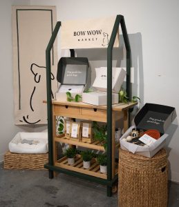
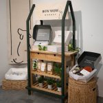
Jaine Hillier is a graphic designer driven by a passion for helping business owners find their visual identity. She combines creativity and strategy to help people bring their entrepreneurial visions to life in brands that are both powerful and unique. Jaine is graduating from the Bachelor of Media Studies program with a minor in Psychology. Bow Wow Market is a dog product retailer and subscription box start-up company that focuses on refined luxury, natural, and quality dog products. This customized brand including comprehensive visual identity, packaging, signage, and retail display was crafted by graphic designer, Jaine Hillier. The brand’s mission to redefine luxury pet products by prioritizing quality products and pet wellness is represented in the organic colours, textures, and forms used in its visual identity. The main product packaging is the monthly subscription box received by subscribers. Specialized packaging and accompanying elements, such as the birthday box, are developed for special occasions and holidays. Each touchpoint was created to be a part of the larger brand identity, incorporating visual elements that are seen across the brand such as the wagging tail. The signage is hand painted on raw canvas to foster the natural focus of the company. The overall display is curated to showcase a visually engaging and immersive brand experience using elements that tie into the brand’s themes. By showing a comprehensive vision of the brand, attendees can appreciate a nuanced glimpse into Bow Wow Market’s core values through its visual identity.
Lauren Johnson
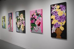
Acrylic on canvas. 24”x48”.
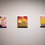
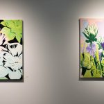
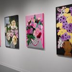
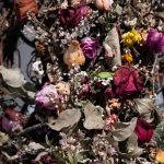
My pre-dispositioned love for art is attributed to my late grandfather. I grew up surrounded by his paintings, infatuated with the way he saw the world. His passing stirred a perpetual curiosity within me of art and my own forms of self-expression and how these function within greater concepts of time, nostalgia, fleeting moments and family lineages. With a love for bold patterns, textures, and fluorescent colours, I reimagine personal imagery and strive to reintroduce it into a new realm of existence; one that offers much more permanency. Paintings can offer a mere fleeting moment an opportunity at a new life, which in the case of my floral paintings, allows the floral bouquets to live on. Flowers also provide me with a lot of creative freedom; granting me the ability to loosely use reference imagery however modify the information as much or as little as I please whilst effectively maintaining the overall feeling of a flower. These works function as a celebration of colour and shape. I aim to channel pop art and graffiti-like elements in my work through a combination of bold solid colours, distinct patterns, and various application processes. My process is subjective and varies depending on the work; however, I typically begin by establishing a fluorescent underpainting. I will then, gesturally outline the contours of my subject matter before colour blocking the larger shapes. I then push and pull in my process and discover what areas I want to leave the underpainting to shine through and what areas I would like to cover. I am in the process of discovering a harmonious balance between the two. As a young, developing artist, my artistic practice, process, and interests are ever-changing and evolving as I continue to grow as a person. Through this journey of self-discovery, I aim to establish a consistent voice in my work, whilst continuing to experiment in new ways of creating and engaging within greater conceptual interests.
Matthew Kenney
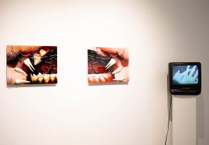
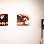
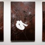
Kenney Attempts to understand identity and its fundamental transformation within the digital era form the basis of my capstone project. Throughout my artistic journey, teeth have held a potent significance, symbolizing endurance beyond corporeal decay and embodying the core of individuality. In this installation, I embark on an exploration of self-understanding amidst the labyrinthine realms of the digital landscape using teeth to represent the “roots” of my identity. The advent of digital frameworks has ushered in a change in how I perceive myself and others. As the myriad of internet subcultures and influences grows, my grasp on personal identity has become enigmatic, a puzzle constantly and consistently reshaped by online experiences. The installation consists of two printed panels, each depicting a half of a mouth — a dichotomy symbolizing the duality of identity. On the right, a digitally painted/textured representation of my mouth mirrors introspection, where I am investigating the roots of my being. On the opposing panel, the left side portrays a distorted amalgamation of glitchy teeth evocative of digital alteration. This visual disjunction of the two half of a mouth underscores the schism between innate identity and its digitally warped counterpart. Complementing the printed panels, a 3D animation is displayed on a nearby screen. Here, the narrative unfolds as teeth undergo a metamorphosis, relinquished to the digital space. They morph into glitch-ridden versions of themselves, no longer recognizable within the confines of my mouth. This symbolic journey mirrors the transmutation of identity under the sway of digital influences, as the altered teeth demand attention while the fundamental roots recede into the background. Ultimately, my intent is to provoke introspection among viewers, urging them to contemplate the pervasive influence of the digital realm on their own sense of self. Through this immersive exploration of identity and its digital metamorphosis, I aspire to highlight the intricate interplay between individuality and our increasingly digital society.
Fengyu Lu
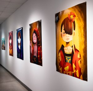
Digital art.
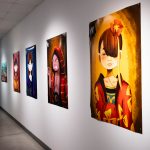
Fengyu knows that art is not only a display of personal talent, but also a bridge for cultural exchange and emotional expression. Therefore, he strives to explore how to integrate traditional Chinese culture with modern art to present uniquely charming works. This work stands at the intersection of art, emotion, and culture, drawing from and contributing to a dialogue about the universal and timeless nature of human emotions. Through the integration of ancient Chinese elements, Fengyu aims to bridge historical and cultural contexts, demonstrating the enduring relevance of emotions in our contemporary world. Fengyu’s oeuvre is a testament to the personification of core human emotions — joy, anger, sorrow, and happiness — embodied in the ancient Chinese artistic style. Distinct colors are meticulously chosen to symbolize the unique attributes of each emotion, infusing the works with layers of meaning and cultural resonance. Fengyu’s work offers a unique perspective on history, employing a process of reverse derivation. Fengyu begins by exploring written accounts or descriptions of events, scenes, or emotions. Instead of interpreting these texts in a traditional linear fashion, Fengyu reverse engineers them, translating them back into visual representations accompanied by animation and music. Through this process, Fengyu aims to build immersive spaces that invite viewers to reconsider familiar narratives from new angles. By reconstructing historical or experiential moments in a multimedia format, Fengyu seeks to evoke emotional responses and prompt contemplation about the complexities of human perception and memory.
Amy Marui
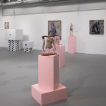
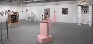 Amy Marui is a ceramic and mixed medium artist whose works explore the relationships we have with ourselves, others, and the world. The excavation through these memories takes place using a variety of materials she is drawn to. Her figurative works appreciate the beauty of the human form while using it as a vehicle to examine the struggles of mental well-being. Through her work with clay she constructs bodies that intermingle with each other, creating a conversation with their interactions and the environment they are displayed through vulnerable forms, these figures evoke feelings of empathy, longing, stillness, and a desire to care for. Drawing inspiration from classical sculpture and painting, Marui strives to balance between realism and the abstract nature of emotions. Finding balance between the explicit nudity and childlike naïveté; Marui’s figures are rooted in personal experiences of childhood neglect, trauma, mental health struggles, and body image. Her artwork allows the viewer to digest uncomfortable realities through a spoonful-of-sugar method, leaning towards reframing difficult conversations within a lens of pastel-tinted truth. Working towards open conversations about feeling different, forgiveness, the complexities of relationships, and the importance of support during mental crises is the goal of her art pieces. Dismantling the taboo around these topics using visually softening colors enables a smoother translation of the darker content in her work. Amy Marui’s art is an exploration of external and personal struggles, juxtaposing hard and soft elements. Marui’s work appreciates the nuances of the human experience, striving to dismantle stigmas through a visually softened lens. Ultimately, her art invites reflection, empathy, and a deeper understanding of each other.
Sarah McNeil
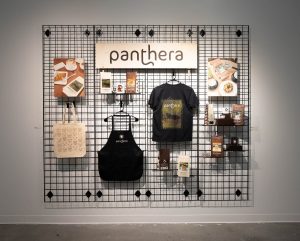
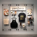
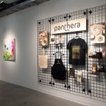
Sarah McNeil is a graphic designer with a passion for creating individualized brand identities. Sarah’s design practice is unique as she pairs her skills as a digital artist with her ability to utilize traditional mediums such as gouache and watercolour. This partnership of mediums helps to bring a humanistic aspect to her graphically made designs. Sarah is graduating from the Bachelor of Media Studies program with a minor in Fine Arts. Panthera is a speculative coffee brand conceptualized by the artist Sarah McNeil which involves the creation and development of a fully unique brand identity, including packaging, merchandise, and painted advertisements. The brand houses five different blends of coffee, each with their own unique bag design. The blends reflect the different cats belonging to the genus of Panthera: the panther, the lion, the tiger, the leopard, and the snow leopard. To accompany the bags, two mugs, a t-shirt, an apron, and a tote bag were designed and printed as well. Paired with the packaging and merchandise are two gouache still-life pieces painted on watercolour-mounted wooden cradle board panels. Each painting depicts a bag of Panthera coffee in a café setting surrounded by cups of coffee and pastries. As advertisements, these pieces help to conceptualize the brand as a higher-grade type of coffee. The paintings also bring a sense of warmth into the brand identity through the personalized touch of a hand-made piece of art. If the brand were to be realized, Panthera would be a voice to showcase the importance of direct trade relationships between coffee farmers and distributors, and a portion of its proceeds would go towards the conservation of each of the wild cats’ habitats that are showcased on its packaging.
Anjali Menezes
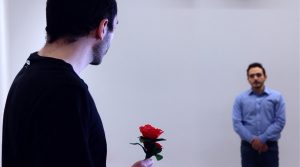
Anjali Menezes is an artist whose primary focus is in film, with a keen eye for storytelling as demonstrated in her diverse filmography. She has produced films in various genres, from impactful documentaries, captivating narrative and inventive independent projects. Her dedication to mastering film editing is a skill she hopes to refine, and is the main driving force behind her creative process. The work entitled Honestly… is a dialogue-driven narrative film in which a man named Peter undergoes a personal journey of introspection as he discusses and grapples with understanding the existence of a God. Honestly… explores the themes of questioning, anger and grief all intertwined with potent religious undertones. The film argues for the validity of both belief and disbelief, as we witness Peter’s shattered faith in the so-called love of God come to light. Peter, bearing witness to the cruelty and injustice of the world, no longer believes in the notion of a benevolent deity with the harsh realities he has experienced. When he encounters the alternative Peter, whose faith remains unshaken, it becomes a pivotal moment that sets off a chain reaction of self-doubt and revelation. The confrontation leads to the truth emerging; shattering the facade of Peter’s carefully constructed worldview. The film installation is displayed in a box to imitate the intimate confines of a confessional booth. As viewers peer into the box in this immersive, private, experience they step into Peter’s shoes, witnessing his struggle firsthand and feeling the weight of his internal conflict. Honestly… compels viewers to confront their own questions and emotions, prompting a reflection on the nature of faith, doubt, and the human condition.
Jade Molen
Media art installation.
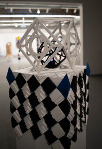
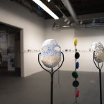
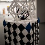
Métis artist Jade Molen specializes in graphic design, animation, 3D printing, and 3D modeling. She frequently experiments with cutting-edge digital tools and techniques within her works to produce fresh takes on the various digital mediums. Always exploring the possibilities on what can be created, seeing what they have to offer, as well as testing the limits of digital tools. Every component of the installation of her piece Beyond the Edge is meticulously designed and calculated. She is able to take abstract concepts and turn them into concrete forms that float between the boundaries of reality and imagination by using a 3D modeling software. Afterwards, 3D printing is used, which involves melting plastic to produce multiple layers for the purpose of building objects. This gives the creations substance and brings abstract concepts to life. The three pedestal displays demonstrate this. The pedestals along with their objects demonstrate the progression of light; many candles that flicker in a light blue hue are housed in melted wax on top of the shortest pedestal. The wax and candles begin to fade and take shape as it goes on. Becoming a lantern, revealing the beginnings of certain geometric shapes near the top of the structure along with some wax remnants at the bottom of the lantern’s legs, while most of the candles transform into a string of lights that encircles each leg of the lantern. Within the lantern is a single, sizable candle with a flame that is also flickering a shade of blue. The lantern undergoes its final shape change, taking on a geometric appearance and accommodating the final, smaller candle within the two geometric structures before the wax runs out. This project acts as a way to test the boundaries and find limits within the new mediums.
Karina Nardi
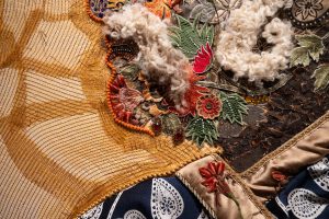
I am a painter and mixed media artist living on the unceded territory of the syilx people. My work reflects on the intertwining of histories, cultures, and identities that happen with love found amidst lands with violent histories.
The Karina Battista and Jahangir Hussein project was initially inspired by the Italian Renaissance diptych The Duke and Duchess of Urbino Federico da Montefeltro and Battista Sforza (Uffizi 1890 nn. 1615, 3342) and the Mughal miniature Portrait of Emperor Jahangir(MET 13.228.47). I reinterpreted these figures with a contemporary twist, by overlaying profile portraits of myself and my partner and rendering these hybrid images first as copper-toned watercolours and then as large mixed–media portraits.
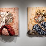
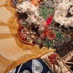
For the mixed-media portraits, I collected and deconstructed thrift textiles such as wool sweaters, shower curtains, and pillowcases, a medley of “globally inspired” home décor and homespun fashions. I then decorated their faces and bodies with botanical motifs and imagery. I approached the textiles not as a seamstress but as a painter and a collagist. Surrounded byleftover scraps, I decided to fill a vintage frame with them, which led to the work Remnants. The stratified layers of fabric are preserved, remembered, and mixed, rather than discarded.
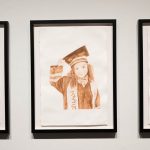
As I worked, news of the Israeli genocidal war on Gaza permeated my thoughts especially the tragic story of Hind Rajab, a young Palestinian girl–one of thousands of children killed by Israeli forces. I made a watercolour of her based on a widely circulated photograph, in which she smiles and looks at the viewer while wearing her kindergarten graduation gown. For the exhibition, I placed her image between the portraits. I wrestled with the interplay of sentimentality and familiarity within the paintings, recognizing my complicity as a privileged colonial settler but acknowledging my feeling of empathy.
My artworks reflect the complexities of identity, belonging, and cultural exchange in a world marked by the legacies of colonialism. My portraits are steeped in personal meditations on the troubling, yet enduring, colonial constructs of “East” and “West” that arise through the violent histories of imperialism, capitalism, and ethno-religious nationalism.
Hannah Palomera

Acrylic and ink on canvas. 16”x20”.
Hannah Palomera is a Mexican/Canadian illustrator and painter who mainly works with gouache, watercolour, and inks. With a focus on storytelling and world-building, Hannah’s paintings are meant to give a glimpse into fictional worlds and the daily lives of their inhabitants. Inspired by comic books, animation, and video games, the worlds she creates are meant to feel strange but lived in. A version of life foreign or fantastical but also nostalgic, trying to capture the same feelings when playing a new game for the first time or starting a new novel and getting immersed in its world. Currently, she is inspired by Mexican and Aztec folklore, creating different settings that depict speculative versions of a sci-fi future largely influenced by Mexican culture. Having noticed that a lot of modern sci-fi media is influenced by Asian and American cultures, she wanted to explore a similar concept with her own culture. In Market, a town has built itself around a robotic beast inspired by the Aztec deity Quetzalcoatl, and the town and market itself based on festivals and markets she frequented as a kid, but with sci-fi additions in the tech and clothing worn by the people in the town. Hannah’s paintings all start with simple stories and ideas of how people might live under different circumstances, and spiral into full narratives spanning many paintings. Hannah aims to continue fleshing out these narratives so that she can create an art book including many paintings all depicting different parts of a larger story.
Julia Petrie
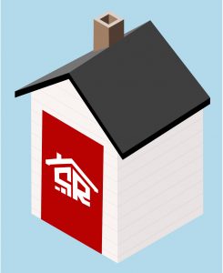
Julia is graduating with a Bachelor of Media Studies; she works in VR game development and graphic design. Additionally, she is minoring in computer science and is interested in human-computer interaction and user interface/ user experience design. Combining technical skills with her design background has become her favourite form of self-expression. StrataRater is a website that connects strata owners with strata buyers to share essential information on the overall well-being of individual stratas. This project is inspired by the housing affordability crisis, as strata units are often more affordable than single-family homes, and the climate crisis, as condos and townhomes are generally a more sustainable alternative when compared to single-family homes. Despite the perceived benefits of strata living, many people are reluctant to buy into them due to the myriad of hidden problems that can exist within them, such as dysfunctional strata culture, bullies and bylaws, mishandled conflicts, unresponsive councils and management companies, underfunded reserves, and looming general assessments. Owners are forced to live with these problems daily. Currently, buyers have no simple tool to determine a strata’s pre-existing issues relating to strata culture, conflict, dysfunction, etc. StrataRater focuses on helping two distinct yet interconnected groups: strata owners and buyers. While providing owners with a tool to improve their strata experience, StrataRater creates critical data for buyers to better understand if a particular strata is right for them. This process also aims to hold strata owners, councils and management companies accountable for their behaviours. It will provide transparency into how a strata functions and incentivize positive change. StrataRater is paired with a 4×8-foot house. This sculptural element “houses” the idea of StrataRater, providing space for a technical product within the gallery space.
Ari Pielecki
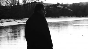
Experimental narrative film.
Ari Pielecki is an independent filmmaker and visual artist originally from Vernon BC. His childhood was spent playing in the forests and fields near his home, where he and his friends would pretend they were adventurers exploring long forgotten magical lands. These imaginative childhood games greatly influence his practice today. He is currently examining themes of isolation, perseverance, and survival in his work. Ari is also interested in exploring how human beings interact with both natural and manufactured environments. Inspired by filmmakers such as Terrence Malick and Kelly Reichardt, he strives to incorporate a naturalistic look and feel into his work, even if the subject matter is fantastical. Ari currently lives and works on the unceded territory of the Syilx Peoples in the Okanagan Valley, British Columbia. The Yearning is an experimental narrative short film following the story of a sailor who is left to die on the shores of a strange and perilous land. There, the protagonist encounters otherworldly creatures which make him question reality as he struggles to survive. The story has three levels: the framing narrative in which an older version of the protagonist tells the story to the audience, the primary narrative which consists of the protagonist’s physical experiences, and the interior narrative in which the dreams and memories of the protagonist are played out. The Yearning engages with the idea that sometimes factuality must be neglected in favor of a greater truth – an emotional truth. This stems from the phrase “the ecstatic truth”, coined by the documentary filmmaker Werner Herzog to describe films that stretch reality to obtain more significant meaning. Strawberry Juice is a short documentary about Chandler Barnett, an emerging painter and tattoo artist from Kelowna, BC. The film focuses on Chandler’s journey as an artist, as well as his developing style, and the contrast between his tattooed and painted works. With this documentary, Ari explores in detail the creative process of one individual to discover what drives them to make art.
Shelley Sproule
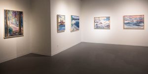 A poem my father used to recite to me as a child was “Good, better, best, never let it rest, until your good gets better and your better best.” I have always been driven to be the best I can be. After retiring from my career as a nurse, the next chapter in my life is to pursue my love of art. Painting, drawing and sculpture has been my main focus. My inspiration has come from the women in my life. My grandmother was a textile artist, mother an oil painter and musician, and my granddaughter an artist and graduate of Emily Carr with a degree in communication design. The beautiful scenery in the Okanagan, Shuswap and Muskoka has given me an abundance of references for my landscape art. My recent paintings are connected by intangible family bonds and respect for the land in the Muskoka and Shuswap Lake areas. I have been experimenting with color, using form and outlining. Painting quickly and gesturally has helped with loosening my subject matter and developing a more stylized and intuitive result. The latest approach is preparing my painting board with modeling paste and gesso and texturizing with kitchen utensils such as spatulas, scouring pads, brooms, scrapers and palette knives with serrated edges. Trees from meaningful places have been a recurring focus in my recent work. Artists who have inspired me are the “Group of Seven”, Tom Thompson and Emily Carr. Thompson’s West Wind painting intrigued me with the Muskoka pine, the technique of outlining in abstracted colors and the stylized tree. Carmichael’s abstracted colors and especially Carr’s reference to movement through lines, as demonstrated in her painting Above the Gravel Pit have had an effect on my work. This approach has proven to be a challenging new direction.
Romalee Stanley
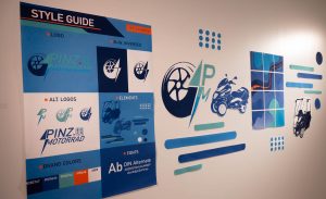
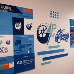
Romalee Stanley is a creative and detail-oriented digital illustrator, animator and graphic designer with a recognized talent for conveying personalities, emotions, intentions, and motion. An animator with practical expertise in aspects of technical art and graphics. Highly skilled in character creation along with collaborating with other specialists to complete team projects and share ideas. Romalee is working with Professor Ernest Goh in creating a distinct comprehensive brand style, and social media presence for the company Pinz Motorrad. This involves motion graphics, responsive designs and dynamic presentation. Pinz Motorrad is “A pioneer in advanced mobility solutions, and the creator of the Enclosed Narrow-Track Electric Vehicle — an innovative three-wheeled electric motorcycle featuring a climate-controlled cabin.” The assets are all made to establish a genuine transparent personality that fosters transparency throughout the company’s developmental stages. The project will embody authenticity, sincerity, and fun. It will showcase a vibrant and responsive personality that resonates with the essence of the product — which is electric and accessible. In her role as the brand’s translator, Romalee communicates the artist’s intentions and character via design and media. The aim is to establish a genuine connection with the audience through the project. From design elements to overall media presence, the project serves as a testament to a commitment to authenticity. Romalee’s work with Professor Ernest Goh on the Pinz Motorrad project has been an exciting opportunity to showcase her skills in motion graphics, responsive designs, and dynamic presentation. The collaboration has allowed her to contribute to the creation of a comprehensive brand style and social media presence for a pioneering company in advanced mobility solutions.
Nick Tai
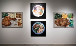
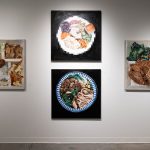
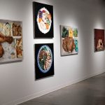
Nick is a visual artist whose core practice is based on oil medium, pursuing styles like surrealism, cynical realism and realism. In this series, his artworks confront the contrast between digital and analog processes, while exploring the parallel intricacy between the preparation process between meals and paintings in realism. “Digital technology allows us to freeze time by capturing a moment, for example, a photograph of a meal; where it is locked in time without an expiration. There are two components to a meal: preparation and consumption, both temporary with an expiration. A meal can take ten minutes or ten hours to prepare and is usually consumed in minutes, furthermore, it can shared or consumed alone; therefore meals have collected memories from the beginning to its end. With the help of digital photography, I can translate intricate memories onto canvases, and most importantly the preservation of these memories.” The Eggs and FriendsGiving are personal homages to his Canadian experience as a young adult; The Eggs is a reminder of simplicity and indolence, while FriendsGiving is a reminder of friendship and acceptance. In contrast, Beef noodle soup (????????????) and Bentos series (????????) are personal remembrances of his Taiwanese experiences as a child; Beef noodle soup is a homage to Taiwanese origin and ethnic backgrounds (families), while Bentos series is a remembrance of youth conformity and convenience. The Food series became an homage for the artist to invite viewers to appreciate the intricacy of individual lives. In this series of artworks, Nick painted memorable meals he experienced in his life, ranging from his childhood experiences in Taiwan to his young adult exploration in Canada. The subject matter becomes a merge of cultural differences and collective memories left from a digital image. “Each meal contains a story with an expiration as we finish the meal. We capture the visual meals with photography to preserve the story, from preparation to consumption, our experience forever digitized; our precious time with or without people. Meals connect me to loved ones, strangers, and myself. Each meal is a plate of memories categorized by emotions, time of day, place, and relationships.”
Katya Torin
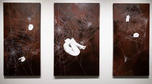
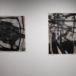
Hi! My name is Katya and I am a multi-disciplinary visual artist who works in many mediums such as drawing, acrylic painting, digital tattoo design, and one-of-a-kind articles of clothing. I began university attempting a Mathematics degree, but switched into the Fine Arts, just after finishing my first year. Visual arts is my deep-seated passion, and I realized I needed to be true to myself and pursue this seriously. In my paintings and drawings, I aim to capture the essence of “ephemera”, being art that is enjoyed for only a short time. The ephemeral art I create is not meant to be on display or relevant forever, it is merely meant to represent the precise time it was made in. I am interested in creating art that is up to the viewer’s interpretation. I appreciate when each viewer can discover and interpret something different within my work and create their own narratives. I enjoy experimenting with combining realistic imagery, abstraction, and complex mark making. The backgrounds of my paintings come about as I create layer after layer of acrylic paint, resin oil, and other mixed media. With each new piece, I find a different and new way to create marks that I have not seen before. Sometimes this means dipping forks into acrylic paint and scratching the surface of my canvas. Other times it means dropping cups of paint and splattering the liquid everywhere. My favourite textural marks come when I scrape a comb across the surface of wet paint; this leaves a dried mark that is raised above the surface and can be felt with the fingertips. The nuance that is created from this mark making, is something that cannot be planned out or controlled. This process forces me to accept where the painting wants to go, as if it has a mind of its own, and to discover the complexities within the work as it grows overtime. I aim to take realistic aspects of life, such as animals, insects, or humans, and tie them together with abstraction and textured backgrounds to create art that is strange yet fascinating.
Aliana Voshell
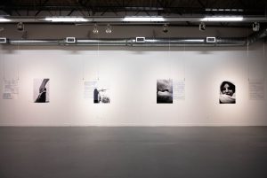
Since the start of my career in 2021, I’ve focused on channelling my talent and creativity into meaningful and powerful messages. I have developed strong images in photography relating to the themes of expressionism in humanity, and abstract viewpoints of portraits, wildlife and nature in photography. My goal as an artist is to start the conversation and bring to light the way we see the world and how to best show new ways of understanding what we may or may not already know through discovery. The inspiration for this piece is the fragility of glass when it is shattered by a rock. To me, the rock represents the damaging words used in society to break people and silence them into the fear that their emotions and ideas don’t matter. To represent glass I chose transparent acrylic sheets because of their unique blends, resilience, and imperfections. The writing on the images represents the response of the mind to damaging words and opinions. I have always felt alone in society. Having ADHD in a world with strong opinions makes it hard to express your own. I have lived life always trying to act correctly and never to say what comes to mind because it is deemed rude or thoughtless. This work is to represent not just the beauty of an appearance but to help people and society realize it’s not just glass you’re throwing that rock into. I have thoughts and Ideas too however imperfect they are. By bringing in photography and perspective through emotional writing, the work can be viewed from multiple perspectives. My work is responding to the issues we face in society almost daily — the feelings of not being heard, feeling like an outcast, or even just feeling out loud. Sometimes I just want to scream at the world and say what I want, but I can’t because of how I would be seen in society and by people. We live in a perfectly imperfect world. These works challenge the audience to look inward, letting go of harmful social constructs and embrace other’s imperfections while understanding and acknowledging their own.
Aaron Voth
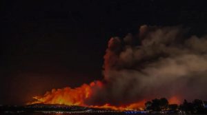
Documentary.
A Province in Flames: Unraveling the Wildfire Crisis is a compelling documentary project delving into the heart of the wildfire crisis, juxtaposing the devastating blazes that ravage the Okanagan’s sprawling forests with the infernos sweeping through British Columbia’s arid landscapes. Through interviews within the Fire Fighting community, it unveils the shared struggles, resilient spirit, and urgent need for global action in the face of this escalating environmental catastrophe.
Christine Wakal
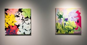 My artistic practice this past year revolves around the intimate interaction between acrylic paint (and mixed media) on paper, utilizing techniques akin to watercolour to create vibrant and dynamic compositions. Influenced by the pioneering spirit of Andy Warhol and the innovative use of technology in art, particularly artificial intelligence, my works on paper explore the intersection of traditional mediums and contemporary themes. Echoes of Warhol’s fascination with colour and mass production resonate in my work, as I often incorporate reimagined flowers layered with a female portrait, reimagining them through a lens of aesthetic experimentation. Just as Warhol embraced the mechanical processes of his time, I embrace the digital age, drawing inspiration from the fusion of art and technology combined with floral photography and life drawing. The bold colours and expressive shapes in my works pay homage to the masterful techniques of David Hockney and Henri Matisse, which can be seen in my exploration of vibrant colour palettes to evoke mood and atmosphere. I invite the viewers into a world where imagination and reality converge. In essence, my works on paper serve as a visual dialogue between the past and present, drawing from the legacies of Warhol, Hockney, and Matisse, while embracing the possibilities afforded by contemporary technology, artistic innovation, and the human touch. Through this synthesis, I strive to create art that is forward-thinking, inviting viewers to reconsider the boundaries of traditional mediums and the ever-evolving landscape of artistic expression.
Ziv Wei
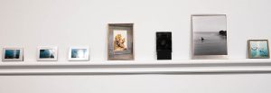
Photography installation.
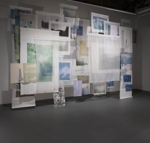
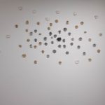
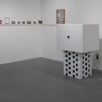
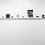
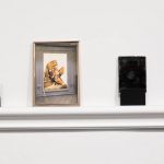
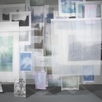
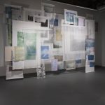
Ziv Wei (b. 2000, Shenyang, China) is an interdisciplinary visual artist exploring photography, sculpture, and installations. Based in Kelowna, his works have been exhibited in multiple galleries in Canada, establishing him as an emerging artist who is interested in thinking about the shared experiences that transcend linguistic and cultural barriers. The three works in this exhibition celebrate the tangible characteristics of images in an era dominated by digital ubiquity. At the center of this space is Don’t Let It Divide Us: a room divider adorned with hundreds of uncut transparency film photos. Devoid of context, this installation invites observation and on-site “curation” by each audience. What story will you choose to see? Running along the back walls is Yourself, Myself, Their Shelf, a piece that questions the sentimentality of images and objects by embedding artist’s photographs within found frames to create objects that evoke a blend of history and spontaneity. Finally, located in the farthest corner is Black Box, White Box. It juxtaposes the black box (a large format camera) with a white box (an abstracted gallery space). The black box uses photographic film to make an image of the gallery room itself over the course of the exhibition while the white box displays an existing image. Both boxes point their lenses at the audience, emphasizing the reciprocity between the artist, the audience, the artwork, and the context. This exhibition is an invitation to reflect on the intimacy and materiality of photographs as objects of connection. It challenges the conventional act of viewing, encouraging a shift from passive to active engagement. It prompts contemplation on the societal value ascribed to memories and objects, urging a reexamination of how art and memory interlace within our collective unconsciousness.
Jessica Williams
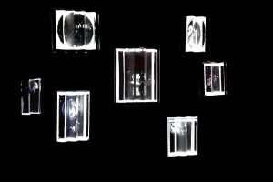
Lenticular projection-mapped animated installation.
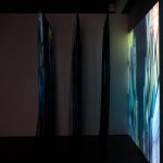
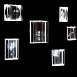
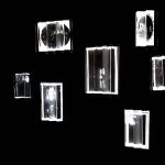
Thursday is a lenticular projection-mapped animated installation aimed to explore the connection between nature and humanity, as well as their unique perspectives on grief associated with both life and death. The non-linear narrative incorporates seven digital paintings that depict three living entities, each paired with their juxtaposed corresponding afterlife representation. The moving images are spliced and interlaced with one another, allowing visuals to vanish and reemerge when viewed from various angles. The paired animated artwork is mapped onto framed 3D structures hung up, reminiscent of a gallery wall. This symbolic imagery provides a glimpse into the lives of each being. Through the combination of lenticular art, animation software, digital illustrations, projection mapping, and nonlinear storytelling integration, this installation aspires to deliver an impactful visual experience. This installation aims to explore the complex concept of grief, as it is not something to be feared or avoided but rather embraced as an inevitable part of life. By visually representing grief through contrasting, allegorical imagery, the narrative challenges our understanding of this universal human experience, while also delving into the unique burden it imposes on humanity, not only in moments of loss but also throughout life. The dark and whimsical imagery depicted in each painting aims to illuminate the darkness while acknowledging the existence of shadows that linger within the light. Jessica Williams is a digital artist and animator currently enrolled in the Bachelor of Media Studies program. Her current practice focuses on animation, digital painting, watercolor, and projection mapping.
Wayne Xie
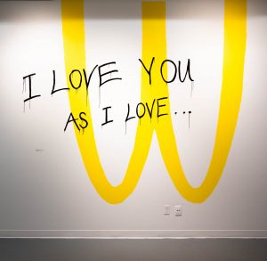
Mixed media.
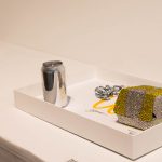
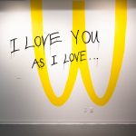
Wayne Xie (b. 1999, Kunming, China) is a senior Fine Art student, who makes sculpture, painting, music, photography, video and media art that explores the concepts of consumer culture, fashion, and brand culture, combining elements of style with various media to examine their impact and interplay. Through this fusion, he aims to delve into the complexities of how consumerism shapes aesthetic values, brand identity, and influences societal trends. I Love You As I Love WcDonald’s, is a series of works combining sculpture, photography, video, and Augmented Reality (AR) that examines McDonald’s as a global symbol. By using the McDonald’s iconic image and logo in unexpected ways, the series provokes a deeper consideration of the consumer’s place in global consumer culture. I reimagined McDonald’s packaging, transforming a hamburger box and fries container into wearable art: a rhinestone-encrusted necklace and a mild steel fries box. Inspired during a meal at McDonald’s, I crafted these pieces, adding a spray-painted finish to the fries box and a chain to the burger box, turning them into fashion statements. These creations aim to highlight the artistry in everyday items and provoke thoughts on our attachments to familiar consumer brands. My series delves into consumer culture through a blend of videos, photographs, and social media face filters, offering a critical view on the interplay between commerce and art. This work goes beyond revisiting the McDonald’s brand; it probes into our collective brand obsession and capitalism’s dynamics. It adds to the discourse on our consumption motives. In my artistic journey, Tom Sachs and Andy Warhol are pivotal influences. Sachs, with his meticulous, handcrafted reinterpretations of consumer symbols, like his “Hermés Value Meal,” blurs cultural hierarchies, resonating with my objectives. Warhol’s fusion of art and commercialism, illustrated in works like “Brillo Box,” guides my integration of consumer imagery and art. Their legacies fuel my investigation into consumerism’s impact on aesthetics and societal patterns, urging a critical reflection on our bond with consumer brands and capitalist frameworks.

 Follow
