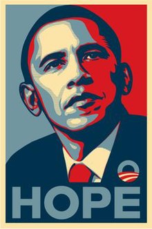
After reading Lesley Farmer’s article, “I See, I Do: Persuasive Messages and Visual Literacy”, the first thought that popped up in my mind was the use of posters during Obama’s 2008 campaign for presidency. The infamous posters (pictured above) are quite simple: a headshot of Obama looking off into the distance in a somewhat contemplative yet stoic manner. His image itself has been digitized, manipulated to take on the appearance of a comic book character, perhaps even the image of a superhero. The message written underneath his portrait consists of a single word, whether it be “Hope”, “Change” or “Progress”. The message is simple, concise, and creates a bold message, absent of any gimmick or jingle, something that voters often complain about. Perhaps what is most interesting about the poster is the use of colour. The contrasting shades of red, white and blue appear, on the surface, as a patriotic tribute to the colours of the American flag. However, I was curious about the persuasiveness of those colours and decided to do some research on the psychology of colour. Interestingly enough, blue evokes a sense of steadfastness, dependability, wisdom and loyalty. It is also a colour most individuals associate with the feeling of calm. Red, as most can attest to, is used to draw attention. It is a colour associated with energy, and evokes a sense of excitement. And finally, white, aside from being associated with cleanliness and purity, has also been associated with safety.
Whoever was behind Obama’s 2008 campaign appears to have put a lot of thought into this compelling poster. As I recall, there was a huge push to get people to vote, as voter turn out was at an all-time low. Years after Obama was elected, that image remains burned in my memory. Whether it had persuasive abilities to get voters to not only vote, but to vote for Obama, is something worth exploring. But in the context of this class, the analysis I conducted could be a great exercise for students to critically engage in analyzing political ads to determine what techniques are used to win over voters.
PS. After researching further, I discovered that the poster’s creator, Shepard Fairey, is a street artist who works for the skateboard company, OBEY. This adds an interesting dimension to the persuasiveness of the ad, considering the choice of artist may have been a deliberate attempt to reach out to younger voters. Also fascinating is the fact that Fairey illegally used an image of Obama captured by the Associated Press as inspiration for his poster and eventually faced criminal charges! What a crazy turn of events!
Kiran Aujlay
Sources:
Psychology of Colour:
http://www.precisionintermedia.com/color.html
Image of Obama:
http://en.wikipedia.org/wiki/Barack_Obama_%22Hope%22_poster
News article about Shepard Fairey:
http://www.huffingtonpost.com/2012/09/07/shepard-fairey-sentenced_n_1864785.html
3 replies on “Can We?”
So interesting, Kiran, your post script. And your analysis and comments regarding the hugely popular and influential poster made me think of something Naomi Klein wrote in No Logo “We were so busy analyzing the pictures being projected on the wall to notice that the wall itself had been sold”. (2000) I understand her comment, and the symbolism of the poster in question, to speak to the new “political correct” political image that women and people of colour have any real power in North America. (Or that any political leaders do.) Business owns and yields power over our countries. And a well designed, (well-intended?) political campaign poster is only that; a empty symbol of “Hope”, “Change” and “Progress”. It (successfully) makes the viewer believe that something new is happening, without explaining how or what actions are required to produce this change or progress. Even his pin, with the American flag symbol, looks like a path, a road, leading to some promised land. The irony of all of this, for us, (our generation, and we as educators) is that the same student who we are asking to be careful consumers of images such as these, are the very ones that will be designing them.
I thought your analysis of the different colours used in the logo were particularly interesting – it speaks to a type of sublimial messages, similar to how music can evoke a emotional response. I definitely think that colour is an important aspect of advertising, since it is one way to relate to a target audience – for instance, how Barbie adds on TV often use pale, pastel colours while toys targetted towards young boys use dark, richer colours like red, navy blue, etc.
Of course, visual rhetoric, like any rhetoric, is culturally specific. We might ask, how does the psychology of colour change across cultures and how might particular images be interpreted in different contexts?