Categories
Uncategorized

Giving Animoto A Try

I’ll be teaching three different Shakespeare plays during my long practicum, and I thought of different ways I could start off each unit. I thought I’d try my hand at Animoto, and initially, the plan was to do a fun, short video about strange biographical facts about Shakespeare. Unfortunately, the free version of Animoto really limits the amount of text per slide, so then I had to scrap that idea. Then, I recalled that Shakespeare invented a large number of words, and so I thought I’d do a short video of twenty words invented by Shakespeare. Turns out there’s a limit to ten slides in total. So with very few options left, I created a short video with four words invented by him. It’s a little underwhelming, but it did give me an opportunity to play around with an alternative mode of representation. I think perhaps I’d use this tool with students instead, to come up with a short presentation about an act they read, or perhaps have them take pictures of things they think represent a specific play and use Animoto to create a small presentation about those images to promote visual literacy.

Try our slideshow maker at Animoto.

– Kiran A.

Categories
Uncategorized

“Imagine all the people…….”


In the summer of 2009, I did a volunteer internship with Amnesty International. Part of my job was to design educational kits for the classroom which would teach youth about human rights.  Although some may argue that an introduction to the concept of humanitarianism belongs in a social studies curriculum, I think that any field of study can incorporate philanthropy into its discourse.

I must admit that since being introduced to Wordle in this class, I’ve become slightly addicted.  I can see how it would be a great tool, especially for determining students’ prior knowledge on a subject, and also as a hook to a possible lesson.   I re-examined the UN Declaration of Human Rights, and thought it’d be neat to take the preamble of the document, and see what I could create in Wordle.  I thought it’d be neat to take what as text appears somewhat dry, and re-animate it using this tool.  I also tried to shape the actual image so it was balanced both horizontally and vertically in an attempt to create a globe-like structure.  This is what I came up with.  Although it’s not exactly what I had in mind, I still think it’s a beautiful representation of the very first global expression of human rights.

– Kiran Aujlay

Categories
Uncategorized

“I Am He As You Are He…..”

In “On the Origin of Adaptations: Rethinking Fidelity Discourse and “Success” Biologically”, the authors discuss how an adapted narrative should determine its success not on how well it follows or replicates the original source of inspiration but how it has evolved to form itself into an independent entity.  I thought a useful exercise to demonstrate various parts of the article would be to examine an example of an adaptation.  “I Met The Walrus” is an animated short film, adapted from an original interview with John Lennon, conducted by a 14 year old Jerry Levitan.  The original interview was 30 minutes long but for the film, it was edited down to five minutes.  The short film was hugely successful and won numerous awards including an Emmy and it also secured an Oscar nod.  It is now also a best selling book with the same title, written by Levitan.

I believe this is an example of a successful adaptation because it speaks to the notion of diversity, as mentioned in the article.  In this case, it is the different forms of media: an interview, which only existed in audio format was then translated into a visual form which now has been translated into text.  I’d also argue that the success behind the short film is also the fact that the medium or vehicle through which the core narrative was delivered was so different from the original source, that it wasn’t difficult for the adaptation to exist as an independent entity.  Critics watch this film and see it as its own work of art, as opposed to something that wishes to imitate or recreate the success of an existing piece.

As a general comment in regards to the article, I found it to be a very engaging piece.  As an future English teacher, I’m constantly finding ways to bridge the gap between science and the arts, and the fact that the authors managed to use evolutionary theory as an analogy in the context of literary adaptation successfully, made for an interesting read.

For a better version of this video, click here: I Met The Walrus

Sources: “I Met The Walrus” Wikipedia Entry: http://en.wikipedia.org/wiki/I_Met_the_Walrus


-Kiran Aujlay

Categories
Uncategorized

Joe Camel Ads

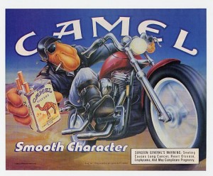
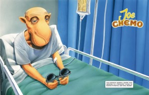
Although I’m home sick, I still wanted to share what I had prepared for class today.  One of my favourite local magazines is Adbusters.  The magazine takes a radical and critical approach to consumerism and often comes up with spoof ads as a social commentary about the impact advertising can have on society.  One such spoof ad I came across on the weekend was in response to those famous Joe Camel ads from the 70s-80s.

Here’s the original ad:


And here’s the spoof ad:

This spoof ad is particularly powerful because it mocks the original Joe Camel ads which depicted a cool character sporting a cigarette, insinuating that by smoking, he upped his cool factor.  Instead, the spoof ad paints the same character in a pathetic light, now hooked to an IV and receiving chemo for his lifestyle choices.  The play on words, changing from Joe Camel to Joe Chemo is also an effective method at getting the point across:  Smoking isn’t cool anymore.  Also interesting is the edited version of the small Surgeon General’s warning.  What once read as a descriptor of the primary conditions caused by smoking is now replaced with detrimental effects to characters who smoke.  Spoof ads, although based in humour, are compelling nonetheless, and cater to a wittier generation.

I don’t know how prevalent smoking is amongst teens today, since there have been fairly aggressive PSAs about the dangers of smoking, but I recall that when I was in junior high, the kids who smoked were “the cool kids”.  One has to wonder if that attitude is a reinforcement of the message these ads hoped to push.  My general impression is that society is becoming less excepting of smoking and that’s reflective in the current BC laws restricting smoking to very few areas, so it’d be interesting to see how cigarette advertisements change as society’s view changes.


– Kiran Aujlay

Categories
Uncategorized

Can We?

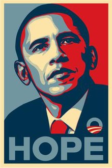
After reading Lesley Farmer’s article, “I See, I Do: Persuasive Messages and Visual Literacy”, the first thought that popped up in my mind was the use of posters during Obama’s 2008 campaign for presidency.  The infamous posters (pictured above) are quite simple: a headshot of Obama looking off into the distance in a somewhat contemplative yet stoic manner.  His image itself has been digitized, manipulated to take on the appearance of a comic book character, perhaps even the image of a superhero.  The message written underneath his portrait consists of a single word, whether it be “Hope”, “Change” or “Progress”.  The message is simple, concise, and creates a bold message, absent of any gimmick or jingle, something that voters often complain about.  Perhaps what is most interesting about the poster is the use of colour.  The contrasting shades of red, white and blue appear, on the surface, as a patriotic tribute to the colours of the American flag.  However, I was curious about the persuasiveness of those colours and decided to do some research on the psychology of colour.  Interestingly enough, blue evokes a sense of steadfastness, dependability, wisdom and loyalty.  It is also a colour most individuals associate with the feeling of calm.  Red, as most can attest to, is used to draw attention.  It is a colour associated with energy, and evokes a sense of excitement.  And finally, white, aside from being associated with cleanliness and purity, has also been associated with safety.

Whoever was behind Obama’s 2008 campaign appears to have put a lot of thought into this compelling poster.  As I recall, there was a huge push to get people to vote, as voter turn out was at an all-time low.  Years after Obama was elected, that image remains burned in my memory.  Whether it had persuasive abilities to get voters to not only vote, but to vote for Obama, is something worth exploring.  But in the context of this class, the analysis I conducted could be a great exercise for students to critically engage in analyzing political ads to determine what techniques are used to win over voters.


PS.  After researching further, I discovered that the poster’s creator, Shepard Fairey, is a street artist who works for the skateboard company, OBEY.  This adds an interesting dimension to the persuasiveness of the ad, considering the choice of artist may have been a deliberate attempt to reach out to younger voters.  Also fascinating is the fact that Fairey illegally used an image of Obama captured by the Associated Press as inspiration for his poster and eventually faced criminal charges!  What a crazy turn of events!


Kiran Aujlay


Sources:

Psychology of Colour:

http://www.precisionintermedia.com/color.html

Image of Obama:

http://en.wikipedia.org/wiki/Barack_Obama_%22Hope%22_poster

News article about Shepard Fairey:

http://www.huffingtonpost.com/2012/09/07/shepard-fairey-sentenced_n_1864785.html

Categories
Introductions

Misconceptions About Literature

art spiegelman - MAUS

Due to copyright laws, I was unable to use an original image from Art Spiegelmen’s Maus, so instead, through the CC branch of Flikr, I found a fan’s snapshot of the book itself.  I chose this image because it is the first book that forced me to question one of my many pre-conceived notions of what constitutes literature and that was the belief that all literature worthy of reading should consist solely of words. Spiegelmen’s Maus is a semi-autobiographical graphic novel about his father’s experience as a Polish man, forced to live in concentration camps during the Holocaust.  Until I came across this novel, I had understood that a book that consisted mainly of images used to tell a story was simply a comic book, the fast-food of the literary world, consumed quickly with no lasting intellectual value.  As a child and teenager, I had read many Marvel comics and MAD magazines, but I would have never deemed them as literature.

I came across Maus as an adult, and the book had a profound impact on me.  It is a moving, beautiful piece of literature. What is fascinating about the text itself is that it deals with a disturbing time in history, but the story is told from the perspective of a mouse that represents the Jews.  The Germans are replaced by cats and the Poles are depicted as pigs.  Many questions spring to mind.  By depicting these races as animals, does this format trivialize the experience?  Or is it somehow more accessible?  Would a format such as this speak to students moreso than a traditional text like The Diary of Anne Frank?  The possibilities of analysis of this text from an academic viewpoint are endless, and I hope to work through them in my upcoming presentation, but I thought I’d share this with you initially, as my introduction.  I’m looking forward to this class and working together with all of you!

Kiran Aujlay

Spam prevention powered by Akismet