Multiliteracies in ELA Classrooms

Entries Tagged as 'Uncategorized'

2 + 2 = 5

October 1st, 2012 · 4 Comments

I should preface by stating that I’ve been having trouble accessing the reading… and if anyone can help me with that it would be much appreciated.

So I took the topic of the week “Persuasive Visual Media” and considered something a little differently… something a little more personal!

If you haven’t read George Orwell’s novel “1984” … you should. While the story is a bit dated (originally produced in the 50s) it’s even more relevant in today’s society. I read it for my grade 12 theatre class. We were reworking it into a script for the stage with a specific focus on the relationship between the Ministry (the producers) and the proles (the consumers). The reason I feel as though 1984 is a relevant point of discussion is because 1. many high school English Language Arts classes include it in their curriculum; and in 1984 20-some years after the books release many people panicked about the predictions from the 50s. 1984 itself is full of persuasive language: the protagonist, Winston Smith, worked day in and day out in by editing news postings and books into “doublespeak” an edited form of English to an unidentifiable disintegration of grammar and language.

When we transferred the story onto the stage the mise-en-scene took on a visual representation of producing commercial product for the ministry, while the ‘proles’ setting was the leftovers of the ads that we see today. Consider this commercial from Apple’s introduction to the market:

While there is some competition between Apple and PCs in today’s market doesn’t this commercial seem to contradict the way that Apple has risen to the top? Personally I can’t leave the house (never mind my room) without my iPhone! All I want for Christmas is an iPad since I already have my two front teeth! It’s a strange balance between dependency and useful productivity. Maybe not everyone in this class uses and iPhone and MacBook… but can anyone say they use an mp3 instead of an iPod? Have we become the ministry of drones to Apple’s Big Brother take over? Does Apple use persuasive visual media? Or are people like me just so dependent on the company that seeing the persuasion has become impossible? My lifeline depends on the new iOS updates and possibility for an upgrade?

I find this idea of “persuasive visual media” interesting as well in regards to propaganda and the street art world. In another of our classes a group of us are making a lesson plan between three different subjects based around the idea of “propaganda”. One key artist that came to mind was Banksy and the documentary associated with him “Exit Through the Gift Shop”. I’m running out of words here so I’ll just attach the Wikipedia synopsis: . The interesting part about this film is that one of the subjects of the film, Thierry Guetta, is overtaken by Banksy’s ideals (art that forces a deeper thought process and commentary on current social questions) but when his own desire for fame creeps in, his morals go out the door…

Wow… I just realized I went from 1984 to Exit Through the Gift Shop in 500 odd words… I’d like to leave with this image… my point being that it is easy for us to become manipulated by something so simple…

Brendan

Tags: Uncategorized

Bringing Technology home

October 1st, 2012 · No Comments

In the I See, I Do article, the piece that stood out the most to me, is the “technology-rich activities for critical visual thinking”. I really liked the idea of asking students to go out into their “world” and take pictures of things that are real for them. I feel like I could use this as a project, to not only involve students in what is going on around them, but also have them “stop and smell the roses” so to speak. I feel like in a world of technology that kids are watching their worlds go rushing by them. They want web pages to load instantly, (yes I expect that too…) they are no longer enjoying the basics in life. Kids are becoming obese in a place where we are safe to go outside and play. They are redefining “play”. It has gone from playing a game of flashlight tag, to sitting inside all weekend playing Dungeons and Dragons. Yes, technology can help us, but is it helping when the only social skills a kid is learning is through a head set and computer screen.
However back to the article. While reading the part about what colors and lines create, I had to stop and think about all of her analogies. I am not sure if the emotions we are supposed to learn are ingrained, but I don’t relate to what the shapes imply. I don’t feel that “Squares are stable, triangles are active, circles are organic, and spirals are cyclical”. I am curious as to where she got the ideas from, or if I am wrong and we are taught these at a young age. I was also confused with some of the color ideas and lines. Usually a line for me is the closing of a box, underlining something, or drawing directions. I feel like lines have start and end points and don’t think too much farther then that. Maybe its my own ignorance, but I feel like colors invoke different messages for different people. What if someone is colorblind? How are they to create feelings from colors that they do not see correctly?
I liked how she added resources for the reader to look at, but without a conclusion I am a little confused about her point and how she got to her ideas.

Sarah

Tags: Uncategorized

So cute!

October 1st, 2012 · 1 Comment

So I was watching TV last night and I saw this add and I had to share it. I haven’t had time to analyze it specifically in relation to the article we read, but I also couldn’t get it out of my mind and needed to share it.

I am not sure what visual media techniques it employs beyond using an adorable hedgehog. I will look into that before Wednesday. To be honest, I don’t even care what it is about… I just love it! I am not sure if that means they were successful because I won’t forget it… or unsuccessful because the star of the commercial outshines what it is supposed to be advertising.   Either way, I am looking forward to discussions about this kind of stuff on Wednesday!


Fluzone commercial featuring an adorable Hedgehog by pfyrestorm

Melissa

Tags: Uncategorized

Can We?

September 30th, 2012 · 3 Comments

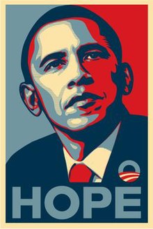
After reading Lesley Farmer’s article, “I See, I Do: Persuasive Messages and Visual Literacy”, the first thought that popped up in my mind was the use of posters during Obama’s 2008 campaign for presidency.  The infamous posters (pictured above) are quite simple: a headshot of Obama looking off into the distance in a somewhat contemplative yet stoic manner.  His image itself has been digitized, manipulated to take on the appearance of a comic book character, perhaps even the image of a superhero.  The message written underneath his portrait consists of a single word, whether it be “Hope”, “Change” or “Progress”.  The message is simple, concise, and creates a bold message, absent of any gimmick or jingle, something that voters often complain about.  Perhaps what is most interesting about the poster is the use of colour.  The contrasting shades of red, white and blue appear, on the surface, as a patriotic tribute to the colours of the American flag.  However, I was curious about the persuasiveness of those colours and decided to do some research on the psychology of colour.  Interestingly enough, blue evokes a sense of steadfastness, dependability, wisdom and loyalty.  It is also a colour most individuals associate with the feeling of calm.  Red, as most can attest to, is used to draw attention.  It is a colour associated with energy, and evokes a sense of excitement.  And finally, white, aside from being associated with cleanliness and purity, has also been associated with safety.

Whoever was behind Obama’s 2008 campaign appears to have put a lot of thought into this compelling poster.  As I recall, there was a huge push to get people to vote, as voter turn out was at an all-time low.  Years after Obama was elected, that image remains burned in my memory.  Whether it had persuasive abilities to get voters to not only vote, but to vote for Obama, is something worth exploring.  But in the context of this class, the analysis I conducted could be a great exercise for students to critically engage in analyzing political ads to determine what techniques are used to win over voters.


PS.  After researching further, I discovered that the poster’s creator, Shepard Fairey, is a street artist who works for the skateboard company, OBEY.  This adds an interesting dimension to the persuasiveness of the ad, considering the choice of artist may have been a deliberate attempt to reach out to younger voters.  Also fascinating is the fact that Fairey illegally used an image of Obama captured by the Associated Press as inspiration for his poster and eventually faced criminal charges!  What a crazy turn of events!


Kiran Aujlay


Sources:

Psychology of Colour:

http://www.precisionintermedia.com/color.html

Image of Obama:

http://en.wikipedia.org/wiki/Barack_Obama_%22Hope%22_poster

News article about Shepard Fairey:

http://www.huffingtonpost.com/2012/09/07/shepard-fairey-sentenced_n_1864785.html

Tags: Uncategorized

persuasive word cloud

September 29th, 2012 · 1 Comment

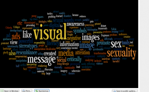
here is my wordle based on my notes on the subject of persuasive visual media. sex sex sex. what’s the opposite of subliminal, super-liminal?!


Tags: Uncategorized

Better late than never!

September 26th, 2012 · 2 Comments

Sorry guys. I know this is past deadline but I wanted to post about my experience anyways.


I had never read a Graphic Novel before, and to be honest, I was not interested. I have never been interested in comics, video games, ereaders. I could probably be called a “lit snob”. I was all about novels, poetry, and film. I had nothing against other forms of literature for other people, I just personally wasn’t interesting in them myself. I can definitely say that I have changed my mind.


Like Sarah and Katie, I also read American Born Chinese by Gene Luen Yang. I couldn’t put it down! I was hooked from the first page. I must say, though… I had a TERRIBLY hard time looking at the pictures. I just wanted to read the words. I was so interested in what was going to happen and since I always read books that are strictly text, that was the way I knew to find out what was happening. I had to force myself to look at the pictures.  Even still, I want to go back and read the entire thing again. I am sure there are some pictures that I entirely skipped over! This was definitely an eye-opener. I am sure most of my students will not have this problem! Something to be aware of.


That being said, I thought it was an amazing book. Sarah and Katie have already touched on a lot of the major issues that the novel addresses so I will try not to be too repetitive. I found the message about accepting who you are to be such an important one. Even as an adult, I sometimes struggle to be myself and not what I think someone else wants me to be. As much life experience as I gain, I am not sure if that is something I will ever outgrow completely. I would LOVE to teach this in high school. It was such a quick easy read and super relate-able. As a white, Christian woman, I wasn’t sure how much I would relate to a story about a young Chinese-American boy. There are, however, allusions to the Christian faith that made me feel super connected to the story. There were a lot of powerful messages and allusions that I feel made it so pretty much anyone could read and connect to it.


I am very happy to have lost my graphic novel virginity. I can’t wait to read more and find ways to bring them into my classroom.

Tags: Uncategorized

A potential change in teaching – American Born Chinese

September 25th, 2012 · 3 Comments

I added this youtube video from the creater, Gene Luen Yang. He is talking about his own struggles, and being able to express it all on paper is a great way to deal with stress. I know that I used writing to express myself in high school…through pieces that I will never share, but I used it as a coping mechanism, a way to see the light through all the darkness.

Trying to find an identity, no matter who you are, or where your from, is tough. Growing up we all want to have friends, be liked, have a talent of some sort, and make it through the day in a relatively happy format. We all want to fit in. Through out our high school lives, or at least through mine, I remember feeling lost, inadequate and ashamed of anything that made me different from every one else. I used writing poetry and short stories to express myself, deal with struggles and pain, and as a way to help me sort out all of the thoughts in my head. I find that even now I use this a technique to plan and deal within my adult life.

Using a book like this in high schools, I feel, could be potentially life changing for some kids. By using not only the element of writing, but of pictures to express struggle, I feel this could push kids to put pen to paper instead of other modes of dealing in negative ways. Many teens turn to drugs and alcohol to mask and hide behind, and some always will, but what if they could write stories, or draw pictures to make sense of their own personal chaos. Giving kids an outlet, that isn’t just writing, may allow some to explore graphic novels if they never had before.
Graphic novels can do so many things. They can tell a story of the past, create images for the present, and evoke dreams for the future. I feel that now that graphic novels are being recognized within the school system, that they have the potential to reach more kids because they are using the same literature, but displayed in a different type of language.

-Sarah

Tags: Uncategorized

American Born Chinese

September 25th, 2012 · 3 Comments

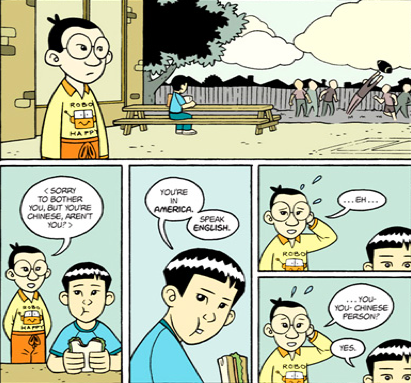
When we were asked to choose a book it was so hard to pick one because they all looked so interesting. I ended up choosing “American Born Chinese” by Gene Luen Yang because the pictures when I flipped through the book interested me a lot. specifically this one:

I thought, this must be about racial issues in America… (because there is no way it would depict a Chinese person in this way without some indication that racism is wrong) So, I really wanted to see how the author would wrap up the novel.

There are 3 stories within the book, which alternate and connect as you move throughout the book; they target different reactions to racism.

The first is about the very proud and self righteous monkey king who experiences racism (or a form a prejudice where he is seen as lesser for being a monkey). The monkey king handles it by lashing out and taking drastic measures to hurt the people who hurt him. This one interested me because it drew on how Chinese culture often uses myth and parables to tell stories. He also goes on to study the highest levels of Kung-Fu, which gives an even stronger tie to Chinese traditional culture.

The second story is about a Chinese boy, Jin Wang, in an American class – this is the story we can all relate to the best. It shows the type of racism that probably happens all the time in our high schools. The Chinese-American boy is singled out and not accepted by the white students (even though he was born in America and speaks English fluently) He ends up suffering silently, not having friends and wishing he were white. He lacks confidence and can’t see what others value in him.

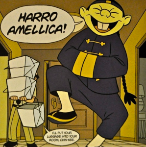
The third story is about a white boy, Danny, who has a Chinese cousin “Chin-Kee”, Chin-kee is the ultimate stereotype of a Chinese person or “F.O.B.”. In this story, Danny is extremely embarrassed of Chin-Kee and his Chinese way of acting; he believes that he will lose all of his friends and the respect of the whole school and he will eventually be teased so much that he will need to switch schools. This Chinese stereotype was displayed in Chin-Kee’s language: R and L (shown in the above picture), the food he ate: which had a cats head in it, the jokes he made: which were just weird, his name: Chin-Kee, and the way he appeared: buck-teeth, school uniform, slanted eyes, etc.

All of these stories do, in fact, tie together in the end and make a very nice conclusion that promotes acceptance. It would be an excellent way to bring an alternate form of literature into a classroom and discuss the effects of racism with students.

-Katie
Ps. Sorry for posting late, I was having major internet problems.

Tags: Uncategorized

Fall Haiku

September 25th, 2012 · 3 Comments

falling to the ground
I watch a leaf settle down
in a bed of brown

~ Anonymous: Source)

Following from our discussions last week, I selected a short anonymous Haiku from the UCLA Asia Institute site and identified certain words I felt carried greater weight: “falling,” “ground,” “leaf,” and so on. I created a text file, pasted in the original poem and then repeated words I wanted to emphasize. I pasted the resulting text with some words repeated many times into Wordle and manipulated the display using the “layout” and “randomize” features. Here’s the text I used:

falling falling falling falling falling falling falling falling
to the
ground ground ground ground ground
I I I I
watch watch watch watch
a
leaf leaf leaf leaf leaf leaf leaf leaf
settle settle settle settle settle
down down down
in a
bed bed bed bed bed
of
brown brown brown brown brown

The resulting adaptation may not be particularly effective in conveying the sense of the original Haiku; however, does it have any merit on its own? And does the above text, as an intermediary step, have any aesthetic merit?

I’d be interested in seeing more explorations of visual adaptations of poetry for this week’s seminar on literature and image.

Teresa

Tags: Uncategorized

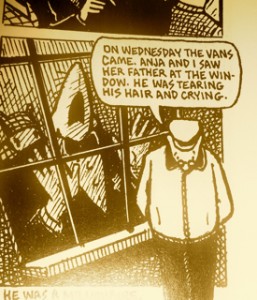
Maus — the horror and fragility of an open mouth!

September 22nd, 2012 · 5 Comments

This is the first graphic novel I’ve ever read and I couldn’t put it down. It is in fact a novel I have heard much about and had intended to read over the years. I am glad to have had the opportunity to do so now.

Interesting how Spiegelman uses the traditionally “low” form of the comic book to treat a very very serious and grave subject matter. Subversive!

I found the “visual rhetoric” striking and powerful. Spiegelman’s specific animal representations are potent. First off, the choice to portray the Jews as mice of course brings up the Nazi representation/metaphors of Jews as rats. The cats (Nazis) and the pigs (Poles) elicit associations of cunning and greed/plenty; also of cat as aggressor/oppressor and mouse as victim/oppressed. There is something reductive and stereotypical about the visual representations, which reflects the horrific reductive nature of Nazism and anti-Semitism.

The visual/graphic format itself also recalls the “Protocols of the Elders of Zion” – Nazi anti-Semitic propaganda.

Interesting how many different types of texts lie within the text: diagrams, photographs, detailed plans, and maps… There are narratives within narratives, and a fluid interplay between image, narrative, and dialogue.

In my own reading, I noticed that I am far more text centered than image centered. My eyes followed the words and I actually found myself forcing myself to slow down and pay attention to the illustrations at times. The image that won’t leave me is that of Anja, mouth agape. Throughout most of the book, the mouths of the characters  (mice) are closed. When they’re open they are portraying cries and screams, lending a humanity and vulnerability that is heart wrenching.

Tags: Uncategorized