Author Archives: Chelsea Theriault

Writing and Dreamshit; or, A Modest Proposal

From “Alice, Where Art Thou?” by Vincent Starrett (1949):

“Quaint child, old-fashioned Alice, lend your dream:

I would be done with modern story-spinners,

Follow with you the laughter and the gleam:

Weary am I, this night, of saints and sinners.”

Although this course has given me endless food for thought, since the term’s beginning one question has continually resided in the back of my mind: ‘What is the city?’ Each text, in its own speculative way, poses as an answer to this query. As can be expected, there is no common agreement: is the city a reflection of our societal values? A glorified prison? A commercialized celebrity junkyard? A sprawling cyber network? A magnet for depravity and squalor? Even our own city, Vancouver, opposes definition due to its contrasting, multi-faceted, and ever-shifting nature. However, the thematic variance we have encountered in our texts combined with this description of Vancouver actually points to an answer: The city is fluid and adaptable.

 In addition to changing conceptions of the city, another aspect of the course texts that has stuck out to me is the focus on dreams and dreaming; a fitting focus, since science fiction is a speculative genre that “dreams” itself into existence. Just like the differing cityscapes we encountered, dreamscapes and the act of dreaming have been approached varyingly, from Neuromancer’s “dreaming real” to Perdido Street Station’s dream-sucking, nightmare-inducing slake moths. Although seemingly detached topics, I feel that a connection can be made between the multiple representations of dreaming and the idea of “what” a city is. After all, dreams are also fluid, ever-changing, and adaptable; in this vein, I propose that the city is a dream.

 To explore the dream/city, I will draw examples from some of the texts we have examined so far that refer to dreamscapes and, in turn, comment on different aspects of the city. Here’s an augmented example:

 The City Dreams for Us

 In We, D-503 dreams up what the city excludes: color, oozing mess, mysticism. He states that dreams are a “serious psychic disease,” a term which the reader knows also characterizes the society encased by the glass city itself. Here, I argue that the city is the real dream, i.e unsustainable, acknowledged by the One State’s desire to remove “fancy” (the ability to dream) from its denizens’ minds, in part by covering everything in glass (which leaves nothing to the imagination). If the citizens don’t dream, then the false dreams of the city can continue to reign.

 Some other ideas I plan to explore in this way are the city as reflecting a dream’s amalgamation of nonsense (referring to Patchwork Girl), the city as “dreamland” (looking at Koolhaas’ history of Coney Island) the city as nightmare (using Perdido Street Station), and the city as the thin line between dream and reality (referring to Neuromancer). Overall, I hope to draw attention to a few different aspects of the word “dream”, eventually coming to a cohesive whole, a patchwork of my own, which composes a new way of conceiving the “city”.

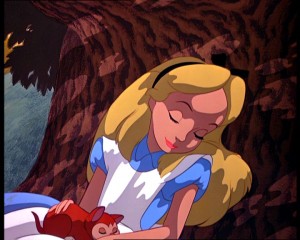
One of my favorite “dreams” from the course:

YouTube Preview Image

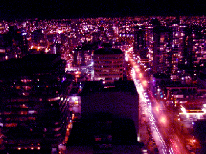
 However, the continual focus on dreamscapes might draw attention away from the equally important idea that the city is fluid. In order to keep these ideas constantly linked, I will provide photographs of Vancouver that exemplify whatever subcategory of the dream/city is being explored. This way, I’m not only able to use Vancouver as an example of how the city is adaptable (since the photographs will reflect varying texts and themes), but may signify the visual nature of dreaming.

Critical Response#1: The Garden of WE-den

Hello cyberspace. I decided to take a traditional route with this assignment, and formulated a close reading of I-330 from Zamyatin’s WE. Since I’m currently reading Milton’s Paradise Lost in another class, I was inspired by the tale of Adam and Eve in the Garden of Eden. Here goes!

Disclaimer 1: The Zilboorg translation of We that I will be quoting from is quite different from other versions of the text; for example, my book uses “fancy” where others use “imagination”.

Disclaimer 2: I will be referring to the Adam and Eve story as common knowledge; hopefully you are all familiar with its basic characters and events.

“They, fools that they were, chose freedom” (59): I-330 as the Satanic Eve

It is difficult to read Eugene Zamyatin’s We without being reminded of the biblical story of Adam and Eve. The forest “beyond the Green Wall” (149) can be likened to Paradise itself, and the Well-Doer’s “surgical removal of fancy” (77) is reminiscent of God’s desire to keep human nature separate from the “Knowledge of Good and Evil”. In addition, the subversive Mephi who “tempt” susceptible Numbers away from the doctrine of the United State play a Satanic role; of course, the name “Mephi” refers to Mephistopheles, Faust’s version of the devil. Overall, We presents readers with an inverted Adam and Eve tale, since we have characters being tempted into Eden, and not away from it.

Given that a paper much longer than this one could be written on this subject, I’m choosing to focus solely on the way that the character of I-330 complicates the “Adam and Eve” metaphor. Although she is undoubtedly a reincarnation of Eve, I-330 also embodies aspects of Satan; what does this do to a proposed reading of We as a topsy-turvy version of humankind’s fall from Paradise? First, I-330 represents Eve in that she is D-503’s true counterpart (despite his “relationship” with O-90). The first moment we meet her is when D-503 notes, “A laugh, as if an echo of mine, reached my ear” (7; emphasis added); just as Eve is to Adam, I-330 is D-503’s equal and he quickly falls in love with her. Here, the key word is falls; it could be argued that D-503’s infatuation with I-330, which made him realize that “love and jealousy do exist, and not only in the idiotic books of the ancients” (61), is the impetus for his “fall” from the faux-paradise of the One State into the Eden-like world beyond the Green Wall. Just as Eve gives Adam the forbidden fruit, I-330 gives D-503 a taste of forbidden alcohol (54); a few pages later, D-503 admits, “For the first time in my life I see clearly” (57).

Although she embodies an Eve-like role within the text, I-330 similarly represents Satan. Aside from the obvious example of her role in the Mephi, she also expresses the desire to make “all that was certain come to an end” (137), just as Satan desired to undermine God’s “project” on Earth by tempting Adam and Eve to sin. In addition, we can possibly view I-330’s connection to the color yellow as allying her with the devil. In the excellent essay “Zamjatin’s Modernist Palette: Colors and Their Function in We”, Sona S. Hoisington and Lynn Imbery survey and consolidate the various studies that have analyzed Zamyatin’s use of color; as they see it, yellow “symbolizes vitality, the presence of the life force associated with the sun in the heroine I-330, in the world of the past, and in the world beyond the Wall” (163). Interestingly, according to Wikipedia, “During the Middle Ages, both green and yellow were used to symbolize the devil”; just as the “ancients” of our present culture associated yellow with the devil, D-503 associates I-330 with yellow objects in the “Ancient House”, as well as with the yellow pollen that drifts over the Green Wall.

Therefore, it is possible to read We as an Adam and Eve story where I-330/Satan distributes the “Knowledge” that disrupts the One State/Paradise, while I-330/Eve also tempts D-503/Adam to follow her into a new life. Although the garden is re-entered in We and not abandoned, the fact that I-330 embodies aspects of both Satan and Eve leads to the death of D-503’s chance at living in the “real” Utopia: when D-503 discovers that he was recruited by I-330 for reasons other than love, he gives up his humanity to be a Number forever. Unable to reconcile the Satan within his Eve, D-503 chooses the false Paradise over true Eden.

Works Cited

Hoisington, Sona S. and Lynn Imbery. “Zamjatin’s Modernist Palette: Colors and Their Function in We.” The Slavic and East European Journal, 36.2 (1992): pp. 159-171.

 Zamyatin, Eugene. We. Trans. Gregory Zilboorg. Toronto: Clarke Irwin, 1959. 

Domed Utopias

When our discussion about Diaspar from The City and the Stars brought up the idea of utopian domed structures, I was reminded of something that might have been too tangential for class. . . but perfect for the Interweb! Let me introduce you to Auroville, an experimental township in southern India.

From their official website (http://www.auroville.org): “The purpose of Auroville is to realise human unity– in diversity. Today Auroville is recognised as the first and only internationally endorsed ongoing experiment in human unity and transformation of consciousness, also concerned with – and practically researching into – sustainable living and the future cultural, environmental, social and spiritual needs of mankind.”

Auroville was created in 1968, and is the brainchild of Mirra Alfassa (1873-1978), a French woman mostly known as “The Mother”. She designed the town as a spiral, or “galaxy”, and guess what’s in the center of the spiral?          (http://www.auroville.org/thecity/buildingthecity.htm)

This photo was taken in May 2007, before construction was finished.

Auroville spirals out from a domed ashram called the Matrimandir. The Matrimandir is made from flattened spheres of real gold leaf, and inside “the spacious Inner Chamber in the upper hemisphere of the structure is completely white, with white marble walls and white carpeting. In the centre a pure crystal-glass globe suffuses a ray of electronically guided sunlight which falls on it through an opening at the apex of the sphere”.

Since it’s an ashram (meditation center), you have to be completely silent in the dome and surrounding gardens. Walking up in pure silence to the giant orb, which glows golden in the sunshine, is one of the most beautiful and surreal things I have ever experienced. 

Auroville is very cool, but it is also a little creepy. Visitors are not allowed full access to the town, but my Gr.11 French teacher used to live there and took our class on a rare 3-day field trip. We visited a free cafeteria run entirely on solar power (cool), and a water bottling facility that makes “energy water” by playing classical music to it (creepy). We met international folk who gave up their careers to live a more meaningful life (cool), and we met a family whose house was full of pictures of The Mother (creepy). That’s all subjective, but I’m pessimistic about whether a utopia can actually be achieved. Is Auroville really “a universal town where men and women of all countries are able to live in peace and progressive harmony, above all creeds, all politics and all nationalities”, or is it just wishful thinking? In any event, Auroville’s Matrimandir is further evidence that domes are the ultimate utopian structures.

Retro-futurism

This film poster reminded me of the “raygun gothic” / Googie architecture that we briefly looked at yesterday; it’s playing Thursday night at Vancity Theatre as part of Spark FX ’09 (http://www.vifc.org/films/special.htm). I can’t explain it, but I find something in the 1950s aesthetic very appealing, probably the use of color.

Also, because nothing beats a retro trailer that basically tells you the entire plot:

YouTube Preview Image

“What’s a bathing suit?”

“Oh, murder!”

{Edit}

Just thought I should add a little something about retro-futurism (from the wiki http://en.wikipedia.org/wiki/Retro-futurism):

“Retrofuturistic design is a return to, and an enthusiasm for, the depictions of the future produced in the past (most often the 1920s through 1960s), both in science fiction and in nonfiction futurism of the time, which often seem dated by modern standards.[1] The ideology combines retrogradesociopolitical views with techno-utopianism. […] A great deal of attention is drawn to fantastic machines, buildings, cities, and transportation systems. The futuristic design ethic of the early 20th century tends to solid colors, streamlined shapes, and mammoth scales. It might be said that 20th century futuristic vision found its ultimate expression in the development of googie or populuxe design. As applied to fiction, this brand of retro-futuristic visual style is also referred to as Raygun Gothic, a catchall term for a visual style that incorporates various aspects of the GoogieStreamline Moderneand Art Deco architectural styles when applied to retro-futuristic science fiction environments.”

What interests me about this is how even the “future” can seem dated when viewed through the lens of cultures past, as we were talking about in regards to Bladerunner… forward thinking directors and designers try to keep this in mind. Thankfully, most don’t, and we can have a laugh at representations of a future that we are supposedly living in right now; I once read a hilarious article about the things that we need to invent right away to be up to speed with the 2015 as envisioned in Back to the Future Part 2. Guess what guys, there are only 6 years left before we all have hoverboards!

Kind of related

This picture is from Burning Man a couple of summers ago, which was themed “Future: Hope or Fear?” People could vote one way or the other at stations around the camp, and this pavilion reflected the scores. It might be too small to see, but the clock thingy at the center says that fear was winning! Yay! Also, the “man” would change depending on the score: arms down= fear is winning, arms up= hope is winning.

The pavilion is designed to reflect the theme, so it changes every year. Interestingly, this “future” pavilion seems to match Metropolis‘s 1920s art-deco-ish vibe. I thought it was pretty cool, but… it burned down. Oh well!

Bonus fun activity: see how many crazy hats you can spot