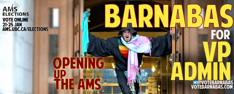
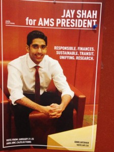
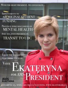
Clearly we’ve all been spending time with our Clean Modern Design textbooks this term. While nobody’s asking anyone to repeat mistakes of years past, candidate posters have been downright dull and professional this year. Also, no joke candidates. Is it the economy that’s making you all play it so safe? [Ed: …no, we don’t know what the economy does. Coming soon: our coverage of the VP Finance race!]

Definitely always the exception #yolo
What do you mean dull, you bitter hacks, you say. Do you want everyone to cover their posters with glitter Myspace gifs?

but also would it kill you to use a typeface with serifs?
Normally we’d break this mother down into good-bad-ugly, but we don’t want to attract the mockery of the graphic design set [Ed. – See above, re: areas not in our expertise]. Instead, we’ve broken it down into the far duller categories of Solid as Concrete, Dynamic Red, and Firm Hand on the Tiller Blue—apparently the only three options for background colours if you’re not going for ‘blurry nature scene.’
Solid as Concrete


These gentlemen have grounded themselves on a background that says they’re stoic. Solid. Dependable. Like a rock. Note the touches of red and blue—them’s the leadership colours.
Dynamic Red


At least two of these just make us want to break out into “ABC Café“—you know? revolution! sex! STRONG OPINIONS ABOUT ANNE HATHAWAY
RED—the blood of angry hacks
BLACK—UN complaints of past
RED—the ire of students’ rants
BLACK—or grey for good contrast
We expect a full parody musical on our desk by this time next week.
Firm Hand on the Tiller Blue

With the exception of Princess Shinyhair, Queen of Efficiency, blue shows up largely as subsets of other colours, e.g. concrete:

While it may not be as musical-theatre as red, blue gives a soothing, peaceful image. Ahhh. So relaxing. Now just drift away on a sea of budget reports and mental health initiatives…
Nature scene
WILD CARD.

We’re a little worried by Tanner’s lack of foresight, though [insert joke about athletics fees here]:

Keep an eye out for more coverage and poster critiques in the coming days, kids.

