
Heart Disease Rate Hotspots in the Southern USA 2016
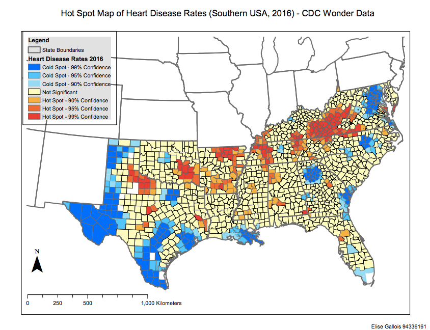
Map 1: Hotspot analysis of Heart Disease in Southern USA, 2016
This map represents hotspots of Heart Disease in the Southern US States in the year 2016. The input data was heart disease rate (which was derived from the Centre for Disease Control and Prevention. The red polygons represent the highest rates of heart disease by county, and the blue polygons represent the lowest rates of heart disease by county. The legend outlines the level of statistical significance (from the Getis-Ord Gi* statistic) and the ‘hot’ and ‘cold’ hotspots visually represent significantly high or low occurrences of heart disease by county, with non-significant occurrences by county represented in yellow. The analysis was conducted using the HotSpot analysis tool on CDCP data in ArcGIS.
There are clusters of ‘hot’ hotspot counties (99% significance) throughout Oklahoma, in Southwest Georgia, West Virginia, East Kentucky and Northwest Tennessee in 2016, indicating that these counties have a significantly high rate of heart disease in comparison to the norm. Each of these clusters is bordered by 95% confidence and 90% confidence ‘hot’ hotspots. ‘Cold’ hotspot clusters (95-99% significance) can be found in West and South Texas, North Carolina and South Louisiana, in addition to smaller clusters in patches on the east coast. Again, these clusters appear to be bordered by ‘Cold’ hotspots of 95% and 90% significance. It could be generally stated that there are more counties with significantly high heart disease rates in the interior, and more counties with significantly low heart disease rates at the coast. The majority of counties show no statistical significance, although it should be noted that there are a number of counties with missing data (particularly in western Texas).
Further analysis could involve determining the extent to which these patterns are influenced by variables such as population density, socio-economic indicators and mobility, perhaps through spatial autocorrelation. This data could be useful to healthcare policy-makers in targeting heart disease treatment and preventative measures to the counties that show a significantly high heart disease rate.