Key Mistake in a Breast Cancer Awareness Ad

I came across this ad in the girl’s bathroom the other day.  As I stood there drying my hands with the paper towel, I caught a closer look and that was when it struck me how poorly tailored this ad was.

Ever since the medical community established that the occurrence of breast cancer in younger women had previously been dangerously underrated, breast cancer awareness campaigns have long begun to target not only middle-aged women but younger women as well. Campaigns have went ahead and made efforts to emphasize the fact that one is “never too young” and the concept that “it’s never too early to get a check-up.”

This was why I found myself surprised by the ad which portrayed an extremely limiting image of three women, all of whom looked middle-aged with greying hair. Placed in a university campus within a bathroom frequented by young college girls, the ad was evidently aimed for young women. However, what it communicated through the picture failed to match up.

In its current state, this ad would not readily appeal to a young college girl. At least for a typical teenage girl, the sight of the three old women would cause a faulty categorization of breast cancer as an illness that only occurs to old women.

The ad attempts to invite in a friendly way, “Join us to learn how to prevent breast cancer through healthy lifestyle changes!”…But honestly, why would a young girl want to join a bunch of old moms in making healthy lifestyle changes? A girl would probably be thinking, “I am perfectly young and healthy! Why do I need to make any healthy lifestyle changes?”

Right then and there, a vital sense of connection between an ad and the target audience is lost. The young girl no longer feels that this ad is relevant to her life, and the ad thus fails.

Ad companies, Is This All You’ve Got?

Ads are awesome. They’re eye-catching and fun, they’re appealing,…they bring out the much-appreciated giggle every now and then. But some businesses take the route of linking sleaze and advertising every now and then.

The Dolce & Gabanna ad above is a prime example. This provocative ad positions a woman lying helplessly on the ground with her wrists being forcefully constrained. She lays powerless – practically like a puppy dog chained by the neck – while several men loom above looking down at her, clearly dominating the scene. The whole image reflects the implication that women are purportedly subservient to men. The Candies ad to the upper right also gives off this message. Along with the man’s nudity, the suggestive positioning of the hands and legs almost screams “sex” in this image. The man is portrayed as the obvious dominant one; his facial expression says he’s the boss in control and ready for his own pleasure. As for the girl, her facial expression isn’t even visible! Her emotions are thereby concealed by the man’s shoulder; she is being portrayed as one without feelings – a mere object – that’s simply there to quench the man’s thirst for sex.

Whether it’s objectifying or degrading women, promoting sexism through advertising campaigns displays a clear lack of integrity on a company’s part. Sometimes, it’s honestly hard to believe that campaigns like this are still being tolerated today. Sure, maybe “sex sells”…. But seriously?

Advertising companies, is this really all you’ve got?

Chocolate: Mom-friendly, Elegant, and Sexy

As a chocoholic, I naturally caught myself thinking about how chocolate brands around us increase their appeal. Since the store aisles are filled with similar chocolate competitors, chocolate companies definitely need to show customers how their products bring them unique value. Taking a look at some of the chocolate brands around us, we can spot many traces of technique that companies use to keep themselves in customers’ minds.

For example, Kinder establishes its point of differentiation as a chocolate that is “made for kids” and “approved by moms.” Their ad campaigns illustrate Kinder Surprises as not mere chocolates, but chocolates packed with intellectually-stimulating toys (i.e. the puzzles inside the eggs) that are valuable to kids’ learning. They also emphasize that Kinder Surprises are tools with which parents can bond with their child through spending quality time on the puzzles together.

Other brands like Lindt and Ferrero Rocher aim for a more high-end feel. In particular, Ferrero Rocher uses packaging that seems to reflect elegance and class. Their ad campaigns pitch these chocolate balls as the golden chocolates “for golden moments,” playing on the fancy gift-worthy packaging and associating the Ferrero image with special occasions (e.g. Christmas parties, weddings).

The line of mint m&m’s, on another note, targets a more specific market of young teenagers. This m&m flavor features a liplicious green lady with luscious lashes, portraying the m&m’s image as sexy and cool.

As a consumer, a large part of my decision will boil down to what I am looking for in my chocolate at the time of purchase. Do I want something kid-friendly? Something with a touch of luxury to use as a small gift? Or maybe something a little sexy to treat myself to?

Or maybe all of the above, because hey, why not?

Are YOU Canadian?

I’m Canadian. And apparently so are my oats.

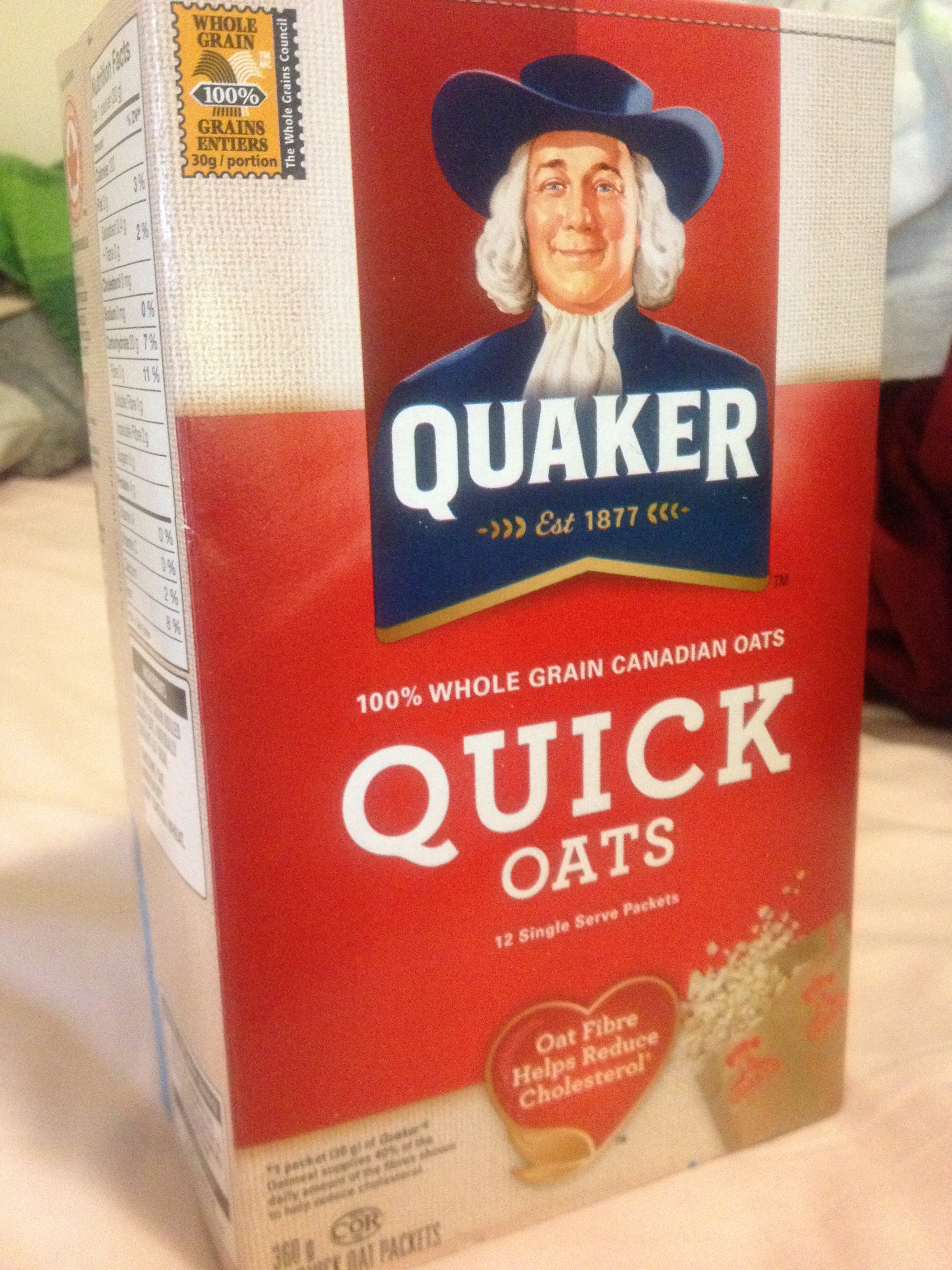
As I recently found out, these yummy oats of mine have now been repackaged and relabeled as “100% Whole Grain Canadian Oats” in the Canadian market. That’s right folks, these ain’t just 100% Whole Grain oats, but 100% Whole Grain Canadian oats! Pow.

So my favorite breakfast is now filled with 100% goodness of whole grains and Canadians and Canadian pride…But it wasn’t always like this.

Quaker® 100% Whole Grain Oats Packets Ready in 1 Minute

The box used to look like this, but with the new Canadian-ized packaging, maple red has replaced the old pinkish-red and blue, the Quaker in the logo has a different look (which I’ve made a mental note to further investigate), and the title overall just boasts a prouder, more dignified Canadian feel. With that said, beyond the box, the two lines of oats are still exactly the same in taste, nutrition facts, and serving size.

…Nothing like some nationalism in my breakfast products every now and then. Or everywhere in my food products or my Facebook news feed, for that matter.

So what about you? Are YOU Canadian?