Get fit NOW: Facebook Offers

Facebook Offer by Gold's Gym

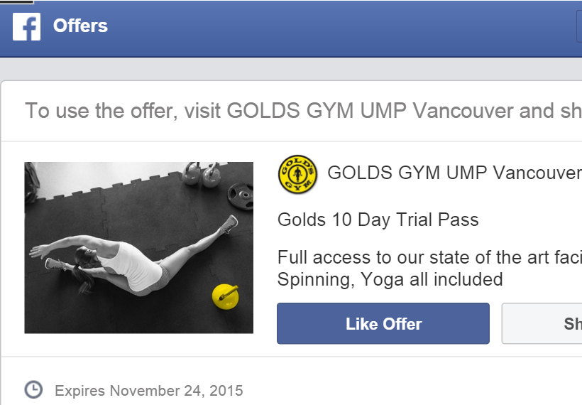
Facebook Offer by Gold’s Gym

I was scrolling through Facebook on my phone when I came across an offer by a gym located in the UBC village. As someone who loves all things healthy, it naturally caught my eye and stood out from the cat videos and other posts I had been seeing on my News Feed.

It was then that I discovered Facebook’s new function: targeted offers. It turns out that this gym targeted people within a 4-mile radius or so, as well as those who have shown interest in health and fitness. For example, I have done many searches on healthy eating, kickboxing, zumba, etc. Facebook also knows I go to UBC, so that’s probably how I ended up with this cool little offer in my feed. As this offer was so well-targeted in addition to time-sensitive, I naturally jumped on the offer and went to check out the gym. After trying out the classes and being personally introduced to the facility by the sales rep there, I began seriously considering joining.

This is a smart way for businesses to leverage social media to drive traffic into their stores and acquire new customers. As a customer myself, I understand that people are more likely to join a fitness facility after they’ve had a chance to try it out themselves. Especially with the booming of so many fitness companies these days, an attractive Facebook offer is one solid way to stand out. In this offer in particular, I can see that women are being targeted. The picture is of a fit woman, and classes such as zumba, spinning, and yoga were emphasized in the text of the offer. Good move, Gold’s.

Not surprisingly, after I clicked on this one, a range of other offers started popping up in my feed, with everything from kickboxing studios to yoga memberships. Thanks to the appropriate targeting, I was not annoyed at all. In my mind, I thought, “Sweet!!”

What a great reason to be on Facebook. And what a great time to get fit!

YESTERDAY YOU SAID TOMORROW – Inspiring E-marketing

I came across this photo on a friend’s Facebook page. Unsurprisingly, the ad was receiving mad likes and shares. Even friends who usually resist ads were voluntarily spreading this one, taking in the inspiring message and perhaps registering in their minds that Nike is a top-notch, professional brand for sports gear.

It then hit me how powerful subtle marketing can be. The ad is centered around an inspirational quote, and rather than having the name “Nike” loudly boasted all over the poster, only a small logo resides in the bottom corner with their signature motto. In fact, the name “Nike” doesn’t even appear anywhere.

This subtle branding technique portrays the brand in a positive light, guiding customers to associate Nike with the words  “motivational” and “inspiring.” As I found in this article after further research, subtle marketing is actually a pervasive tactic that has proven to positively influence customers’ purchasing habits.

It’s not surprising to find that people generally more readily accept an ad that comes packaged as a meaningful piece of inspiration. Social media platforms like Pinterest and Twitter are especially effective in promoting these inspiring pieces. Even my own Pinterest board is filled with cool quotes, many of which were spread by companies that sell a certain lifestyle, product, or service.

Post by Women’s Health Mag

Facebook post by an organic foods company. Caption: We choose a healthy and responsible new world. #local #organic #promiseofanewday

If you are ever in need of a deep quote or life motto, simply search #inspirationalquote, #MondayMotivation #quoteoftheday, or any of the thousands of other relevant hashtags/accounts on Twitter.

YESTERDAY YOU SAID TOMORROW- Just do it.

Heck, who could resist a quote like that?

All the Holiday Feels!

Time and time again, I’ve found myself getting hooked by “limited edition” or seasonal goodies that companies launch when the holidays arrive. For the fall there was the infamous Pumpkin Spice Latte courtesy of Starbucks, and now as we move into winter, the festive cups of the holiday season have debuted in the stores along with “Christmas flavors” such as Peppermint Mocha. The Christmas wave doesn’t stop at Starbucks though.

In the past two weeks, everywhere I went – be it the shopping mall, the dollar store, or the neighborhood supermarket – traces of “seasonal” marketing have arrived. Suddenly I found myself in a wonderland of red, green, and gold Hershey’s chocolates, snowflake m&m’s, “winter fragrances” by beauty shops, and “winter” ice-cream flavors. It occurred to me that these constant launching and relaunching of holiday lines and fun new flavors are one of the key things that keep customers pumped. They give customers a reason to keep checking back. They keep customers excited about getting a piece of what’s new and what all the recent buzz is about. Most of all, they keep customers engaged.


The rise of highly visual social media platforms such as Instagram, Pinterest and Tumblr have tapped into our emotions and helped fuel holiday sales.

Thanksgiving Instagram post by Starbucks

Thanksgiving Instagram post by Starbucks

Christmas themed Instagram post featuring Starbucks

Christmas themed Instagram post featuring Starbucks

There are even Tumblr websites specifically dedicated to seasonal moods such as http://autumncozy.tumblr.com/ (it’ll make you feel all warm and cozy, guaranteed)!

So what about you? How are you leveraging social media this holiday season?

You are not good enough.

Social media is incredible. It provides us with so many tools, resources, ideas, connections, inspiration,… but when manipulated a certain way, it also has power to negatively impact us.

#thinspiration #fitspo #thighgap #flatstomach #goals #bikinibody #booty

I see myself as healthy with a good appearance, but as I scroll through Instagram and Tumblr and see all these edited images of people, I cannot help but have insecure thoughts.

Photoshopped, slimmed, shaded

With the rise of highly visual social platforms, it’s become harder to resist images that indirectly lead us to certain thoughts. So many Instagram accounts filled with perfect images of people or images of 100-calorie diet plates have become idolized by millions of followers. Many women in particular have been fed unrealistic expectations for their bodies, leading to triggering thoughts related to binge-eating, anorexia, bulimia, orthorexia, etc. To my disgust, some companies have even preyed on individuals’ insecurities to sell diet products and body-slimming gear.

I have to remind myself time and time again that living a healthy lifestyle, listening to my body, and taking care of my mental well-being are far more important than trying to mold my body to a certain external appearance. So my challenge for companies today is: how will you sell your products? Will you drive positive change in society, or will you put people down?

Hey Kids! Eat Your Oatmeal

I love my oatmeal.

As an avid oatmeal fan (yes, we do exist), I have come across Quaker multiple times while hitting the shops for this hearty hot cereal. As I scrounged the aisles at my local supermarket the other day, I was hooked when I found that Quaker produces “kids’ oatmeal” in addition to their classic versions. This new kids line boasts fun flavors such as Cookies n’ Creme, Chocolate Chip and even “Dino Eggs” (which I have yet to find out the intriguing details about).

However, as I inched closer to inspect the options, I was struck by how off the packaging was for the Chocolate Chip.

To my surprise, I found myself face-to-face with a dark box displaying a dreadfully black background, “KIDS’ INSTANT OATMEAL” in boring, official adult font, and just an overall unappealing look. The only visible attempt to spice up the box was a title in semi-bubbly letters. But even that was unable to salvage the overall “dead” look… as if the idea of oatmeal itself were not unappealing enough to kids already.

Where are the bright colors and fun chocolate chips (other than the puny ones sitting lifelessly around beside the bowl)? Where is the lively milk being splashed into the cereal? Where is the energy? As far as could be observed, the packaging of this product did not look the least bit exciting to an adult – never mind to a kid.

In order to pique the interest of the product’s target audience, Quaker should take steps to tailor their packaging more to kids. The two boxes below for Cookies n’ Creme, for example, are much more suited for kids.

Vibrant colors, funky fonts, lively cookie bits splashing around in milk, and unconventional positioning all combine to communicate a much more “fun” image. Kids will most definitely be more readily attracted to an oatmeal that doesn’t look drab and boring.

Packaging may not be everything there is to a product, but it sure plays a key role in influencing whether a product can sufficiently reach out to its target customer.

$4 Milkshake, Anyone?

I stumbled across this article which got me thinking about why I, like so many others, have a special soft spot for Starbucks. Thinking about it now, when we hand over a ridiculous $4 for a cup of coffee, what we are buying is really not coffee, but a package of “the Starbucks Experience.” Starbucks has taken its brand and shaped it into an enticing token of luxury and sophistication, and traces of their branding technique can be found in practically every corner of the coffee shop.

For example, the article brought up the point that Starbucks stores have no rigid edges; everything is rounded, creating a welcoming atmosphere, and they use the tiniest round tables which have “no empty seats” so individuals feel comfortable going alone to sit down and have a study session without looking lonely. In addition, I’ve noticed that Starbucks has even developed their own language for coffee, using fancy vocab like “half-caf” and “grande valencia latte” to give a sense of high-class sophistication that adds to Starbucks’ atmosphere as a coffee society for the elite.

Another factor that keeps up Starbuck’s appeal is the perceived uniqueness. Take the Frappuccino for example. In essence, a Frappuccino is really just a milkshake (with a lot of cream on top). Why are we willing to pay $4 for a milkshake? What Starbucks has managed to do is take an ordinary beverage and put the “suave” spin on it, dressing it up with a fancy Italian name and getting us to perceive it as cooler and classier than a milkshake. Yes, you can get a milkshake anywhere, but you can only get a Frappuccino at Starbucks.
And yet, despite recognizing that so much of Starbucks largely comes from hype, I would still gladly take an afternoon to melt into one of those sofas and sip on my very own cup of luxury, warmth, and Sophistication.
Maybe I’ll gain some “grande valencia latte” sophistication along the way.

Key Mistake in a Breast Cancer Awareness Ad

I came across this ad in the girl’s bathroom the other day.  As I stood there drying my hands with the paper towel, I caught a closer look and that was when it struck me how poorly tailored this ad was.

Ever since the medical community established that the occurrence of breast cancer in younger women had previously been dangerously underrated, breast cancer awareness campaigns have long begun to target not only middle-aged women but younger women as well. Campaigns have went ahead and made efforts to emphasize the fact that one is “never too young” and the concept that “it’s never too early to get a check-up.”

This was why I found myself surprised by the ad which portrayed an extremely limiting image of three women, all of whom looked middle-aged with greying hair. Placed in a university campus within a bathroom frequented by young college girls, the ad was evidently aimed for young women. However, what it communicated through the picture failed to match up.

In its current state, this ad would not readily appeal to a young college girl. At least for a typical teenage girl, the sight of the three old women would cause a faulty categorization of breast cancer as an illness that only occurs to old women.

The ad attempts to invite in a friendly way, “Join us to learn how to prevent breast cancer through healthy lifestyle changes!”…But honestly, why would a young girl want to join a bunch of old moms in making healthy lifestyle changes? A girl would probably be thinking, “I am perfectly young and healthy! Why do I need to make any healthy lifestyle changes?”

Right then and there, a vital sense of connection between an ad and the target audience is lost. The young girl no longer feels that this ad is relevant to her life, and the ad thus fails.

Ad companies, Is This All You’ve Got?

Ads are awesome. They’re eye-catching and fun, they’re appealing,…they bring out the much-appreciated giggle every now and then. But some businesses take the route of linking sleaze and advertising every now and then.

The Dolce & Gabanna ad above is a prime example. This provocative ad positions a woman lying helplessly on the ground with her wrists being forcefully constrained. She lays powerless – practically like a puppy dog chained by the neck – while several men loom above looking down at her, clearly dominating the scene. The whole image reflects the implication that women are purportedly subservient to men. The Candies ad to the upper right also gives off this message. Along with the man’s nudity, the suggestive positioning of the hands and legs almost screams “sex” in this image. The man is portrayed as the obvious dominant one; his facial expression says he’s the boss in control and ready for his own pleasure. As for the girl, her facial expression isn’t even visible! Her emotions are thereby concealed by the man’s shoulder; she is being portrayed as one without feelings – a mere object – that’s simply there to quench the man’s thirst for sex.

Whether it’s objectifying or degrading women, promoting sexism through advertising campaigns displays a clear lack of integrity on a company’s part. Sometimes, it’s honestly hard to believe that campaigns like this are still being tolerated today. Sure, maybe “sex sells”…. But seriously?

Advertising companies, is this really all you’ve got?

Chocolate: Mom-friendly, Elegant, and Sexy

As a chocoholic, I naturally caught myself thinking about how chocolate brands around us increase their appeal. Since the store aisles are filled with similar chocolate competitors, chocolate companies definitely need to show customers how their products bring them unique value. Taking a look at some of the chocolate brands around us, we can spot many traces of technique that companies use to keep themselves in customers’ minds.

For example, Kinder establishes its point of differentiation as a chocolate that is “made for kids” and “approved by moms.” Their ad campaigns illustrate Kinder Surprises as not mere chocolates, but chocolates packed with intellectually-stimulating toys (i.e. the puzzles inside the eggs) that are valuable to kids’ learning. They also emphasize that Kinder Surprises are tools with which parents can bond with their child through spending quality time on the puzzles together.

Other brands like Lindt and Ferrero Rocher aim for a more high-end feel. In particular, Ferrero Rocher uses packaging that seems to reflect elegance and class. Their ad campaigns pitch these chocolate balls as the golden chocolates “for golden moments,” playing on the fancy gift-worthy packaging and associating the Ferrero image with special occasions (e.g. Christmas parties, weddings).

The line of mint m&m’s, on another note, targets a more specific market of young teenagers. This m&m flavor features a liplicious green lady with luscious lashes, portraying the m&m’s image as sexy and cool.

As a consumer, a large part of my decision will boil down to what I am looking for in my chocolate at the time of purchase. Do I want something kid-friendly? Something with a touch of luxury to use as a small gift? Or maybe something a little sexy to treat myself to?

Or maybe all of the above, because hey, why not?

Are YOU Canadian?

I’m Canadian. And apparently so are my oats.

As I recently found out, these yummy oats of mine have now been repackaged and relabeled as “100% Whole Grain Canadian Oats” in the Canadian market. That’s right folks, these ain’t just 100% Whole Grain oats, but 100% Whole Grain Canadian oats! Pow.

So my favorite breakfast is now filled with 100% goodness of whole grains and Canadians and Canadian pride…But it wasn’t always like this.

Quaker® 100% Whole Grain Oats Packets Ready in 1 Minute

The box used to look like this, but with the new Canadian-ized packaging, maple red has replaced the old pinkish-red and blue, the Quaker in the logo has a different look (which I’ve made a mental note to further investigate), and the title overall just boasts a prouder, more dignified Canadian feel. With that said, beyond the box, the two lines of oats are still exactly the same in taste, nutrition facts, and serving size.

…Nothing like some nationalism in my breakfast products every now and then. Or everywhere in my food products or my Facebook news feed, for that matter.

So what about you? Are YOU Canadian?